 Against the backdrop of the United Nations Climate Change Conference COP27, quite a few data visualizations on climate and environmental issues came out. Earlier, we showed you the Emissions Map by the Climate Trace coalition. This time on DataViz Weekly, here are some more of the top recent ones we believe are worth looking at:
- Uneven distribution of climate change effects across the world — FT
- Future of European forests under different climate scenarios — Appsilon
- Rise of clean energy — Reuters
- Endangered Flemish agricultural land under the seventh manure action plan — De Tijd
Data Visualization Weekly: November 18, 2022 — November 25, 2022
Uneven Distribution of Climate Change Effects Across World
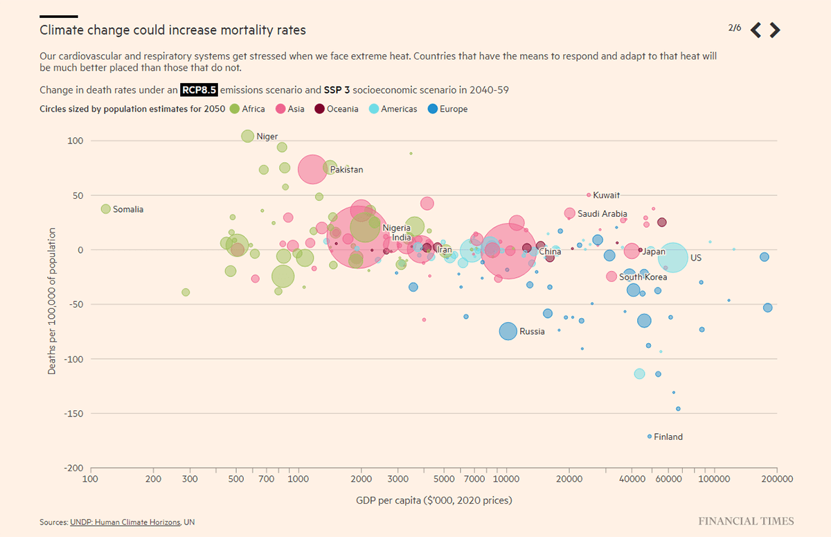
Researchers say climate change disproportionally impacts poorer countries. It is seen as a major factor in the worsening of inequalities across the globe over the following decades.
Steven Bernard of the Financial Times graphically represented data from the new Human Climate Horizons platform, built by Climate Impact Lab in partnership with the United Nations Development Programme (UNDP), and his visualizations greatly show some striking disparities. Using the bubble charting technique, he plotted the expected changes in mortality rates, hours worked, and electricity use against GDP per capita, by country. He also made an animated map displaying the global warming trend around the world.
See the data graphics on the FT.
Future of European Forests Under Different Climate Scenarios
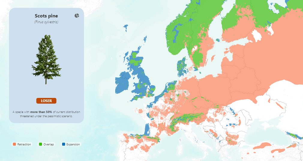
Global warming is also changing forests. If you wonder how, you should be especially interested in checking out this new data visualization project.
Appsilon, an R Shiny app development firm, created an interactive dashboard representing the future of forests in Europe under three different scenarios of climate change based on data from a study by Marcin K. Dyderski, Sonia Paź, Lee E. Frelich, Andrzej M. Jagodziński. Select one of the twelve available tree species, and you’ll see its current distribution. To get an idea of what might happen to it by 2070, pick a climate scenario — optimistic, pessimistic, or moderate.
Explore the Future Forests dashboard on Appsilon’s website.
Rise of Clean Energy
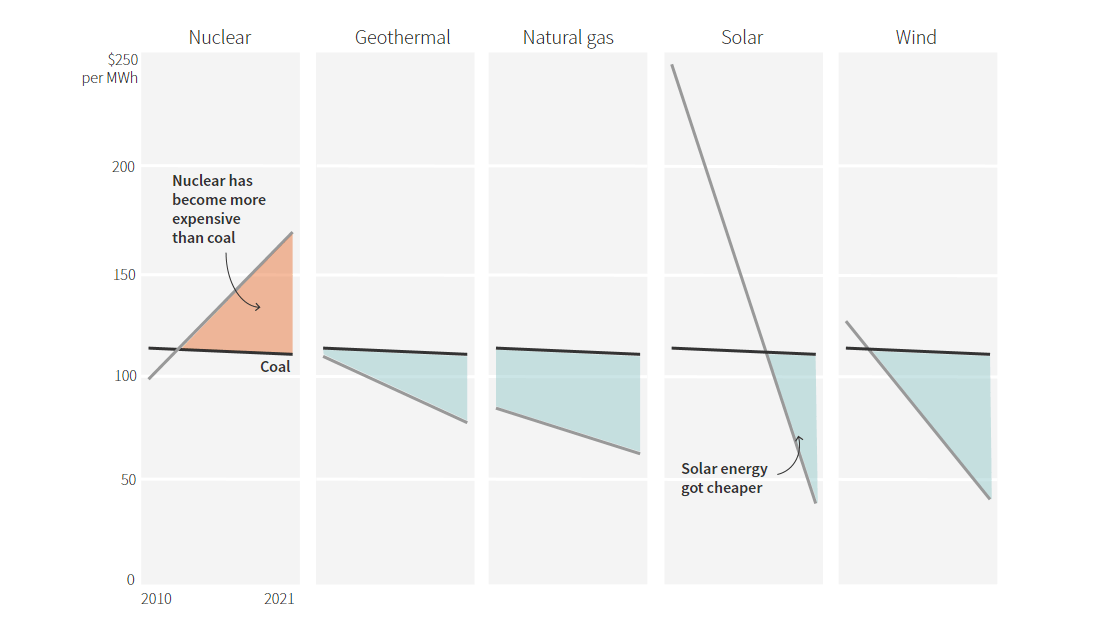
Compared to fossil fuels, renewables have already become more affordable. And global investments in solar and wind projects are expected to surpass those in gas and oil as soon as by the end of 2022. But poorer countries, exposed to climate change impacts more than developed ones, have rather limited access to clean energy progress.
For Reuters, Prinz Magtulis and Sumanta Sen looked into how renewable energy fares, with the help of data from the International Energy Agency, Rystad Energy, Climate Policy Initiative, and Lazard. The graph displayed above, for example, shows the cost of geothermal, natural gas, solar, and wind energy has gotten lower than coal while nuclear power is now more expensive. The same article also has multiple other interesting charts. One of them, for instance, lets you see at a glance that low-income countries have only a tiny carbon footprint compared to rich countries (although suffer most from global warming).
Take a look at the charts on Reuters.
Endangered Flemish Agricultural Land Under Seventh Manure Action Plan
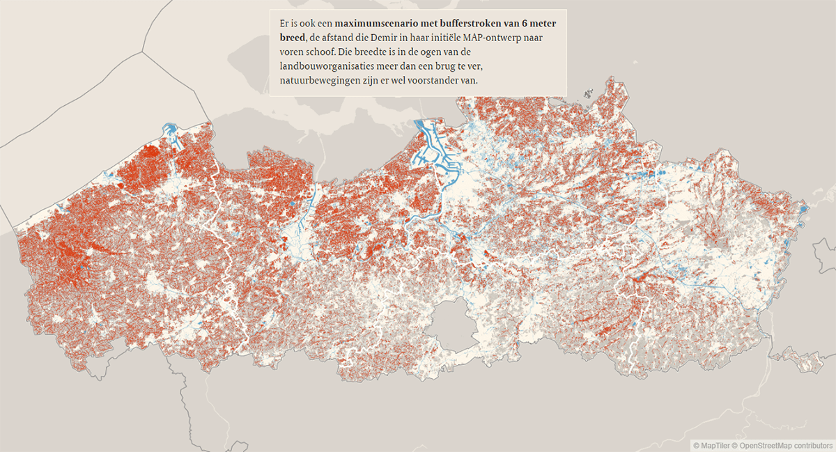
According to a directive of the European Commission, all countries of the European Union are obliged to have the “good” quality of all water bodies by 2027. In Belgium’s Flanders, the surface water suffers from nitrates and phosphates coming from fertilizers, and the seventh manure action plan (MAP7) is designed to improve the situation but will apparently lead to significant cuts in the agricultural area.
De Tijd published a remarkable visual story by Thomas Segers, Olaf Verhaeghe, and Raphael Cockx that analyzes the MAP7’s impact and makes it clear where it is projected to be the greatest. The plan lays down, in particular, special buffer zones between waterways and cropland. In the article, the journalists show how much agricultural area is supposed to be lost with buffer zones of different sizes in action.
Check out the story on De Tijd.
***
You are more than welcome to check out previous issues of Data Visualization Weekly to make sure you have not missed out on some cool charts, maps, and infographics. Those featuring graphics on climate change, for example, can be found under the “climate change” tag. Stay tuned for more!
- Categories: Data Visualization Weekly
- No Comments »