 Map charts are a great way to put data in a geographical context. And they are not difficult to create! I am eager to demonstrate that by walking you through the creation of a bubble map, one of the most popular types data maps, with the help of JavaScript.
A bubble map is a combination of a bubble chart and a geographical map. It uses circles of different sizes (and sometimes colors) to indicate numeric values relating to locations or territories.
In this tutorial, I will be visualizing the data on gasoline prices across the United States. They saw record highs this summer after a surge fueled by the outbreak of the Russia–Ukraine conflict. The first, basic bubble map will display the gas prices in July by state. The final one will add the magnitude of the change since February 23, one day before Russia launched an attack on Ukraine.
Follow along and you’ll learn to build beautiful interactive maps in JS with ease and no problem!
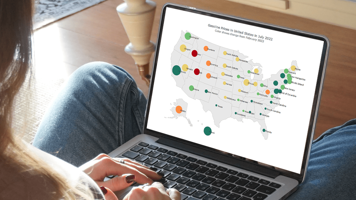
Final JS Bubble Map Preview
Check out the final result of the JavaScript-based bubble mapping in this tutorial:
Basic JavaScript Bubble Map in 4 Steps
Creating interactive JS bubble maps from scratch might seem daunting and tedious. But I will show you how to do it with ease and fun.
Generally speaking, there are four fundamental steps to build a basic bubble map, just like any other chart: prepare a web page, add JavaScript files, load data, and write some charting code. Let’s do that!
1. Prepare a web page
First things first. I create a blank web page. Then I add a block-level HTML element (div) as the placeholder for the bubble map; I also give it a unique id (container) and set some styling.
Here is how my HTML page looks now:
<html>
  <head>
    <title>JavaScript Bubble Map</title>
    <style type="text/css">
      html, body, #container {
        width: 100%; height: 100%; margin: 0; padding: 0;
      }
    </style>
  </head>
  <body>
    <div id="container"></div>
  </body>
</html>
I want the visualization to be displayed over the entire screen. So I’ve set the width and height of the placeholder div element as 100%. Feel free to change that as you see fit in your situation.
2. Add JavaScript files
Second, all the JS files that will be used to make a bubble map must be added to the web page. That is done by adding the corresponding links wrapped in the script tags to the head section.
To make it all quick and straightforward, I will use the JavaScript charting library called AnyChart, precisely the AnyMap solution. So, I include the two modules needed to build bubble maps, “core” and “geo maps”, as well as the geodata file for the United States.
Then I prepare a place for the future JS mapping code itself by adding the script tag to the body section (basically, this tag can be put anywhere across the page).
See what my HTML page looks like now:
<html>
  <head>
    <title>JavaScript Bubble Map</title>
    <script src="https://cdn.anychart.com/releases/8.11.0/js/anychart-core.min.js"></script>
    <script src="https://cdn.anychart.com/releases/8.11.0/js/anychart-map.min.js"></script>
    <script src="https://cdn.anychart.com/releases/8.11.0/geodata/countries/united_states_of_america/united_states_of_america.js"></script>
    <style type="text/css">
      html, body, #container {
        width: 100%; height: 100%; margin: 0; padding: 0;
      }
    </style>
  </head>
  <body>
    <div id="container"></div>
    <script>
      // The place for the JavaScript bubble mapping code.
    </script>
  </body>
</html>
3. Load data
Third, I add my data.
There are multiple data formats that can be used. I decided to go with JSON and created a data file with the prices of regular gasoline across the U.S., by state, which you can take a look at here.
I will need two more JS files for using the data. One is the Data Adapter for loading the JSON data file itself. And the other is Proj4js for transforming the coordinates to plot bubbles over the respective geographical states. I reference them in the head section together with the other scripts.
<script src="https://cdn.anychart.com/releases/8.11.0/js/anychart-data-adapter.min.js"></script>
<script src="https://cdnjs.cloudflare.com/ajax/libs/proj4js/2.3.15/proj4.js"></script>
Then I use the anychart.data.loadJsonFile() function to load the JSON file, within the script tag previously placed in the body section.
anychart.data.loadJsonFile( 'https://gist.githubusercontent.com/shacheeswadia/eead370d79e0f20df5148b79b6887393/raw/fba29e3dcf1806cab770e845546a136a924cf1d5/dataBubbleMap2.json', function (data) {})4. Write some charting code
The fourth step is for populating the script tag in the body section of the web page with the code to visualize the JS-based bubble map. Actually, just a few quick lines will be enough!
All the code is to be wrapped into the anychart.onDocumentReady() function so that the page is fully loaded before anything else is executed.
Inside it, to begin with, I load the data as shown in the 3rd step. Then I create a map chart instance using the built-in function and add the geodata for the United States.
<script>

  anychart.onDocumentReady(function() {

    // load the data
    anychart.data.loadJsonFile( 'https://gist.githubusercontent.com/shacheeswadia/eead370d79e0f20df5148b79b6887393/raw/fba29e3dcf1806cab770e845546a136a924cf1d5/dataBubbleMap2.json',
    function (data) {

      // create a map chart
      let map = anychart.map();

      // add the u.s. geodata
      map.geoData("anychart.maps.united_states_of_america");

    });

  });
</script>
Since I want to denote the gas prices with bubbles, I create a bubble series and map those values as the size of the bubbles all over the map:
let series = map.bubble(
  anychart.data.set(data).mapAs({
    size: "Petrol"
  })
);
Captions are important for better legibility. So I enable the series labels to display the names of the states and add a title.
// enable the series labels
series
  .labels()
  .enabled(true);

// set the map's title
map.title("Gasoline Prices in the United States in July 2022");
Finally, I reference the HTML block-level element as the container for the map and draw the resulting visualization.
// set the container id
map.container("container");

// initiate the map drawing
map.draw();
There you go! A lovely interactive bubble map is created using JavaScript just like that! You can clearly understand which U.S. states saw the highest gas prices in July 2022.
I have kept the code for this basic JS bubble map in the Playground online code editor so you can take a closer look at it, add your own data, and so on. I am also putting it here below.
But don’t leave yet and do keep reading as I have much more to show you!
<html>
  <head>
    <title>JavaScript Bubble Map</title>
    <script src="https://cdn.anychart.com/releases/8.11.0/js/anychart-core.min.js"></script>
    <script src="https://cdn.anychart.com/releases/8.11.0/js/anychart-map.min.js"></script>
    <script src="https://cdn.anychart.com/releases/8.11.0/geodata/countries/united_states_of_america/united_states_of_america.js"></script>
    <script src="https://cdn.anychart.com/releases/8.11.0/js/anychart-data-adapter.min.js"></script>
    <script src="https://cdnjs.cloudflare.com/ajax/libs/proj4js/2.3.15/proj4.js"></script>
    <style type="text/css">
      html, body, #container {
        width: 100%; height: 100%; margin: 0; padding: 0;
      }
    </style>
  </head>
  <body>
    <div id="container"></div>
    <script>
      anychart.onDocumentReady(function () {
        anychart.data.loadJsonFile(
          "https://gist.githubusercontent.com/shacheeswadia/eead370d79e0f20df5148b79b6887393/raw/fba29e3dcf1806cab770e845546a136a924cf1d5/dataBubbleMap2.json",
          function (data) {

            // create a map chart
            let map = anychart.map();

            // add the u.s. geodata
            map.geoData("anychart.maps.united_states_of_america");

            // create a bubble series
            let series = map.bubble(
              anychart.data.set(data).mapAs({
                size: "Petrol"
              })
            );

            // enable the series labels
            series
              .labels()
              .enabled(true);

            // set the map's title
            map.title("Gasoline Prices in the United States in July 2022");

            // set the container id
            map.container("container");

            // initiate the map drawing
            map.draw();

          }
        );
      });
    </script>
  </body>
</html>
Custom JS Bubble Map
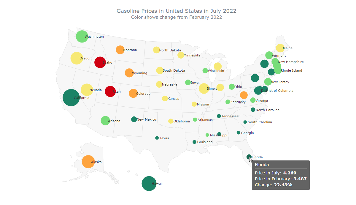
There are umpteen possibilities to customize JavaScript bubble maps. Right now, I will explain and demonstrate some of them. To start with, I will color the bubbles to reflect how greatly the gas price in each state increased between February and July 2022. Then I will enhance the label placement, tooltips, coloring in the hovered state, and map title.
1. Use colors to display the change
In bubble maps, like bubble charts, you can use color to visualize an extra dimension in data. I want to take this opportunity to represent the difference between the gas prices in February and in July in each state. The data file has these two values, “PetrolFeb” and “Petrol”, respectively. So, before anything else, I iterate through each data point and find the difference. From this value, I calculate the percentage of the rise and limit the number of decimal places to two.
data.forEach(function (d) {
  let diff = d.Petrol - d.PetrolFeb;
  d.percentRise = ((diff * 100) / d.PetrolFeb).toFixed(2);
});
Now I will color the bubbles based on this percentage. For this, I need a scale that will accept the values and return the corresponding color. AnyChart provides color scale options, but to make this tutorial even more educative, here I want to show you how you can use another library to power some features in combination with the main one. I decided to demonstrate the creation of a linear color scale using D3.js, an open-source JavaScript charting library.
Firstly, I include the D3.js script in the head section of the HTML page.
<script src="https://d3js.org/d3.v7.min.js"></script>Secondly, I create a D3 quantile scale that accepts a range of values and returns colors. I keep the domain to accept values from 20 to 50, because the percent rise values fall between those numbers, and add five color values in the range.
let fillColor = d3
  .scaleQuantile()
  .domain([20, 50])
  .range(["#1b8366", "#77dd79", "#f7e975", "#fea43e", "#cf0011"]);
Lastly, I set the fill value of each data point based on the percentage rise value using the D3.js scale I’ve just created.
data.forEach(function (d) {
  let diff = d.Petrol - d.PetrolFeb;
  d.percentRise = ((diff * 100) / d.PetrolFeb).toFixed(2);
  d.fill = fillColor(d.percentRise);
});
Don’t worry if this sounds a bit complicated. I just wanted to show you the power of customization where the alternatives are abundant.
2. Improve the label placement
By default, the labels are placed in the center of the bubbles. I want to shift them a bit to the side. Along the way, I’ll also customize the font size and color of the labels for better readability and aesthetics.
series
  .labels()
  .enabled(true)
  .anchor("left-center")
  .position("right")
  .fontColor("#353535")
  .fontSize(11)
  .offsetX(5);
Glancing at this interactive bubble map (it’s available on Playground), it’s easy to notice that compared to the rest of the country, the gas prices in California were the highest in February but grew not much, while Utah and Idaho saw the steepest rise.
3. Enhance the tooltip
The default tooltip shows the latitude and longitude, which is useless in this situation. It is always a good idea to display more meaningful information in the tooltip. And that can be easily implemented.
I choose to show the following in the tooltip: the names of the states, the gas prices for July and February, and the change percentage. For a better presentation, I use HTML.
series
  .tooltip()
  .useHtml(true)
  .format("<h6 style='font-size:14px; font-weight:400; margin: 0.2rem 0;'>Price in July: <b>{%Petrol}</b></h6><h6 style='font-size:14px; font-weight:400; margin: 0.2rem 0;'>Price in February: <b>{%PetrolFeb}</b></h6><h6 style='font-size:14px; font-weight:400; margin: 0.2rem 0;'>Change: <b>{%percentRise}%</b></h6>");
4. Change the bubble color in the hovered state
Since I have enhanced the tooltip, which shows up when the bubbles are hovered over with a mouse, I also want to tweak the way the bubbles are colored in the hovered state. For example, let me make it a darker shade of whatever the base color is.
series
  .hovered()
  .fill(function (d) {
    return anychart.color.darken(d.sourceColor, 0.2);
  })
  .stroke(0);
5. Customize the title
Finally, I make the title better explain what the bubble map is representing. I simply enable HTML for the title and add a bit more information and formatting to the title.
map
  .title()
  .enabled(true)
  .useHtml(true)
  .text(
    '<span style = "color: #7c868e; font-size:18px;">Gasoline Prices in the United States in July 2022</span>' +
      '<br/><span style="font-size: 15px;">Color shows change from February 2022</span>'
  );
And that’s it, an absolutely beautiful and informative bubble map is ready! Check it out:
This interactive JavaScript bubble map is available on Playground where you are more than welcome to continue playing with its code.
Conclusion
Now you know how to make bubble maps using JavaScript (HTML5)! As the next step, see the documentation and just keep on practicing. Visualization greatly helps make sense of data. With a robust JavaScript library, and when you know what you’re doing, creating charts and maps can be very easy.
Let me know if you have any questions or suggestions for the next type of data visualization that you would like to learn. Till then don’t let the high petrol prices get you down — experiment with the bubble map or any other visual because doing that requires no fuel!
Many thanks to Shachee Swadia for this stunning Bubble Map tutorial!
Make sure to not miss other JavaScript charting tutorials on our blog!
Got an idea for a not less amazing guest post? Let us know and we will be glad to discuss your suggestion!
- Categories: AnyChart Charting Component, AnyMap, Big Data, HTML5, JavaScript, JavaScript Chart Tutorials, Tips and Tricks
- No Comments »