 DataViz Weekly is where we curate the coolest data graphics published just about now around the web. Check out our new collection!
- Top topics in political ads ahead of the U.S. midterms — The Washington Post
- Republican candidates spreading election denial online — Bloomberg
- Access to essential services in cities — Leonardo Nicoletti, Mikhail Sirenko, Trivik Verma
- Tap water contamination across Spain — DATADISTA
Data Visualization Weekly: October 28, 2022 — November 4, 2022
Top Topics in Political Ads Ahead of U.S. Midterms
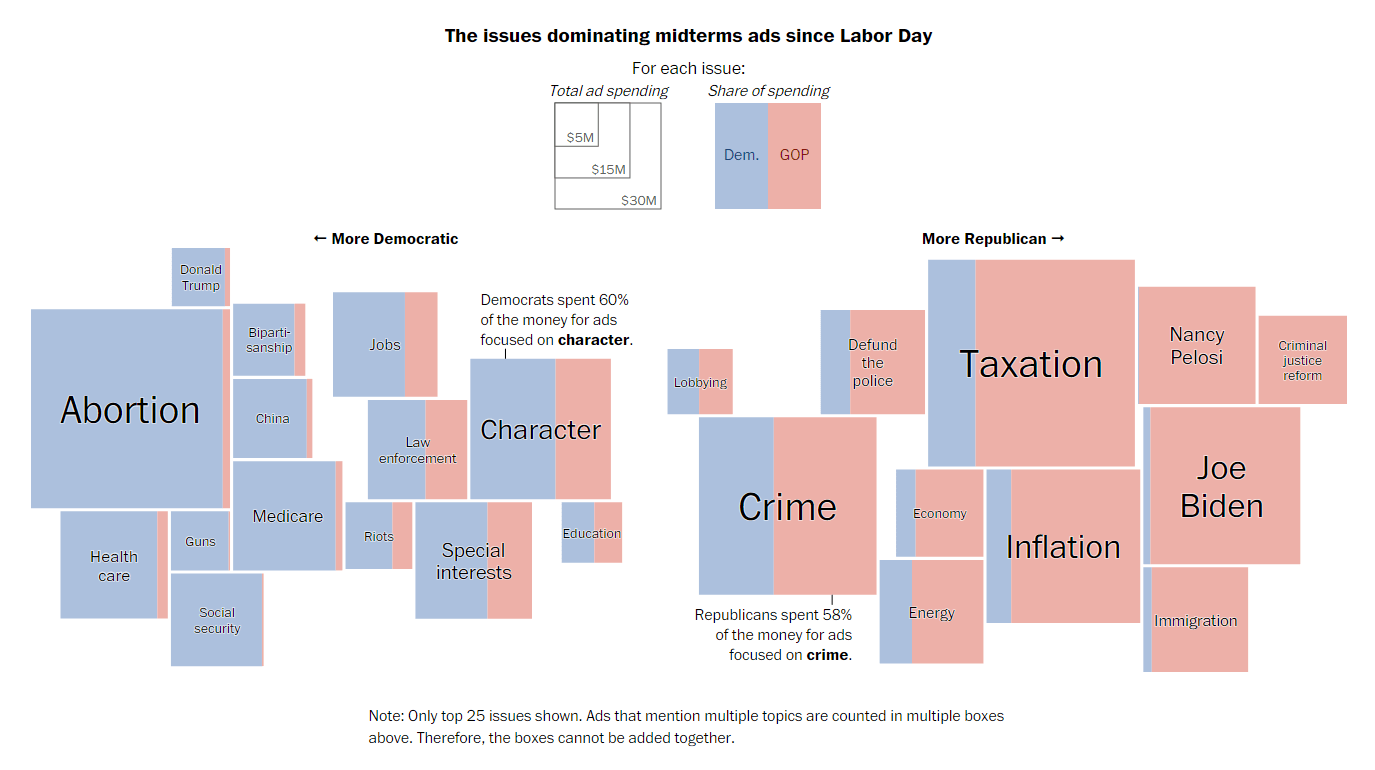
Democrats and Republicans have reportedly spent about the same amount of money on congressional campaign advertisements over the last several weeks. But the issues they have focused on in their ads are greatly different.
The Washington Post analyzed data from AdImpact, an advertising intelligence company that tracks ad spending, to look at the topics prevailing in midterm ads since Labor Day. The chart you see above, made by Harry Stevens, gives a clear picture of what both parties are putting their best bets on. In the original, it is interactive, and you can see the ad spending totals and shares by hovering over the issues.
See the chart and the story on The Post.
Republican Candidates Spreading Election Denial Online
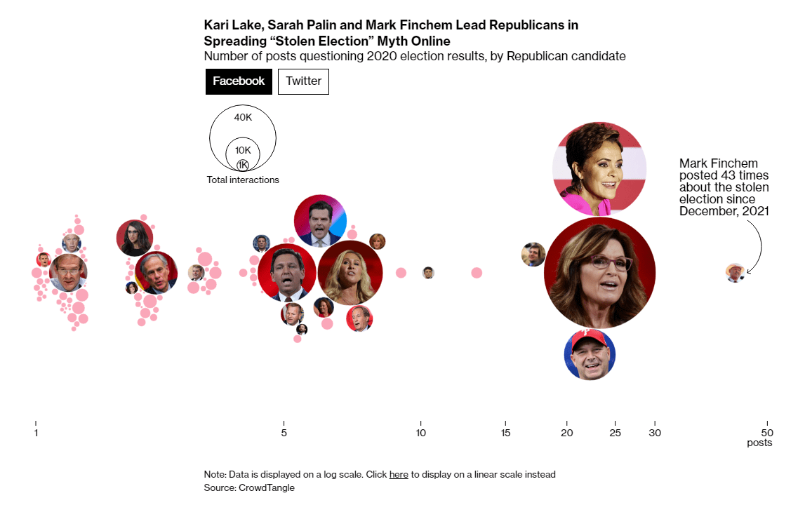
Quite a few of the Republican candidates campaigning for the midterms have been seen pushing the “stolen election” myth on social media. Apparently, such posts garnered up to ten times more engagement than their average posts.
An interesting new article on Bloomberg News reveals which candidates posted election-denying claims on Twitter and Facebook from September 2021 to October 2022, how often, and how much better than usual such posts performed. Based on data from CrowdTangle, a tool for social media monitoring, the analysis is powered by a series of cool interactive visualizations built by Leonardo Nicoletti, who got his first-ever byline on Bloomberg with this story (congrats!).
Check out the graphics and learn more on Bloomberg.
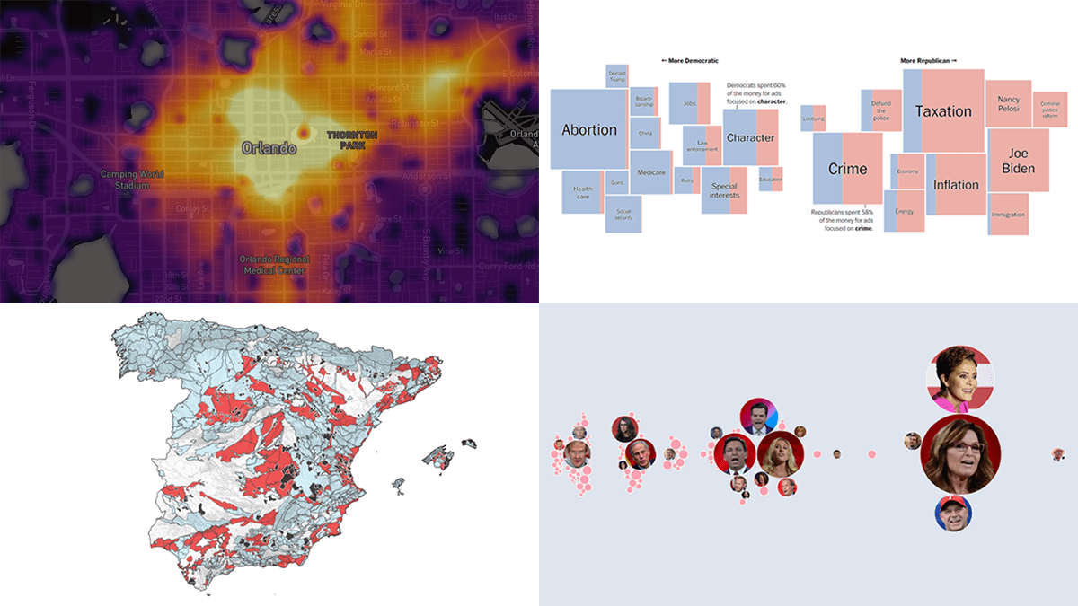
Access to Essential Services in Cities
It almost never happened that more than one work of the same data visualization creator was featured in the same DataViz Weekly roundup. Well, now is that situation for Leonardo Nicoletti!
Together with Trivik Verma and Mikhail Sirenko, he made a fascinating open-source project that shows how accessible a variety of services (public transit stations, medical care institutions, education facilities, and so on) is across literally any city around the globe. Titled CityAccessMap, it uses data from OpenStreetMap and the European Commission’s Global Human Settlement Layer (GHSL) to represent the average walking time from a place to these services. For each city, you can also see what share of its population has access to daily necessities within a 15-minute walk (remember the 15-minute city concept?) and how that compares to others in the same country.
Explore the project at cityaccessmap.com.
Tap Water Contamination Across Spain
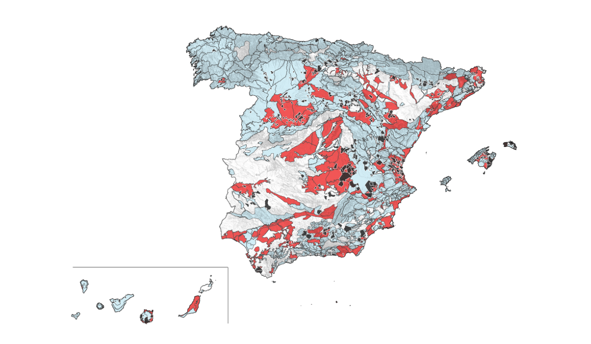
According to the Ministry for the Ecological Transition and the Demographic Challenge of Spain (MITECO), about 30% of all people in Spain drink tap water from groundwater. But much of it appears to be not suitable for health.
DATADISTA and Greenpeace Spain investigated the quality of tap water by analyzing over 13 million records of sampling results from the National Information System on Drinking Water (SINAC). They found that in many municipalities, tap water is contaminated by nitrates, especially those from organic (and inorganic) fertilizers. In DATADISTA’s article, produced by Antonio Delgado and Ana Tudela, you can see several maps illuminating the issue and displaying where across Spain the situation is especially bad.
Look at the maps and take a read, on DATADISTA.
***
Check out these awesome projects and stay tuned for Data Visualization Weekly!
- Categories: Data Visualization Weekly
- No Comments »