Information Graphics Examples for Data About Primaries, Prices, Flu, and Thanksgiving — DataViz Weekly
November 29th, 2019 by AnyChart Team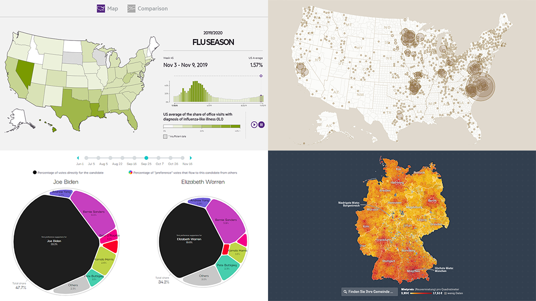 Hardly a day goes by without new visualizations appearing around the internet, providing insight into data about various things, big and small. Every week, we curate some of the most interesting ones to meet you with them within the framework of our regular DataViz Weekly feature. Enjoy and get inspired by information graphics examples on the following subjects in our new selection of cool visual data projects:
- Preferential polling for the Democratic presidential primaries — Swayable
- Rent prices in Germany — Zeit Online
- Flu season in the United States — athenaInsight
- Thanksgiving harvest origins — Esri’s StoryMaps team
- Categories: Data Visualization Weekly
- No Comments »
Charting Salaries, Earthquakes, Housing, and Coffee Shops — DataViz Weekly
November 22nd, 2019 by AnyChart Team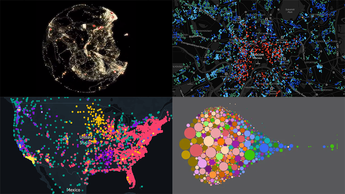 Join us as we praise new amazing data visualization projects from around the web. These are cool examples dedicated to charting salaries, earthquakes, housing history, and coffee shop locations. Look what DataViz Weekly has to showcase today:
- Salaries across occupations in the United States — FlowingData
- Earthquakes worldwide, with exaggerated depth — Raluca Nicola
- History of Moscow housing — Strelka Mag
- Coffee shops in America and worldwide — Thinknum
- Categories: Data Visualization Weekly
- No Comments »
AnyChart Recognized in Top 10 Business Intelligence and Analytics Companies of 2019
November 19th, 2019 by AnyChart Team We are excited to announce that Analytics Insight, a magazine that covers big data and business intelligence developments, included AnyChart in The 10 Next Generation BI and Analytics Companies of 2019 — “for providing the most advanced solutions and playing a significant role in shaping the future of these disruptive technologies.”
The list has been made public in the just-released November issue of the magazine and is accompanied by the stories about each featured company. With permission of Analytics Insight, today we are republishing the magazine’s story about us on our blog — “AnyChart: Turning Data into Actionable Insights with Award-Winning Data Visualization Solutions.”
Read the story of AnyChart as it appeared on Analytics Insight »
- Categories: AnyChart Charting Component, AnyGantt, AnyMap, AnyStock, Big Data, Business Intelligence, Charts and Art, Dashboards, Financial Charts, Flash Platform, Gantt Chart, GraphicsJS, HTML5, Interesting Facts, JavaScript, News, Success Stories
- No Comments »
Charting Data About Retirement Savings, Warren’s Plans, California Housing, and UK Election — DataViz Weekly
November 15th, 2019 by AnyChart Team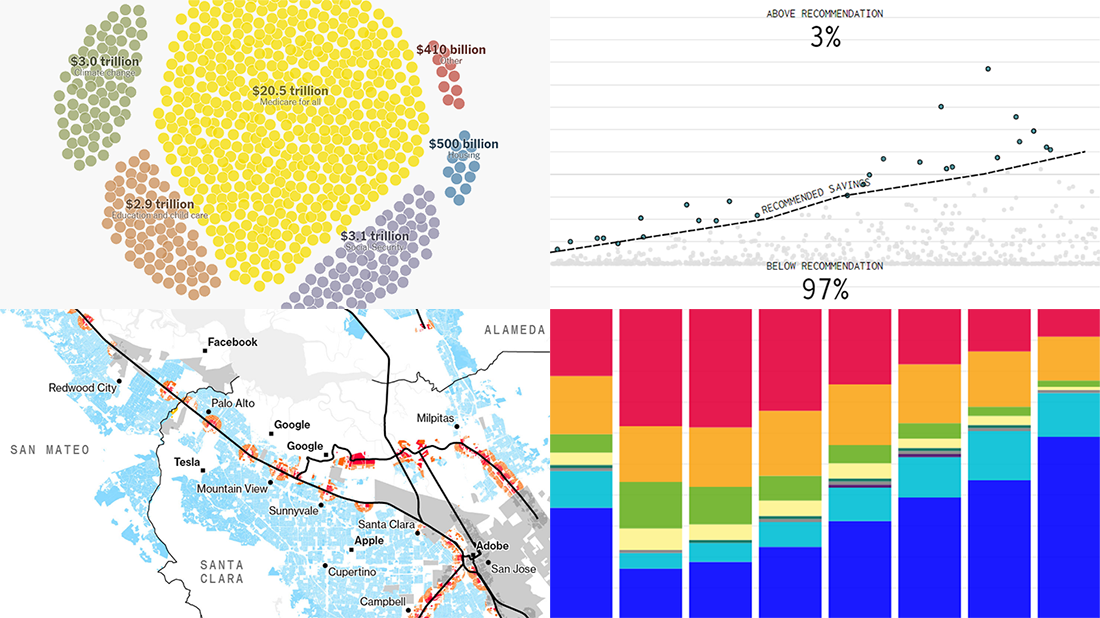 It’s Friday, which means we are ready to share with you new awesome examples of charting in action. Look how powerful the right visualization can be when one needs to explore or communicate various statistics. Here’s a quick list of the projects presented in this new DataViz Weekly post — we’ve found them out there these days:
- Saving for retirement in the United States — FlowingData
- Costs of Elizabeth Warren’s policy plans — The New York Times
- Housing crisis in California — Bloomberg
- Voting intentions before the 2019 United Kingdom general election — CNBC
- Categories: Data Visualization Weekly
- No Comments »
Visual Data Analysis in Action with Examples on Laugh, DST, Science, and Health — DataViz Weekly
November 8th, 2019 by AnyChart Team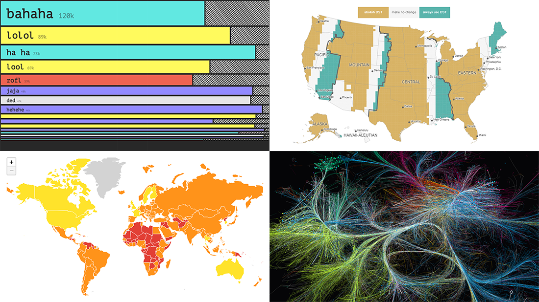 Visual data analysis can be extremely helpful when you need to make sense of large amounts of diverse information. Check out several new striking examples! The four projects in the spotlight of today’s DataViz Weekly roundup have been made public just about now and we are glad to introduce them to you right now:
- Laughing online — The Pudding
- DST gripe assistant tool — Andy Woodruff
- 150 years of papers — Nature
- Global health security — JHU, NTI, and EIU
- Categories: Data Visualization Weekly
- No Comments »
Information Graphics About Friends, Birds, Savings, and Pollution — DataViz Weekly
November 1st, 2019 by AnyChart Team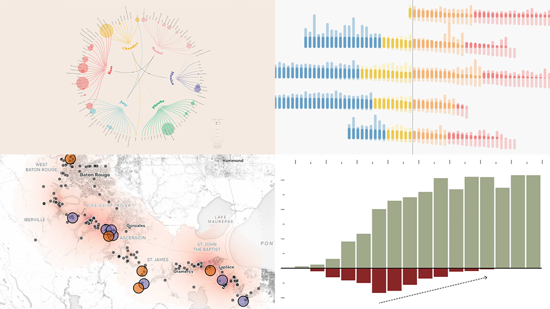 Take a look at four cool information graphics projects we’ve recently come across around the web and decided to feature this time in the DataViz Weekly series:
- Travels, events, and relationships in the Friends TV series — Marion Rouayroux, IIB Awards
- North American birds at risk from climate change — Audubon
- Assets and debt in the United States by age group — FlowingData
- Aggravating air pollution in Louisiana’s “Cancer Alley” — ProPublica
- Categories: Data Visualization Weekly
- 3 Comments »
Qlik Sense Gantt Chart Extension AnyGantt Gets New Awesome Features in Version 4.0
November 1st, 2019 by AnyChart Team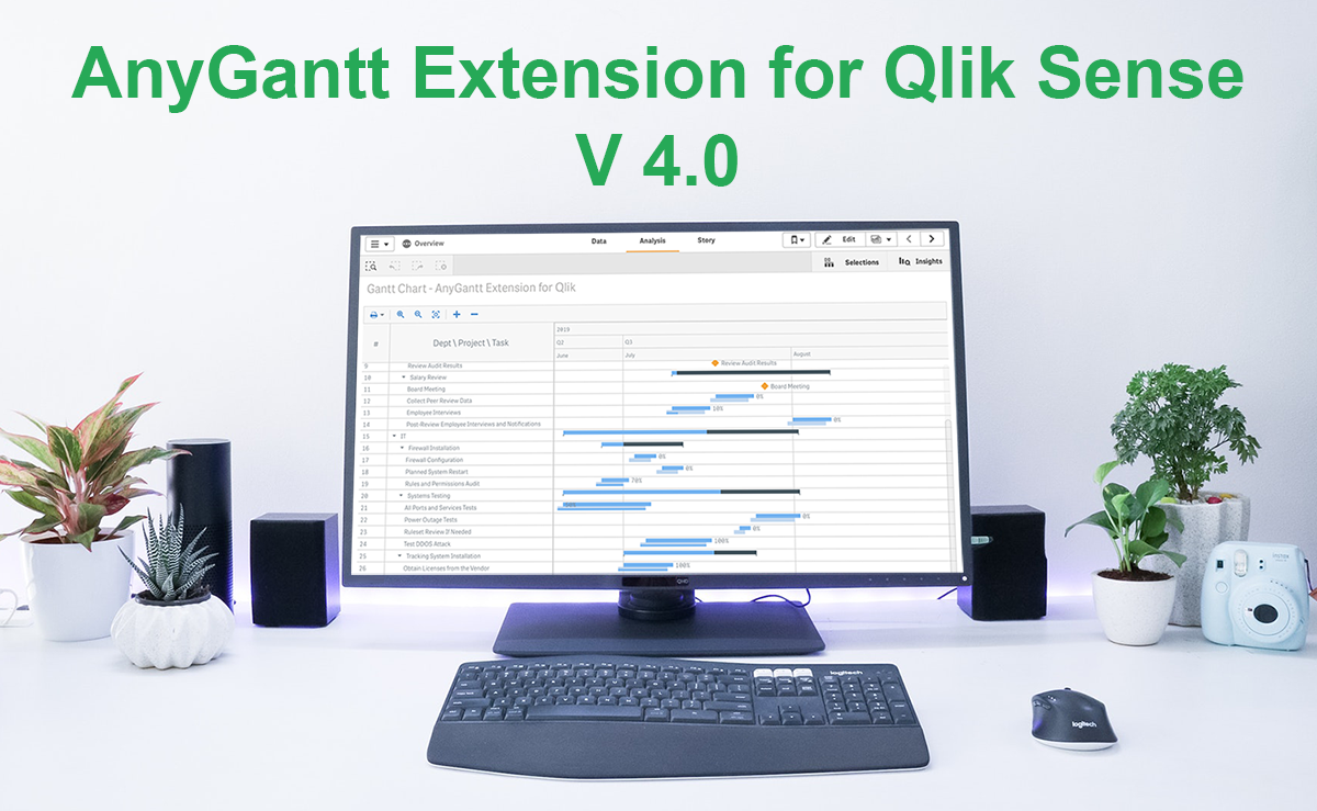 Good news, Qlikkies! We’ve released a major update to our Qlik Sense Gantt chart extension AnyGantt, bringing a bunch of new awesome features to further improve your project and resource data visualization experience using it. Look what’s new in version 4.0!
Read more at qlik.anychart.com »
- Categories: AnyChart Charting Component, AnyGantt, News, Qlik
- No Comments »