 Visual data analysis can be extremely helpful when you need to make sense of large amounts of diverse information. Check out several new striking examples! The four projects in the spotlight of today’s DataViz Weekly roundup have been made public just about now and we are glad to introduce them to you right now:
- Laughing online — The Pudding
- DST gripe assistant tool — Andy Woodruff
- 150 years of papers — Nature
- Global health security — JHU, NTI, and EIU
Visual Data Analysis Examples in Data Visualization Weekly: November 1, 2019 — November 8, 2019
Laughing Online
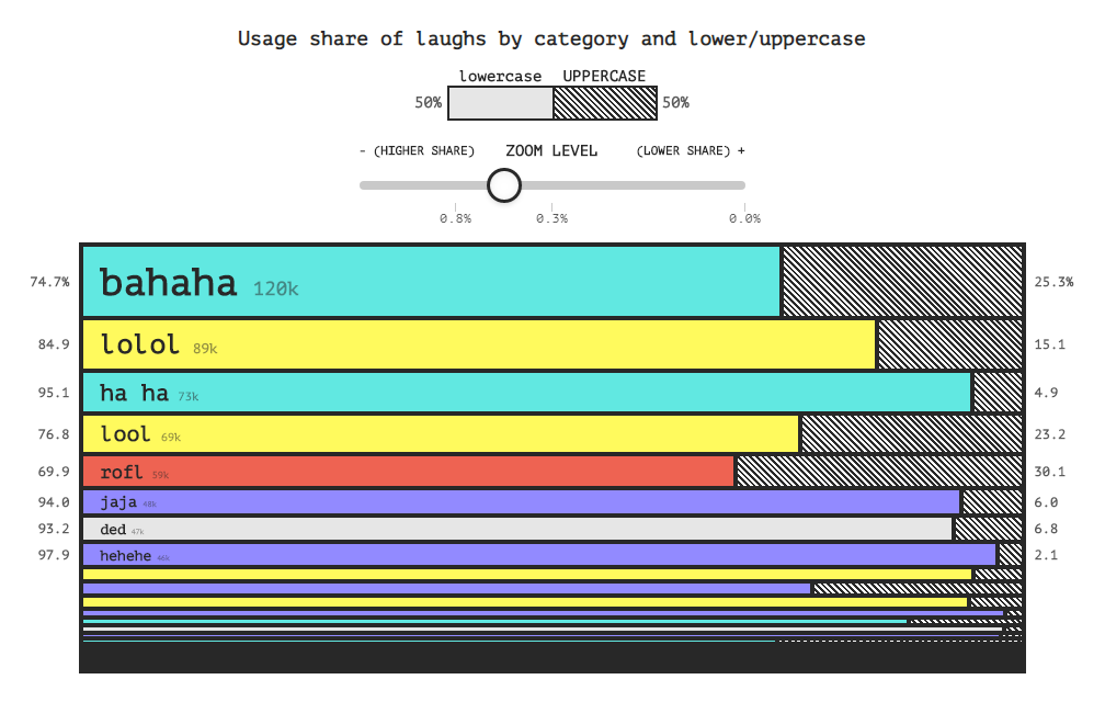
Lol, lmao, and rofl. Haha, hahaha, and bahaha. There are numerous text forms to express laughter online, and sometimes it is not easy to figure out precisely what kind of laugh we see here or there, whether it is real or fake, and so on.
This week, The Pudding has published an awesome visual research into how people laugh online. Analyzing Reddit comments since 2009, it sheds light on some interesting nuances about the digital laughter, providing insight into exactly how laugh is expressed, how it has evolved for ten years, and how its different variations are generally perceived.
Explore the beautiful charts to find out how the internet laughs.
DST Gripe Assistant Tool
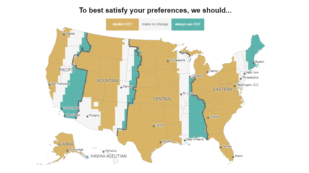
Last Sunday, Daylight Saving Time in the United States officially ended and clocks were retarded by one hour in order to return to what we call standard time. Among other things, that change is known to traditionally reinforce disputes over advantages and disadvantages of DST.
To help us see and prove how right or wrong it actually is for each of us to complain about the time change, cartographer Andy Woodruff made a cool interactive map-based visual analytics tool. Depending on what sunrise and sunset times you consider to be reasonable, the map can show you whether or not you need DST in your place of living and what areas around the country you can expect to better satisfy your preferences in terms of DST observance.
Check out the Daylight Saving Time Gripe Assistant Tool by Andy Woodruff — “a handy tool to help make your case when whining about a biannual time change.”
150 Years of Nature Papers

The very first issue of Nature, currently one of the world’s most famous scientific journals, saw the light on November 4, 1869. Celebrating the 150th anniversary, Nature published a spectacular picture of its publication archive.
Rendered in the form of colorful network, fireworks-like graphics, the Native 150 Interactive visualization greatly shows the journal’s multidisciplinary scope and history. Each sphere is one paper. Connections between papers represent co-citations. The prominence of each paper, determined by the number of these co-citations, is reflected by the size of the sphere. The color indicates the discipline.
Explore the co-citation network of Nature — 150 years of interconnected research across diverse disciplines.
Global Health Security
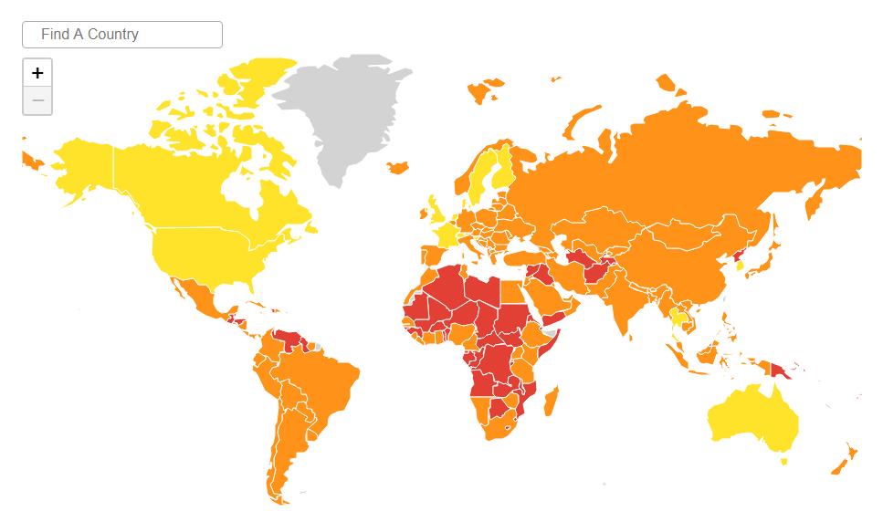
Experts see the 2014 Ebola outbreak as a wake-up call that opened the eyes of the world to a fact that there are significant gaps in the global capacity to combat epidemics and pandemics. To reveal details regarding where those gaps lie and how countries are prepared, the Johns Hopkins Center for Health Security (JHU) and the Nuclear Threat Initiative (NTI) in collaboration with The Economist Intelligence Unit (EIU) created the Global Health Security (GHS) Index.
Referred to as “the first comprehensive assessment and benchmarking of health security and related capabilities across the 195 countries,” the GHS Index is fully based on open data. An extensive framework of 140 questions, which shapes the research together with 34 indicators and 85 sub-indicators, is organized across six categories. These include prevention, detection and reporting, rapid response, health system, compliance with international norms, and risk environment.
Take a look at the data and charts to find out how ready the world is to address infectious disease outbreaks and where the biggest issues lie.
***
Within the next days, someone will definitely launch new cool projects that can be good examples of visual data analysis in action. And we will definitely highlight the most interesting ones in DataViz Weekly. Stay tuned.
- Categories: Data Visualization Weekly
- No Comments »