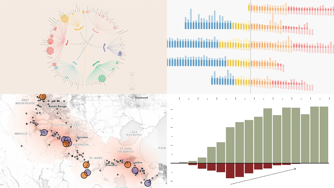
 Take a look at four cool information graphics projects we’ve recently come across around the web and decided to feature this time in the DataViz Weekly series:
- Travels, events, and relationships in the Friends TV series — Marion Rouayroux, IIB Awards
- North American birds at risk from climate change — Audubon
- Assets and debt in the United States by age group — FlowingData
- Aggravating air pollution in Louisiana’s “Cancer Alley” — ProPublica
New Information Graphics in Data Visualization Weekly: October 25, 2019 — November 1, 2019
Friends in Infographics
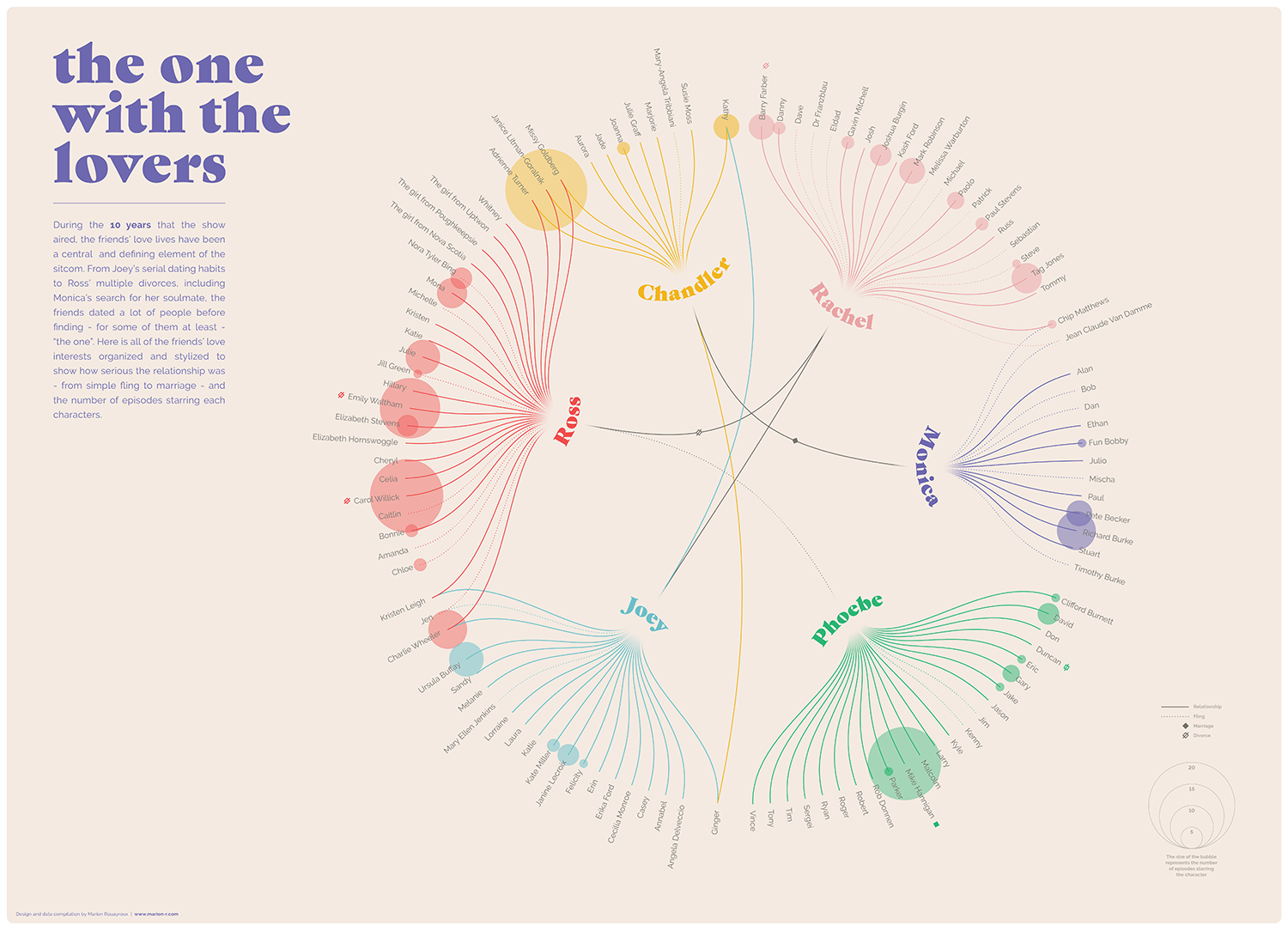
Marion Rouayroux, a London-based graphic designer, admitted her longtime love for the American TV sitcom Friends and shared a series of fascinating information graphics dedicated to it. Featuring three posters on different topics, her work is longlisted for this year’s Kantar Information is Beautiful Awards in the Arts, Entertainment & Culture category.
One infographic is a map that displays all the locations the six main characters traveled to. The second picture is a timeline of the most iconic moments. Finally, there’s a wonderful graphical representation of love interests and relationships Rachel, Monica, Phoebe, Joey, Chandler, and Ross had over the 256 episodes.
It is already known that Marion’s project submission has not made it to the shortlist stage and therefore will not be able to win at the IIB Awards in 2019. However, these three infographic posters look really cool and are definitely worth checking out especially if you are a fan of the Friends show.
North American Birds at Risk from Climate Change
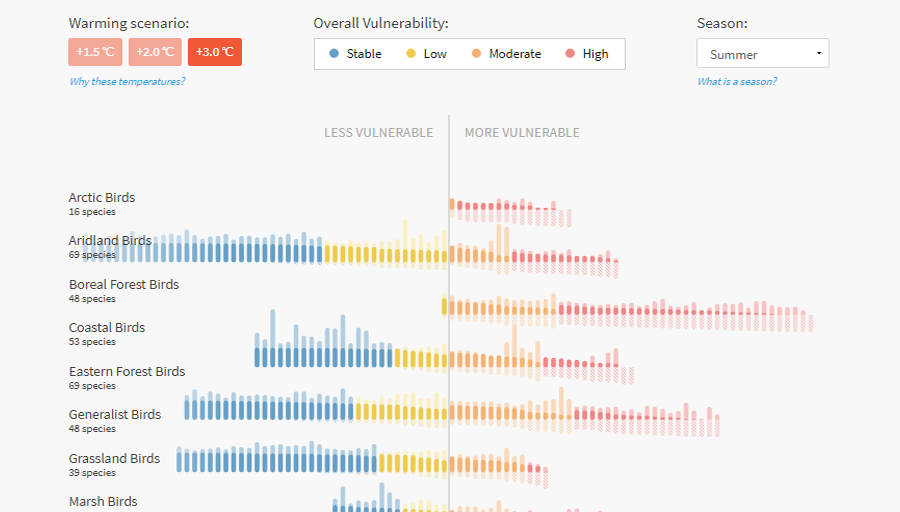
A new data analysis conducted by the National Audubon Society, working to protect birds and places they need, shows that nearly two-thirds of all North American bird species — 389 out of 604 — are exposed to an increasing risk of extinction due to global warming and will have to relocate to find new, more favorable homes.
In the research, scientists explored data from 140 million observations to reveal in which areas birds live nowadays and applied climate models to determine where the living range of each species might shift (if they survive at all).
Look at the visualizations from Audubon to see a detailed picture and check what is going to happen in different warming scenarios. In particular, there’s a special interactive tool that can show you exactly how climate change is expected to impact your area of living and affect local birds.
Assets and Debt by Age Group
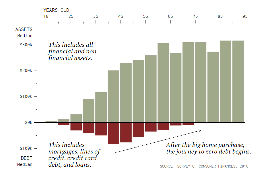
According to Bank of America’s 2018 Better Money Habits Millennial Report, 16% of millennials in the United States — about one in six — have $100,000 or even more in savings. Nathan Yau, an expert in data visualization and analysis, decided to figure out and demonstrate how that is possible.
Delving into data and definitions, he made calculations and created several simple though interesting and instructive column charts that shed light on this matter.
Look how, according to the Survey of Consumer Finances (SCF) conducted by the Federal Reserve Board, the amount of assets, debt, and net worth changes as Americans grow up, by age group.
Aggravating Air Pollution in Louisiana’s “Cancer Alley”
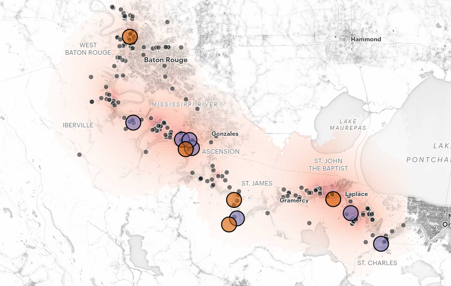
ProPublica published an impressive visual story created by its experts Lylla Younes, Al Shaw and Claire Perlman in collaboration with Tristan Baurick and David Grunfeld of New Orleans’ The Times-Picayune and The Advocate, bringing into focus the problem of air pollution in Louisiana’s highly industrialized region stretching along the Mississippi River from New Orleans to Baton Rouge.
Known as “Cancer Alley” due to a very high concentration of toxic chemicals emitted by over 200 plants already located over there, this area already is one of the most greatly polluted places in the United States of America. However, the authorities continue to approve the expansion of existing plants and — what sounds even more awful — the construction of new ones.
Look where existing and projected plant facilities are located and find out how toxic the air is estimated to be across the seven parishes that make up the “Cancer Alley” area in the heart of Louisiana.
***
We’ll keep telling you about new interesting projects with cool and greatly implemented information graphics. Stay tuned for Data Visualization Weekly.
- Categories: Data Visualization Weekly
- 3 Comments »
Comments (3)
Hi,
Hope you are doing well. I just wanted to know if Ii could send some great article ideas for a guest post on your website.
If you like the ideas i put forward, i will provide you with high-quality free content/articles. In exchange, all i expect is a back link from within the main body of the article.
Do let me know if you like this proposal and if i can begin sending you some topic ideas.
Best Regards
Ashlie Lopez
Hi Ashlie. Thanks for the suggestion. Generally, guest posts are allowed. You are welcome to discuss the details with Andrey: andrey.khachaturov@anychart.com. Thank you.