Data Visualizations About Manhattan Buildings, Web Search, Chinese Expansion, and Research Productivity — DataViz Weekly
April 27th, 2018 by AnyChart Team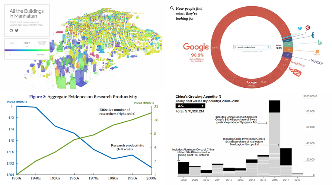 DataViz Weekly is here, bringing you another selection of data visualizations that we’ve found worth seeing. All these pieces were published only a short time ago.
In this article, you will find graphics about the following:
- Manhattan buildings;
- China’s expanding presence in Europe;
- Google’s true dominance in the search market;
- research productivity.
- Categories: Data Visualization Weekly
- No Comments »
Visualizations About Climate Change, Immigration, Wealth, and Differences — DataViz Weekly
April 20th, 2018 by AnyChart Team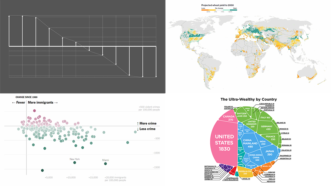 It’s Friday, and it’s DataViz Weekly on the AnyChart blog. Let’s take a look at some fresh cool visualizations that have caught our eye these days.
Here’s a quick list of what infographics and charts we are featuring in today’s article:
- climate change impact on what we eat;
- immigration and crime in America;
- where rich people live;
- visualizing differences in data.
- Categories: Data Visualization Weekly
- No Comments »
Charts and Infographics About Apollo 11, Investment, Pay Gap, Coffee — DataViz Weekly
April 13th, 2018 by AnyChart Team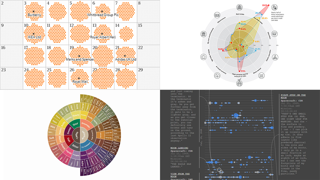 Another week-long wait is over, and Data Visualization Weekly is back to our blog! We’ve put together a new selection of interesting charts and infographics that saw the light just recently. So chill out and look at the following cool visualizations:
- all Apollo 11 conversations;
- how different generations would invest $10,000;
- gender pay gap in Great Britain;
- coffee flavor wheel.
- Categories: Data Visualization Weekly
- No Comments »
How AnyChart Team Makes Use of Clojure and ClojureScript
April 11th, 2018 by Irina Maximova
The prime directive of AnyChart team is to develop the best interactive charts possible. While doing so, we create and use a number of different tools and technologies, and we always search for the new technologies that may help us and make our work more efficient. In this article, we want to talk about the way we make use of Clojure and ClojureScript, and why.
- Categories: AnyChart Charting Component
- No Comments »
Visualizations About Music, Death, Bombs, and Brexit – DataViz Weekly
April 6th, 2018 by AnyChart Team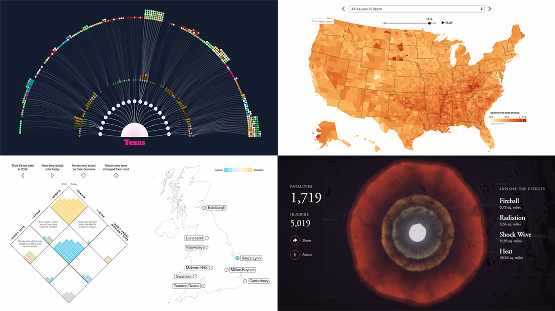 Data visualization keeps gaining popularity as a great way to represent information in an insightful manner, and a lot of charts and infographics come out every day. We are glad to continue our DataViz Weekly series, helping you not miss out on some interesting visualizations.
Today, we are sharing visualizations of data about the following:
- Southern United States’ music in 1939;
- leading causes of death in the US in 1980–2014, by county;
- nuclear bomb effect on your neighborhood;
- opinions on Brexit in the UK.
- Categories: Data Visualization Weekly
- No Comments »