 Another week-long wait is over, and Data Visualization Weekly is back to our blog! We’ve put together a new selection of interesting charts and infographics that saw the light just recently. So chill out and look at the following cool visualizations:
- all Apollo 11 conversations;
- how different generations would invest $10,000;
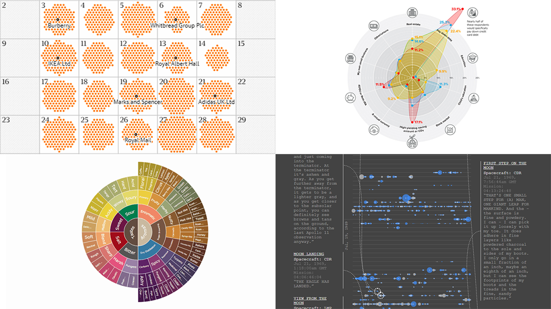
- gender pay gap in Great Britain;
- coffee flavor wheel.
Data Visualization Weekly: April 6, 2018 — April 13, 2018
All Apollo 11 Conversations on Timeline
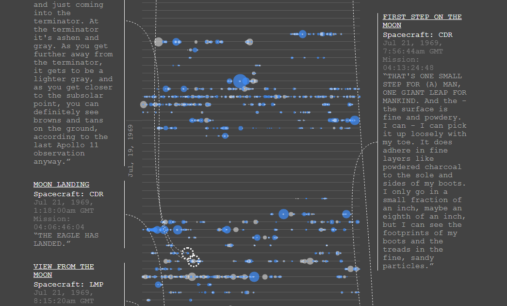
Web developer Nicholas Rougeux made a facinating interactive timeline that shows all the conversations between Apollo 11, with Neil Armstrong and Buzz Aldrin on the way to the moon and back, and Earth. The author presented every transmission of this historical mission which took place in July 1969 and specifically highlighted the most important words said.
How Different Generations Would Invest $10,000
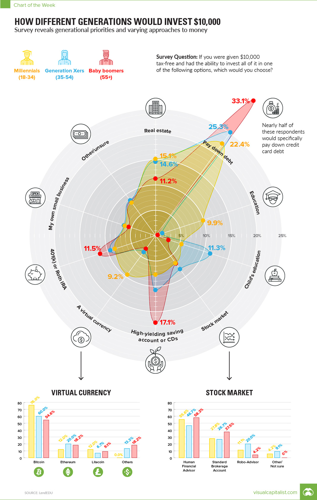
Based on a recent research conducted by LendEDU, Visual Capitalist created a graphics displaying at a glance how different generations would invest $10,000. Check out the visualization to identify similarities and distinctions.
Gender Pay Gap in Great Britain
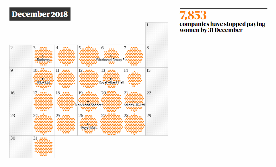
The Guardian visualized the gender pay gap in Great Britain on a calendar to show at what point of the current year women in various companies throughout the UK effectively start working for free. Above the calendar, you can enter a company name to get the precise date and its pay gap size.
Coffee Flavor Wheel
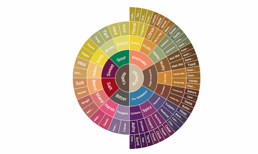
Having recently added Sunburst Chart to the already huge list of chart types our JavaScript charting library supports out of the box, we made several examples to demonstrate how it can be built with AnyChart. One of them is a cool interactive visualization of various aromas and tastes of coffee taken as data, which was quite well received, for example, on Data Is Beautiful.
***
Have a great weekend and look forward to more charts and infographics within the framework of DataViz Weekly next Friday!
- Categories: Data Visualization Weekly
- No Comments »