 DataViz Weekly is here, bringing you another selection of data visualizations that we’ve found worth seeing. All these pieces were published only a short time ago.
In this article, you will find graphics about the following:
- Manhattan buildings;
- China’s expanding presence in Europe;
- Google’s true dominance in the search market;
- research productivity.
Data Visualization Weekly: April 20, 2018 — April 27, 2018
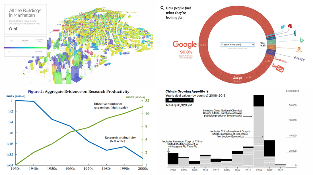
Interactive Map Showing All Manhattan Buildings in 3D
BuzzFeed’s Taylor Baldwin greatly visualized all Manhattan’s 47 thousand buildings in the 3D layout. His interactive map is based on NYC’s open data such as PLUTO. Here you can explore the buildings’ age, height, and class, as well as play with the visualization in a lot of ways: zoom, rotate, move back and forth around the map, and switch the available controls for a different look.
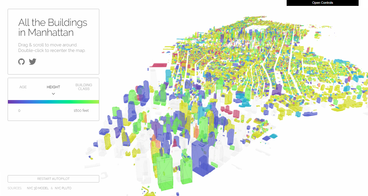
Charts Visualizing Data About China’s Expanding Presence in Europe
China is known to invest a lot of money into numerous businesses around the world. Calling the European direction of such an economic expansion “less well known” than some others, Bloomberg conducted what they claim to be “the most comprehensive audit to date of China’s presence in Europe,” looking into the spreading Chinese footprint in this continent. Take a look at the charts in the article, highlighting some key points: where China is investing, what it owns, deal values by country, top acquirers, and more.
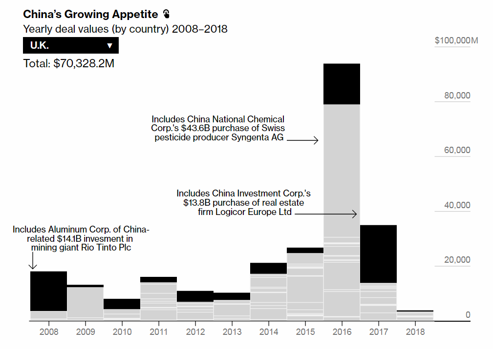
Infographic Displaying Google’s Real Dominance in Web Search
Google is dominating the search market, and this fact can hardly surprise anyone. But how strong is its prevalence? Maybe even more than many people could expect. According to this infographic based on clickstream data, more than 90% of all the searches on the Web go via Google platforms. Check it out on Visual Capitalist to learn more and also see how the share of the major global search market players changed for two years.
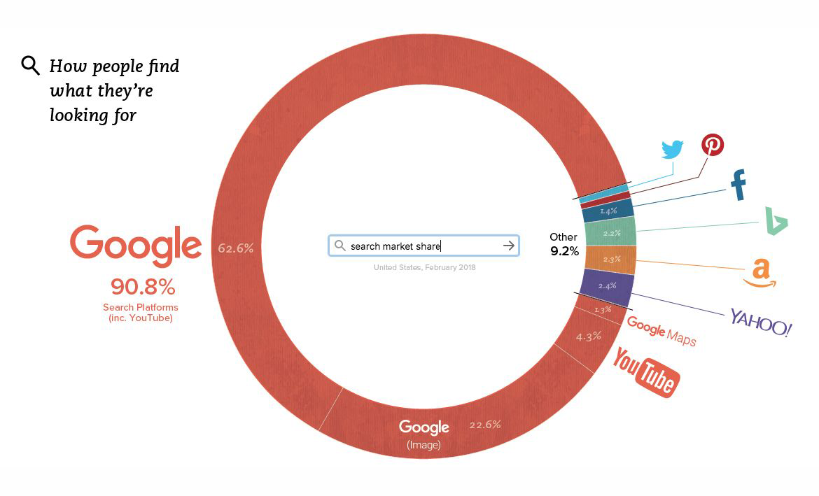
Chart of Research Productivity Vs. Number of Researchers
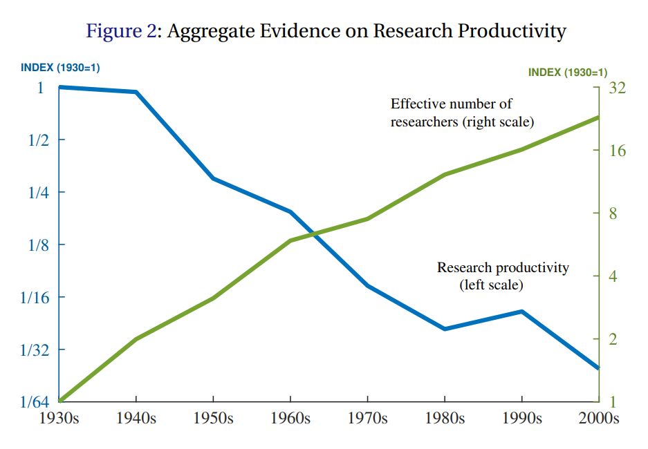
The chart above reveals an interesting trend: While the effective number of researchers grows over time, the research productivity falls. To learn more, check out the recent “Are Ideas Getting Harder to Find?” study from which the chart is taken, for an in-depth look into the topic as well as for more charts and data on that.
***
That’s all for now, folks! We appreciate your attention and hope to see you soon on our blog. The next Data Visualization Weekly issue will see the light in seven days.
- Categories: Data Visualization Weekly
- No Comments »