 It’s Friday, and it’s DataViz Weekly on the AnyChart blog. Let’s take a look at some fresh cool visualizations that have caught our eye these days.
Here’s a quick list of what infographics and charts we are featuring in today’s article:
- climate change impact on what we eat;
- immigration and crime in America;
- where rich people live;
- visualizing differences in data.
Data Visualization Weekly: April 13, 2018 — April 20, 2018
Climate Change Impact on What We Eat
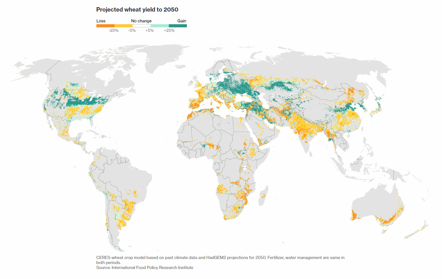
Bloomberg looked at the global warming from the point of view of its impact on our dinner tables. Check out the story with maps and charts to see what is changing around the world in terms of food production.
Immigration and Crime in America
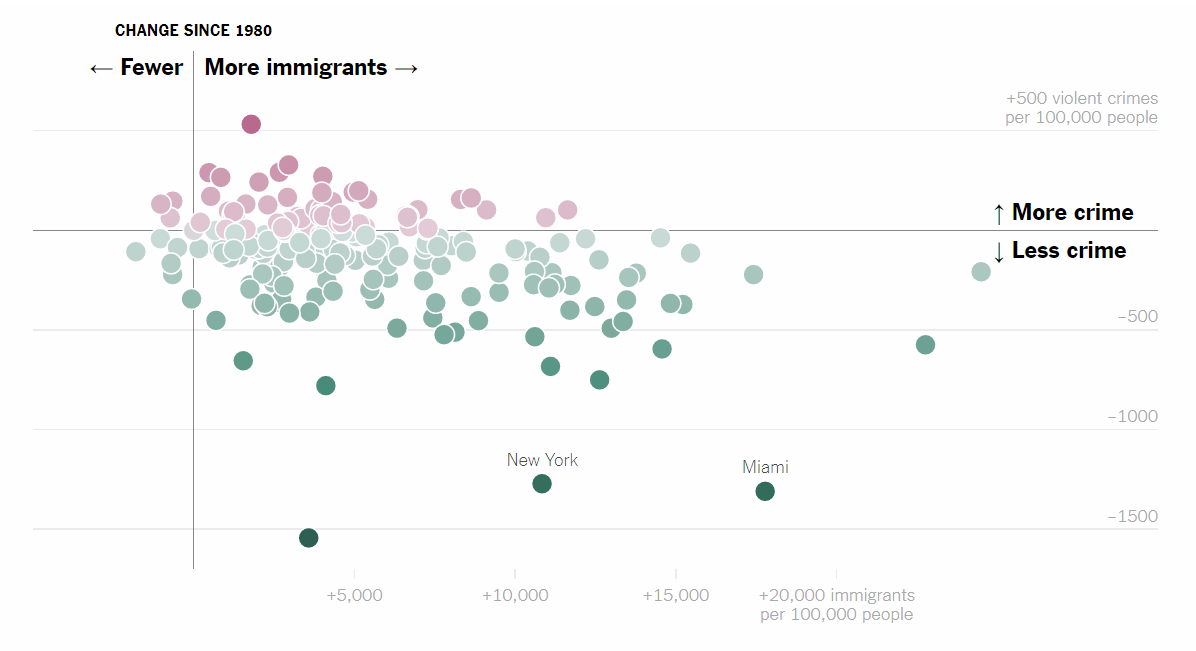
The Upshot, in partnership with The Marshall Project, published a story “The Myth of the Criminal Immigrant.” Based on a data study, the article shows it is hardly more than just a prejudice to say that immigrants bring crime into the United States.
Where Rich People Live
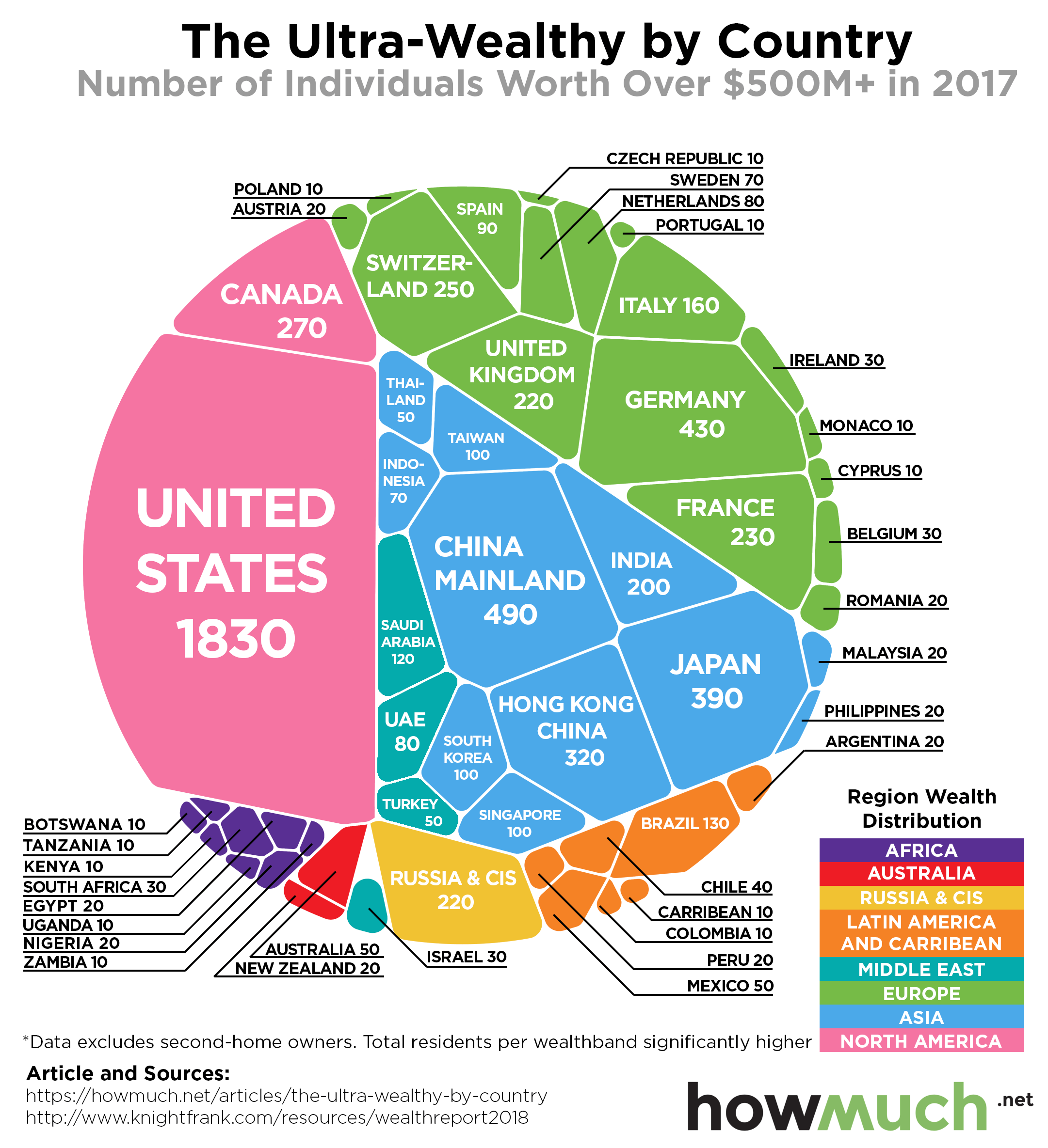
Howmuch.net made another infographic showing where the richest people live in the world. The visualization is based on data from real estate company Knight Frank that counted how many individuals with personal wealth worth $500 million and more live in one country and another. See what countries are home to people that are really reach.
Visualizing Differences in Data

Nathan Yau made another cool data visualization guide. This one is about how to best visualize differences. Not only is it a great guide for everyone working with data and creating various charts. The article refers to a number of worth-seeing visualizations to illustrate each point.
***
Thank you for your attention. The next Data Visualization Weekly article will see the light next Friday. Whenever you come across or make an interesting chart, infographic, or whole dataviz project, feel free to share it with us and we may well decide to feature it next time. Meanwhile, we wish you a great weekend!
- Categories: Data Visualization Weekly
- No Comments »