New Data Graphic Examples Worth Checking Out — DataViz Weekly
June 28th, 2019 by AnyChart Team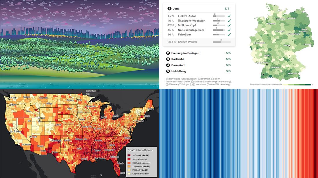 We’ve picked another four awesome projects as new data graphic examples to showcase in DataViz Weekly this Friday. Check them out right away as they are definitely worth it:
- Suicides in the Netherlands
- Where Germany is really green
- Temperature change worldwide
- Vulnerability to tornadoes across the United States of America
- Categories: Data Visualization Weekly
- 1 Comment »
AnyChart’s Co-Founder Timothy Loginov Named Top Creative Leader Innovating in Business 2019
June 24th, 2019 by AnyChart Team Business magazine Insights Success featured AnyChart‘s co-founder Timothy Loginov as one of the Top Creative Leaders Innovating in Business 2019! Today we are republishing an engaging two-page article that illuminates his journey from a freelance technical writer to a successful tech entrepreneur, outlines how our company has developed into a global leader in data visualization tools, and summarizes meaningful lessons and tips for emerging entrepreneurs.
- Categories: AnyChart Charting Component, News, Success Stories
- No Comments »
New Cool Diagrams, Graphs, and Maps Visualizing Interesting Data — DataViz Weekly
June 21st, 2019 by AnyChart Team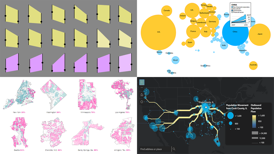 Generally, data becomes much easier to make sense of when it is visualized in diagrams, maps, or other forms of graphics. DataViz Weekly shows you examples of how this is true in reality. Today, we’ve put together another four of the latest data visualization projects discovered by our team around the internet. They bring insight into the following topics:
- Single-family home zoning in the United States of America
- Time use of parents vs people without kids
- Debt of emerging market countries
- U.S. internal migration
- Categories: Data Visualization Weekly
- 1 Comment »
All 3 Extensions for Qlik Sense Updated with New Charting Features in Version 3.4
June 19th, 2019 by AnyChart Team Hey Qlik users, we are happy to announce the release of version 3.4 for all our three extensions for Qlik Sense! We updated them with new awesome data visualization features and functionality such as technical indicators and more.
At last month’s Qlik Qonnections 2019 conference in Dallas where we exhibited as a new Qlik Technology Partner, we received amazing feedback from the Qlik community. We took that information and have already begun building out some of those requests for our next release of version 3.5 for our extensions for Qlik Sense, so please keep the feedback coming and we’ll keep building.
In the meantime here’s what we added.
Read more at qlik.anychart.com »
- Categories: AnyChart Charting Component, AnyGantt, AnyMap, AnyStock, Business Intelligence, Gantt Chart, Qlik, Stock Charts
- No Comments »
4 Great Visualization Projects on Privacy, Electricity, Ocean, and Emotions — DataViz Weekly
June 14th, 2019 by AnyChart Team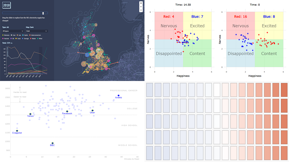 Are you ready to check out new compelling visualization projects? DataViz Weekly is awaiting your attention! Today in the focus:
- Privacy policies of 150 popular websites and apps
- Transformation of electricity supply in the United Kingdom
- Oceans in the changing climate
- Emotions during a basketball game
- Categories: Data Visualization Weekly
- No Comments »
Create Cool Interactive Sankey Diagram Using JavaScript — Tutorial
June 13th, 2019 by Alfrick Opidi Sankey diagrams are becoming more and more popular in data visualization tasks. So, it’s essential for front-end web developers to know how to create charts of this type. Actually, it is quite a simple and straightforward process, especially if you are using one of the good JavaScript charting libraries.
In my tutorial, I’ll show you how to create beautiful, intuitive, interactive JS (HTML5) Sankey diagrams with no fuss.
Read the JS charting tutorial »
- Categories: AnyChart Charting Component, Big Data, Business Intelligence, Charts and Art, HTML5, JavaScript, JavaScript Chart Tutorials, Tips and Tricks
- No Comments »
Most Interesting Data Visualization: GBP, EU Election, MHW, Bob Ross — DataViz Weekly
June 7th, 2019 by AnyChart Team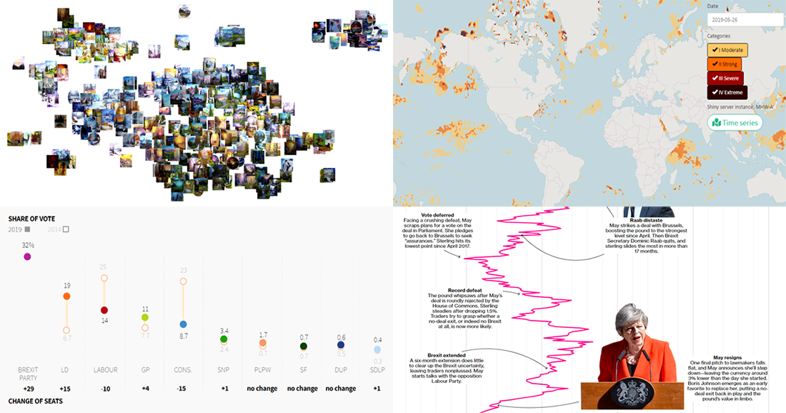 Take a look at four of the most interesting data visualization projects and stories we have found around the web during the last few days. Here’s what we feature today in DataViz Weekly:
- GBP rate change in the context of Brexit turns
- European Parliament election in the United Kingdom
- Marine Heatwave Tracker
- Evolution of Bob Ross’s famous phrases over all 403 episodes of The Joy of Painting
- Categories: Data Visualization Weekly
- No Comments »