 Are you ready to check out new compelling visualization projects? DataViz Weekly is awaiting your attention! Today in the focus:
- Privacy policies of 150 popular websites and apps
- Transformation of electricity supply in the United Kingdom
- Oceans in the changing climate
- Emotions during a basketball game
New Great Visualization Projects in Data Visualization Weekly: June 7, 2019 — June 14, 2019
Privacy Policies of 150 Popular Websites and Apps
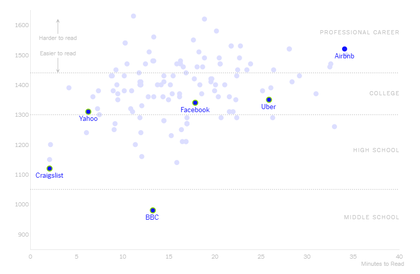
Continuing The Privacy Project launched earlier this year in a new effort to examine the issue of privacy in the digital ecosystem, The New York Times offers an interesting look at privacy policies of about as many as 150 popular websites and apps. Kevin Litman-Navarro analyzed the privacy policies of Facebook, Google, BBC, Yahoo, Airbnb, Craigslist, Uber, Imgur, AT&T, GitHub, Instagram, and many more of the major media and tech platforms and companies in order to see how long and actually readable these documents are. Check out his findings presented on and along a dedicated interactive visualization.
Transformation of Electricity Supply in Britain
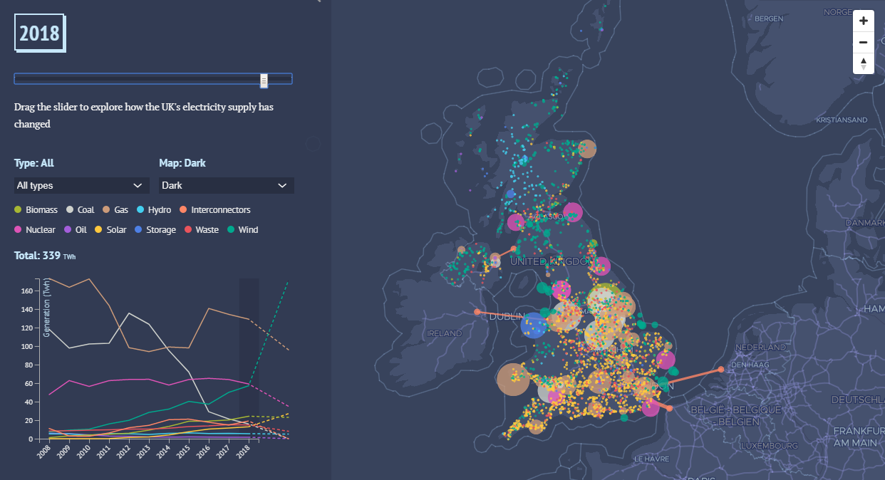
Simon Evans and Rosamund Pearce created a spectacular storytelling project for Carbon Brief, showing how the United Kingdom has changed its electricity supply in slightly more than a decade since 2008 when the Climate Change Act was becoming law. In particular, here you’ll find all the country’s power plants mapped for each year: “From the smallest solar rooftop to the largest coal-fired giant, this UK map is the most comprehensive ever published, containing nearly 3,000 larger sites and more than 800,000 smaller ones.” Track the transformation and see what to expect in the future.
Oceans in Changing Climate
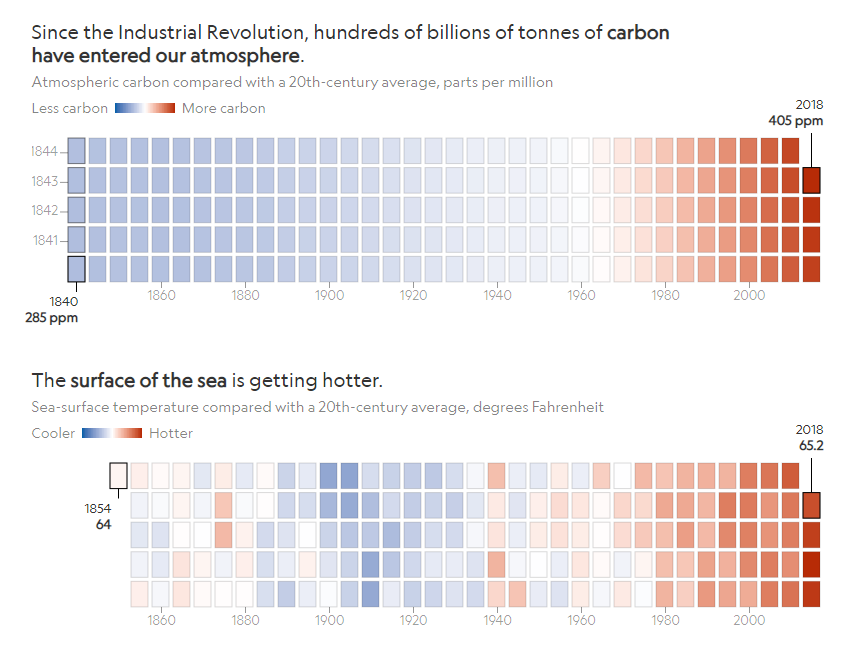
Kennedy Elliott, a graphics editor at National Geographic, visualized the impact of carbon emissions on the sea with the help of heatmaps, displaying “the drastic toll climate change is taking on our oceans.” Look at the changes to the sea temperature, arctic sea ice extent, seawater pH level, and other parameters.
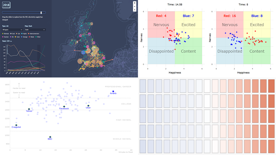
Emotions During Basketball Games
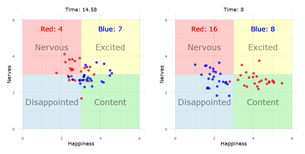
Aiming to simulate the laws of human emotion dynamics, Will Hipson, a PhD student in developmental psychology at Carleton University, created a simulation of emotions that basketball fans experience during a game. Nervous, content, disappointed, and excited — check out the two quadrant chart-based animations to observe the feelings changing over time and according to what is going on on the court. Do not miss out on the spline and range spline area charts that follow the animations, for more insights.
***
Pleasure to see you on our blog! Stay tuned!
- Categories: Data Visualization Weekly
- No Comments »