 Sankey diagrams are becoming more and more popular in data visualization tasks. So, it’s essential for front-end web developers to know how to create charts of this type. Actually, it is quite a simple and straightforward process, especially if you are using one of the good JavaScript charting libraries.
In my tutorial, I’ll show you how to create beautiful, intuitive, interactive JS (HTML5) Sankey diagrams with no fuss.
What Is Sankey Diagram
Let’s start with quickly figuring out what Sankey is so you can understand the purpose, before we get down to the JavaScript charting matter itself.
A Sankey diagram, or a Sankey chart, is a type of data visualization that displays flows and quantities from one set of values to the other, proportionally. For the inquisitive, it is named after Irish-born captain and engineer Matthew Sankey, who created a chart illustrating the energy efficiency of a steam engine in the late 19th century.
In Sankey diagrams, the things being linked to each other are referred to as nodes, and they are connected using lines or arrows. The width of the lines or arrows is proportional to the flow quantity from the source to the target; that is, the larger the width, the larger the flow quantity.
The lines or arrows can be joined or separated through their paths on every phase of a process. You can also add color to split the chart into different categories or to demonstrate the transition occurring from one state of the process to the other.
As such, Sankeys are useful in displaying the major transfers or flows in a system, which can assist in pointing the domineering contributors to an overall process. Therefore, this type of chart can be very good in visualizing many-to-many relationships between two domains or multiple paths through a set of phases within a system.
For example, Sankey charts can be used for illustrating the energy flow from the source to destination, the transfer of goods from one location to the other, and other diverse processes and their states.
How to Build Simple JavaScript Sankey Diagram
Sankey diagrams look complicated and may seem to be difficult to create. However, there are several Sankey charting libraries available on the web that you can use to draw interactive Sankey charts easily.
Essentially, the steps for drawing Sankey diagrams with almost any JavaScript library for data visualization that supports this chart type tend to be more or less the same. Therefore, after mastering how to use any of them, you can simply extrapolate the process to the other libraries, and build something else remarkable.
For this Sankey diagram tutorial, I’ll use the AnyChart JavaScript charting library. AnyChart is lightweight, versatile, and easy-to-use. Particularly, I like its extensive documentation that comes with a code playground for testing out things, a wide range of supported chart types, and several other captivating data visualization features.
Now, let’s get our hands dirty and see how to use AnyChart for drawing cool interactive JavaScript-based Sankey charts.
Here are the steps to follow.
1. Create a container
Let’s start by creating a container on the HTML page that will reference the Sankey diagram.
<div id="container"></div>2. Connect to a JavaScript charting library
Connecting to a JS charting library assists in deploying its features to our work space. We can connect to a library by either downloading the relevant packages and keeping them locally or using a Content Delivery Network (CDN) service. A CDN is usually preferred because it deploys the library’s files from a data center nearest to the user, leading to greater availability of the content and better performance.
AnyChart utilizes a minimalist, modular-based technique that allows you to connect only those chart types and features you require in your project, impressively lowering the size of the JavaScript code required in your application.
For creating a Sankey chart, we’ll need to add the following Core and the Sankey Diagram modules in the <head> section of our page.
<script src="https://cdn.anychart.com/releases/v8/js/anychart-core.min.js"></script>
<script src="https://cdn.anychart.com/releases/v8/js/anychart-sankey.min.js"></script>
3. Create data
Now, let’s create the array of data that will be displayed on the Sankey diagram. The AnyChart JS charting library requires the following data fields to be defined:
from — specifies the source of the data flow
to — specifies the destination of the data flow
weight — specifies the value of the data
In AnyChart, a data row identifies the data flow connecting two nodes, whose names are defined in the from and to fields. The weight value represents the width of every flow; wherein, the bigger the width, the bigger the flow quantity.
The nodes, which are arranged into multiple columns automatically, have varying heights that are proportionate to the total quantity of either incoming or outgoing flows; that is, the larger the quantity, the higher the height.
For example, here is an arbitrary data of the web traffic that some websites receive from two popular search engines per day:
var data = [
 {from: "Google", to: "Facebook", weight: 20000},
 {from: "Google", to: "Twitter", weight: 17000},
 {from: "Google", to: "YouTube", weight: 8000},
 {from: "Google", to: "Wikipedia", weight: 11000},
 {from: "Bing", to: "Facebook", weight: 7500},
 {from: "Bing", to: "Twitter", weight: 5000},
 {from: "Bing", to: "Wikipedia", weight: 4000}
 ];
4. Call the Sankey function
To draw a Sankey diagram, we’ll need to call the anychart.sankey() chart constructor and pass the data parameter to it, as illustrated below.
var sankey_chart = anychart.sankey(data);5. Customize the nodes
Let’s now call the nodeWidth() method to configure the width of the nodes. The width of the nodes can be set either as a percentage or in pixels.
sankey_chart.nodeWidth("20%");Furthermore, we can call the nodePadding() method to set the vertical padding between the nodes. In this case, we provided a value of 20 for the vertical padding.
sankey_chart.nodePadding(20);6. Set container id and initiate drawing the JS chart
Let’s point the Sankey Diagram to the container id we created on the HTML page and initiate drawing the beautiful chart.
sankey_chart.container("container");
sankey_chart.draw();
Lastly, we’ll wrap the entire code within AnyChart’s onDocumentReady() function to ensure that the chart is rendered when the web page is ready for displaying content.
Here is the entire code for creating the simple Sankey diagram using JavaScript:
<html>
<head>
<script src="https://cdn.anychart.com/releases/v8/js/anychart-core.min.js"></script>
<script src="https://cdn.anychart.com/releases/v8/js/anychart-sankey.min.js"></script>
</head>
<body>
<div id="container"></div>
<script>
anychart.onDocumentReady(function(){
 //creating the data
 var data = [
 {from: "Google", to: "Facebook", weight: 20000},
 {from: "Google", to: "Twitter", weight: 17000},
 {from: "Google", to: "YouTube", weight: 8000},
 {from: "Google", to: "Wikipedia", weight: 11000},
 {from: "Bing", to: "Facebook", weight: 7500},
 {from: "Bing", to: "Twitter", weight: 5000},
 {from: "Bing", to: "Wikipedia", weight: 4000}
 ];
//calling the Sankey function
var sankey_chart = anychart.sankey(data);
//customizing the width of the nodes
sankey_chart.nodeWidth("20%");
//setting the chart title
sankey_chart.title("Simple Sankey Diagram Example");
//customizing the vertical padding of the nodes
sankey_chart.nodePadding(20);
//setting the container id
sankey_chart.container("container");
//initiating drawing the Sankey diagram
sankey_chart.draw();
});
</script>
</body>
</html>
Here is how the chart looks on a browser:
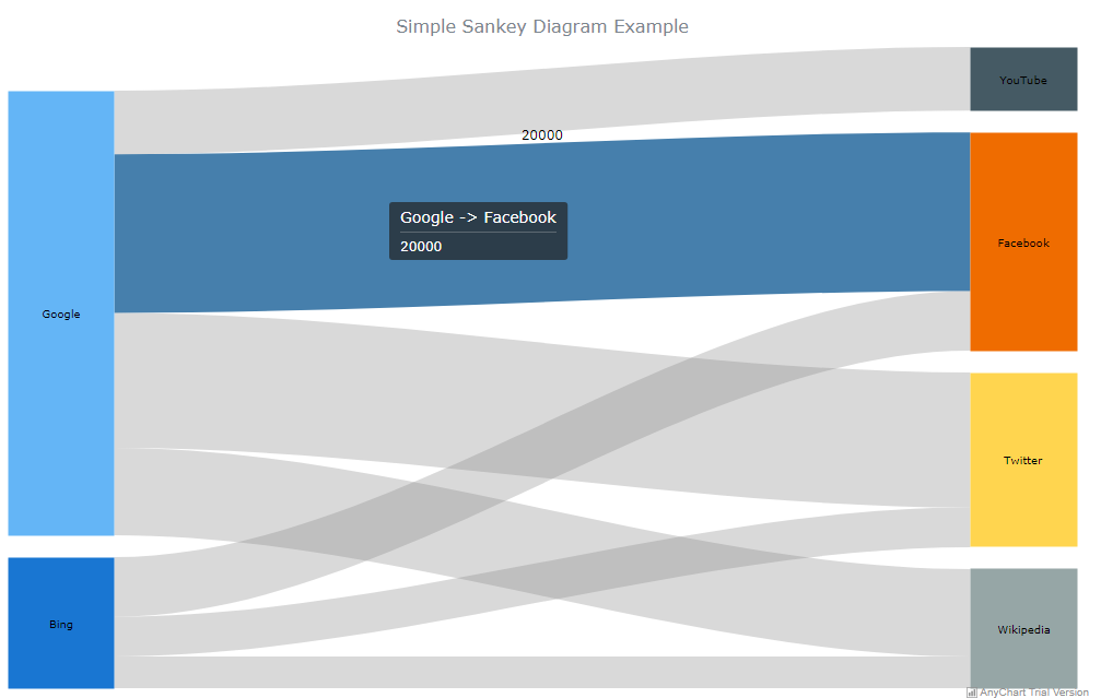
As you can see on the image above, this Sankey chart is interactive by default.
Some of its default interactive behaviors include showing tooltips of the weight values, highlighting the flows when hovered over, and displaying the nodes with different colors.
How to Enhance JS Sankey Chart Visually
Since we already know how to use the AnyChart JS library to draw simple Sankey diagrams, let’s talk about how to enhance their capabilities in representing data visualization tasks.
For example, you can improve the charts by customizing their appearance, adding dropoffs, and creating multilevel charts.
Let’s talk about each of them.
a. Customizing appearance
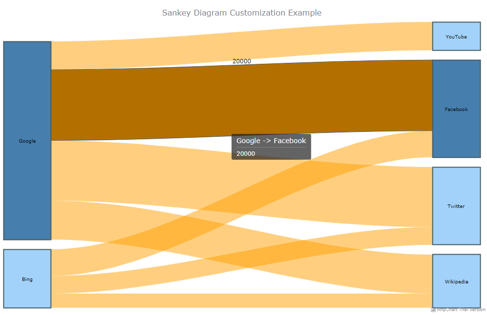
AnyChart Sankey diagrams can be customized to improve their appearance. For example, the visual appearance of the nodes and flows can be configured to show different colors depending on their normal and hovered states.
To achieve this, the normal() method and hovered() method can be used together with the fill() method (for setting the fill) and stroke() method (for setting the stroke).
Here is the code for configuring the chart’s visual appearance:
<html>
<head>>
<script src="https://cdn.anychart.com/releases/v8/js/anychart-core.min.js"></script>
<script src="https://cdn.anychart.com/releases/v8/js/anychart-sankey.min.js"></script>
</head>
<body>
<div id="container"></div>
<script>
anychart.onDocumentReady(function(){
 //creating the data
 var data = [
 {from: "Google", to: "Facebook", weight: 20000},
 {from: "Google", to: "Twitter", weight: 17000},
 {from: "Google", to: "YouTube", weight: 8000},
 {from: "Google", to: "Wikipedia", weight: 11000},
 {from: "Bing", to: "Facebook", weight: 7500},
 {from: "Bing", to: "Twitter", weight: 5000},
 {from: "Bing", to: "Wikipedia", weight: 4000}
 ];
//calling the Sankey function
var sankey_chart = anychart.sankey(data);
//customizing the width of the nodes
sankey_chart.nodeWidth("20%");
//setting the chart title
sankey_chart.title("Sankey Diagram Customization Example");
//customizing the vertical padding of the nodes
sankey_chart.nodePadding(20);
//customizing the visual appearance of nodes
sankey_chart.node().normal().fill("#64b5f5 0.6");
sankey_chart.node().hovered().fill(anychart.color.darken("#64b5f7"));
sankey_chart.node().normal().stroke("#455a63", 2);
//customizing the visual appearance of flows
sankey_chart.flow().normal().fill("#ffa000 0.5");
sankey_chart.flow().hovered().fill(anychart.color.darken("#ffa000"));
sankey_chart.flow().hovered().stroke("#455a63");
//setting the container id
sankey_chart.container("container");
//initiating drawing the Sankey diagram
sankey_chart.draw();
});
</script>
</body>
</html>
Here is how the configured chart looks on a browser:
b. Adding dropoffs
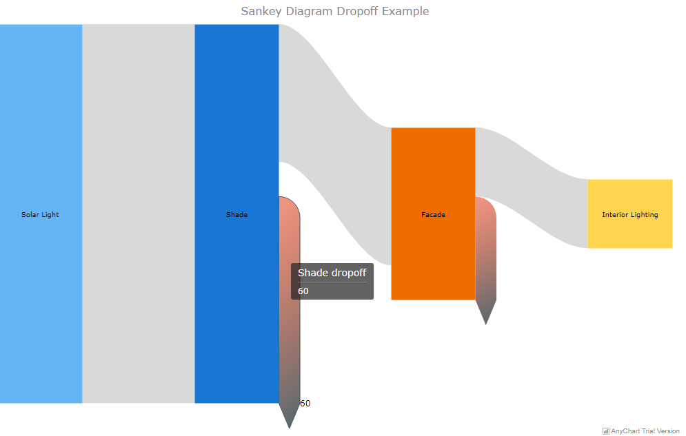
A dropoff is formed whenever the destination of the flow is lacking. Since the target node is not provided, a dropoff usually showcases losses. Therefore, to set up a dropoff, include a data row with the value of null in the to field. You also need to set the name of the data flow source in the from field and the value of the dropoff in the weight field.
You can also customize the dropoff to suit your preferences, such as configuring its visual appearance.
Here is the code for adding dropoffs that show the process of transmitting solar light energy until it reaches the interior of a building:
<html>
<head>
<script src="https://cdn.anychart.com/releases/v8/js/anychart-core.min.js"></script>
<script src="https://cdn.anychart.com/releases/v8/js/anychart-sankey.min.js"></script>
</head>
<body>
<div id="container"></div>
<script>
anychart.onDocumentReady(function(){
 //creating the data
var data = [
 {from: "Solar Light", to: "Shade", weight: 110},
 {from: "Shade", to: null, weight: 60},
 {from: "Shade", to: "Facade", weight: 40},
 {from: "Facade", to: null, weight: 30},
 {from: "Facade", to: "Interior Lighting", weight: 20}
];
//calling the Sankey function
var sankey_chart = anychart.sankey(data);
//customizing the width of the nodes
sankey_chart.nodeWidth("50%");
//setting the chart title
sankey_chart.title("Sankey Diagram Dropoff Example");
//customizing the vertical padding of the nodes
sankey_chart.nodePadding(20);
//customizing the visual appearance of dropoff
sankey_chart.dropoff().normal().fill(
 {keys: ["#dd2c01 0.5", "#455a62 0.9"], angle: 275}
);
sankey_chart.dropoff().hovered().stroke("#455a61");
//setting the container id
sankey_chart.container("container");
//initiating drawing the Sankey diagram
sankey_chart.draw();
});
</script>
</body>
</html>
Here is how the dropoffs look on a browser:
c. Creating multilevel Sankey charts
Furthermore, you can use the AnyChart JS library to create Sankey Diagrams having multiple levels of linkages.
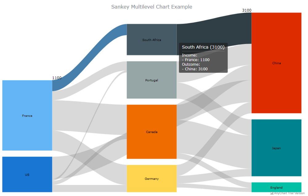
In the example below, I’ve created a Sankey diagram that shows an arbitrary number of people migrating from one country to the other per year. The nodes are arranged in three columns and the additional levels are added automatically, and as necessary.
Here is the code:
<html>
<head>
<script src="https://cdn.anychart.com/releases/v8/js/anychart-core.min.js"></script>
<script src="https://cdn.anychart.com/releases/v8/js/anychart-sankey.min.js"></script>
</head>
<body>
<div id="container"></div>
<script>
anychart.onDocumentReady(function(){
 //creating the data
var data = [
 {from: "France", to: "Canada", weight: 3000},
 {from: "France", to: "Germany", weight: 2000},
 {from: "France", to: "South Africa", weight: 1100},
 {from: "France", to: "Portugal", weight: 900},
 {from: "US", to: "China", weight: 2200},
 {from: "US", to: "Canada", weight: 400},
 {from: "US", to: "Germany", weight: 700},
 {from: "US", to: "Portugal", weight: 200},
 {from: "Canada", to: "China", weight: 1500},
 {from: "Canada", to: "Japan", weight: 3300},
 {from: "Canada", to: "England", weight: 550},
 {from: "Germany", to: "China", weight: 1100},
 {from: "Germany", to: "Japan", weight: 750},
 {from: "Germany", to: "England", weight: 400},
 {from: "South Africa", to: "China", weight: 3100},
 {from: "Portugal", to: "China", weight: 2100},
 {from: "Portugal", to: "Japan", weight: 1600}
];
//calling the Sankey function
var sankey_chart = anychart.sankey(data);
//customizing the width of the nodes
sankey_chart.nodeWidth("50%");
//setting the chart title
sankey_chart.title("Sankey Multilevel Chart Example");
//customizing the vertical padding of the nodes
sankey_chart.nodePadding(20);
//setting the container id
sankey_chart.container("container");
//initiating drawing the Sankey diagram
sankey_chart.draw();
});
</script>
</body>
</html>
Here is how the multilevel Sankey charts look on a browser:
Wrapping Up
As you’ve seen from this JS chart tutorial, creating intuitive and interactive Sankey diagrams using a good data visualization library is not rocket science. With a developer-friendly solution, you can create wonderful charts and take your data visualization efforts to the next level.
Of course, we just scratched the surface on what you can do with Sankey diagrams. You can visit the AnyChart documentation and learn how to make the most of Sankey charts, as well as several other types of charts.
You can also try out the other JavaScript charting libraries and assess their capability of assisting you in adding the visualizations you need to your web applications.
Do you have any comments or questions?
Please post them below.
The “Create Cool Interactive Sankey Diagram Using JavaScript — Tutorial” article is published on the AnyChart blog with permission of Alfrick Opidi.
Originally appeared on Hacker Noon under the title “How to Create Cool Interactive Sankey Diagrams Using JavaScript” on May 15, 2019.
- Categories: AnyChart Charting Component, Big Data, Business Intelligence, Charts and Art, HTML5, JavaScript, JavaScript Chart Tutorials, Tips and Tricks
- No Comments »