New Stunning Charts and Maps from Around the Web — DataViz Weekly
January 29th, 2021 by AnyChart Team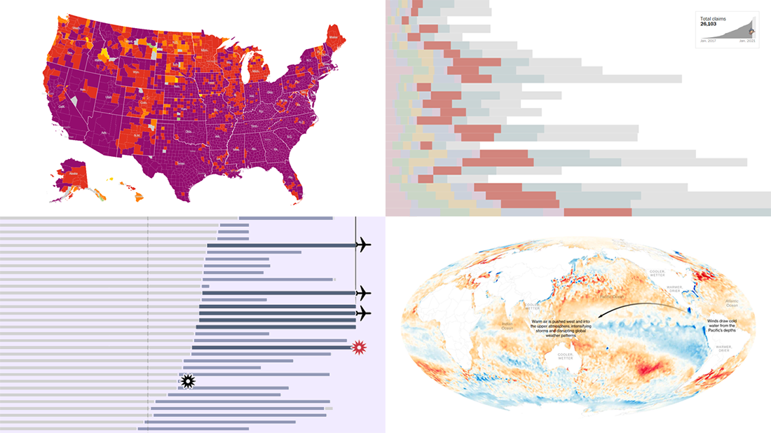 We continue our weekly blog feature where we show you the best data visualizations we’ve met out there over the past seven days. Here’s our new selection of stunning charts and maps from different creators — check it out! Today on DataViz Weekly:
- La Niña and its impacts — Bloomberg
- Donald Trump’s false and misleading claims while in office — The Washington Post
- COVID-19 risk levels by county — The New York Times
- Sriwijaya Air fleet — Reuters
- Categories: Data Visualization Weekly
- No Comments »
How to Create Bubble Map with JavaScript to Visualize Election Results
January 25th, 2021 by Shachee Swadia In these times of exponentially growing data, visualization is a necessary skillset to have in your tool box. Popular techniques include bar charts, line graphs, pie charts, and bubble maps among others.
Building interactive charts from scratch with JavaScript can be a difficult endeavor for any developer, especially someone starting out new. That is exactly why we have JS charting libraries which make it much easier and quicker to conjure up insightful visualizations!
Read on to see how I create a JavaScript Bubble Map with one of these libraries.
Read the JS charting tutorial »
- Categories: AnyChart Charting Component, AnyMap, Big Data, Charts and Art, HTML5, JavaScript, JavaScript Chart Tutorials, Tips and Tricks
- No Comments »
Great Visualizations Not to Miss — DataViz Weekly
January 22nd, 2021 by AnyChart Team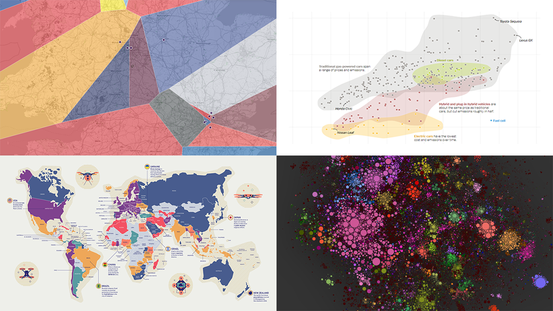 For those unfamiliar with DataViz Weekly, each Friday we select the most interesting data visualization projects from all we’ve discovered these days around the internet. Then we present them in a dedicated summary post. Look at our new picks!
- Electric, hybrid, and gas car costs vs emissions — NYT
- Nearest English football team — Automatic Knowledge
- Map of 100,000 books — David Manzanares
- Drone privacy legislation worldwide — Surfshark
- Categories: Data Visualization Weekly
- No Comments »
New Compelling Data Visualizations on Climate Change — DataViz Weekly
January 15th, 2021 by AnyChart Team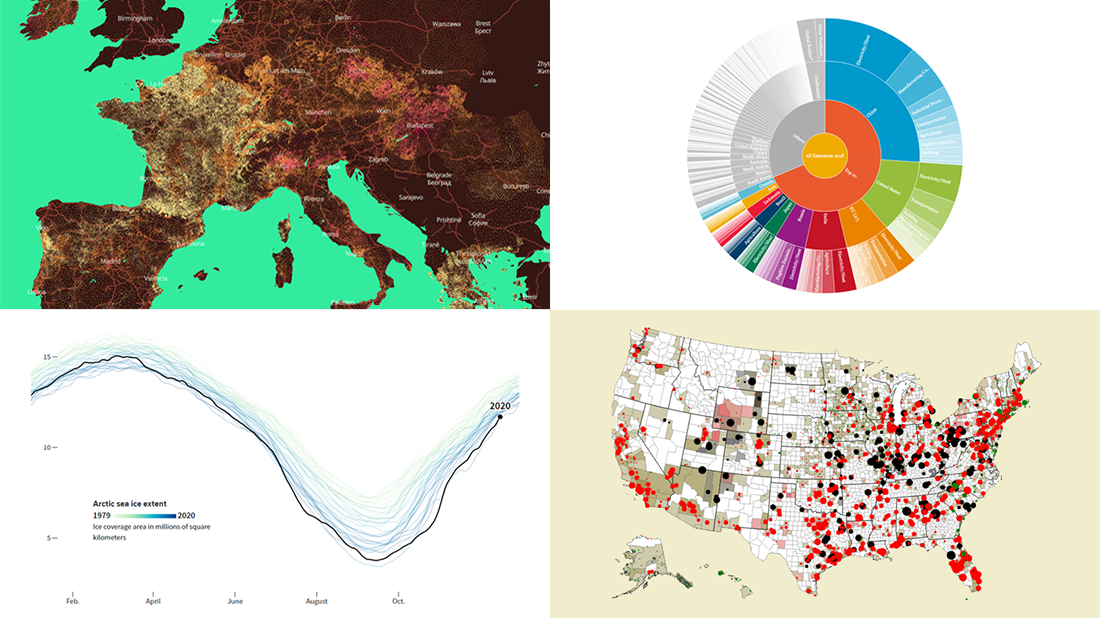 Lately, we’ve come across a number of compelling new data visualizations on climate change and related topics. And we’ll tell you about some of the most interesting ones right now! Check out the new DataViz Weekly roundup.
- Fingerprints of climate change in 2020 — Reuters
- Global warming in European municipalities — EDJNet
- Top greenhouse gas emitters — WRI
- Future of U.S. fossil fuel-fired electricity — Emily Grubert
- Categories: Data Visualization Weekly
- No Comments »
Best Data Visualizations of 2020 — DataViz Weekly
January 8th, 2021 by AnyChart Team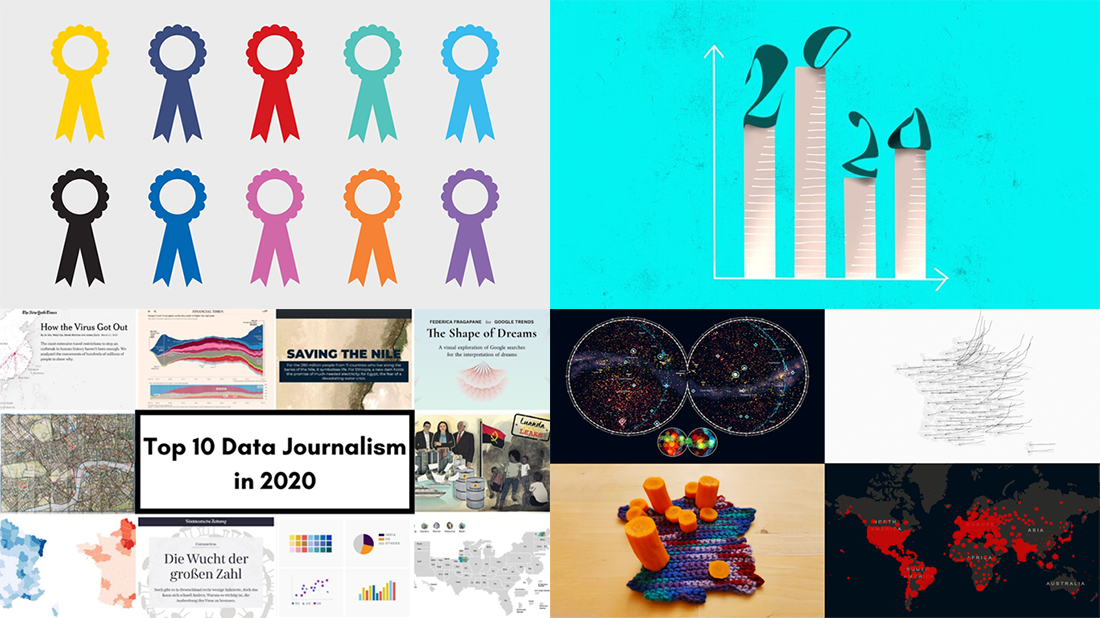 Each week throughout the 2020 year, we curated the most interesting data visualizations from around the Web and introduced them to you in the DataViz Weekly roundup. Now is the time to look at the best of the best! We will hand you over to distinguished experts — Nathan Yau, Alli Torban, Lea Pica, Kenneth Field, and the GIJN team — who have already made their (brilliant) choices. Meet their picks for the best data visualizations of 2020!
- Categories: Data Visualization Weekly
- 1 Comment »
2020 Year in Review in Charts — DataViz Weekly
January 1st, 2021 by AnyChart Team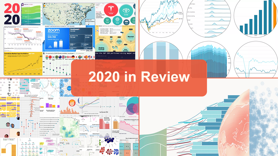 2020 was strange. It was difficult. But it was. Happy New Year everyone! ?
Even though 2020 was not that bad in everything, we all hope, of course, that 2021 will be (much) better. Let it be so! But before we dive into the new one, let’s take a glance back and remember 2020 as is, with the help of great data visualizations.
The January 1st issue of DataViz Weekly invites you to look through the lists of the charts included in the year-in-review features on Visual Capitalist, Recode by Vox, FiveThirtyEight, and The Economist. Sneak a peek, and then check out the graphics.
- Categories: Data Visualization Weekly
- 1 Comment »