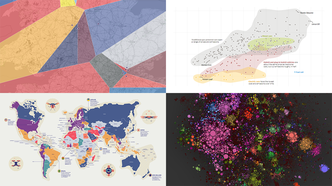
 For those unfamiliar with DataViz Weekly, each Friday we select the most interesting data visualization projects from all we’ve discovered these days around the internet. Then we present them in a dedicated summary post. Look at our new picks!
- Electric, hybrid, and gas car costs vs emissions — NYT
- Nearest English football team — Automatic Knowledge
- Map of 100,000 books — David Manzanares
- Drone privacy legislation worldwide — Surfshark
Data Visualization Weekly: January 15, 2020 — January 22, 2020
Electric, Hybrid, and Gas Car Costs vs Emissions
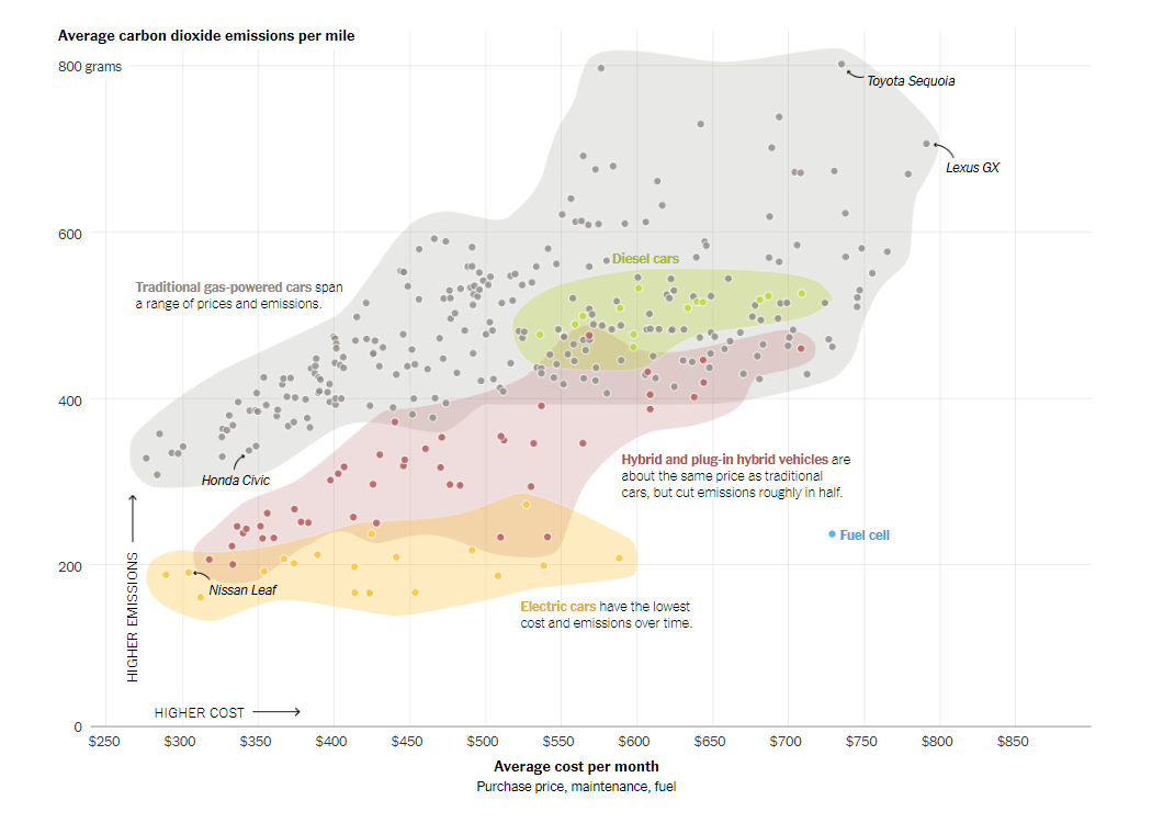
Electric cars are more climate-friendly than their gas-powered counterparts. However, many Americans are still hesitant about purchasing them. The major reason is simple: electric vehicles are also more expensive. However, in the long run, they appear to be cheaper, saving their owners pretty good money over a lifetime.
The New York Times charted the average carbon dioxide emissions against the effective average cost for gas, electric, and hybrid and plug-in hybrid cars. The visualization is based on new data from the MIT Trancik Lab. The average cost value here includes, in addition to the purchase price, maintenance and fuel expense.
This NYT chart displays data about new cars retailing for no more than $55,000. But actually, the researchers calculated CO2 emissions and lifetime cost estimates for about all new vehicle models. If you are interested, you are also welcome to check out the original project, Carboncounter.
Nearest English Football Team
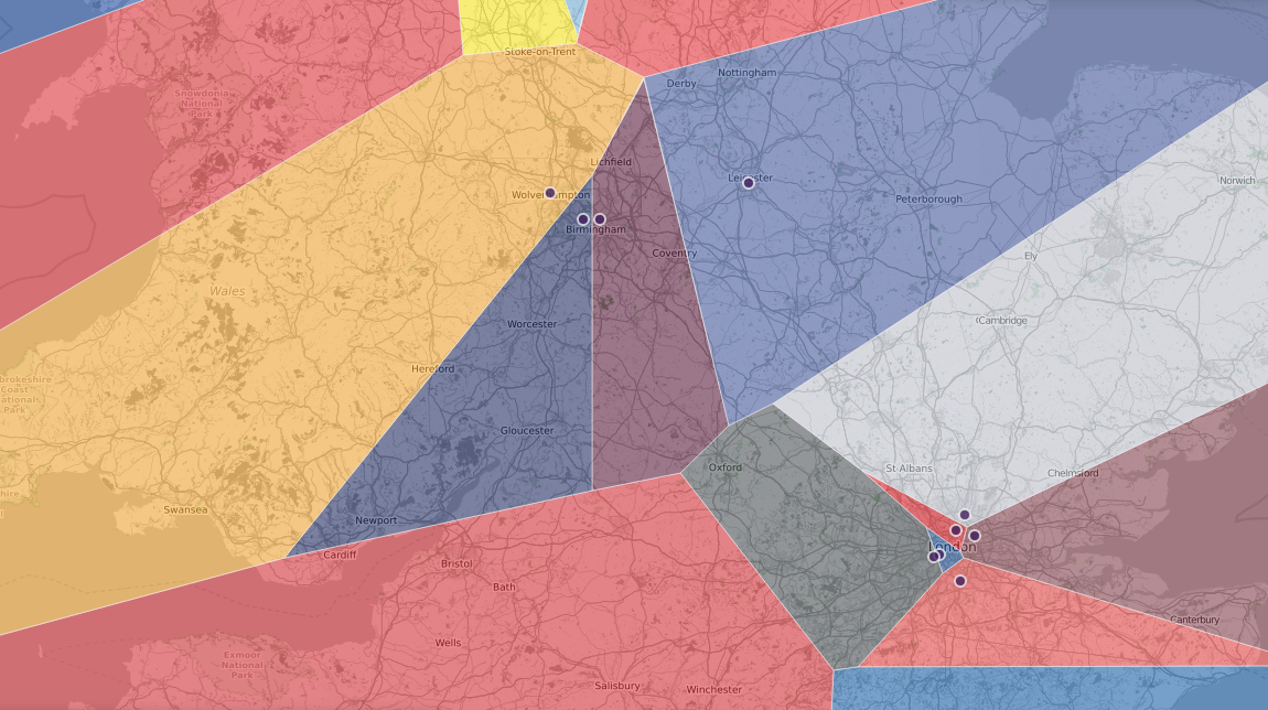
Automatic Knowledge, a data consultancy firm, created a compelling map that displays what’s the nearest English Premier League football team anywhere in Great Britain (and even beyond). When you look at this visualization, you’ll see a number of colored shapes — Voronoi polygons. All locations within each polygon are nearest to one EPL team and you can easily find out which by clicking the polygon.
Actually, there are also two sister maps available, for the top four leagues and tiers 1 to 8. These visualizations could help someone decide on which team to support. Or not. Anyway, it looks like a great showcase for Voronoi polygons.
Map of 100K Books

There are so many books out there that choosing the next one to read is often quite challenging. But here’s where interactive maps of books can be helpful. Check out a new one we have recently come across: TheLibraryMap.
TheLibraryMap is a beautiful bubble-based visualization that shows over 100,000 books based on relevance and similarity. Color is used to encode genres and topics. Although the project looks very interesting, it certainly lacks a map key (legend) that would streamline the book discovery process. However, TheLibraryMap is young and the author — David Manzanares — welcomes feedback, so we may expect improvements soon.
Drone Privacy Legislation Worldwide
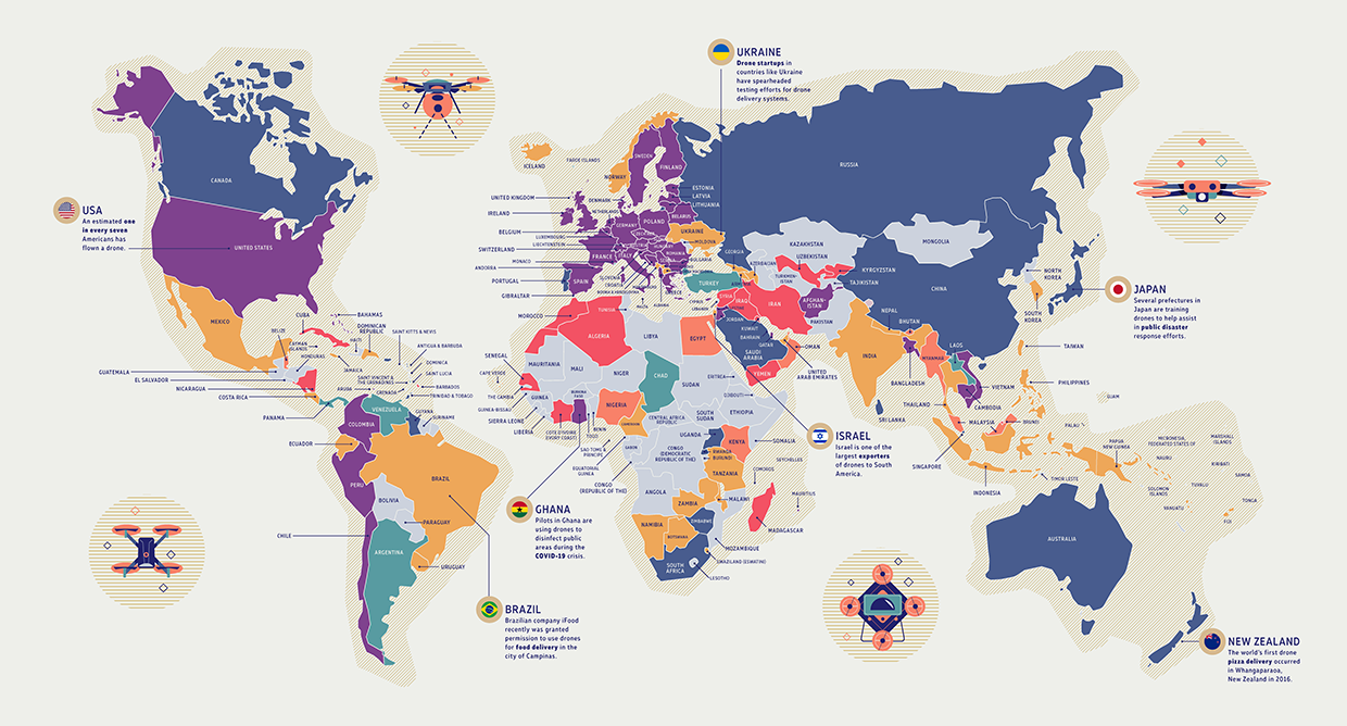
The growing use of drones all over the globe is seen as a threat to citizens’ privacy. So lawmakers have to respond. The responses, however, vary quite greatly. Surfshark, a company behind the homonymous VPN, decided to provide an easy way to explore the international regulatory landscape for drones and created a fascinating map.
The Drone Privacy Laws map by Surfshark colors countries according to the kind of regulation:
- outright ban,
- effective ban,
- restrictions apply,
- visual line of sight required,
- experimental visual line of sight,
- unrestricted, or
- no drone-related legislation at all.
The map and the analysis are available on the Surfshark website. Sources: the Library of Congress, RAND Corporation, UAV Coach, and UAV Systems International.
***
If you like good charts, stay tuned for our weekly blog feature!
Have a good time!
- Categories: Data Visualization Weekly
- No Comments »