Awesome Data Visualizations on NBA, NFL, Syllabi, and Demographics — DataViz Weekly
July 26th, 2019 by AnyChart Team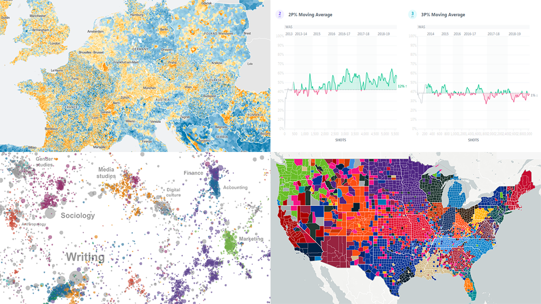 It’s Friday, and we have a pleasure to show you another four new awesome data visualizations we’ve been delighted to check out these days. Look what’s presented on DataViz Weekly this time:
- NBA players’ shot improvement
- Population trends in Europe
- The most-assigned texts from college syllabi worldwide
- The most popular NFL teams and players in every county of the United States
- Categories: Data Visualization Weekly
- No Comments »
Visual Analytics Examples for City Climate, Pain Pills, Water Fountains, and Space Travels — DataViz Weekly
July 19th, 2019 by AnyChart Team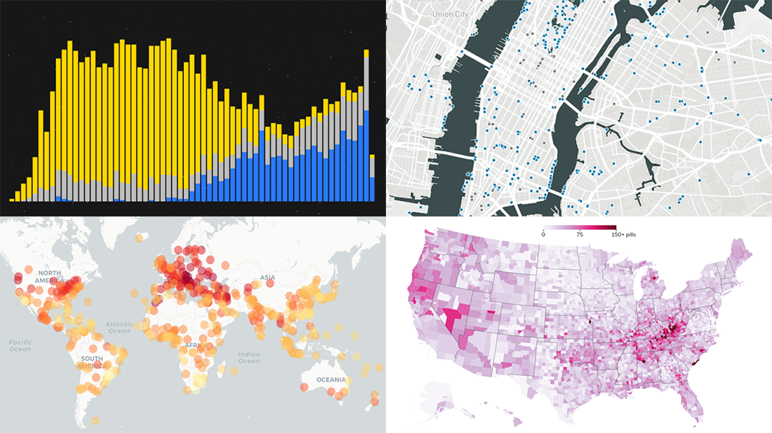 Enjoy another selection of new cool data visualization projects as great examples of visual analytics in action. Here’s what questions the charts featured today on DataViz Weekly show answers to:
- What city’s current climate will your city’s climate resemble in 2050? — Crowther Lab
- How legal pain pills were distributed across the United States in 2006-2012? — The Washington Post
- Where is the nearest water fountain? — Matthew Moy de Vitry
- How space travel has developed since Sputnik in 1957? — Reuters
- Categories: Data Visualization Weekly
- No Comments »
Excellent Visualizations on Subway, Moons, Energy, and Sea Ice — DataViz Weekly
July 12th, 2019 by AnyChart Team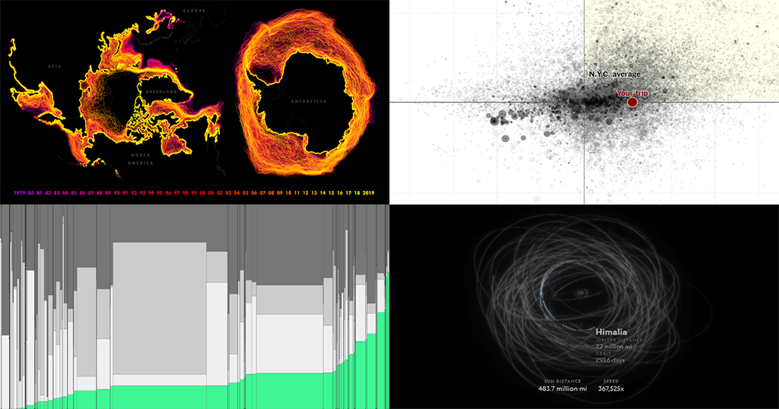 Many excellent visualizations have appeared this week around the web. Now it’s time to choose four and briefly introduce them to you — that’s what we’ve been doing for years within the framework of the special DataViz Weekly feature on our blog.
Alright. We invite you to take a look at the following new cool projects as another set of great data visualization examples, for your inspiration and fun:
- Variability in the New York subway commutes — The Upshot
- Moons in our solar system — National Geographic
- Energy consumption worldwide since 1980 — Bloomberg
- Sea ice extents since 1979 — ArcGIS Blog
- Categories: Data Visualization Weekly
- No Comments »
Engaging Data Visualizations About Time, Light, America, and Britain — DataViz Weekly
July 5th, 2019 by AnyChart Team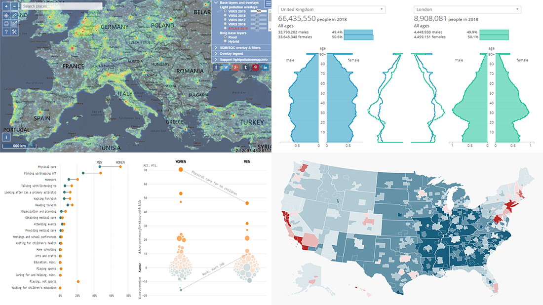 Here are some of the cool, engaging data visualizations we’ve come across these days. They are great examples of how awesome and informative charts can be when they truly let data talk.
The visualizations we are featuring this time on DataViz Weekly are as follows:
- Differences between men and women’s everyday life with kids — FlowingData
- 50 maps showing various aspects of the American life — Business Insider
- New population estimates for the United Kingdom — ONS
- Light pollution around the globe — Jurij Stare
- Categories: Data Visualization Weekly
- No Comments »