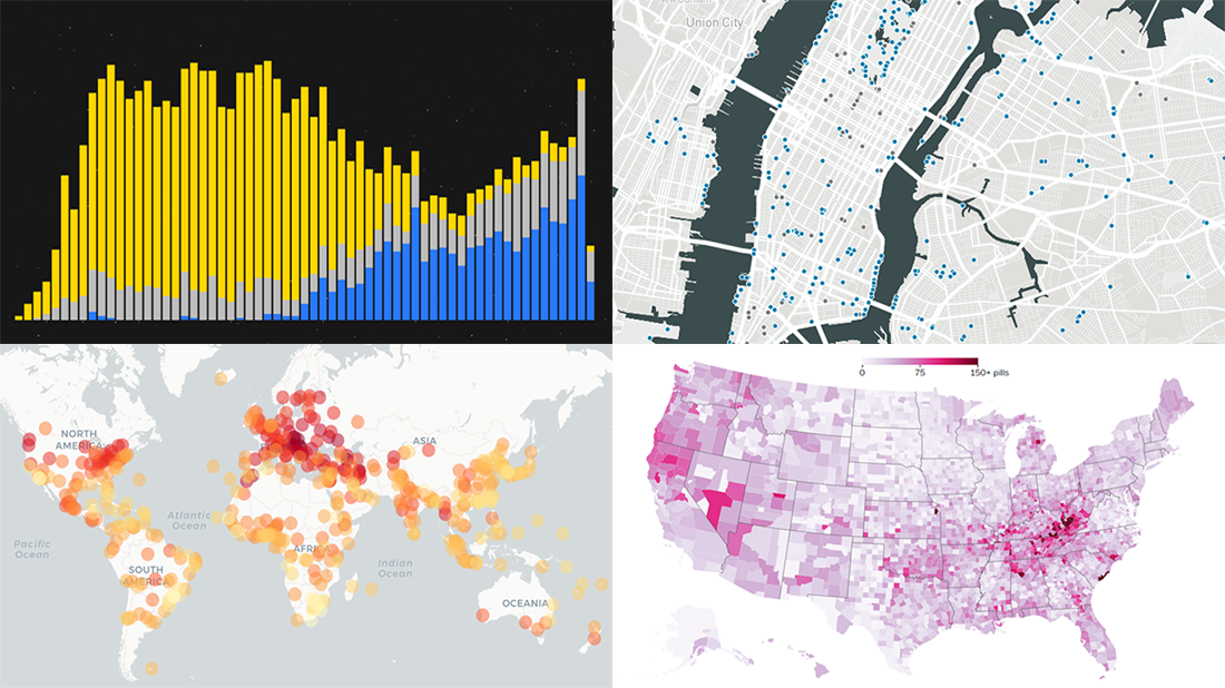
 Enjoy another selection of new cool data visualization projects as great examples of visual analytics in action. Here’s what questions the charts featured today on DataViz Weekly show answers to:
- What city’s current climate will your city’s climate resemble in 2050? — Crowther Lab
- How legal pain pills were distributed across the United States in 2006-2012? — The Washington Post
- Where is the nearest water fountain? — Matthew Moy de Vitry
- How space travel has developed since Sputnik in 1957? — Reuters
Visual Analytics Examples in Data Visualization Weekly: July 12, 2019 — July 19, 2019
Future Climate in Cities
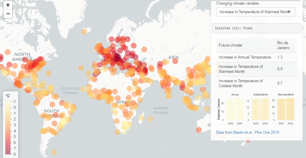
Crowther Lab, a group of researchers aiming to find scientific solutions to the issues of climate change and biodiversity loss, published an interesting study looking into how some cities’ climate can be expected to shift in the next 30 years.
Analyzing the present and future climate conditions in 520 major cities around the world, the authors paired every one city’s temperatures predicted for 2050 with current ones of other cities to find the best analogues. To put it more simply, Crowther Lab identified the current climate of what city each city’s climate will most likely resemble in 2050. For example, the climate of Miami in 2050 is forecast to be more like one of Rio de Janeiro nowadays, London will be more like today’s Barcelona, and so on.
Look at the results of the research represented on an interactive map and find the current analogue of your city’s future climate. If you are interested, you can find more visualizations in the study itself.
Pain Pill Distribution Across U.S. in 2006-2012

According to The Washington Post, now is the first time in history that the Drug Enforcement Administration publishes a database of pain pill transactions in the United States. The data in this database makes it possible to track the path of every legal pain pill sold in the U.S. from 2006 to 2012. During that period, about 100,000 people died as a result of the prescription opioid epidemic fueled by the nationwide surge of these drugs.
The Washington Post mapped this DEA’s data to visualize how pills were distributed across the U.S. in 2006-2012 and how the picture was changing year by year.
Take a look and then, further down the article, you’ll see the lists of the top pill manufacturers (lead by SpecGx, Actavis Pharma, and Par Pharmaceutical) and top pill distributors (lead by McKesson Corp., Walgreens, and Cardinal Health) in 2006-2012.
Water Fountains
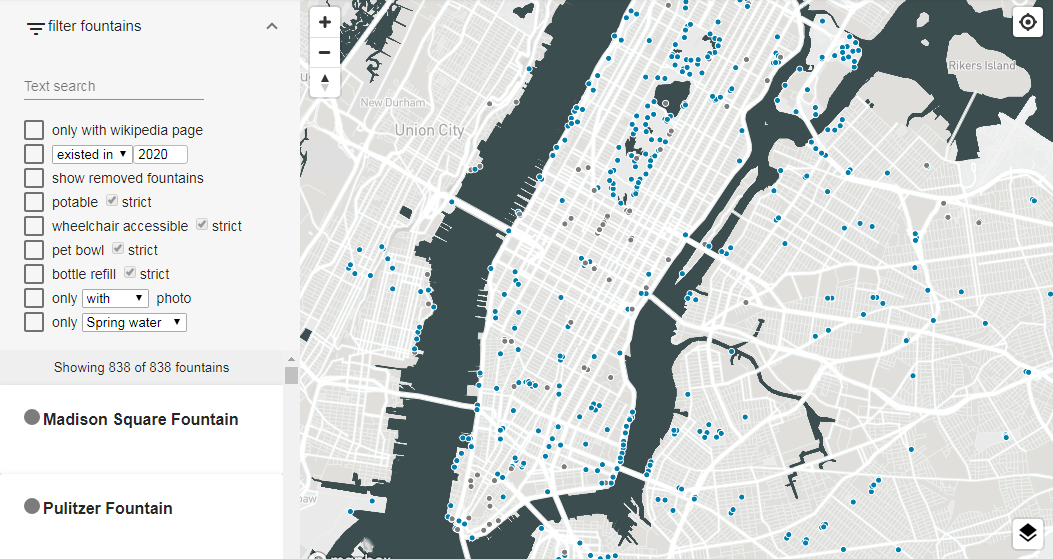
Matthew Moy de Vitry from the Swiss Federal Institute of Aquatic Science and Technology’s Department of Urban Water Management, launched an open-source data visualization project that allows users to find a drinking water fountain nearby. The map shows where the fountains are located, how they look, whether they are wheelchair accessible, and more information using open data from multiple sources like Wikidata and Wikipedia.
Funded by MY-D, a foundation in support of the research and development of open-source software, Water-fountains.org is currently helpful only in America’s New York City, as well as Switzerland’s Zürich, Geneva, Basel, and Lucerne.
See the map if you are in one of these cities or plan to visit them at some time in the future so you know how to avoid or minimize suffering from thirst while outside, or just glance over it for an idea of how such maps can look.
Space Travel Development Since Sputnik in 1957
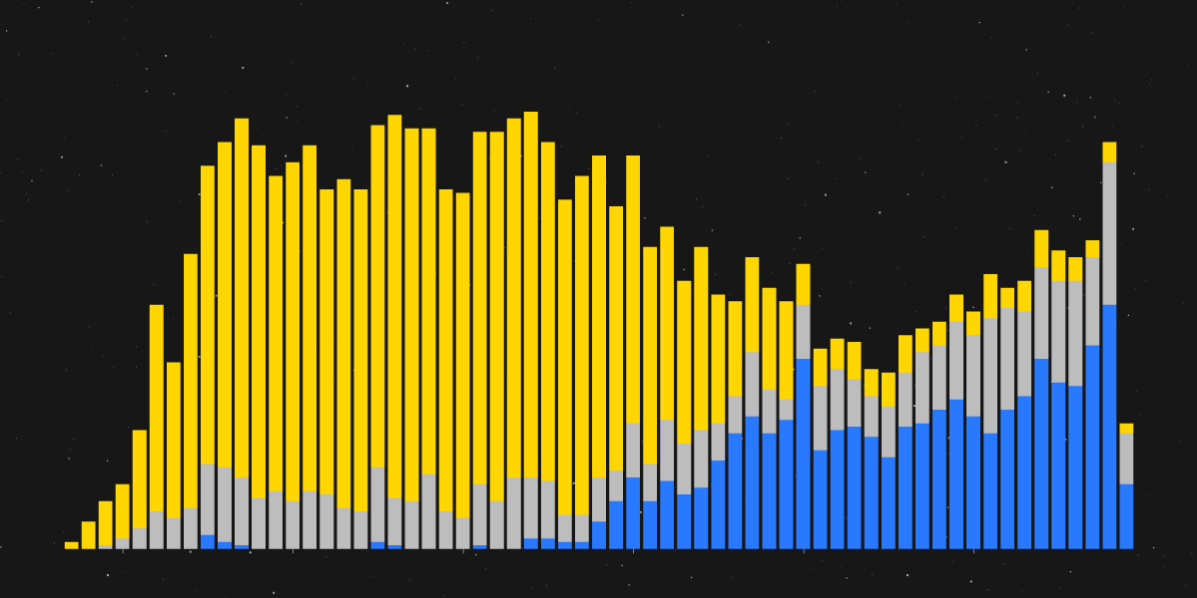
Based on data provided by astrophysicist Jonathan McDowell from the Harvard-Smithsonian Center for Astrophysics, Reuters charted all rocket launches that had successfully completed their missions to carry a payload into orbit since 1957 when the Soviet Union had launched Sputnik.
This visualization is an illustration for a special feature reviewing the development of space travel and growth of commercial, private launches up to their current prevalence over those conducted by governments, on military and civil programs.
Check out the article to explore the interactive chart, overview rocket advancements from the USSR’s Sputnik to SpaceX’s Falcon Heavy, and learn more.
***
Enjoy these visual analytics examples and stay tuned for new ones every Friday on Data Visualization Weekly!
- Categories: Data Visualization Weekly
- No Comments »