Tesla Sales, Brexit Vote, Birth Costs, Health Disparities — DataViz Weekly
January 25th, 2019 by AnyChart Team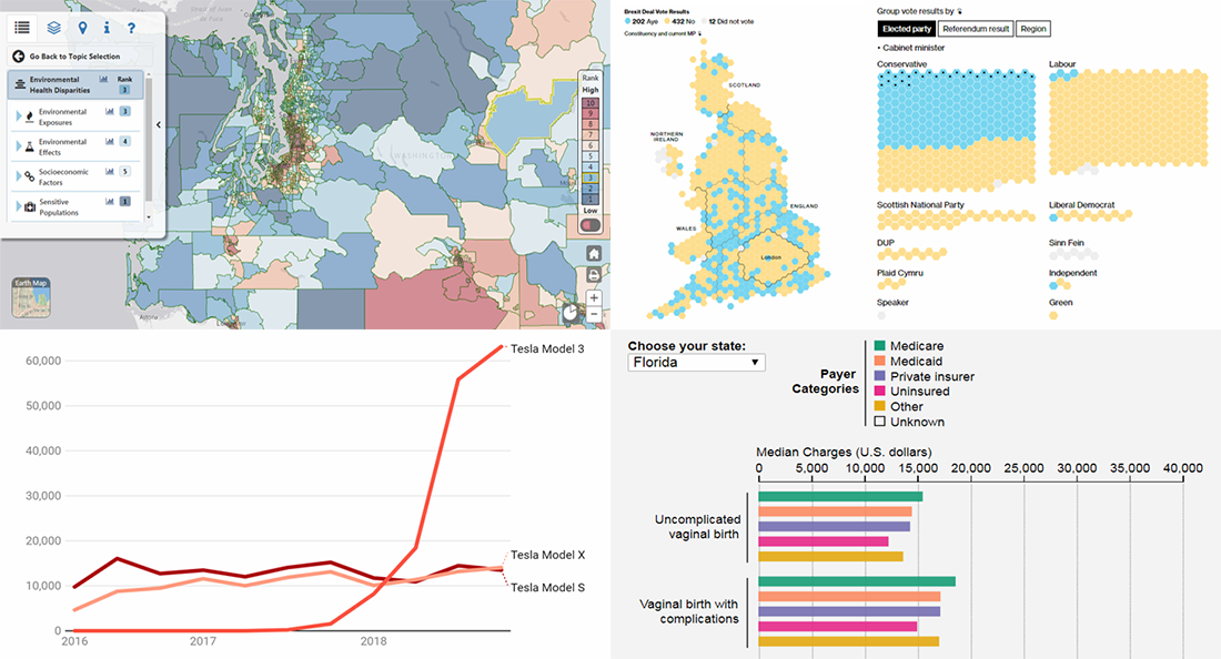 In the new DataViz Weekly post, we highlight interesting interactive data visualizations that have come to our attention this week. Take a look at charts showing details about Tesla sales, Brexit vote in the British Parliament, birth charges in American hospitals, and environmental health disparities in the Washington state.
- Categories: Data Visualization Weekly
- No Comments »
Stacked Column Charts with Images — Challenge AnyChart!
January 23rd, 2019 by Irina Maximova We are ready to share a new advanced JS (HTML5) data visualization tutorial. Tasks we get from our customers are always interesting, and the Challenge AnyChart! series on our blog proved to be a great way to show you some of the most compelling ones and explain how to solve them, demonstrating the power and flexibility of our JavaScript charts library. Today’s challenge is about adding images to stacked column charts using AnyChart.
- Categories: AnyChart Charting Component, Challenge AnyChart!, Charts and Art, HTML5, JavaScript, Tips and Tricks
- No Comments »
Trump Tweets, Big Mac Index, California Wildfires, Mid-Range Shots in NBA — DataViz Weekly
January 18th, 2019 by AnyChart Team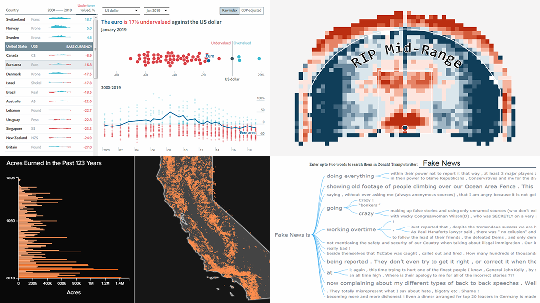 Take a look at some of the cool data visualization examples that appeared on the web just recently! The new article in the DataViz Weekly series features interesting, inspiring projects about words in Trump tweets, destiny of mid-range shots in NBA games, relative value of the world currencies according to the latest Big Mac Index data, and 100+ years of wildfires in California. Also, don’t miss out on an exciting news in the concluding part.
- Categories: Data Visualization Weekly
- No Comments »
Qlik Data Visualization Extension: Introducing Custom Drawing Over Custom Theme
January 16th, 2019 by Irina Maximova Our Qlik Charts Extension now allows a custom renderer to be set for certain chart types! We’ll show you how to make use of this new great feature in your Qlik data visualization practice, implementing custom drawing over a custom theme.
Before we begin, please note: We recommend getting acquainted with the custom drawing documentation of AnyChart JS Charts if you never worked with it before. When you do that, it will be easier for you to understand what the custom drawing functions are and how to use them right and best.
- Categories: AnyChart Charting Component, Business Intelligence, HTML5, News, Qlik, Tips and Tricks
- No Comments »
Cool Data Stories and Reports with Visualizations — DataViz Weekly
January 11th, 2019 by AnyChart Team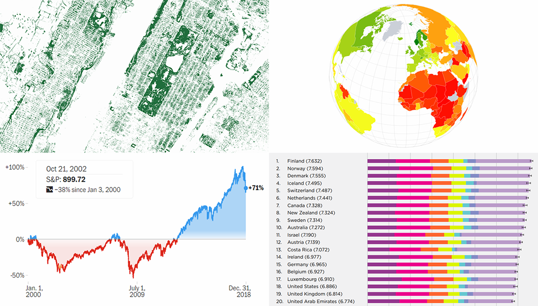 Check out some more interesting visualizations in cool data stories and reports from the last year. We’ve never put them on DataViz Weekly, but now is still a good time to do that. Today, we are glad to feature nice projects about happiness and prosperity around the world, as well as about stock market volatility and mapping tree canopy.
- Categories: Data Visualization Weekly
- No Comments »
Year in Review in Graphics from Top U.S. Publications — DataViz Weekly
January 4th, 2019 by AnyChart Team Happy New Year, everyone! 2019 is already here. But while we still feel the proximity of the last year, let’s take another look back. 2018 brought us numerous interesting visual stories based on data and graphics. For this year’s first DataViz Weekly, we’ve put together year-in-review projects of the graphics teams at four leading media publications in the U.S. (we are a U.S. based company, right): The Wall Street Journal, The New York Times, The L.A. Times, and The Washington Post. Check out some of the key facts, trends, and findings of 2018 in their top picks.
- Categories: Data Visualization Weekly
- 1 Comment »
Custom WiFi Polar Chart in JavaScript — Challenge AnyChart!
January 2nd, 2019 by Irina Maximova Solving challenges is a thing that the AnyChart team can’t live without, and we willingly continue to share some of the most interesting customer cases within the framework of Challenge AnyChart! on our blog. This feature gives us a great chance to help customers with similar tasks and demonstrate the unlimited data visualization capabilities of our JavaScript charting library time after time. The challenge being solved along today’s tutorial is about building a beautiful WiFi polar chart — a custom interactive JS (HTML5) polar chart that displays devices depending on the WiFi signal strength.
- Categories: AnyChart Charting Component, Challenge AnyChart!, Charts and Art, HTML5, JavaScript, Tips and Tricks
- No Comments »