 Check out some more interesting visualizations in cool data stories and reports from the last year. We’ve never put them on DataViz Weekly, but now is still a good time to do that. Today, we are glad to feature nice projects about happiness and prosperity around the world, as well as about stock market volatility and mapping tree canopy.
Cool Data Stories and Reports in Data Visualization Weekly
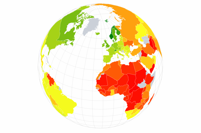
World Happiness Report
What’s been happening with people’s happiness around the world? The Sustainable Development Solutions Network (SDSN), a United Nations initiative, published the World Happiness Report 2018 that provides insight into this delicate issue. According to the rankings, Finland, Norway, Denmark, Iceland, and Switzerland are the top five countries with the happiest population. Take a closer look at these and other interesting charts in the report.
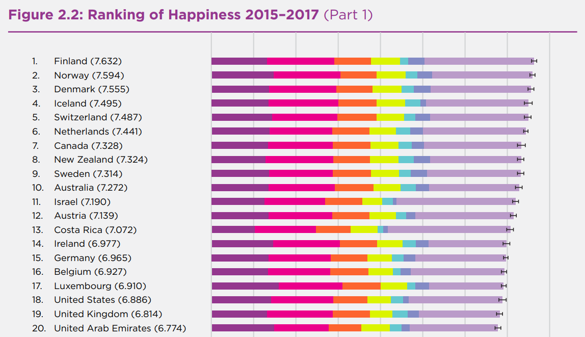
World Prosperity Index
Prosperity and happiness do not always (or fully) correlate. But let’s see. In late 2019, the Legatum Institute published a new ranking that shows the most prosperous countries in the world. The top five spots are occupied by Norway, New Zealand, Finland, Switzerland, and Denmark, which is almost the same situation as in the World Happiness Report. Check out the interactive visualization of the latest Legatum Prosperity Index 2018 data to find out more.
Stock Market Volatility
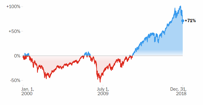
Throughout December 2018, the S&P 500 index went down by 11%. However, the picture cannot be whole if we only take a look at this decline. The Washington Post shared a nice visual story to show the things in a context. Scroll down the article to explore the earlier performance of the stock market, revealing the most significant milestones step by step.
Mapping All Trees Worldwide Using Machine Learning
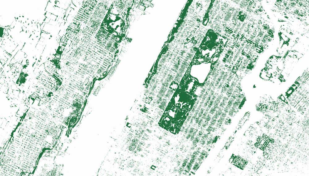
Descartes Labs told a story of how they created a machine learning model that allows them to recognize and visualize trees all over the globe. For this model, the team made use of imagery, both aerial and satellite, and lidar. Learn more and check out some cool visualizations of the tree canopy in the piece on Medium.
***
Have a great time, and stay tuned for Data Visualization Weekly to get alerted on new cool data stories, reports, and other projects with interesting charts and infographics once a week.
- Categories: Data Visualization Weekly
- No Comments »