 In the new DataViz Weekly post, we highlight interesting interactive data visualizations that have come to our attention this week. Take a look at charts showing details about Tesla sales, Brexit vote in the British Parliament, birth charges in American hospitals, and environmental health disparities in the Washington state.
Data Visualization Weekly: January 18, 2019 — January 25, 2019
30 Tesla Sales Charts — CleanTechnica
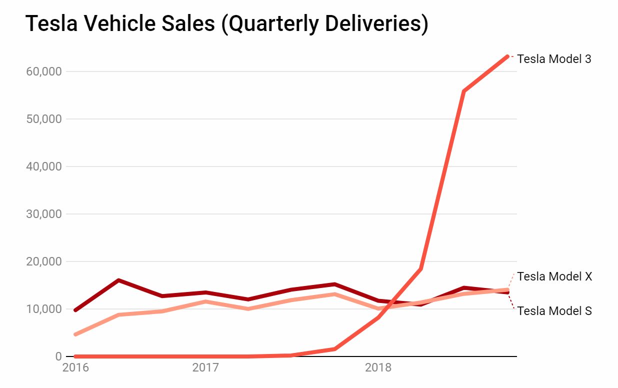
CleanTechnica shared thirty interactive Tesla sales charts that reveal where Tesla currently is in terms of its growth and market position. These bar, column, and line charts, applied to car sales data for Tesla and its competitors like Toyota, Honda, GM, Volkswagen, Hyundai, and others, nicely display “Tesla’s dramatic rise in the US and globally in 2018, its dominance of a few segments of the market, and why it’s finally being treated quite seriously by executives of other major auto firms,” according to a summary from Zachary Shahan, CleanTechnica‘s editor.
UK Parliament’s Vote on Brexit in Detail — Bloomberg
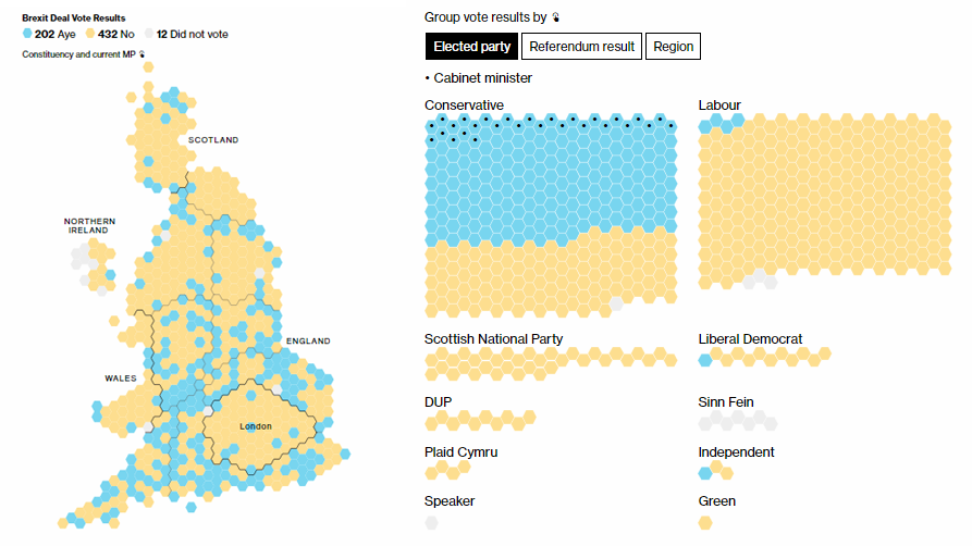
Earlier this month, the British Parliament rejected Theresa May’s Brexit deal, keeping the uncertainty about Brexit going. If you are interested to look at exactly how each member of Parliament voted, check out the interactive visualizations made by the Bloomberg Graphics team. In addition, here you can compare the present results with how the corresponding constituents voted at the 2016 Brexit referendum.
Hospital Charges for Giving Birth in United States — Scientific American
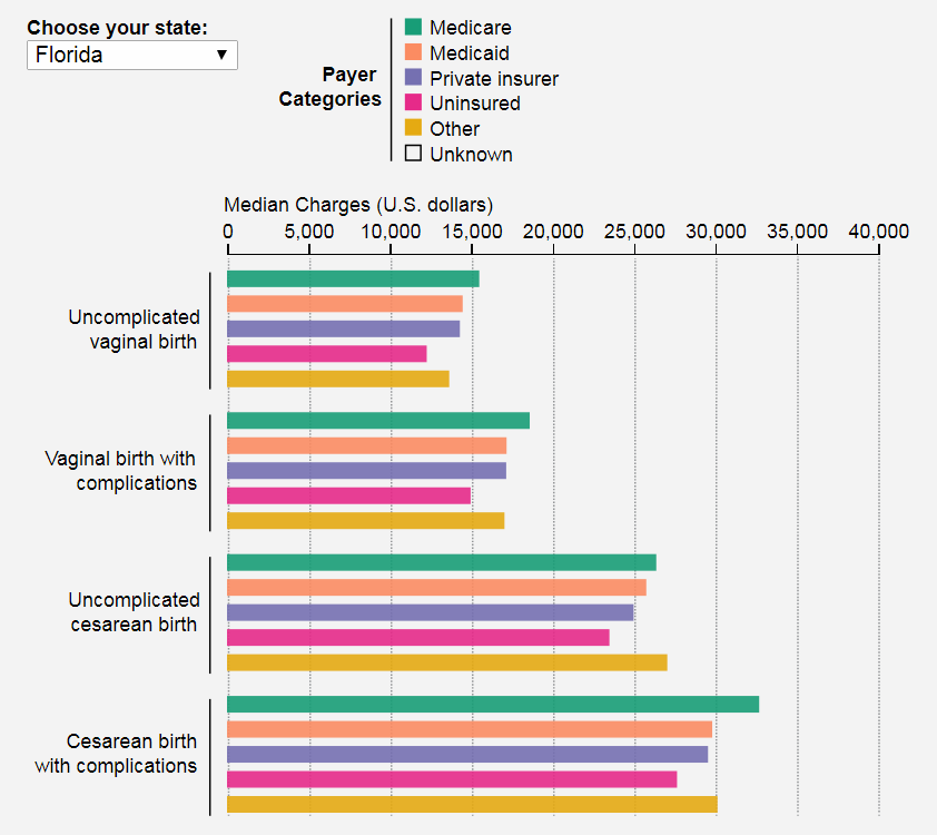
Scientific American‘s graphics editor Amanda Montañez, expecting a baby soon, made an interactive data visualization tool to show median charges for the most common birth types in American hospitals, by state and nationwide. For this project, she used data from the Healthcare Cost and Utilization Project (HCUPnet) maintained by the United States Department of Health and Human Services’ Agency for Healthcare Research and Quality (AHRQ). Check out the bar and donut charts and learn more in the article.
Environmental Health Disparities Across Washington State — Washington State Department of Health
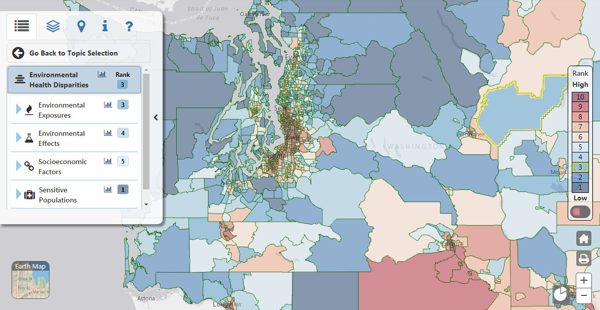
The Washington State Department of Health launched an interactive tool within the framework of its Washington Tracking Network, which visualizes environmental health disparities across the state. Essentially, it is a choropleth map, but while exploring it, you’ll inevitably meet line charts, pie charts, and bar charts that provide even more insight about the corresponding communities.
***
Enjoy the visualizations, and have a great time, everyone!
- Categories: Data Visualization Weekly
- No Comments »