 Take a look at some of the cool data visualization examples that appeared on the web just recently! The new article in the DataViz Weekly series features interesting, inspiring projects about words in Trump tweets, destiny of mid-range shots in NBA games, relative value of the world currencies according to the latest Big Mac Index data, and 100+ years of wildfires in California. Also, don’t miss out on an exciting news in the concluding part.
Data Visualization Weekly: January 11, 2019 — January 18, 2019
Mid-Range Shots vs Three-Pointers in NBA — FlowingData
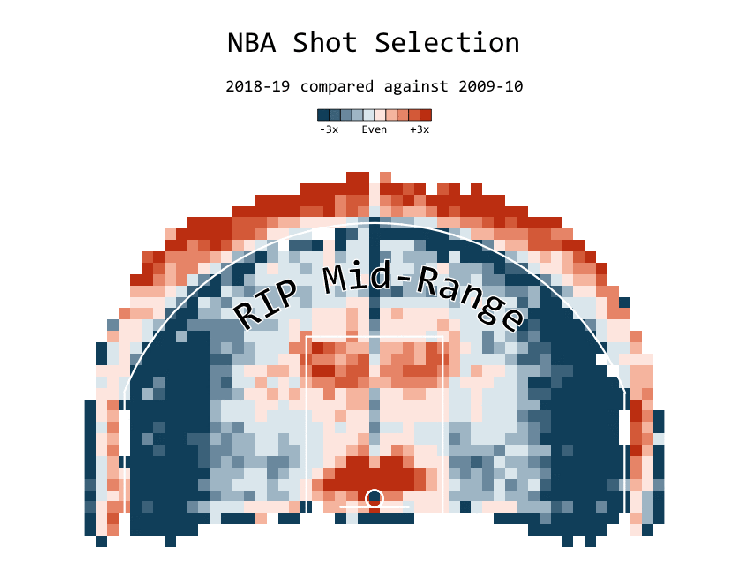
Mid-range shots are about to approach the verge of extinction as a species of shots made in NBA games. At the same time, three-pointers get more and more frequent. Nathan Yau, an expert in statistics and data visualization, played with NBA data to take a closer look at these trends, their roots, and the situation in the current regular season. Check FlowingData to see the four cool charts he’s published this week and to learn more about whether we should already start saying goodbye to mid-range shots in basketball.
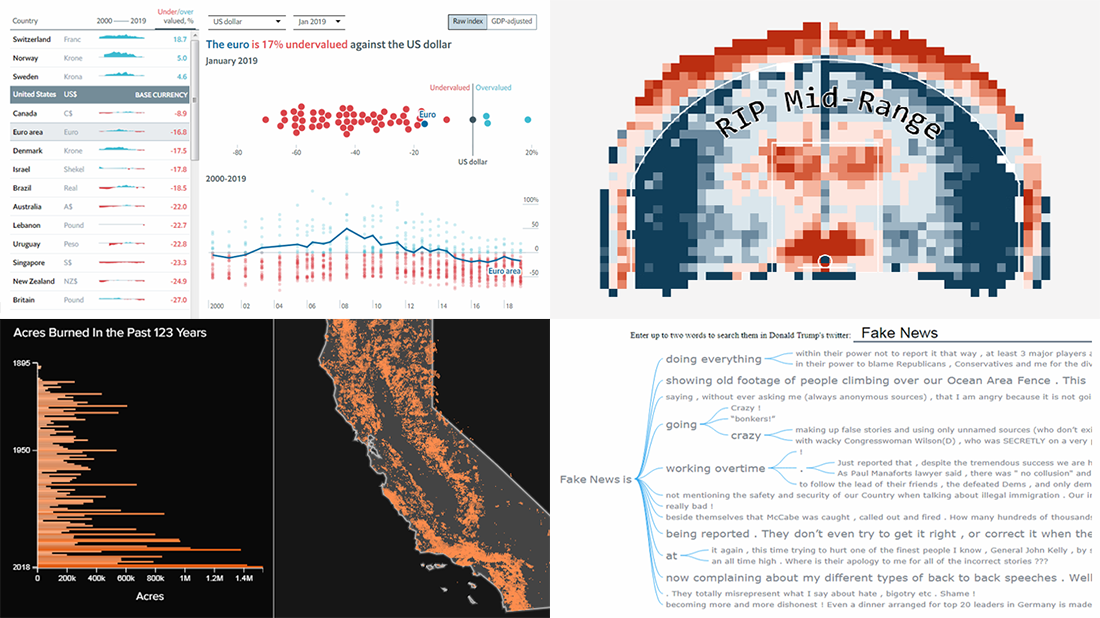
Big Mac Index 2018 — The Economist
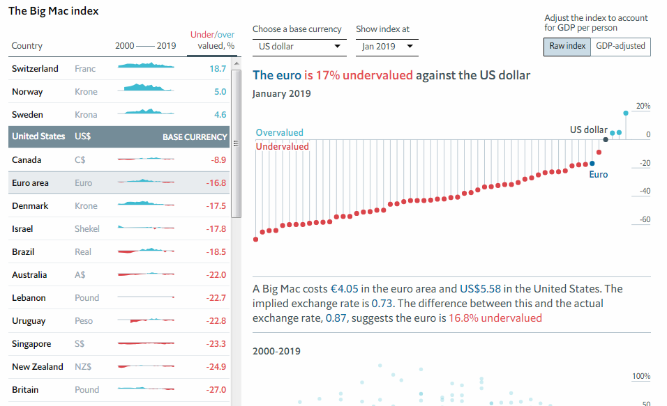
The Economist has been publishing the Big Mac Index for already as long as over 30 years. Although informal, it is widely followed by economists and traders from all over the world as a tool to estimate the purchasing power parity (PPP) of the world currencies and check if some currency is expensive (overvalued) or cheap (undervalued) compared to another. On the 10th of January, 2019, The Economist published new data for the Big Mac Index, nicely represented in an interactive visualization. The charts here show the current relationships, additionally providing a useful look back at past Big Mac Index data.
123 Years of California Wildfires — HuffPost
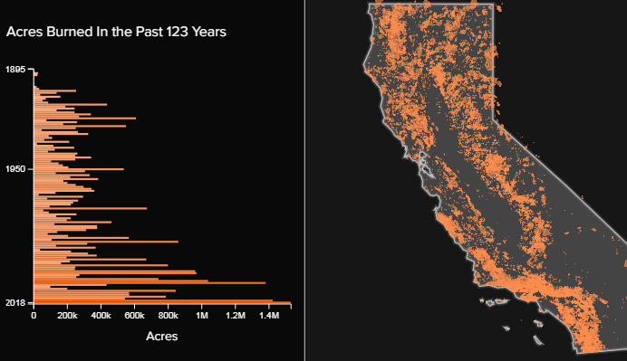
Dataviz expert Lo Bénichou visualized data from the California Department of Forestry and Fire Protection and GeoMAC database in order to show what over a hundred years of wildfires in California look like. Check out an interesting storytelling piece based on that map visualization, shared on HuffPost several days ago.
Trump Tweets: Interactive Word Tree Chart of All Donald Trump’s Twitter Posts — AnyChart JS
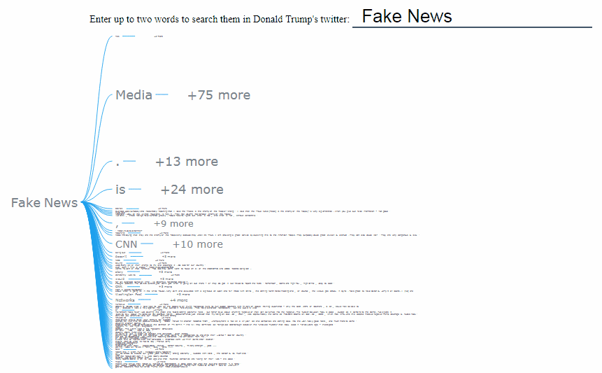
With over 57 million followers, Donald Trump’s @realDonaldTrump is one of the most popular Twitter accounts worldwide, having tweeted over 40 thousand times for almost 10 years live. When thinking about ways to demonstrate how the Word Tree chart type works in our JavaScript data visualization library — it is available in AnyChart JS Charts out of the box since the 8.5.0 major update — we decided to look at what’s in those Trump tweets.
So for one of the demos, we took data from the Trump Twitter Archive website and visualized all Trump’s tweets in an interactive Word Tree data visualization tool now available in our gallery of samples. Here, you can enter one or two words and see typical contexts of how they were used in the tweets on Donald Trump’s official Twitter channel.
By default, the chart shows you the most popular words and phrases that followed “Fake News.” Try any other two-word combinations or single words, click here and there, back and forth, and so on — it’s all interactive. In addition, you are welcome to freely play with the code of this JS Word Tree on the AnyChart Playground. For example, we took all the tweets from May 2009 (that’s when the very first tweet of Donald Trump was published) through December 2018. But you can also add the latest Twitter data, or pick the tweet text data for a certain period of time, or customize the visualization the way you wish. Have fun.
***
In case you are interested, here’s a good news of the week regarding our company. FinancesOnline, a free platform aiming to help people find the best business and SaaS solutions, published an expert review of AnyChart. The review features excellent assessments, and in particular, calls our data visualization software “blazingly fast, comprehensive,” coming with “awesome API functionality, documentation tools, and enterprise-grade support.” What’s more, FinancesOnline honored us with two awards: Premium Usability and Rising Star. We are pleased to get high scores and overall recognition from FinancesOnline’s experts and welcome our customers to leave your user reviews of AnyChart JS Charts over there as well. Thank you all for your support!
We hope you liked the dataviz works featured today on Data Visualization Weekly, providing insight into Trump tweets, value of currencies according to the Big Mac Index, history of wildfires in California, and three-point and mid-range shots in NBA. We’ll share more next week. Stay tuned for cool charts and infographics!
- Categories: Data Visualization Weekly
- No Comments »