 Happy New Year, everyone! 2019 is already here. But while we still feel the proximity of the last year, let’s take another look back. 2018 brought us numerous interesting visual stories based on data and graphics. For this year’s first DataViz Weekly, we’ve put together year-in-review projects of the graphics teams at four leading media publications in the U.S. (we are a U.S. based company, right): The Wall Street Journal, The New York Times, The L.A. Times, and The Washington Post. Check out some of the key facts, trends, and findings of 2018 in their top picks.
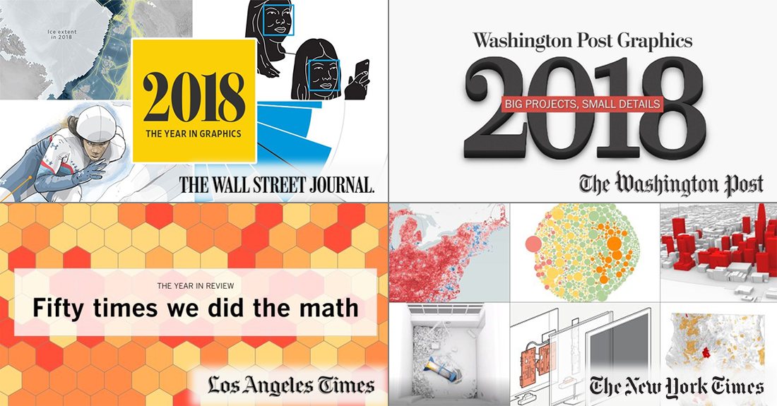
Graphics 2018
The Year in Graphics: 2018 — by The Wall Street Journal

The Wall Street Journal picked the thirty-four best visual stories published on WSJ in 2018.
Graphics articles you’ll find in the selection touch upon diverse topics ranging from the midterms, baseball and bicycling to stocks, Spotify IPO, wages, and more.
2018: The Year in Visual Stories and Graphics — by The New York Times

For their year-in-review feature, The New York Times chose more than 100 of the graphics and data-driven stories published on NYT in 2018.
Listed in order of appearance, the projects are grouped by month, offering a look at the U.S. trade war, wildfire, elections, athletes, schools, income mobility, and many other subjects, nation- and worldwide.
Year in Review: Fifty Times We Did the Math — by The Los Angeles Times

The Los Angeles Times showcased fifty of the stories based on or illustrated by numbers and data visualizations shared on LAT last year.
These articles shed light on a number of different topics, including but not limited to millionaire congressmen, finding the shade at Dodger Stadium, NBA scorers, U.S. election race, and much more.
2018: Big Projects, Small Details — by The Washington Post

The Washington Post selected their thirty best graphics stories of the year 2018. Segregation, school shootings, voting results, FIFA World Cup, hurricane Florence, Kilauea eruption, and so on, and so forth — take a look.
What makes this collection stand out is, all the picks are accompanied by comments of their authors from The Post’s graphics team, offering a look at the favorite details from their projects.
***
In case you missed it, we also featured the Best Data Visualizations of 2018 picks from four other popular media outlets in late December: POLITICO, Recode, The Economist, and Fast Company.
Stay tuned for DataViz Weekly to get regular updates on new interesting data visualization and infographic projects from all over the web.
May all of you have a happy, successful year!
- Categories: Data Visualization Weekly
- 1 Comment »