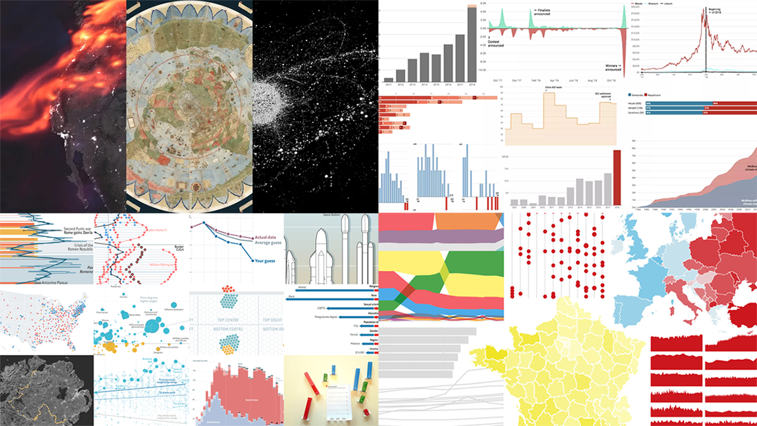
 The last days of 2018 are a great time to look back at these 12 months. The year’s final issue of DataViz Weekly is here to familiarize you with four cool selections of the best data visualizations that show the picture of 2018, curated by four major media outlets: POLITICO, Recode, The Economist, and Fast Company. Take a quick look at the lists and check out the charts.
Best Data Visualizations of the Year: Politico, Recode, The Economist, Fast Company
Politico‘s DataViz of the Year
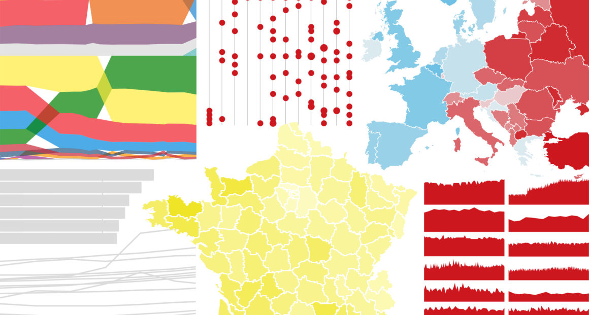
POLITICO picked top 14 projects with charts and figures to tell the story of 2018, on topics that defined the year:
- Rise of the yellow vests movement in France
- Donald Trump’s fake news
- Job changes in the Trump administration
- Apple’s market leadership
- Climate change
- European elections
- Far-right parties across the European Union
- Brexit opinions
- Europeans’ feelings towards Muslims
- EU migration reduction
- Merkel’s staying power
- GDP per capita across the EU
- Respect for human rights of LGBTI+ people in Europe
- Performance of social media
Recode‘s DataViz of the Year
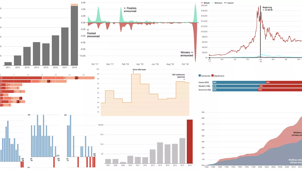
Recode shared a visual review of the year in another 14 charts, focusing on technology and related trends:
- Social media sentiment about Amazon’s HQ2
- Change in social media usage
- Tesla’s stock price
- U.S. plug-in electric vehicle sales
- Cumulative hectares of U.S. forest burned, with and without the climate change
- Users’ trust in major Internet companies
- #MeToo power
- Cryptocurrency price decline
- Popularity of search terms juul, cigarette, marlboro, and electronic cigarette
- Market capitalization of Apple, Microsoft, and Amazon
- Government composition after the midterm elections for the U.S. House, Senate, and governors
- Annual capital expenditure for Apple, Amazon, Microsoft, Facebook, and Alphabet
- Top 10 free games by revenue
- MoviePass parent company stock price
The Economist‘s DataViz of the Year
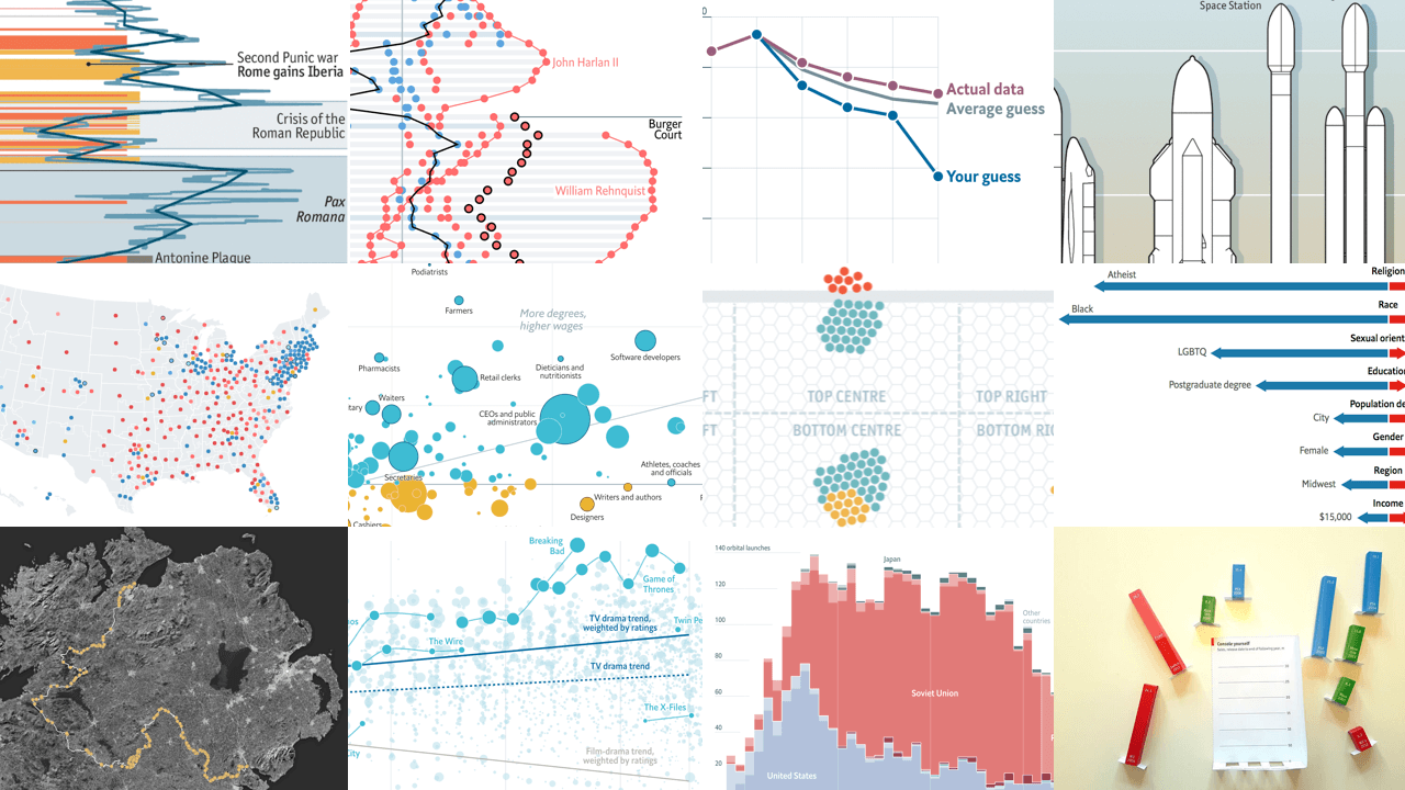
The Economist Data Team selected their 12 most-loved data stories and charts published in 2018:
- Economic returns to university
- Space launchers
- Segregation in America
- Nintendo console sales
- Lead emissions from silver production in 1100 BC through 800 AD
- Midterm election race and results
- Success in penalty shootouts
- Ideologies of the U.S. Supreme Court justices
- All state and commercial space launches
- Vote forecast model
- IMDb user ratings for TV dramas
- EU’s new external border in Ireland
Fast Company‘s DataViz of the Year

Fast Company recalled 10 of the best data visualization works that came to light this year:
- Real size of countries
- Earth atmosphere
- Corporate connections in the S&P 500 top 50
- Space waste
- $1M+ homes across the U.S.
- Block-by-block population estimates for Manhattan over a day
- PayPal user data sharing
- Trump Properties in political campaigns and U.S. taxpayer money
- Map of the ancient Earth up to 750 million years ago
- The largest known early world map made interactive
***
Don’t miss out on these some of the best data visualizations of 2018.
Stay tuned for DataViz Weekly in 2019 as we will continue to share some of the most interesting data visualizations from around the web, within the framework of this Friday feature.
Happy holiday time, everyone!
- Categories: Data Visualization Weekly
- 3 Comments »