 Solving challenges is a thing that the AnyChart team can’t live without, and we willingly continue to share some of the most interesting customer cases within the framework of Challenge AnyChart! on our blog. This feature gives us a great chance to help customers with similar tasks and demonstrate the unlimited data visualization capabilities of our JavaScript charting library time after time. The challenge being solved along today’s tutorial is about building a beautiful WiFi polar chart — a custom interactive JS (HTML5) polar chart that displays devices depending on the WiFi signal strength.
Data Visualization Task
The question a customer wanted us to answer is:
How to use AnyChart charting library to create a polar chart showing devices in different reception zones: excellent, good, medium, and bad?
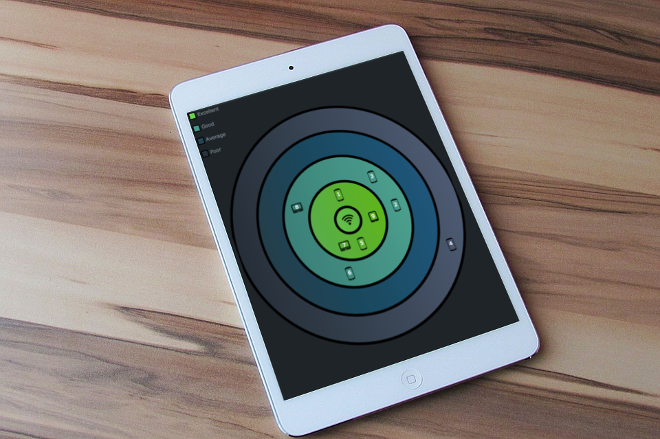
To illustrate how the chart should look like, the customer attached the following picture:
They also mentioned that the numbers in the picture should be accompanied by icons to visually represent the type of each device.
Solution Overview
The polar chart class methods of the AnyChart API will be a great help in solving this interesting data visualization task.
To begin with, draw a polar chart and add a color palette for different reception zones.
Then make the data points look like devices and work on the chart legend a bit more to tune up the visualization.
Creating WiFi Polar Chart
Follow the JS polar charts documentation to draw a chart and add a palette.
You can set data for the polar chart as follows:
var data = [
    {x: 0,   value: 0, signal: 0, name: "WiFi hotspot", deviceType: "wifi", mac: 'BF-AD-3A-36-A4-BE'},
    {index: 1, x: 0,   value: 2, signal: -8, name: "iPhone X", deviceType: "phone", mac: 'D6-18-CD-D4-DE-D2'},
    {index: 2, x: 90,  value: 4, signal: -35, name: "Samsung s8", deviceType: "phone", mac: '03-ED-5C-E2-76-F4'}
  ];
After it’s done, create a function responsible for linking images to the data points using the deviceType field already defined in the data:
function placeImages() {
    var src;
    if (this.getData("deviceType") === "phone")
      src = "https://image.flaticon.com/icons/svg/65/65680.svg";
    if (this.getData("deviceType") === "wifi")
      src = "https://image.flaticon.com/icons/png/128/34/34143.png";
    return {
      src: src,
      mode: 'fit',
      opacity: 1
    }
  }
The function is executed when adjusting the series appearance:
series.normal().fill(placeImages);
series.selected().fill(placeImages).stroke('#0f4b86', 3);
The last thing you need here is set up a legend for the WiFi polar chart using anychart.standalones.legend():
var legend = anychart.standalones.legend();
    var legendItems = [
      {
        text: 'Excellent',
        iconType: "square",
        iconFill: '#6cd053',
        iconStroke: {color: 'black', thickness: 2}
      },
And make it interactive on mouse hover by adding the following code:
legend.listen("legendItemMouseOver", function(e){
      // highlight the area
      polar.yGrid().palette().itemAt(e.itemIndex + 1, "White 0.7");
    });
    legend.listen("legendItemMouseOut", function(e){
        // reset the grid to default
	    polar.yGrid().palette(gridPalette);
    });
That’s it! The custom JavaScript-based WiFi polar chart is ready. It can be found and modified on the AnyChart Playground.
For your reference, the full code of the WiFi polar chart sample is written below:
anychart.onDocumentReady(function() {

  // create a stage
  var stage = anychart.graphics.create("container");
  // create data
  var data = [
    {x: 0,   value: 0, signal: 0, name: "WiFi hotspot", deviceType: "wifi", mac: 'BF-AD-3A-36-A4-BE'},
    {index: 1, x: 0,   value: 2, signal: -8, name: "iPhone X", deviceType: "phone", mac: 'D6-18-CD-D4-DE-D2'},
    {index: 2, x: 90,  value: 4, signal: -35, name: "Samsung s8", deviceType: "phone", mac: '03-ED-5C-E2-76-F4'},
    {index: 3, x: 50,  value: 4, signal: -47, name: "Oneplus3T", deviceType: "phone", mac: '49-5C-D8-54-5A-5B'},
    {index: 4, x: 120, value: 8, signal: -72, name: "Nokia 6", deviceType: "phone", mac: 'C5-F4-29-05-67-0D'},
    {index: 5, x: 170, value: 2, signal: -12, name: "Samsung Note9", deviceType: "phone", mac: '91-72-36-E5-C1-0C'},
    {index: 6, x: 200, value: 4, signal: -37, name: "iPhone XS", deviceType: "phone", mac: 'F5-C3-0F-2B-C8-AE'},
    {index: 7, x: 210, value: 2, signal: -20, name: "Dell XPS", deviceType: "laptop", mac: '44-99-CF-1E-61-CD'},
    {index: 8, x: 300, value: 4, signal: -42, name: "Apple MBP", deviceType: "laptop", mac: '2A-76-AC-F0-52-89'},
    {index: 9, x: 100, value: 2, signal: -25, name: "Lenovo Tab3", deviceType: "tablet", mac: '6B-CC-F8-E8-21-6C'}
  ];

  //create a chart
  var polar = anychart.polar();
  var dataSet = anychart.data.set(data);
  //create a series
  var series = polar.marker(dataSet);
  //adjust the series appearance
  series.type('circle');
  series.normal().fill(placeImages);
  series.normal().size(15).stroke(null);
  series.hovered().size(17);
  series.selected().size(17);
  series.selected().fill(placeImages).stroke('#0f4b86', 3);
  series.labels(true);
  series.labels()
    .anchor('center')
    .offsetY(-2)
    .fontSize(12)
    .fontColor('white')
    .format(function() {
    return this.getData('index');
  });

  var gridPalette = [["#70e952 0.8", "#61da44 0.8"], ["#6cd053 0.8", "#39d811 0.8"], ["#46978d 0.8", "#05bda5 0.8"], ["#274553 0.8", "#01638f 0.8"], ["#28323c 0.8", "#596985 0.8"]];

  //adjust scales and axes
  polar.yGrid().palette(gridPalette);
  polar.yGrid().stroke("black", 6);
  polar.xGrid(false);
  polar.xScale().maximum(360);
  polar.yScale()
    .maximum(9)
    .minimum(0)
    .ticks([0, 1, 3, 5, 7, 9]);
  polar.xAxis(false);
  polar.yAxis(false);
  polar.yAxis().stroke(null);
  polar.background("#1f2429");

  //adjust the tooltip
  polar.tooltip().format("Singnal strenthg: {%signal} dB\nMAC address: {%mac}");
  polar.tooltip().titleFormat('{%name}');

  polar.container(stage).draw();

  //create and adjust a standalone legend
  var legend = anychart.standalones.legend();
  var legendItems = [
    {
      text: 'Excellent',
      iconType: "square",
      iconFill: '#6cd053',
      iconStroke: {color: 'black', thickness: 2}
    },
    {
      text: 'Good',
      iconType: "square",
      iconFill: '#46978d',
      iconStroke: {color: 'black', thickness: 2}
    },
    {
      text: 'Average',
      iconType: "square",
      iconFill: '#274553',
      iconStroke: {color: 'black', thickness: 2}
    },
    {
      text: 'Poor',
      iconType: "square",
      iconFill: '#28323c',
      iconStroke: {color: 'black', thickness: 2}
    }
  ];

  legend
    .items(legendItems)
    .itemsLayout('vertical')
    .align('left')
    .padding(5)
    .container(stage).draw();

  legend.listen("legendItemMouseOver", function(e){
    // highlight the area
    polar.yGrid().palette().itemAt(e.itemIndex + 1, "White 0.7");
  });
  legend.listen("legendItemMouseOut", function(e){
    // reset the grid to default
    polar.yGrid().palette(gridPalette);
  });

  function placeImages() {
    var src;
    if (this.getData("deviceType") === "phone")
      src = "https://image.flaticon.com/icons/svg/65/65680.svg";
    if (this.getData("deviceType") === "laptop")
      src = "https://image.flaticon.com/icons/png/128/59/59505.png";
    if (this.getData("deviceType") === "tablet")
      src = "https://cdn2.iconfinder.com/data/icons/font-awesome/1792/tablet-128.png";
    if (this.getData("deviceType") === "wifi")
      src = "https://image.flaticon.com/icons/png/128/34/34143.png";
    return {
      src: src,
      mode: 'fit',
      opacity: 1
    }
  }
});
Facing any obstacles when working with AnyChart JS Charts? Don’t hesitate to send us your questions at support@anychart.com with “Challenge” in the subject line. Our Support Team is fond of solving challenges and showing the customers what AnyChart is capable of.
Check out more similar articles in the Challenge AnyChart! section. We add new pieces on a regular basis, and it’s your challenge that may well turn into one of such advanced data visualization tutorials.
- Categories: AnyChart Charting Component, Challenge AnyChart!, Charts and Art, HTML5, JavaScript, Tips and Tricks
- No Comments »