JS Map on August’s Projection by AnyChart and More
May 28th, 2016 by Margaret SkomorokhHave you seen the visualizations that we have shared with you this week on AnyChart Facebook Page and in Twitter, and have you checked out our JS map on August’s projection? Here is a quick recap.
- 15 Books with More Characters than You Can Keep Track Of: – This nice infographic by lovereading.co.uk tells about 15 epic books crowded with characters. According to it, there are 131 named characters in Harry Potter and the Philosopher’s Stone, 218 in a Game of Thrones, 463 in The Stand, and 600 in War and Peace. Yes, sometimes it’s hard to track of all of them:)
- On Rocky Beginnings – According to an MIT study, the average office worker produces 5GB worth of data each day. The Quantified Selfie project shows that such data can tell a lot about living humans behind them and can even be used for self-exploration. This interactive data visualization is story of new beginnings in New York City through one person’s music consumption.
- The Changing American Diet – In this interactive simulation by FlowingData, you can see what Americans ate on an average day, for the past several decades, and how the diet was changing, year by year. Click the link and witness the epic battle between butter and margarine!
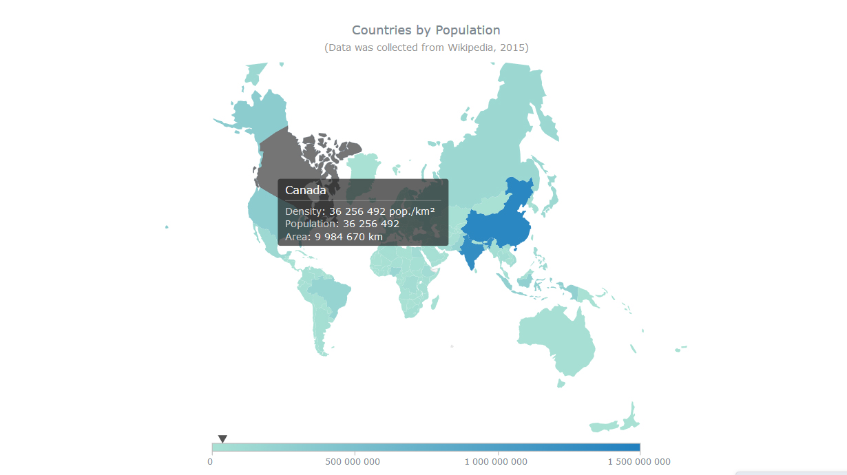
- Countries by Population on August’s Projection – this interactive JS map by AnyChart was created using Map Projections: a new feature that was added in AnyMap 7.10.0. Now you can show any map on one of the following common projections: Aitoff, August, Bonne, Eckert1, Eckert3, Equirectangular, Fahey, Hammer, Mercator, Orthographic, Robinson, Wagner6, and Wsg84 (the map you see here is on August’s projection). Please be careful when you change the projection – be aware of how map projections work and when it is appropriate to use them.
- Categories: AnyChart Charting Component, AnyMap, HTML5, JavaScript, News
- No Comments »
JavaScript Dot Map by AnyChart and More
May 21st, 2016 by Margaret SkomorokhThis week we have shared with you on AnyChart Facebook Page and in Twitter a few data visualizations – including a JavaScript Dot Map by AnyChart. You will find a recap of these posts below.
- Holyrood elections see rise of ‘Team Ruth’ and demise of Labour vision – The elections in Scotland have seen the remarkable transformation of Ruth Davidson’s Scottish Conservatives from “toxic Tories” to the second party and official opposition of the Holyrood parliament. In this article on Theguardian.com, you can see a couple of nice interactive charts showing the change in Scotland’s political geography.
- 24 Charts of Leadership Styles Around the World – Look at 24 charts of leadership styles around the world (from the book When Cultures Collide by Richard D. Lewis) and see how remarkably different these styles are, varying from structured individualism in USA and multiple leadership in Israel to national romanticist in Poland and human force in Spain, including some really tricky styles that cannot be described in one term.
- Digital Attack Map is a live data visualization of DDoS attacks around the globe, built through a collaboration between Google Ideas and Arbor Networks. The tool surfaces anonymous attack traffic data to let users explore historic trends and find reports of outages happening on a given day.
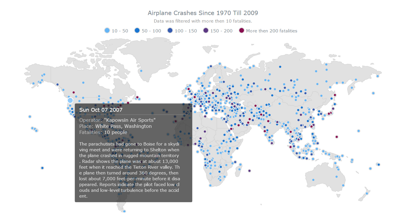
- Airplane Crashes since 1970 till 2009 – The Dot (Point) map type, added in AnyMap 7.10.0, has the widest application range: showing cities, points of interest, events, creating density maps, etc. The JavaScript Dot map you see here shows airplane crashes all over the world (since 1970 till 2009) as dots on a map. The visualization is interactive: each dot is linked to a description of the crash in represents. Please note that in AnyMap dots on Dot maps are fully customizable – you can work with any of predefined marker types, code your own type, or use an image.
- Categories: AnyChart Charting Component, AnyMap, HTML5, JavaScript, News
- No Comments »
HTML5 Connector Map by AnyChart and More
May 13th, 2016 by Margaret SkomorokhIn this post you will find a recap of the cool data visualizations that we have shared with you this week on AnyChart Facebook Page and in Twitter (including an HTML5 Connector Map by AnyChart):
- The Year that Music Died from Polygraph is an animated timeline that shows the Billboard top 5 songs since 1956, all the while playing the top song during a given week (via FlowingData).
- David Rumsey Map Center is a collection of more than 150,000 maps, atlases, globes and other historical treasures. Read more in the article on Smithsonian.com (and check out eight awesome maps from the collection). is a collection of more than 150,000 maps, atlases, globes and other historical treasures donated by the retired San Francisco real estate developer. Read more in the article on Smithsonian (and check out eight awesome maps from the collection).
- The Atlas of Economic Complexity is a great interactive tool that enables users to play around with international trade data. You can visualize a country’s total trade, track how these dynamics change over time, and explore growth opportunities for more than a hundred countries worldwide. As a dynamic resource, The Atlas is continually evolving with new data and features to help analyze economic growth and development.
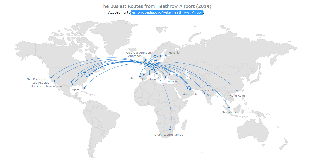
- Busiest Routes From Heathrow Airport – this interactive HTML5 Connector Map by AnyChart shows the most popular flight destinations from Heathrow Airport in London, UK (based on Wikipedia data). Connector Maps can be used used to create Flight Maps, Route Maps, Demarcation Maps, and in many other cases. To take a look at other AnyChart Connector Maps, visit our Gallery, and to read about other new features in AnyMap 7.10.0, see its version history.
- Categories: AnyChart Charting Component, AnyMap, HTML5, JavaScript, News
- No Comments »
JS TreeMap Chart by AnyChart (and More)
May 6th, 2016 by Margaret SkomorokhHere is a quick recap of the visualizations that we have shared with you this week on AnyChart Facebook Page and in Twitter (including a JS TreeMap chart by AnyChart).
- Why so many celebrities have died in 2016 statistics analyzed and visualized by BBC News. It now seems rare for a week to pass without a significant celebrity death being reported – from David Bowie in the second week of January, to actor Alan Rickman a week later, to comedian Victoria Wood and Prince this week. “Enough, 2016” and a more vulgar alternative are phrases people are uttering more and more regularly. So is this wave of celebrity deaths the new normal?
- Insightful human portraits made from data – Artist R. Luke DuBois makes unique portraits of presidents, cities, himself and even Britney Spears using data and personality. In this TED talk, he shares nine projects — from maps of the country built using information taken from millions of dating profiles to a gun that fires a blank every time a shooting is reported in New Orleans. His point: the way we use technology reflects on us and our culture, and we reduce others to data points at our own peril.
- A New Map for America – this data visualization by The New York Times shows how the lower 48 could be realigned into seven mega-regions. These days, in the thick of the American presidential primaries, it’s easy to see how the 50 states continue to drive the political system. But increasingly, that’s all they drive — socially and economically, America is reorganizing itself around regional infrastructure lines and metropolitan clusters that ignore state and even national borders.
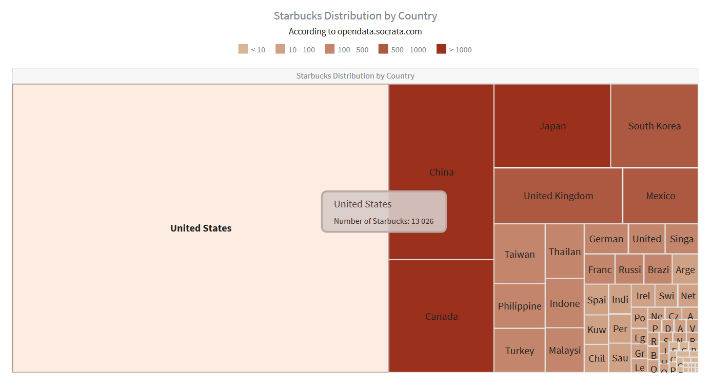
- Starbucks Distribution by Country – In the recent update of AnyChart, we have added TreeMap charts, which are great for showing hierarchical data. This particular interactive JS TreeMap chart (based on data from opendata.socrata.com) allows to compare (at a glance!) the number of Starbucks in different countries. AnyChart 7.10.0 has all the features allowing to create treemap-based solutions: Drill-Down API, Flexible Interactivity Settings, Hint Depth Feature, and smart Labels/Headers display modes. Hierarchical Data Engine allows to add, alter, and search hierarchical data sets.
- Categories: AnyChart Charting Component, HTML5, JavaScript, News
- No Comments »


