Pre-Election Data in Charts and Analysis — DataViz Weekly
October 30th, 2020 by AnyChart Team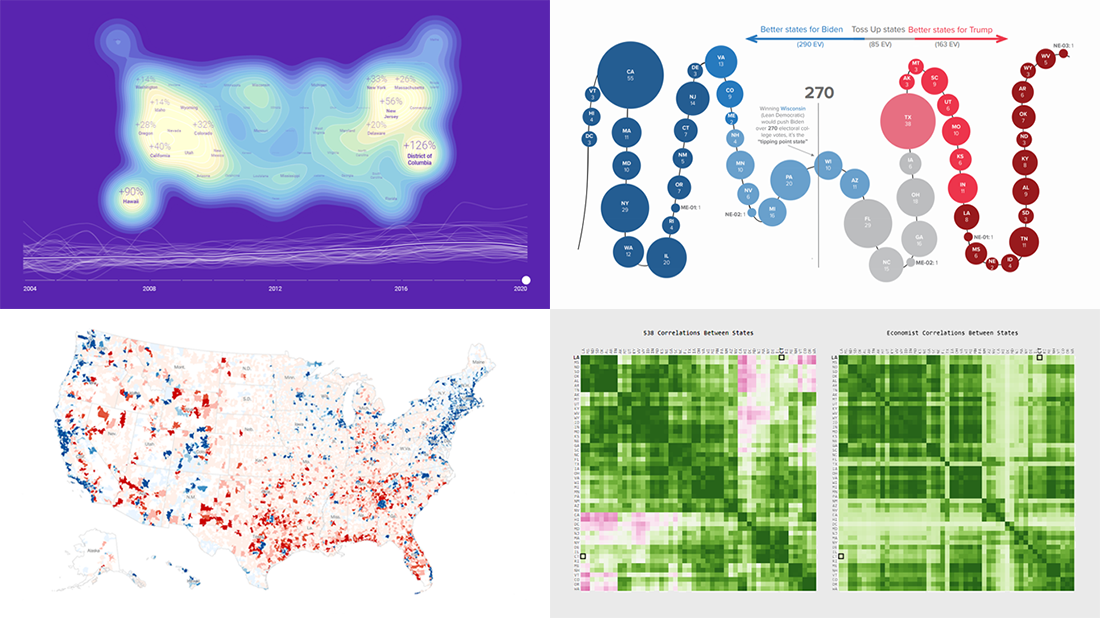 With November 3rd just around the corner, we could not resist the temptation to devote an entire Friday article to the 2020 U.S. election. Indeed, there are many great new data visualization projects on this topic that are worth featuring. Check out some of the most interesting ones in the special pre-election edition of DataViz Weekly:
- Visualizing data about donations to Biden’s and Trump’s campaigns — The New York Times
- Charting the latest Electoral College ratings — The Cook Political Report
- Exploring election forecast correlations — Adam Pearce
- Analyzing search interest in the U.S. election years since 2004 — Truth & Beauty
- Categories: Data Visualization Weekly
- No Comments »
Flippity Uses AnyChart in Word Cloud Visualization Tool
October 26th, 2020 by AnyChart Team
While thousands of companies choose AnyChart to operate interactive data visualization in commercial projects, we are especially proud our charting solutions have been put for good use in education. Here’s a great new case, for example.
Have you heard about Flippity? It is a fascinating free web project providing teachers (and students) with an extremely straightforward way to turn Google Sheets’ spreadsheets into something cool and useful in the education process — flashcards, quizzes, games, timelines, leaderboards, random name pickers, progress indicators, and many other online things. Earlier this year, Flippity added a dedicated tool to create a Word Cloud from a Google spreadsheet, and we are excited it is powered by our JavaScript charting library!
To learn and tell you more about Flippity and their experience using AnyChart JS for data visualization, we had a quick talk with Steve Fortna, a school teacher from Massachusetts and the creator of Flippity. Check out the interview! (Stack: HTML/Google Sheets.)
- Categories: AnyChart Charting Component, HTML5, JavaScript, Success Stories
- No Comments »
Exploring Data About COVID-19, Road Curvature & U.S. Elections — DataViz Weekly
October 23rd, 2020 by AnyChart Team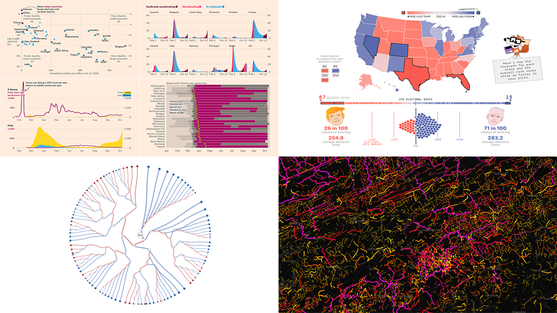 Meet a set of new amazing visualizations we’ve spotted and admired lately. Below is a list of the projects featured today on DataViz Weekly. Keep reading to learn about each and then check them out right away.
- Global COVID-19 crisis in data — FT
- Twisty roads worldwide — Adam Franco
- Ways Biden or Trump could win — FiveThirtyEight
- Electoral College Decision Tree — Kerry Rodden
- Categories: Data Visualization Weekly
- No Comments »
New Stunning Data Graphics Projects Not to Miss — DataViz Weekly
October 16th, 2020 by AnyChart Team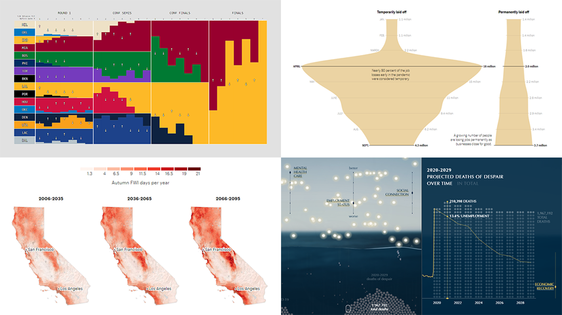 We know DataViz Weekly is read on a regular basis by data visualization practitioners from many countries, and we are happy you guys find it interesting and helpful. Are you ready for another bunch of new great data graphics projects worth looking at? There you go:
- NBA playoff win probabilities — Adam Pearce
- Fall fire weather days in California by the century’s end — ProPublica
- U.S. unemployment crisis shapes — NYT
- Deaths of despair in America — Periscopic
- Categories: Data Visualization Weekly
- No Comments »
Fresh Examples of Data Visualization Best Practices in Action — DataViz Weekly
October 9th, 2020 by AnyChart Team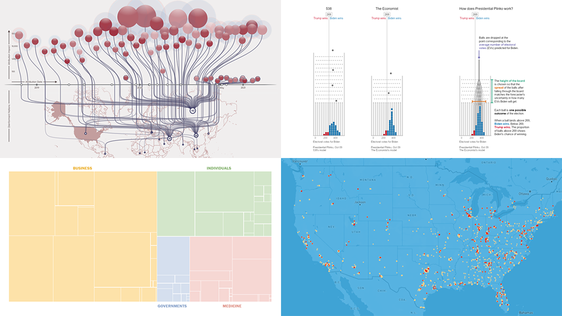 DataViz Weekly is here featuring a selection of new compelling projects with awesome charts and maps. Check out some of the coolest fresh examples of data visualization best practices in action!
- $4 trillion coronavirus bailout under the microscope — The Washington Post
- Presidential Plinko — Matthew Kay, Northwestern University
- Allegations of foreign interference in the 2020 U.S. election — DFRLab
- American streets named after athletes — ESPN
- Categories: Data Visualization Weekly
- No Comments »
Feel Power of Data Visualization in Four New Examples — DataViz Weekly
October 2nd, 2020 by AnyChart Team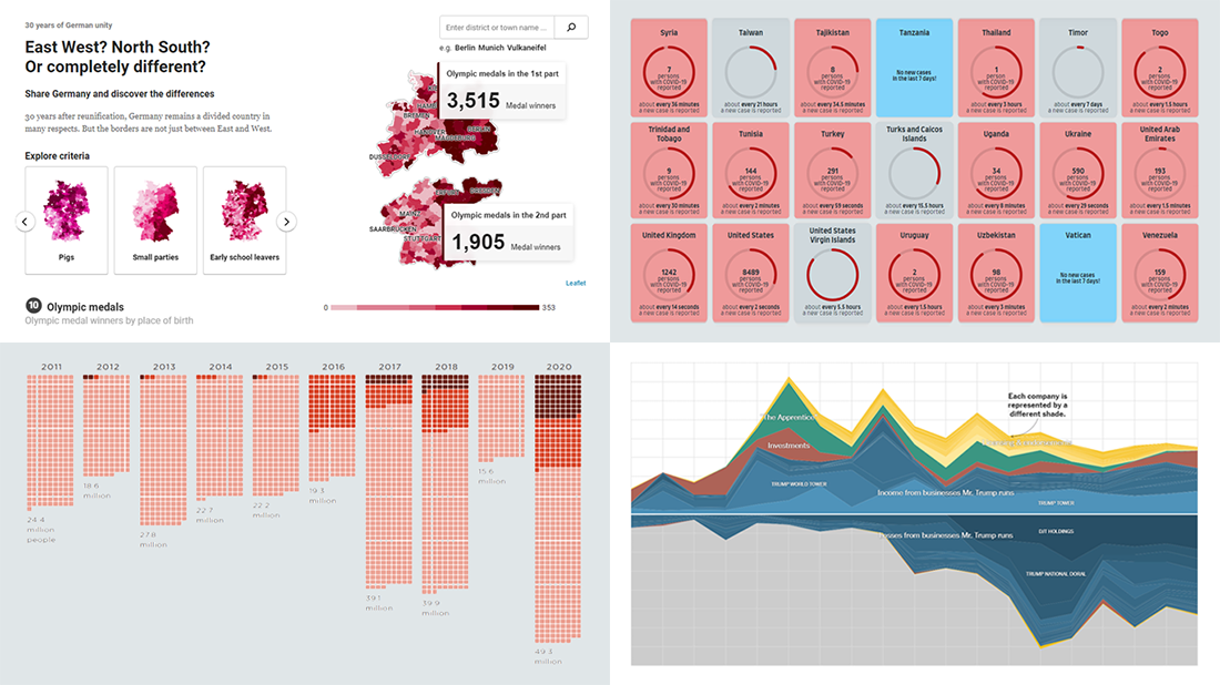 We’ve curated another four new wonderful examples from around the web that greatly illustrate the power of data visualization in action. Meet them straight away, on DataViz Weekly!
- COVID-19 spreading rates by country — Jan Willem Tulp
- Two decades of Trump’s finances — The New York Times
- Dangerous air pollution in the record wildfire season in the Western U.S. — NPR
- Germany divided — Berliner Morgenpost
- Categories: Data Visualization Weekly
- No Comments »