 We’ve curated another four new wonderful examples from around the web that greatly illustrate the power of data visualization in action. Meet them straight away, on DataViz Weekly!
- COVID-19 spreading rates by country — Jan Willem Tulp
- Two decades of Trump’s finances — The New York Times
- Dangerous air pollution in the record wildfire season in the Western U.S. — NPR
- Germany divided — Berliner Morgenpost
Data Visualization Weekly: September 25, 2020 — October 2, 2020
COVID-19 Spreading Rates by Country
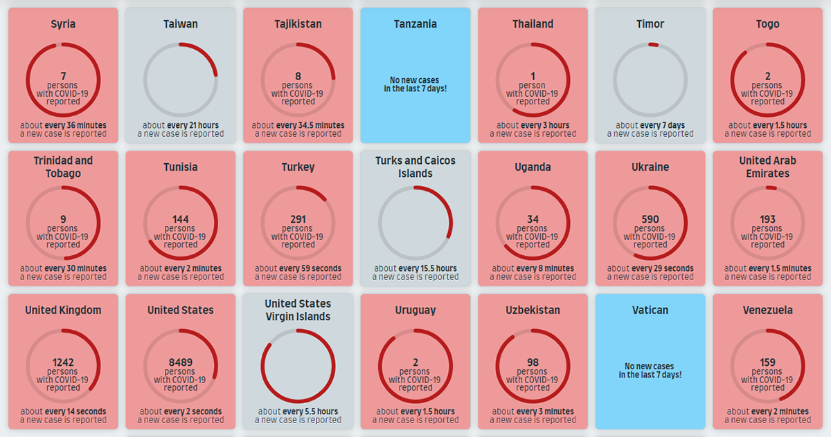
COVID-19 keeps spreading in all parts of the world. How fast? Jan Willem Tulp made a facinating dynamic visualization that shows the spreading rates for all countries at a glance and lets you literally feel the speed of it all.
Always loading the latest pandemic data from Our World in Data, the project provides an intuitive sense of the current rates across the globe in near real time. To put it precisely, it displays how much time it takes for a new COVID-19 case to be reported in each country, in an animated simulation. While you are watching the page and if the sound on your device is on, you also hear a ding notification as another case is confirmed somewhere based on the current averages.
Looks stunning and terrifying, at the same time.
Two Decades of Trump’s Finances
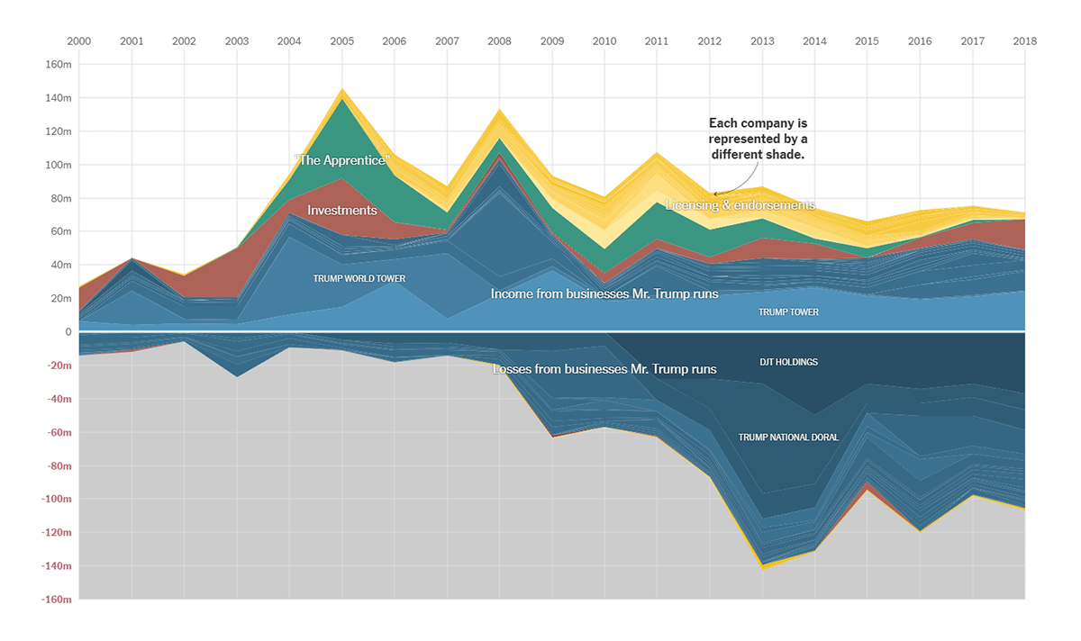
Recently, The New York Times obtained more than twenty years of tax records on Donald Trump. According to the newspaper’s report, called by the U.S. president as “fake news,” he had paid $750 in federal income taxes in 2017, $750 in 2016, and $0 — that’s right, nothing at all — in ten of the preceding fifteen years due to reported heavy losses. To facilitate the exploration of Trump’s tax information, NYT visualized it in a time series graph.
The story starts with an area chart representing the total net income of Donald Trump that he earned in 2000-2018 for playing a tycoon executive on “The Apprentice,” an American reality show. More values stack on top of the initial series as you scroll: endorsement and licensing deals, investments, and own companies’ profits. Then losses appear below the X axis, revealing that, according to the data, his businesses are significantly bigger losers than winners.
Keep scrolling down the piece to look into further details within the same visual form.
Dangerous Air Pollution in Record Wildfire Season in Western U.S.
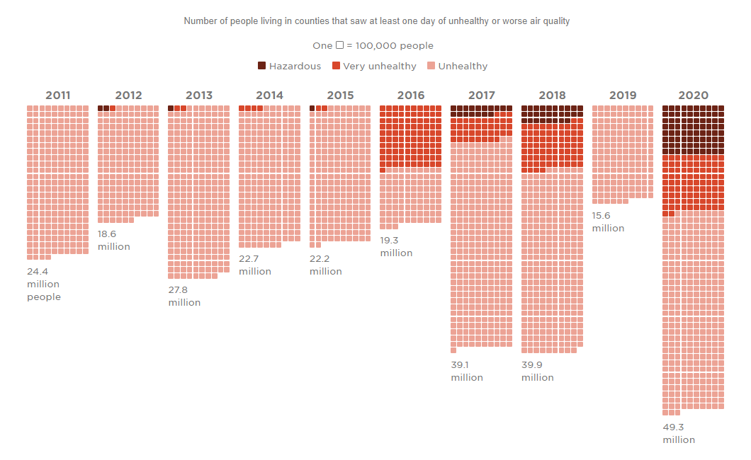
Wildfires have been an extremely concerning issue this year in the U.S., especially in the Western states. According to an NPR analysis of air quality data from the Environmental Protection Agency, about 50 million Americans in California, Oregon, and Washington have experienced unhealthy air in 2020. With this overwhelming number, the current year has already become the worst ever on record.
To look ino what the data has to say, check out NPR’s visualizations. In particular, there’s one graphically representing the number of Americans living in counties that breathed air of unhealthy quality on at least one day during the year in 2011-2020. Then you can see how many counties experienced longer periods of so-called “very unhealthy” air. Finally, it is possible to explore the daily PM2.5 air quality index for individual counties in Washington, Oregon, and California in late August through late September this year.
The immediate health impacts of the heaviest wildfire smoke season in history are known and obvious. The long-term effects are yet to be studied.
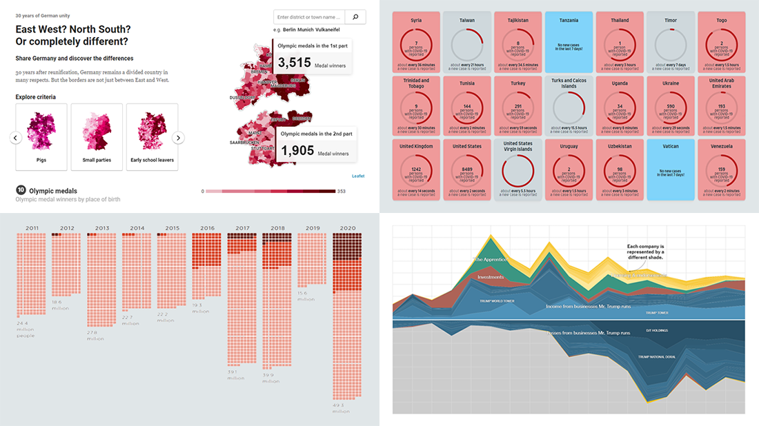
Germany Divided
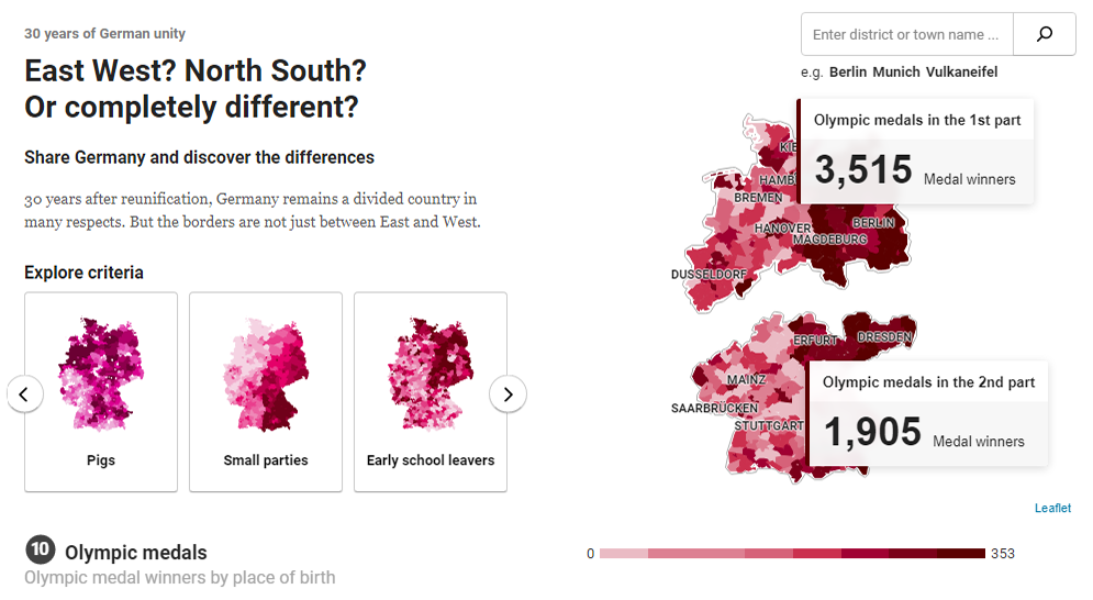
On October 3, 1990, Germany was officially reunited. On the occasion of the anniversary, Berliner Morgenpost published a peculiar interactive map showing that despite thirty years of unity, the country is still divided. The borders, however, are not only between West and East.
There, you can draw a line anywhere with the help of virtual scissors and in this way divide Germany into two parts. Then it’s easy to compare the resulting sections by various metrics, from life expectancy, workload, and gender pay gap, to pigs per capita, Olympic medals, and graffiti. Hover over districts and towns to see precise numbers for the corresponding area.
Looks great to discover the differences (and similarities) across Germany in a stunning visual way.
***
Every week, we curate and share with you a selection of new cool data visualization projects from all over the web. Don’t miss a piece! Stay tuned.
- Categories: Data Visualization Weekly
- No Comments »