 With November 3rd just around the corner, we could not resist the temptation to devote an entire Friday article to the 2020 U.S. election. Indeed, there are many great new data visualization projects on this topic that are worth featuring. Check out some of the most interesting ones in the special pre-election edition of DataViz Weekly:
- Visualizing data about donations to Biden’s and Trump’s campaigns — The New York Times
- Charting the latest Electoral College ratings — The Cook Political Report
- Exploring election forecast correlations — Adam Pearce
- Analyzing search interest in the U.S. election years since 2004 — Truth & Beauty
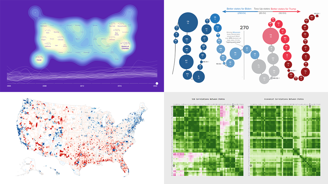
Pre-Election Charts in Data Visualization Weekly: October 23, 2020 — October 30, 2020
Visualizing U.S. Presidential Campaign Donations Data
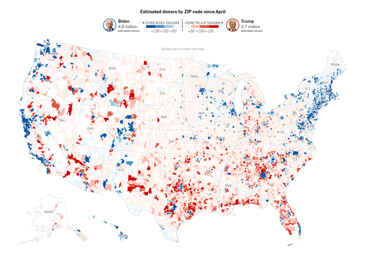
Joe Biden won the presidential race! But (yet?) only in donations. That’s according to a recent New York Times analysis of the Federal Election Commission’s data on fundraising from April to October.
The newspaper mapped out the data showing where the most campaign donations for the two key candidates have come from and matched it with known demographic statistics, revealing quite a clear divide into two different Americas across the entire country. The figures show in particular that the largest gap in campaign donations belongs to areas with a median household income of $100,000 or more where Biden raised almost three times more than Trump, $486 million against only $167 million. From lower-income ZIP codes, both received about the same amounts, $581 million and $565 million respectively.
The data also reveals that when it comes to the direction of presidential donations, in addition to income, education level is another important determinant. Areas where 65% or more people have a college degree generated $478 million for Biden’s campaign, which is almost five times more than the $104 million total for Trump. In less educated ZIP codes, Trump is $39 million ahead, $630 million against $591 million.
Look at the charts and maps on NYT and find out even more on what this year’s presidential election fundraising data has to say.
Charting Latest Ratings from Cook Political Report
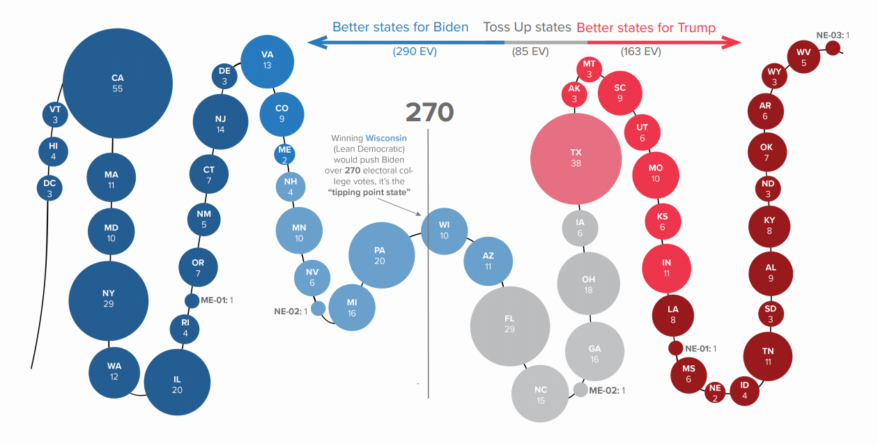
But what about the election itself? Who is winning? The latest 2020 Electoral College ratings from the Cook Political Report show Biden’s chances are higher this fall, and you can see the details represented in two different visualizations.
The first chart, pictured above, displays all states (and the District of Columbia) in a sequence according to how much likely they will vote for Joe Biden or Donald Trump, arranged from the most Democratic and best for the former to the most Republican and best for the latter. The circle size corresponds to the number of votes in the Electoral College.
The graphic shows that to win the presidency, it will be enough for Biden to hold all Solid, Likely, and Lean Democratic states (as rated by the Cook Political Report). Whereas Trump will need not only all Solid, Likely, and Lean Republican states but also Toss Up plus as many as at least twenty-two Lean Democratic votes.
The second visualization shows the same data in the form of two jars with Toss Ups states in between, providing another intuitive view for a quick analysis. Check it out on the Cook Political Report website.
Exploring Election Forecast Correlations
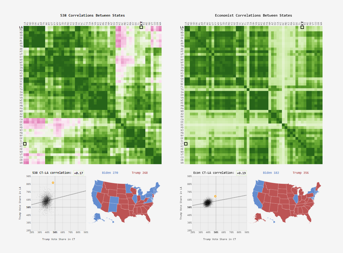
Data and statistics nerds could well be especially delighted with a new work by Adam Pearce. Inspired by Andrew Gelman’s reverse engineering of FiveThirtyEight’s presidential election forecast and exploration of correlations in Trump’s vote share between some states in pairs, he decided to take it from there and go further.
Adam visualized all pairwise correlations like that between states. Moreover, he took the same investigative look into not only FiveThirtyEight’s model but also The Economist’s one.
Explore the awesome synchronized heatmaps, scatter charts, and choropleth maps to analyze the voting patterns in detail. Then look how Trump’s vote share in each state differs between the two models. Very interesting.
Analyzing Search Interest in U.S. Election Years, 2004-2020
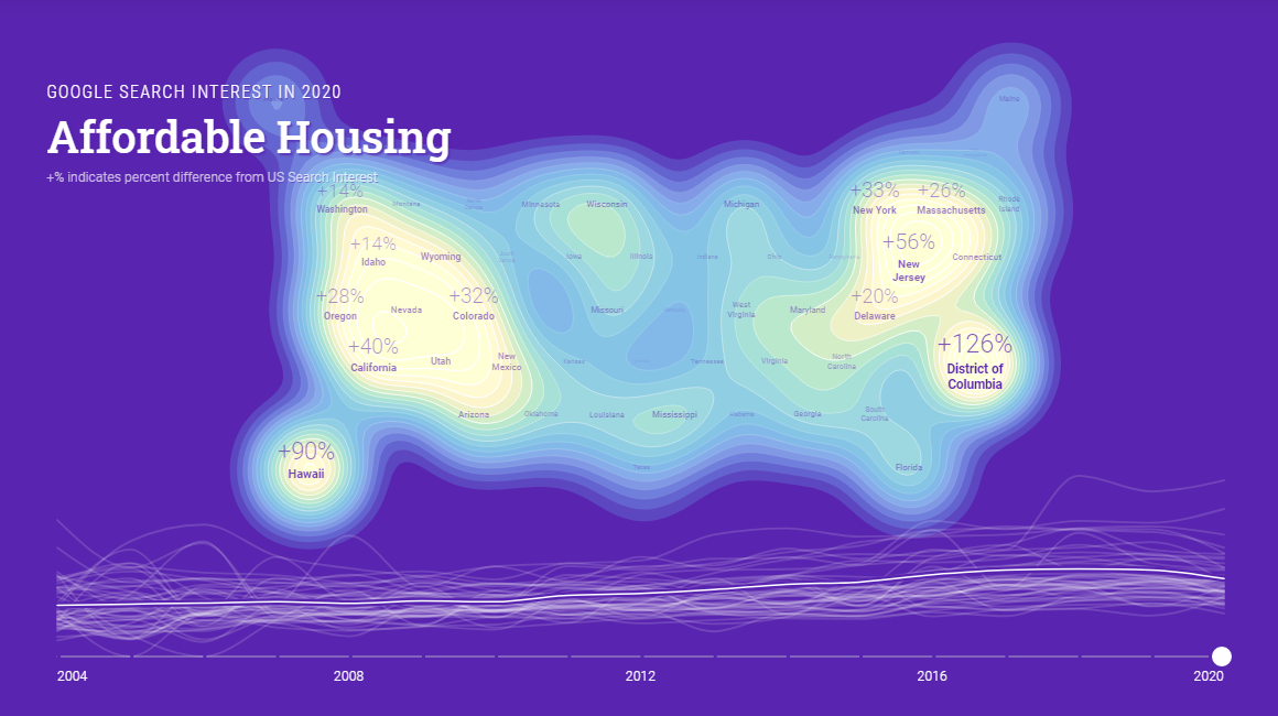
Fundamentally, election results are closely linked to how well the candidates understand (and express their understanding of) the interests and concerns of the electorate. What interests? What concerns? How do they differ over time and across the nation? You can find answers to these and other questions on that in a new stunning data visualization project, a collaboration between Google News Initiative and Truth & Beauty.
Titled “Waves of Interest,” the project builds on Google search data to reveal what issues have attracted the attention of American people during election years, from 2004 to 2020, as well as what shifts have taken place within and between the cycles. All that is graphically represented in beautiful interactive charts.
Scroll down to explore geographical trends in search behavior and their change over the election seasons since 2004, in a cool interactive map accompanied by a timeline and a list of topics. Hover and click around to see more details and switch focus. You can learn more about Waves of Interest here and read how it was created here.
***
Four days left before Election Day…
We wish you a wonderful time. Stay tuned for the most interesting data visualizations — we will continue to tell you about new projects within the framework of our weekly blog.
- Categories: Data Visualization Weekly
- No Comments »