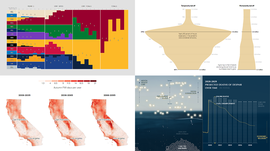
 We know DataViz Weekly is read on a regular basis by data visualization practitioners from many countries, and we are happy you guys find it interesting and helpful. Are you ready for another bunch of new great data graphics projects worth looking at? There you go:
- NBA playoff win probabilities — Adam Pearce
- Fall fire weather days in California by the century’s end — ProPublica
- U.S. unemployment crisis shapes — NYT
- Deaths of despair in America — Periscopic
Data Visualization Weekly: October 9, 2020 — October 16, 2020
NBA Playoff Win Probabilities
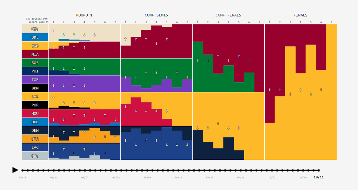
The Los Angeles Lakers are back to the top of the North American basketball. Last Sunday, the Lakers won their seventeenth NBA championship overall in league history and the first title in ten years. Now, it is interesting to look back at the expert forecasts.
FiveThirtyEight, famous for their statistical model-based predictions, used to publish win probabilities for every playoff round, updating teams’ chances after each game. Now, Adam Pearce greatly represented those changes throughout the tournament in an animated visualization. In addition, he aggregated all playoff probabilities in a separate graphic showing how each team’s chances of winning the NBA championship changed over the course of the 2020 playoffs.
Observe the win probability shifts game by game, from Round 1 to the Finals.
Fall Fire Weather Days in California by Century’s End
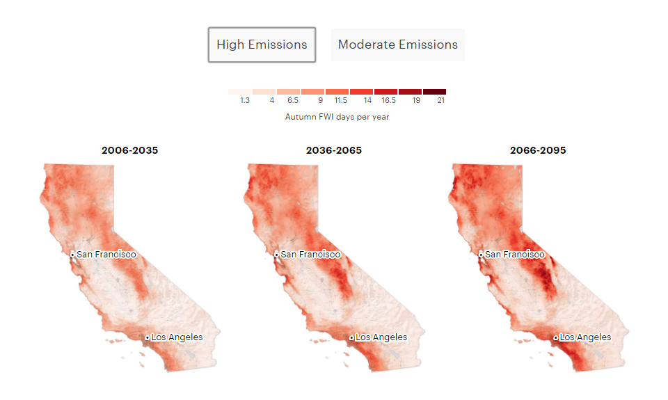
This wildfire season in California is already known as the worst ever on record. But the future can hardly bring relief. A new research shows that climate change is going to further aggravate the fire situation in the fall time. In particular, scientists say, California can expect 40% more days of extreme fire weather conditions by 2065 and twice the current number by the end of this century, at least in some areas. That is when even a very small fire from a spark can instantly grow into a sort of inferno.
ProPublica, namely Al Shaw and Elizabeth Weil, looked into the findings of this research and summarized what has been going on with the wildfires in California and what to expect in the future, in a special visual piece. It starts with a scrollytelling part. Next goes a picture allowing you to see at a glance the average annual number of fall fire weather days across the state in 2006-2035, 2036-2065, and 2066-2095, for two basic emissions scenarios. Then you can take a closer look at the predicted increase for every place in California.
Explore how global warming is going to make California’s wildfire problem even worse within the next years.
U.S. Unemployment Crisis Shapes
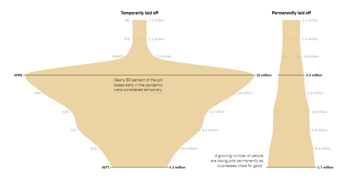
According to the Bureau of Labor Statistics, less than seven million Americans did not have a job just before the pandemic. In April, unemployment in the United States surged to 23 million people; about a half of them returned to work by September. These leaps in data over time appear to look great and informative when visualized in area chart-based, vase-like shapes that also facilitate looking beyond the overall figures.
Ella Koeze from The New York Times made such visuals for the U.S. unemployment in January through September 2020. Shapes nicely show several categories within the total number of unemployed people and enable intuitive side-by-side comparisons.
Check out the shapes of the crisis: “Total unemployed,” “Temporarily laid off,” “Permanently laid off,” and “Not in labor force but want a job” (and “… of those, people not seeking work because of family or transportation reasons”).
Deaths of Despair in America
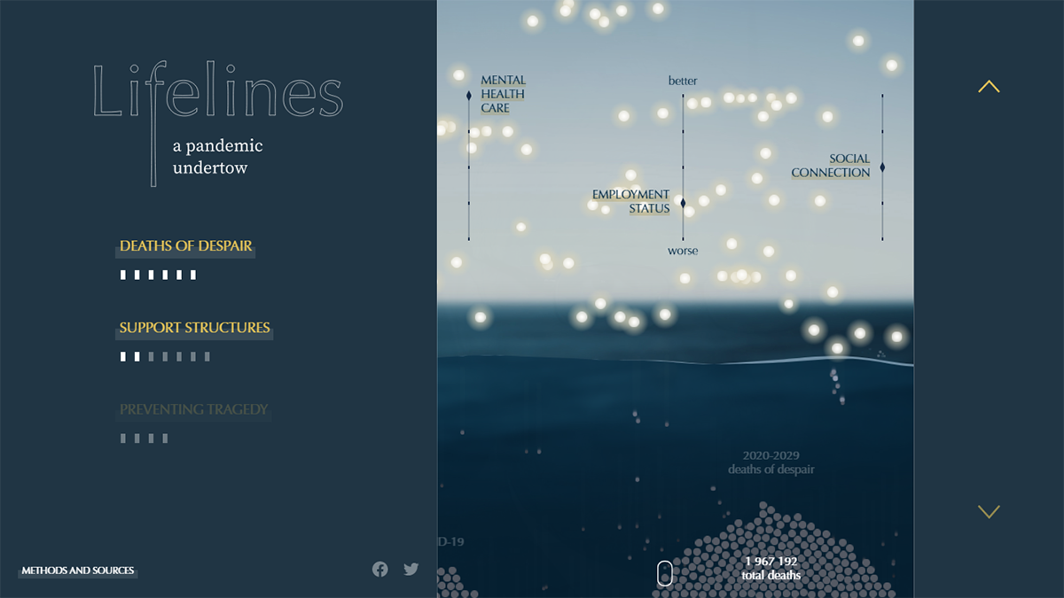
More than 200,000 Americans have already died after getting infected by the novel coronavirus. However, those are far from the only victims of the pandemic. In 2007-2018, 1.6 million Americans died from despair, and this amount is predicted by experts to reach two million in 2020-2029 due to the COVID-19 crisis that leaves people with mental health and addiction problems without proper care, and instead, with additional stress caused by the pandemic and measures taken to address it.
Periscopic, a data visualization firm, made an impressive interactive project aiming to attract attention of a wide audience to this issue. Based on research by Well Being Trust and the Robert Graham Center, its specialists graphically represented the projected deaths from despair and three main support structures which must improve in order to help those at risk. Human lives are shown as lights that fly above the water, and as you change the levels of mental health care, employment status, and social connection, they either stay there or sink to the bottom. Try and see how important these structures are in saving lives.
There’s actually even more to investigate. A picture is worth a thousand words, as we all know, and this is especially the case here. Check out the Lifelines project by Periscopic.
***
Stay tuned for the best data visualization stuff curated from around the web — DataViz Weekly!
- Categories: Data Visualization Weekly
- No Comments »