 Our Qlik Charts Extension now allows a custom renderer to be set for certain chart types! We’ll show you how to make use of this new great feature in your Qlik data visualization practice, implementing custom drawing over a custom theme.
Before we begin, please note: We recommend getting acquainted with the custom drawing documentation of AnyChart JS Charts if you never worked with it before. When you do that, it will be easier for you to understand what the custom drawing functions are and how to use them right and best.
Custom Renderer Overview
Setting up a custom renderer became possible thanks to the updates we pushed live to the AnyChart JavaScript charting library and our Qlik Sense extension last year. It works for all the basic chart types, pie charts, and gauge charts’ bar pointer.
The main thing to note is that the code of a custom renderer is placed in a custom theme, where one can also change any other settings such as palette, background color, font, and so on.
The code of any theme starts with the following pattern:
/** customTheme */
(function(root) {
  root['anychart'] = root['anychart'] || {};
  root['anychart']['themes'] = root['anychart']['themes'] || {};
  root['anychart']['themes']['customTheme'] = {};
})(this);
In the code above, customTheme is the name of a custom theme. All the other settings are in the object which is empty now.
Setting Up Custom Renderer for Advanced Qlik Data Visualization
(1) Palette and Default Background Color
First of all, add a palette and a default background color to be applied to all the charts.
{
    'palette': {
      'type': 'distinct',
      'items': ['#779868', '#c8eca3', '#e5d6c9', '#a39387', '#4e4e4f']
    },
    'defaultBackground': {
      'fill': '#283b6e',
      'stroke': '#9da5bc',
      'cornerType': 'round',
      'corners': 0
    },
}
Now, let’s see how to make it work for several chart types.
(2) Custom Renderer for Column Chart
For example, here’s how to add a custom renderer for the column series type. This particular drawer will be used by all the basic charts with a column series, making corners of all the columns rounded like this:
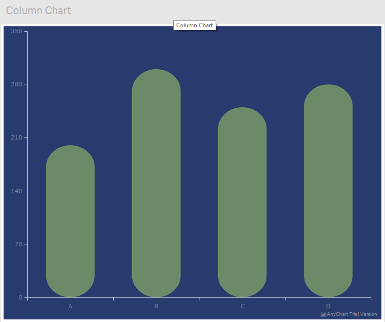
To achieve this result in your Qlik data visualization, we need to include the following custom drawing function:
'cartesianBase': {
      'defaultSeriesSettings': {
        'column': {
          'rendering': {
            'point': function() {
              // if missing (not correct data), then skipping this point drawing
              if (this['missing']) {
                return;
              }

              // get shapes group
              var shapes = this['shapes'] || this['getShapesGroup'](this['pointState']);

	  // if the thickness is set, then use it; if no, use the default =1.5
              var strokeThickness = this['series']['stroke']();
              if (strokeThickness['thickness']) {
                strokeThickness = strokeThickness['thickness'];
              } else {
                strokeThickness = 1.5;
              }
              var halfStrokeThick = strokeThickness / 2;

          // find the coordinates needed for custom drawing

              // calculate the half of the point width
              var rx = this['pointWidth'] / 2;
              var diff = 5;
              var ry = this['pointWidth'] / 2;
              // calculate the left value of the X-axis
              var leftX = this['x'] - rx;
              // calculate the right value of the X-axis
              var rightX = this['x'] + rx;
              var pointHeight = this['zero'] - this['value'];
              var zero = this['zero'];
              var value = this['value'];
              var x = this['x'];

	    // if the column is above xAxis and its height is bigger than 2 ry
              if (value <= zero && pointHeight >= 2 * (ry - diff)) {
                shapes['path']
                // resets all 'line' operations
                  .clear()
                  .moveTo(leftX, zero - ry + diff - halfStrokeThick)
                  .lineTo(leftX, value + ry - diff + halfStrokeThick)
                  ['circularArc'](x, value + ry - diff + halfStrokeThick, rx, ry - diff, 180, 180)
                  .lineTo(rightX, zero - ry + diff - halfStrokeThick)
                  ['circularArc'](x, zero - ry + diff - halfStrokeThick, rx, ry - diff, 0, 180)
                  .close();
              }

           // if the column is above xAxis and its height is smaller than 2 ry
              if (value <= zero && pointHeight < 2 * (ry - diff)) { ry = pointHeight / 2; shapes['path'] .clear() ['circularArc'](x, value + ry, rx, ry - halfStrokeThick, 180, 180) ['circularArc'](x, zero - ry, rx, ry - halfStrokeThick, 0, 180); } // if the column is below xAxis and its height is bigger than 2 ry if (value > zero && Math.abs(pointHeight) >= 2 * (ry - diff)) {
                shapes['path']
                  .clear()
                  .moveTo(leftX, zero - ry + diff - halfStrokeThick)
                  ['circularArc'](x, value - ry + diff - halfStrokeThick, rx, ry - diff, 0, 180)
                  .lineTo(leftX, zero + ry - diff + halfStrokeThick)
                  ['circularArc'](x, zero + ry - diff + halfStrokeThick, rx, ry - diff, 180, 180)
                  .lineTo(rightX, value - ry + diff - halfStrokeThick)
                  .close();
              }

          // if the column is below xAxis and its height is smaller than 2 ry
              if (value > zero && Math.abs(pointHeight) < 2 * (ry - diff)) {
                ry = Math.abs(pointHeight) / 2;
                shapes['path']
                  .clear()
                  ['circularArc'](x, value - ry, rx, ry - halfStrokeThick, 180, -180)
                  ['circularArc'](x, zero + ry, rx, ry - halfStrokeThick, 0, -180);
              }
            }
          }
        }
      }
    }
That might seem complex at first. But when you look closer, that’s a simple work with the AnyChart Graphics Engine.
For any other basic chart series, the code starts with the same lines. For an area series, for example, it should be:
'area': {
 'rendering': {
   'point': function() {}
 }
}
(3) Custom Renderer for Pie Chart
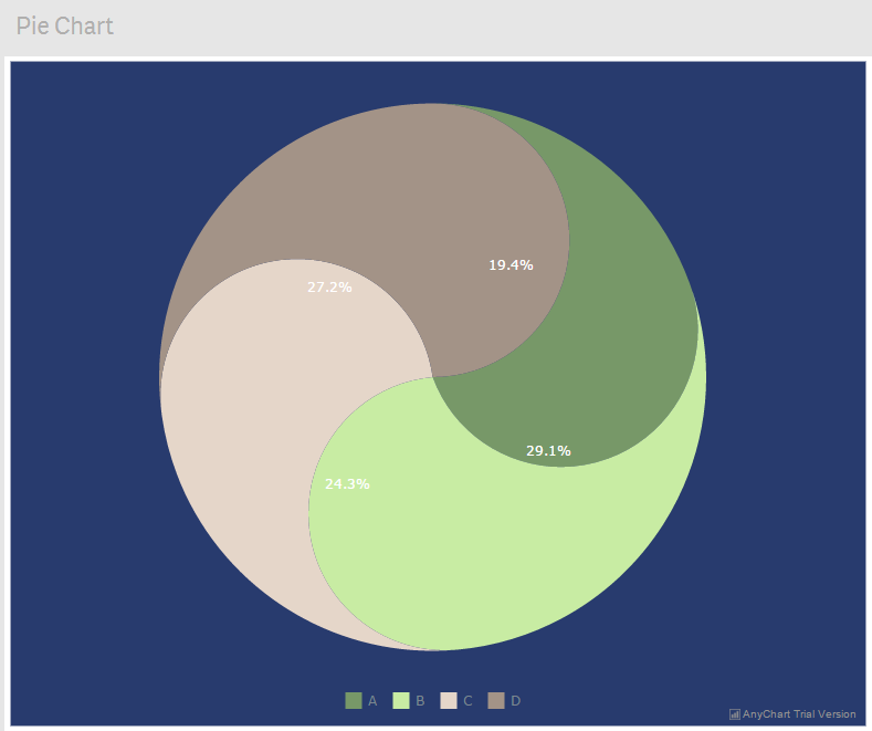
The same technique can be applied to a pie chart. It’s a single-series chart, so its API is a bit different from a multi-series one. A pie with a custom renderer is shown in the picture below. You can find the code for this renderer in the custom AnyChart theme file.
(4) Custom Renderer for Gauge Chart
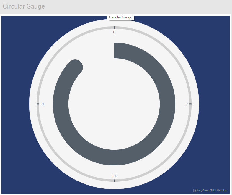
And it works fine just like that for gauges too. The picture below shows a sample custom drawing in a circular gauge. You can find the code for this renderer in the custom AnyChart theme file.
For each chart type, the approach is the same.
If you want to achieve something you can’t do, please reach out to our Support Team and we will be happy to help.
Custom Theme Usage
The custom theme code for the charts shown above can be downloaded here: AnyChart Sample Custom Theme.
To add a custom theme to the AnyChart Qlik Extension, edit the file at ..\Users\\Documents\Qlik\Sense\Extensions\AnyChart-Qlik\lib\themes-combined.js by putting the code of your custom theme at the end.
To use the theme by default in the future, edit the config.js file at ..\Users\\Documents\Qlik\Sense\Extensions\AnyChart-Qlik. There is a property with an empty value at the end of the file. Set the name of your custom theme there so it looks: defaultTheme: "customTheme". This name should be the same as the name of the custom theme.
When all this is done, you just need to launch Qlik Sense and you’ll be able to use our Qlik data visualization extension along with the custom rendered charts.
***
The AnyChart Qlik data visualization extension is a powerful tool, and we continue its active development to make it even better. So if you have any questions or more suggestions about how it can be improved, feel free to share. You can send a message to AnyChart Support Team or simply leave a comment below.
Don’t hesitate to ask and suggest. We’re always glad to work with your feedback as it greatly helps us make our products better.
- Categories: AnyChart Charting Component, Business Intelligence, HTML5, News, Qlik, Tips and Tricks
- No Comments »