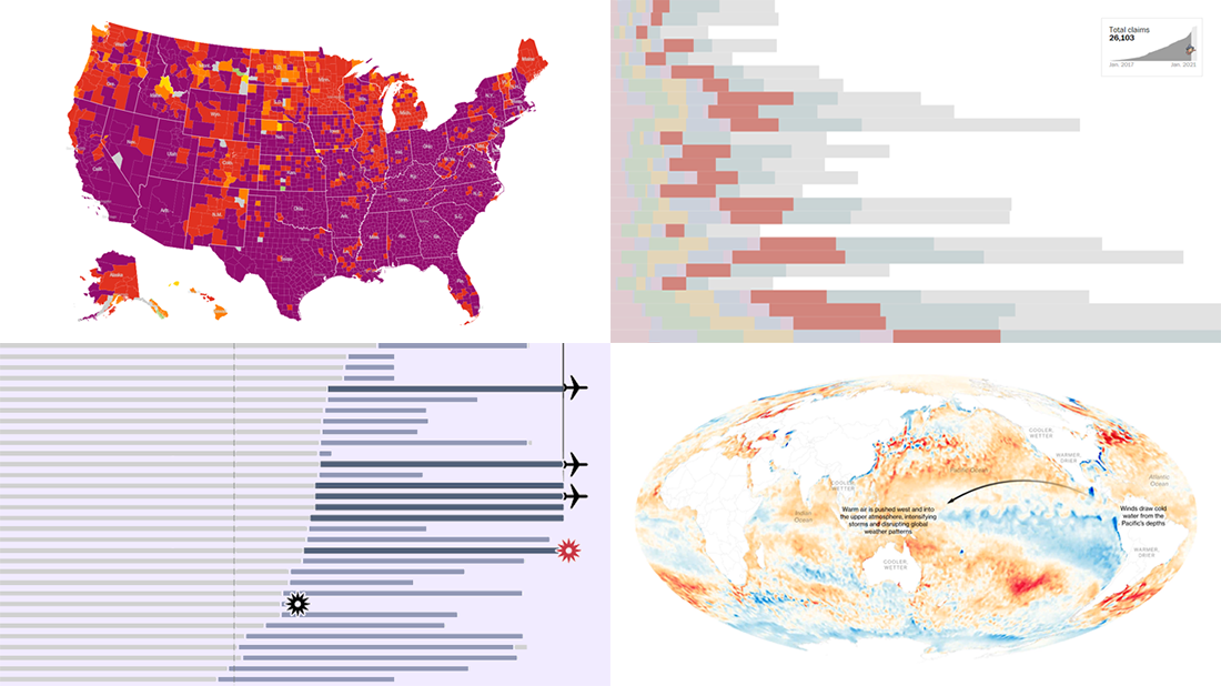
 We continue our weekly blog feature where we show you the best data visualizations we’ve met out there over the past seven days. Here’s our new selection of stunning charts and maps from different creators — check it out! Today on DataViz Weekly:
- La Niña and its impacts — Bloomberg
- Donald Trump’s false and misleading claims while in office — The Washington Post
- COVID-19 risk levels by county — The New York Times
- Sriwijaya Air fleet — Reuters
Data Visualization Weekly: January 22, 2020 — January 29, 2020
La Niña and Its Impacts
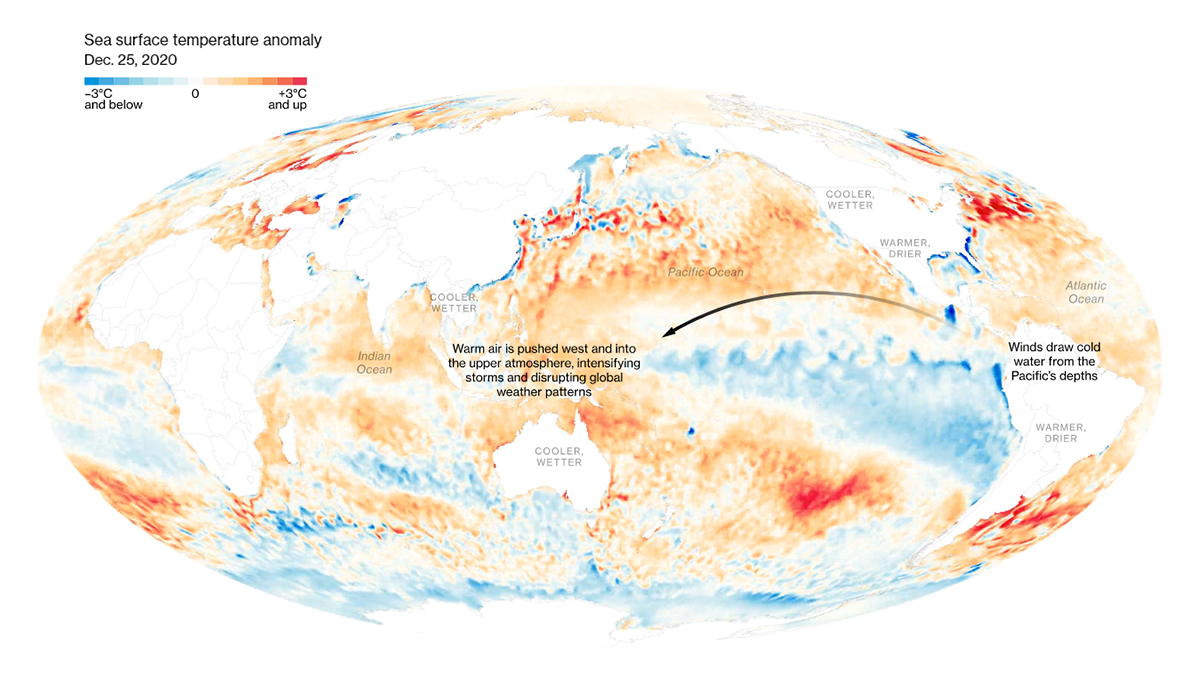
Extreme weather conditions the world experienced last year will not only persist but get worse. The reason is La Niña reaching the peak of its devastating power. Characterized by a large-scale cooling in the equatorial Pacific Ocean, this climate phenomenon shakes weather as well as commodities markets worldwide as it causes severe drought in some regions and flooding in others.
Bloomberg made a compelling attempt to analyze and communicate how La Niña roars. The centerpiece of a dedicated special graphics feature brought by Brian K. Sullivan and Mira Rojanasakul is an animated map visualizing the ocean surface temperature anomaly around the globe over time, from August through December 2020.
After exploring the global patterns, you will be able to take a closer look at some specific impacts of La Niña. For example, hot and dry weather in Argentina and longer rainfalls in Vietnam hit soybean and coffee crops, respectively, making these products’ prices soar. Learn more in new visualizations on the Bloomberg website.
Donald Trump’s False Claims During Four Years in Office
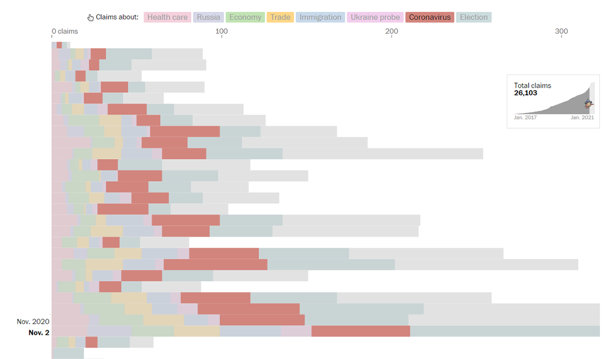
Donald Trump made a total of 30,573 false or misleading claims over the course of his U.S. presidency, or approximately 21 each day on average. At least that’s shown by the final counts of The Washington Post Fact Checker which tracked untruths voiced by Trump during his term at the White House. While you always could explore all those claims right there in the database, a full timeline is now also available.
As you scroll the timeline, you understand how the amount of Trump’s false (and misleading) statements was growing with an ever-accelerating speed, from 6 per day in his first year to 16 per day in the second, to 22 in the third, and 39 per day in the fourth. The claims are represented in stacked bars, one for each day, visualizing a breakdown by topic — highlighted in the timeline are health care, Russia, economy, immigration, coronavirus, and election.
“The longer Trump was president the more frequently he made false or misleading claims,” The Post concludes.
COVID-19 Risk Levels by County
![]()
The risk of getting COVID-19 is currently extremely high in almost the entire United States, according to a recent analysis carried out by The New York Times in collaboration with experts from Johns Hopkins University and the Resolve to Save Lives initiative of Vital Strategies, a global public health company. The research was based on studying the reported number of cases per capita and test positivity data for the past fourteen days, county by county. As a result, COVID-19 risk levels were assigned to (almost) all counties: low, medium, high, very high, or extremely high.
Current risk levels are now represented in an interactive map which looks almost fully purple as of now. To learn more about the COVID-19 situation in a certain county, you can visit its individual page where details are shown in additional visualizations. County-specific advice from experts on how to lower personal risks is also provided.
The project is expected to get updates on a regular basis. So it is another helpful tracker from The Times.
Sriwijaya Air Fleet
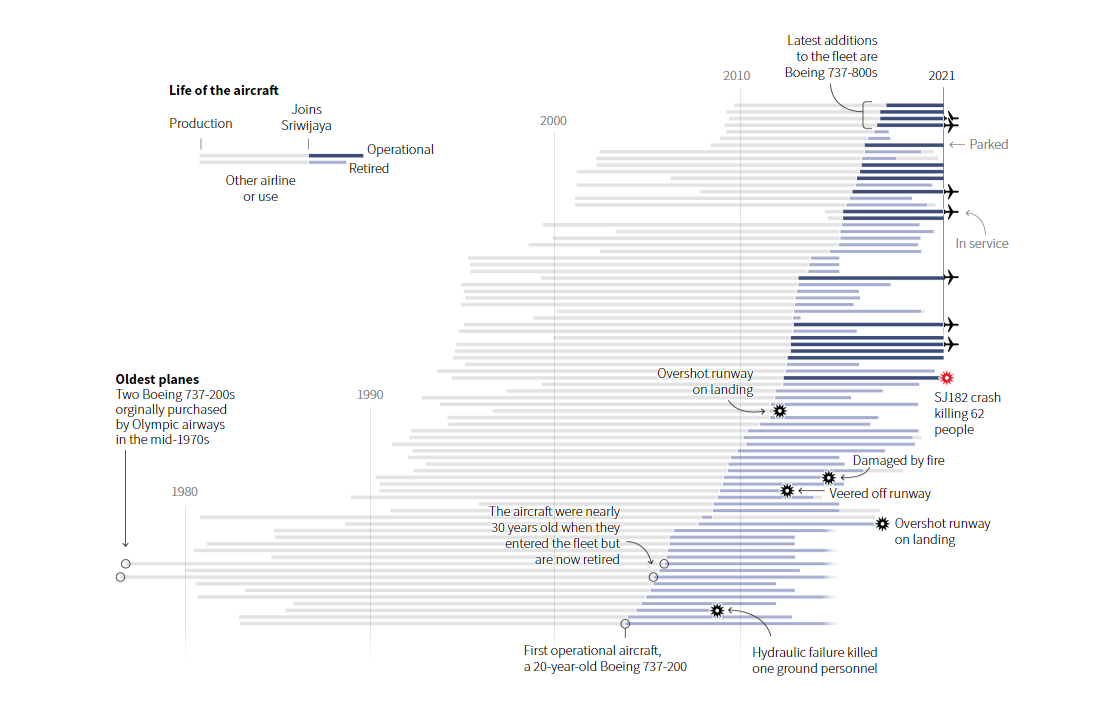
Sriwijaya Air, Indonesia’s #3 airline company, got to the world’s news in early January when its Boeing 737-500 carrying 62 people aboard slammed into the Java Sea off Jakarta. While the investigation into the crash is still ongoing, it was hard to miss the fact that the plane was almost 27 years old. A closer look reveals that employing cheap old aircraft has always been part of the company’s market strategy.
In total, Sriwijaya Air has owned 82 aircrafts. Now, you can see its entire fleet in a new visualization by Reuters, which shows details about the age of each plane at a glance. Each bar is a lifetime of one aircraft, depicting when it was produced, joined Sriwijaya, and retired (if that’s already so). Below the main graphic, you will find charts summarizing the Sriwijaya fleet’s historical breakdown and the average age of other Indonesian airline fleets.
***
We hope you liked these great data visualizations. Stay tuned for more! And whenever you make or find some interesting chart, map, or infographic, please do not hesitate to let us know, so we can consider featuring that work on Data Visualization Weekly.
Have a good time!
- Categories: Data Visualization Weekly
- No Comments »