 We’ve picked another four awesome projects as new data graphic examples to showcase in DataViz Weekly this Friday. Check them out right away as they are definitely worth it:
- Suicides in the Netherlands
- Where Germany is really green
- Temperature change worldwide
- Vulnerability to tornadoes across the United States of America
Data Graphic Projects in Data Visualization Weekly: June 21, 2019 — June 28, 2019
Suicides in the Netherlands

Data visualization designer Sonja Kuijpers used an abstract image to visualize serious data. This nice landscape picture of trees, buildings, sky, and more actually displays suicide data, with each element representing a person who committed suicide in the Netherlands in 2017. The project is based on data from Statistics Netherlands (Centraal Bureau voor de Statistiek, or CBS) and the 113 Suicide Prevention Foundation. For example, trees represent those who died by hanging, buildings — those who jumped from height, and so on. Scroll all the way down the project to see more data visualizations on the subject bringing additional insight.
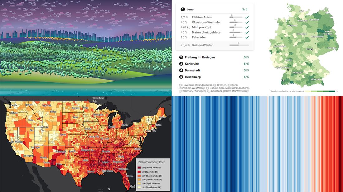
Where Germany Is Really Green
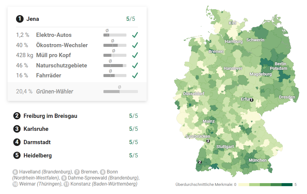
In the latest European Parliament elections, Greens received 20.5% of German votes and became the second most popular political party in Germany. But how green is Germany in terms of economy and lifestyle? Based on various data, Berliner Morgenpost find out what places across the country are really green, looking at household waste, electric cars, green power, natural reserves, and bicycle use. Check out the maps and charts in a special feature.
Temperature Change Worldwide as Stripes

Ed Hawkins, a climate scientist at University of Reading, used stripes to visualize the change in air temperatures around the world over the past hundred years. For this project, he took data from the recently updated Berkeley Earth temperature data set and national meteorological agencies. The picture we’ve included above shows the median temperature data for the entire world. Go ahead and choose any particular location to track the global warming impact on that area.
Vulnerability to Tornadoes in U.S.
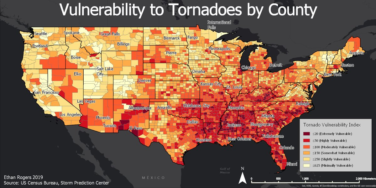
Ethan Rogers, a meteorology student at Penn State University, has been enjoying national attention for a tornado vulnerability index he made for his GIS class. For this project, he worked with data from the National Weather Service and the Census Bureau. In the end, he managed to measure tornado vulnerability for every county in the United States taking into account tornado intensity along with frequency, as well as population density, the amount of mobile homes, and income statistics. Check out the map.
***
Thanks for your attention. Stay tuned for Data Visualization Weekly. We’ll show you more cool data graphic projects next Friday.
- Categories: Data Visualization Weekly
- 1 Comment »