 Take a look at four of the most interesting data visualization projects and stories we have found around the web during the last few days. Here’s what we feature today in DataViz Weekly:
- GBP rate change in the context of Brexit turns
- European Parliament election in the United Kingdom
- Marine Heatwave Tracker
- Evolution of Bob Ross’s famous phrases over all 403 episodes of The Joy of Painting
Data Visualization Weekly: May 31, 2019 — June 7, 2019
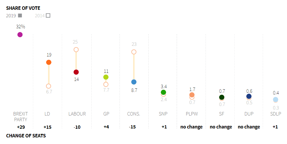
GBP Fluctuations Through Prism of Brexit Turns
Bloomberg’s John Ainger and Sam Dodge offer a look at the ups and downs of the British pound market value over the course of Theresa May’s reign as Prime Minister of the United Kingdom in the context of “the twists and turns of the Brexit process.” See sterling’s peaks and troughs explained, featuring an interesting illustration of what the authors call “May’s turbulent leadership.”
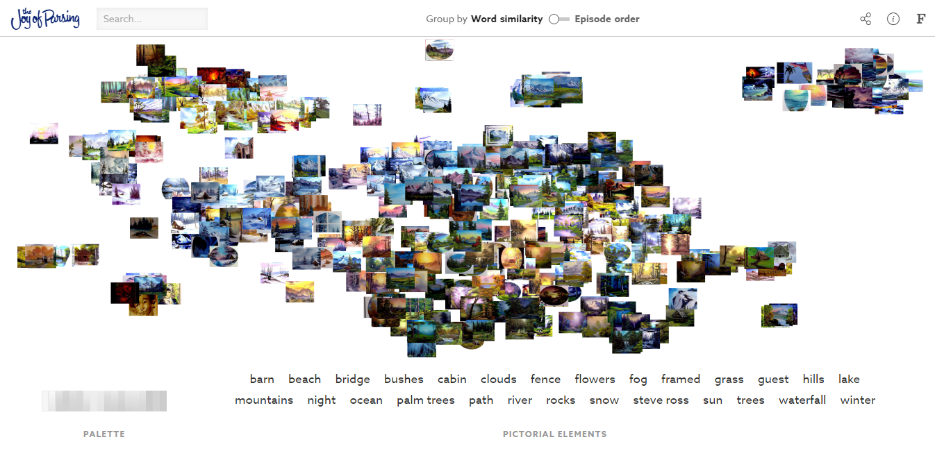
EU Election in Britain
Because Brexit was delayed, the United Kingdom took part in the new European Parliament election in late May. Michael Ovaska and Samuel Granados, graphics editors at Reuters, visually represent the outcome for Britain. Check out how the Brexit Party won, compare the results to the preceding EU election, find out how the voter turnout was different from other votings, and explore how the results look in the context of positions on Brexit and how the new UK seats will shape the European Parliament.
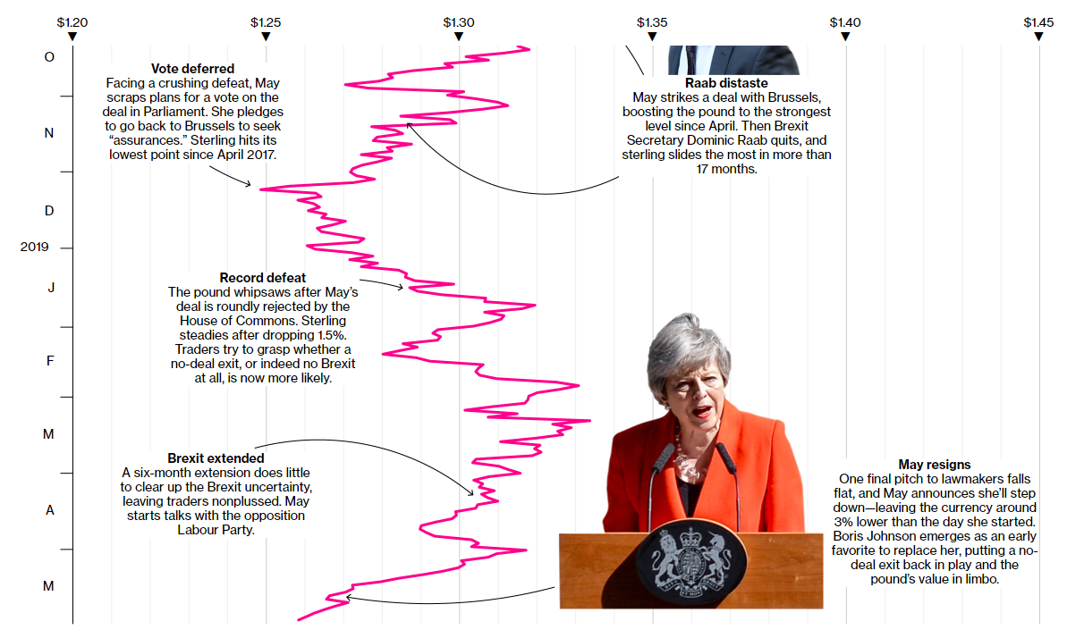
Marine Heatwave Tracker
![]()
Developed by Robert Schlegel, a post-doc researcher in the Department of Oceanography at Canada’s Dalhousie University, within the framework of the Marine Heatwaves International Working Group initiative, the Marine Heatwave Tracker project displays the occurrence of marine heatwaves (MHWs) around the world in about real time. An MHW usually defines when for at least five days in a row the temperature in a certain location is warmer than 90% of the temperatures previously observed in that location during the same time of year. While exploring the map, do not miss out on the opportunity to click a pixel in order to view a time-series chart showing the change of the temperatures in the corresponding location over any time period between present and January 1, 1982.
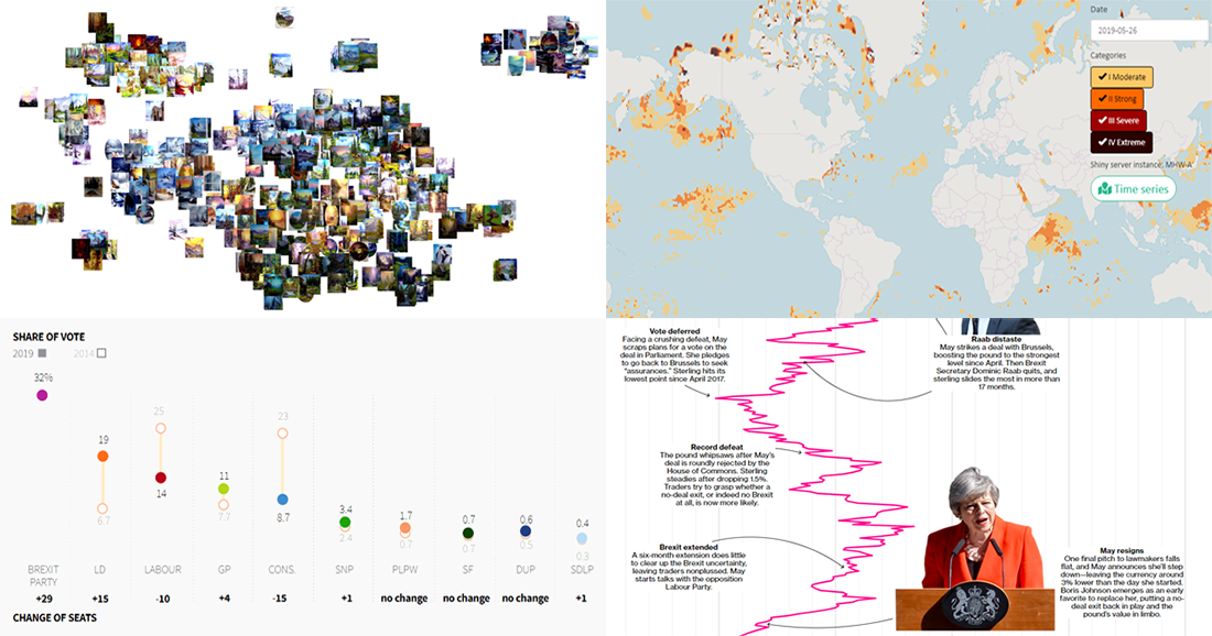
Bob Ross’s Famous Phrases over 403 Episodes of The Joy of Painting
Fathom Information Design created a cool interactive data visualization project that shows how Bob Ross’s famous phrases from the TV show “The Joy of Painting” evolved over 31 seasons (403 episodes). Check out the changes and patterns in them, and do not miss out on playing with filters, by tag and palette type.
***
Enjoy watching and playing with these ones of the most interesting data visualization examples we’ve recently found and checked out. Stay tuned for Data Viz Weekly!
- Categories: Data Visualization Weekly
- No Comments »