 It’s Friday and we’re glad to share with you some of the most interesting third-party visualizations we’ve recently come across. Here’s what DataViz Weekly has for you to check out this time — look at these cool graphics:
- Future of jobs in the regions of Europe — McKinsey Global Institute, Google, et al.
- Flood risk factor database for the United States — First Street Foundation, et al.
- Changes in new cases against testing — Axios
- All we know about SARS-CoV-2 — Scientific American
Cool Graphics in Data Visualization Weekly: July 3, 2020 — July 10, 2020
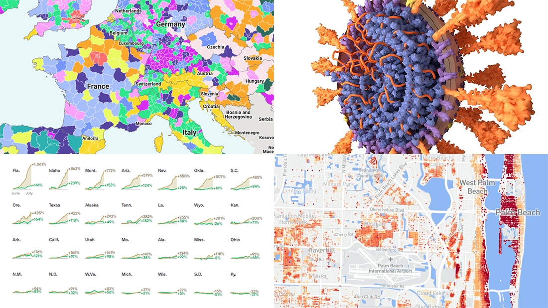
Future of Jobs in Europe
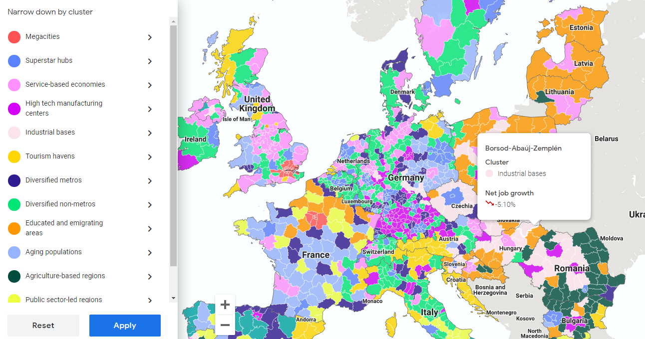
McKinsey Global Institute conducted a new in-depth research into the future of work across Europe. Analyzing local labor markets reported to have experienced about a decade of growth before the pandemic, the study looks at how the geography of employment is being influenced by automation and other significant factors. In particular, the experts identified thirteen types of regional clusters further fitting into three groups:
- dynamic growth hubs (megacities, superstar hubs, and service-based economies),
- stable economies (high tech manufacturing centers, diversified non-metros, and tourism havens), and
- shrinking regions (industrial bases, aging population regions, educated and emigrating areas, agriculture-based regions, public sector lead regions, and trailing opportunity regions).
Google, one of MGI’s collaborators on this research, displayed the model on an interactive map. Open the visualization and you’ll see, according to this methodology, what cluster each one of the 1,095 represented regions belongs to, its net job growth rate in the midpoint automation scenario in 2018-2030, as well as top growing and top declining occupations.
The full report is also worth checking out as it has even more to look at in terms of data, visualizations, and insights, not to mention the workplace is not being shaped by automation alone.
Flood Risk Factor Database for America
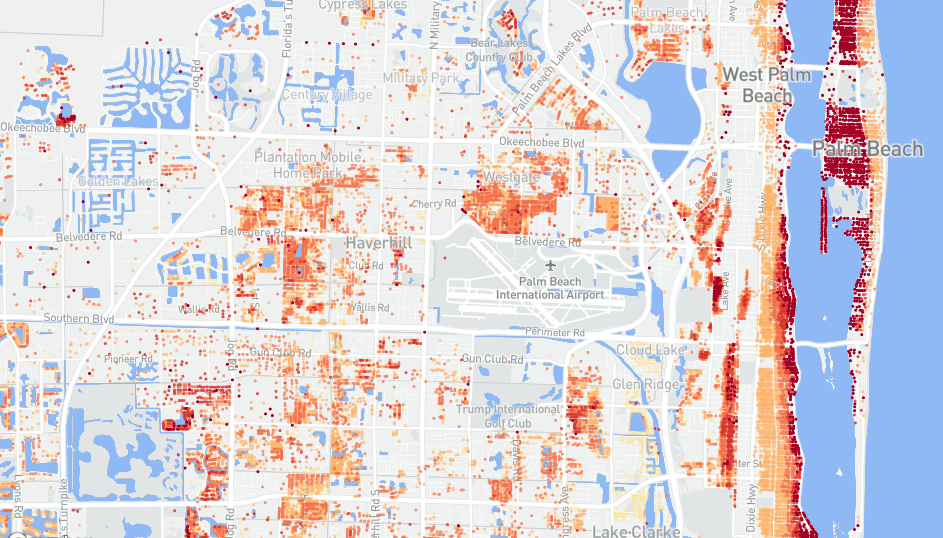
First Street Foundation, a research and technology nonprofit, published flood risk data for over 142 million properties all over the conterminous United States. Each property on the radar is assigned with a score on a one-to-ten scale, called a flood factor, which reflects the estimated chance of flooding from rain, tidal events, riverine, as well as storm surge, now and in the future.
Created in collaboration with a number of top-notch scientists within the framework of a decades-long research, the First Street Foundation’s flood risk model is reported to be unique as the first publicly shared exhaustive one for America.
Find your home, neighborhood, or town to check the flood factor and explore the available projections for your property and area in numbers and graphics.
Changes in New Cases vs Testing Counts
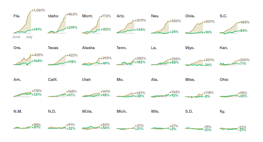
Andrew Witherspoon, a data visualization journalist at Axios, charted the changes in COVID-19 testing against the changes in new cases for 48 states and the District of Columbia. (Hawaii and Vermont had less than twenty cases daily so they did not get their own charts.) Although the worrying growth of the new coronavirus cases in America is often said to take place due to an increase in testing, the graphics reveal that this is hardly true for many areas, especially in the current hotspots.
Looking at the percent change in the weekly average over time from June 1 to July 5, taken from the COVID Tracking Project’s data, it is easy to notice some gaps. A total of twenty-eight states were found to get more new COVID-19 cases than new testing. The others saw less. Check out the charts to understand the situation in every state and the big picture, as well as what conclusions could be drawn based on them, in a quick article on Axios.
Inside SARS-CoV-2

Last but far from least, we cannot help recommending a new amazing piece on Scientific American. It features beautiful graphics that describe and visualize what is known about the novel coronavirus at the moment.
In the article, you can learn how the virus looks and invades, what our immune system does in response trying to neutralize its particles, how vaccines need to work, and even more. All the explanations are provided in detail, making the most important parts of the scientific knowledge about SARS-CoV-2 and the disease it causes, COVID-19, greatly accessible.
***
Thanks for your attention. Stay tuned for cool graphics!
- Categories: Data Visualization Weekly
- 1 Comment »