 Check out new interesting graphics created by different data visualization experts and made public these days. We’ve met them around the web and decided to introduce you to them in today’s DataViz Weekly. These examples are definitely worth seeing if you like good charts and maps (as we do)!
- American Restaurant Reopenings — Nathan Yau
- Sustaining Peace Project — AC4, The Earth Institute, Columbia University
- International Migrant Stock — Nicolas Lambert and Françoise Bahoken
- Global Shutdown — Washington Post
Data Visualization Experts’ New Graphics in DataViz Weekly: June 26, 2020 — July 3, 2020
American Restaurant Reopenings
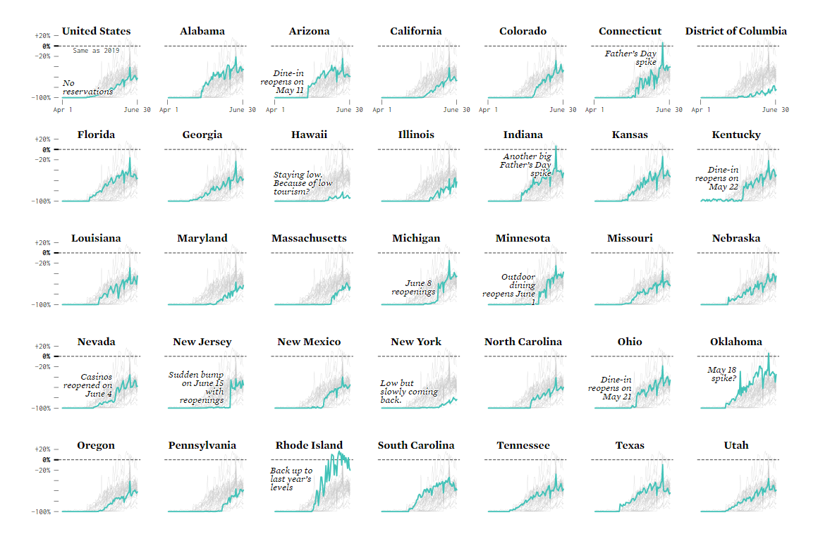
As the American authorities started lifting restrictions imposed earlier within the framework of the unprecedented coronavirus lockdown, restaurants all over the country are finally reopening for dine-in business. In some states, this process goes fast. The others return to normal life at a more cautious, moderate pace.
To visualize how restaurants are reopening across the United States, statistician Nathan Yau charted open data provided by OpenTable, an online restaurant reservation service. You can take a look at the resulting graphics on his blog FlowingData. The charts display seated dining activity over time for the period between April 1 and June 30 this year compared to last year, in 37 states and the District of Columbia — these are the American regions where 50 or more restaurants are on OpenTable’s network.
Sustaining Peace Project
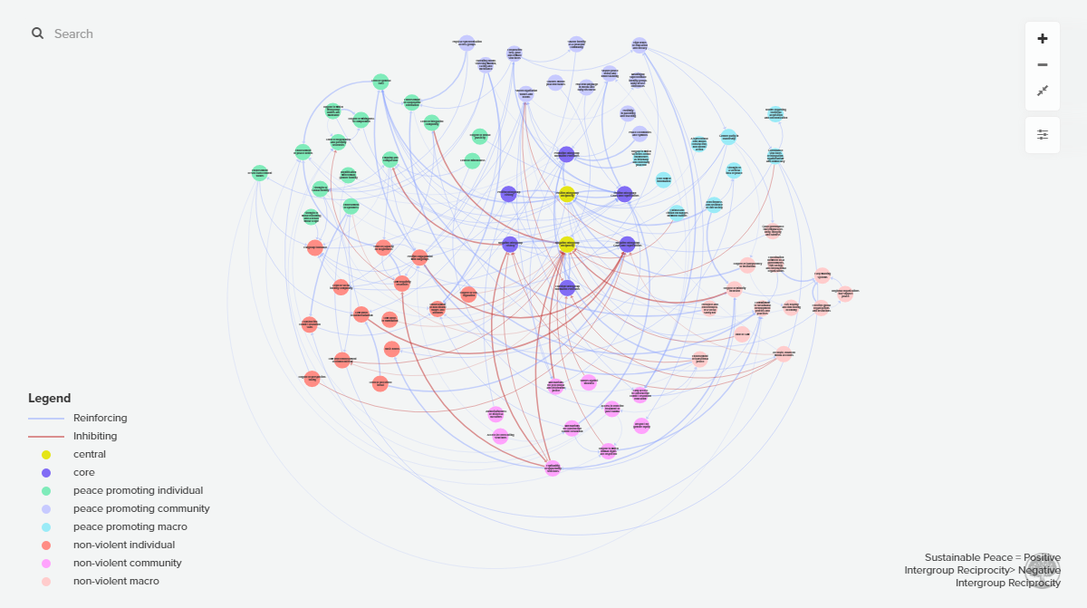
The Advanced Consortium on Cooperation, Conflict, and Complexity (AC4) at Columbia University’s The Earth Institute launched a website for its Sustaining Peace Project, an initiative that has brought together an interdisciplinary group of scientists aiming to better understand the science of piece.
Advocating the idea that reducing violence and creating sustainable peace around the world should be based on the experience of multiple communities that have already managed to achieve sustained harmony over generations, the scholars began to research such peaceful societies six years ago. The new website presents what they have found out so far, in a visual, interactive manner.
In particular, the Sustaining Peace Project website provides a causal loop diagram — you can see its snapshot on the picture above. The visualization represents exactly how different processes and factors are related and interact to impact the likelihood of what is called “sustaining peace.” That’s not all, however, and the website has more graphics and tools worth exploring if you are interested in this subject.
International Migrant Stock
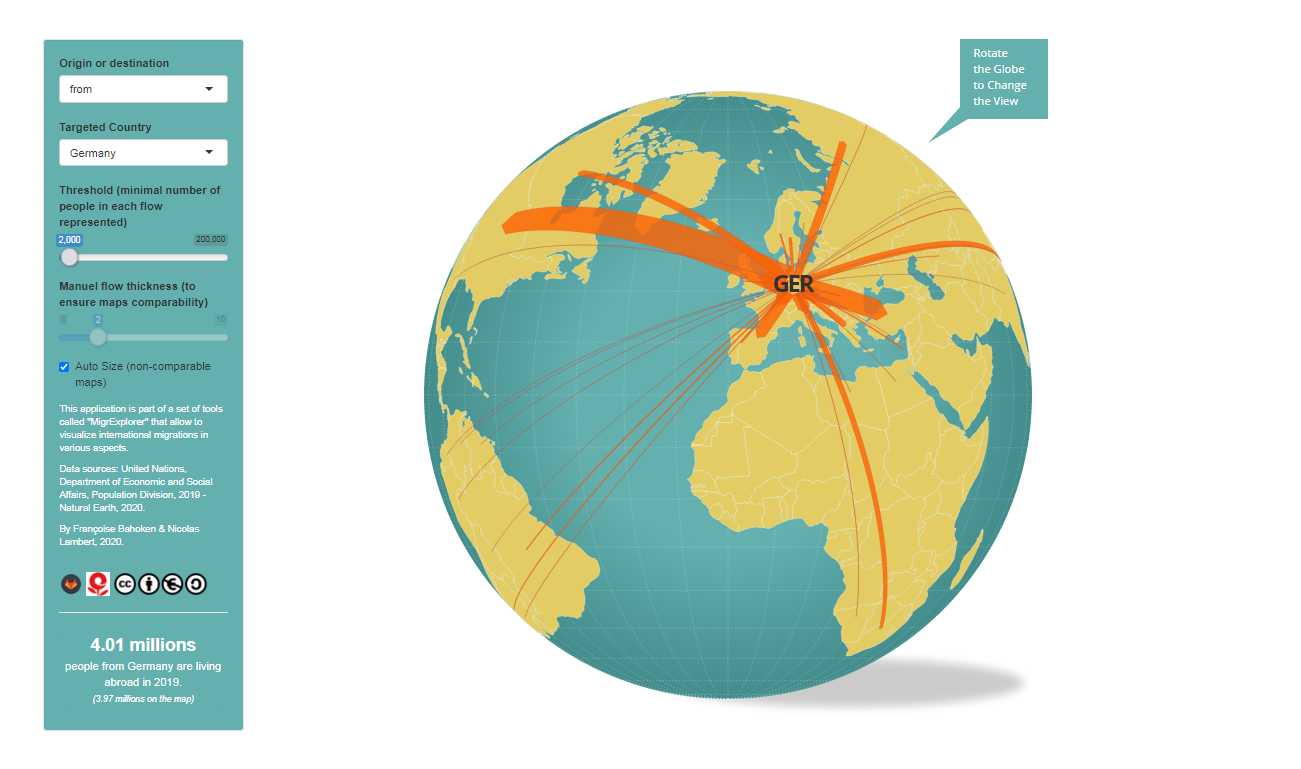
GIS researchers and cartographers Nicolas Lambert and Françoise Bahoken published an interesting interactive flow map. It shows the most popular migration destinations and origins for each country with the help of arrows, reflecting how many citizens of a certain country were living somewhere else and, conversely, how many migrants from different countries were living there, in 2019.
Part of the MigrExplorer set of tools designed to facilitate the exploration of international migration from different angles, the map is graphically representing data from the United Nations and Natural Earth. As is always the case in visualizations of this type, the arrow thickness corresponds to the flow volume. Depending on exactly what you want to see in the data, you can play with the sliders for a refined view.
Global Shutdown
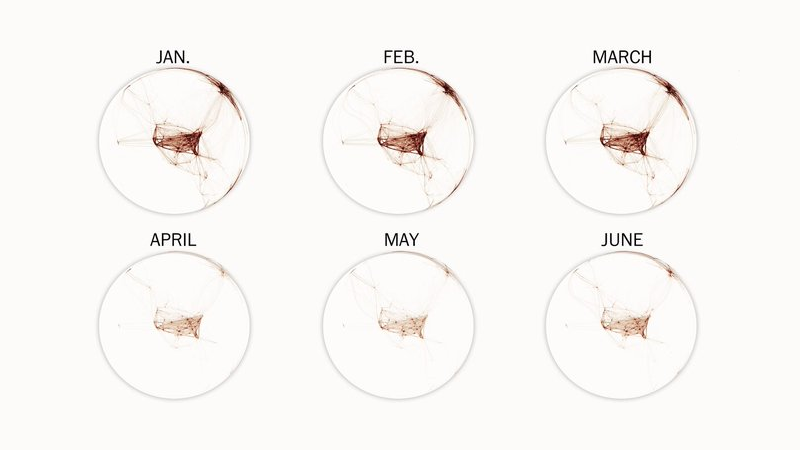
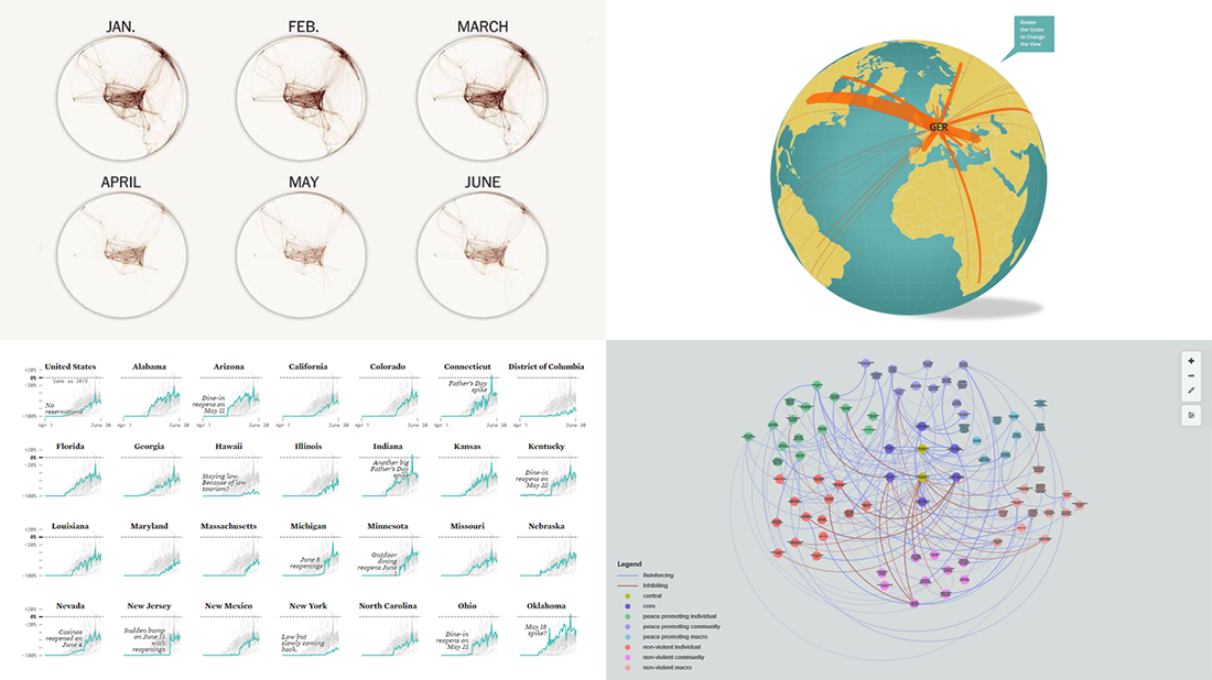
Last Friday, The Washington Post published an impressive story on global distancing. In the article, Anthony Faiola — with the help of awesome graphics from the newspaper’s in-house data visualization experts William Neff and Lauren Tierney — shares a look at how the Covid-19 pandemic actually disrupts the entire world.
When you open this piece, the first big thing you’ll see will be a rotating globe visualization displaying, as you scroll, how flight connections disappeared as the novel coronavirus seized new territories, January to June. Then, don’t miss out on two more maps that show the pandemic’s impact on global travel and GDP change worldwide — another worrying illustrations for how decades of globalization yield to a new era of global distancing.
***
We truly appreciate your attention! Stay tuned for great data visualization works in our regular blog feature DataViz Weekly!
- Categories: Data Visualization Weekly
- No Comments »