 We continue to curate new interesting data visualizations from around the web for our DataViz Weekly blog. Join us as we look at some of the best charts and maps we have seen these days!
- Parenting and Working During Lockdown — Nathan Yau
- Nearest Neighboring Countries — Topi Tjukanov
- Excess Deaths Worldwide — The Economist
- Reopening India from Lockdown — Development Seed and Mapbox
Data Visualization Weekly: July 10, 2020 — July 17, 2020
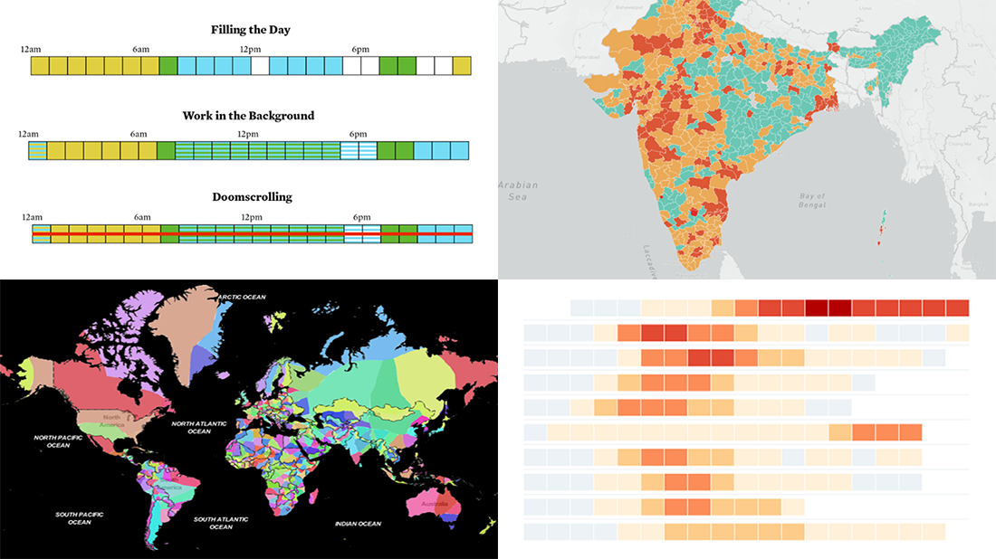
Parenting and Working During Lockdown
Being a parent during a lockdown is different from that in the normal course of things. When preschools and schools are not open for in-person visits and kids stay at home, you need to provide care all day long. This becomes quite a challenge in terms of time use as you also have some work to do, let alone leisure activities you got used to. Well, you definitely know what it’s all about if you have kids.
Nathan Yau, a statistician and expert in data visualization, made a cool graphical presentation showing the problem at a glance. He depicted one day as a grid that consists of twenty-four squares and colored them according to the type of everyday activity: blue for work, yellow for sleep, and green for family care. The rest of the space remained white, representing time for meals, relaxation, socializing, and other stuff like that which we can call “free time.” But when kids school from home, (extra) care and work merge into the same blocks, making it hard to keep the same level of productivity, and then you have to compensate it somehow…
Wondering where the time has gone? Look at these telling visualizations in the FlowingData blog. “Crazy times. I guess we just make do for now,” says Nathan in conclusion. So true.
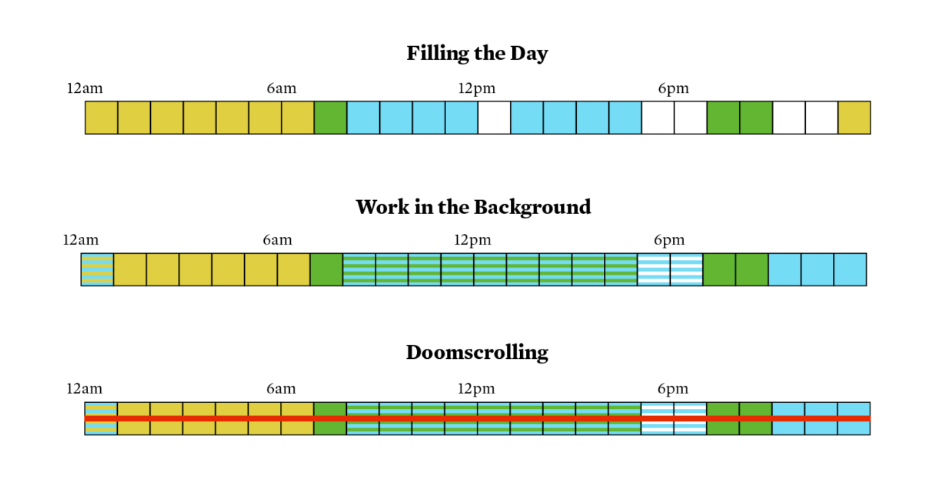
Nearest Neighboring Countries
Have you ever been curious about what foreign country is your nearest neighbor? Anyway, now you can easily find that out thanks to a new cool interactive map! Topi Tjukanov, a geographer and GIS professional, did a great job working with geospatial data and eventually visualizing the closest neighboring country for every location around the globe.
Open the map, click on a place, and you’ll see the nearest country specified in the tooltip. Colors are helpful in further insightful exploration. In addition, the right side menu makes it easy to discover the closest foreign neighbor(s) for a certain country (and its parts if it is surrounded by several countries) as well as filter the areas for which a selected country is the nearest.
Come feel the power of geospatial analysis.
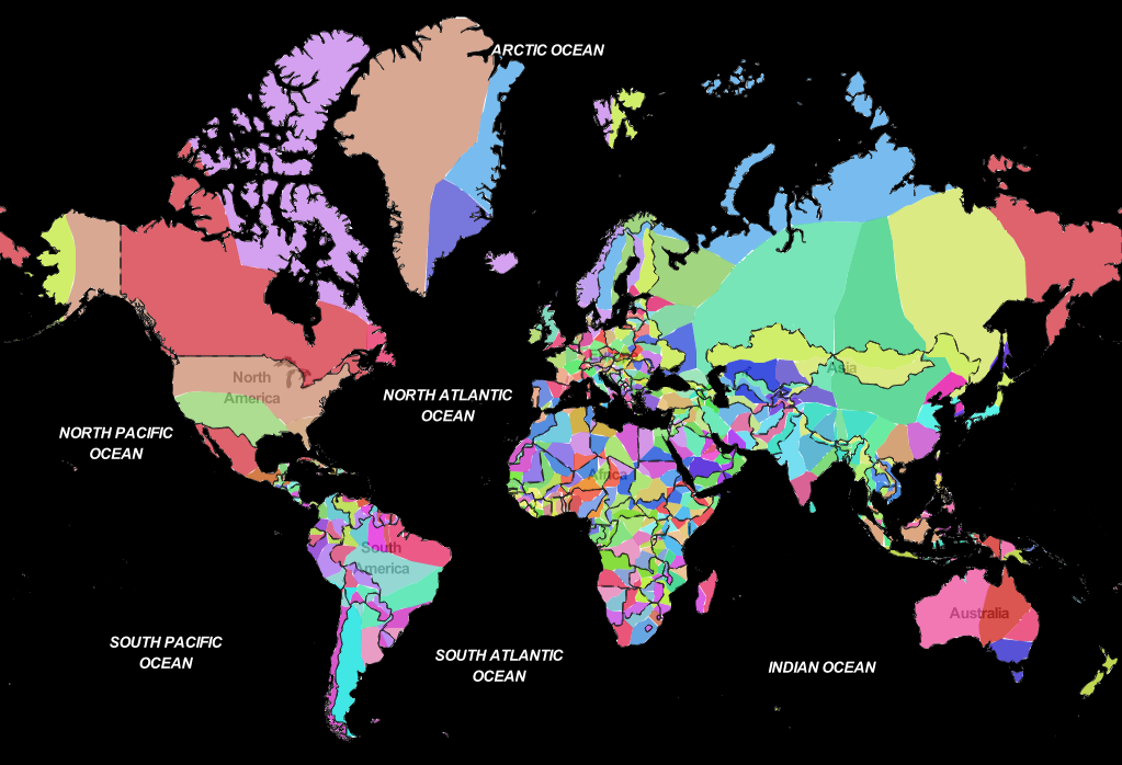
Excess Deaths Worldwide
The official death toll statistics reported by governments around the world may be lower than the real number of deaths caused by the COVID-19 pandemic. If you are wondering why and want to see what the data has to say about the registered deviations from expected deaths, check out The Economist’s big project titled “Tracking covid-19 excess deaths across countries.”
There you will find a lot of charts along with explanations. The graphics visualize data from a number of sources listed at the bottom, providing a view of excess deaths in multiple countries (as well as cities and U.S. states) from different perspectives.
A picture is worth a thousand words, you know. That is exactly the case here. See the visualizations to explore the excess mortality data and learn more, on The Economist.
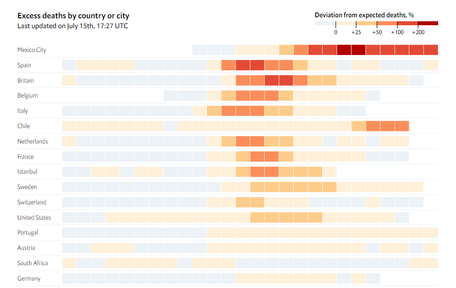
Reopening India from Lockdown
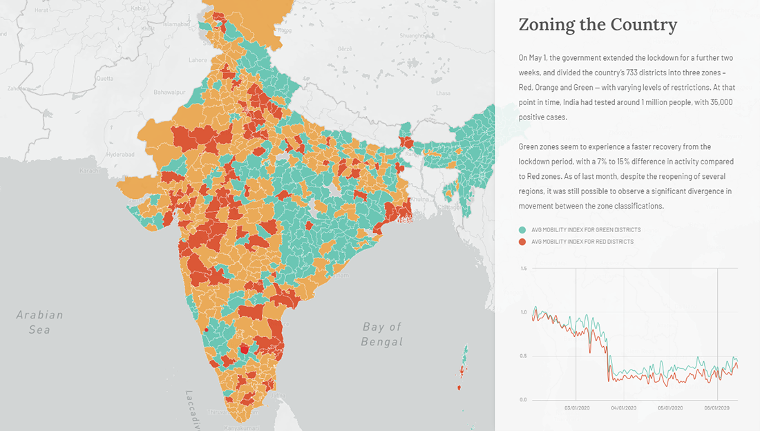
The world is making efforts to emerge from the lockdowns imposed in response to the pandemic. However, it is not easy as, without a vaccine or herd immunity, we are still substantially vulnerable, and there are countries that experience particular difficulties. One such country is India which is currently the epicenter of the novel coronavirus pandemic in Asia, with over 880K confirmed cases and 23K fatalities as of these days.
Development Seed in collaboration with Mapbox created an impressive visual, map-based story revealing the problems of reopening India, a country with over 1.35 billion people (and counting), more than 100 million of whom live in so-called informal settlements where it is too hard to observe proper hygiene, let alone social distancing.
Scroll down the story to see movement data as well as cases and hotspots visualized. You’ll understand how the situation in India has been unfolding and where it might go next.
***
Thank you for your attention. Please stay safe.
- Categories: Data Visualization Weekly
- No Comments »