 New DataViz Weekly is here, highlighting some of the new cool graphics visualizations we found around the web just recently:
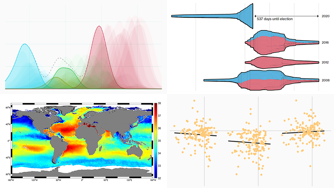
- Finding a link between undocumented immigration and crime in the United States
- Competition in the U.S. presidential elections since 1980
- MLB pitchers’ pitch distribution
- Sea-surface salinity
New Cool Graphics Visualizations in Data Visualization Weekly: May 10, 2019 — May 17, 2019
Looking for Connection Between Undocumented Immigration and Crime in U.S.
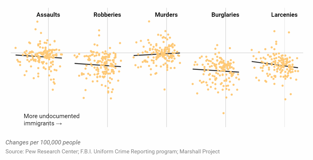
There are many studies out there that reveal no connection between crime and immigration in the United States of America. But what about undocumented immigrants? Join The Marshall Project’s Anna Flagg on The Upshot as she visualizes and analyzes new data from the Pew Research Center to find out if there are any strong links between unauthorized immigration and crime rates in the U.S.
Visualizing Competition in U.S. Presidential Elections Since 1980
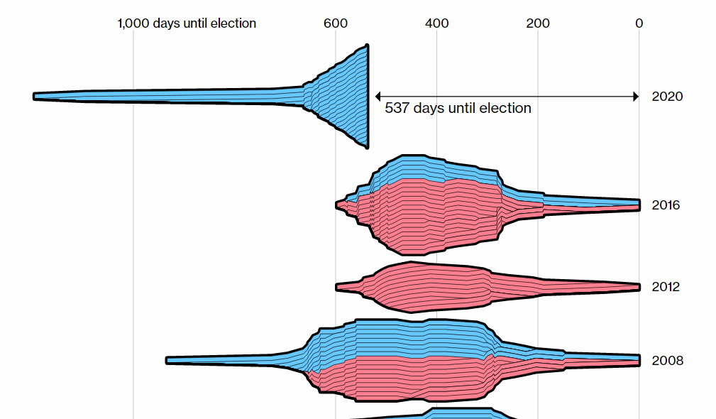
Data journalist Lauren Leatherby and graphics developer Paul Murray, Bloomberg Graphics, looked at a staggering number of Democratic candidates jumping into the race for U.S. president and analyzed what competition looked like during previous presidential campaigns starting from 1980. In addition to the (static) chart that visualizes the number of candidates by election cycle along with their most recent political experience, click around the cool interactive visualization to see when each candidate entered and withdrew from the race.
Charting Statcast Pitch Distribution
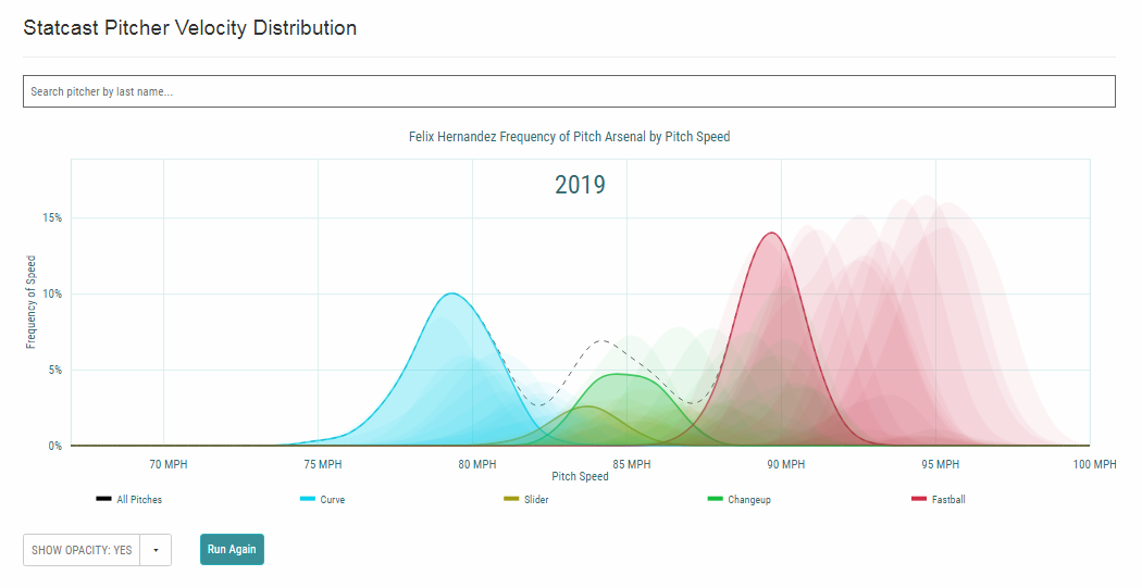
For all baseball analysts and fans, MLB added a new exciting data visualization tool to Baseball Savant, their “clearinghouse for Statcast data.” The new project charts the frequency of pitch arsenal by pitch speed for all MLB pitchers, showing how the velocity of curves, sliders, changeups, cutters, and fastballs have changed for individual players over years, with age. Select your favorite players and look at the animated visualizations.
Mapping Sea-Surface Salinity
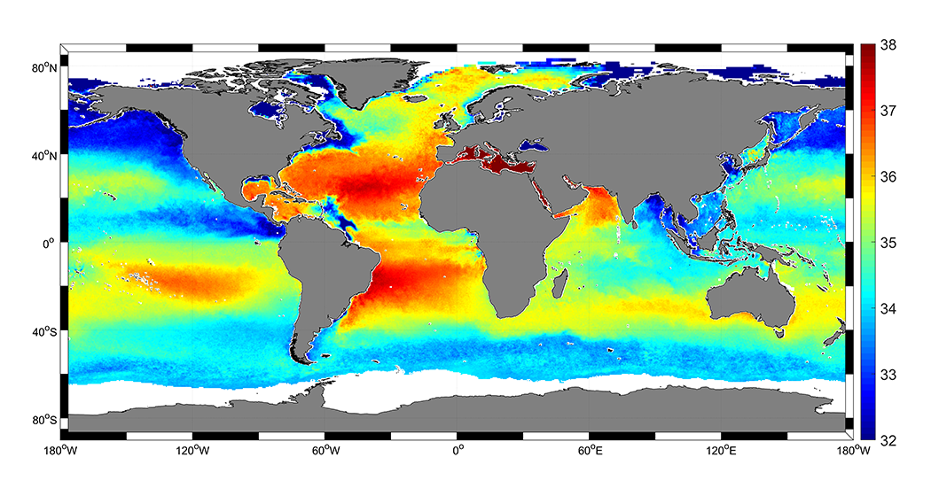
Working as part of the European Space Agency’s Climate Change Initiative, a team of researchers lead by LOCEAN’s Jacqueline Boutin and Ifremer’s Nicolas Reul created what the ESA website calls “the longest and most precise satellite sea-surface salinity global dataset to date.” It is based on observations from the satellite missions measuring salinity from space. Check out a map visualizing the global sea-surface salinity with new, significantly enhanced precision.
***
Thanks for staying tuned!
In addition, don’t miss out on this week’s new major release of our JavaScript charting library, AnyChart 8.6.0 bringing Timeline Chart and Network Graph along with multiple improvements.
If you are a Qlik Sense user, you’ll be amazed to know we’ve just become a Qlik Technology Partner and launched a dedicated extension for Qlik Sense with 36 chart types.
Have a great time over the weekend and beyond!
- Categories: Data Visualization Weekly
- No Comments »