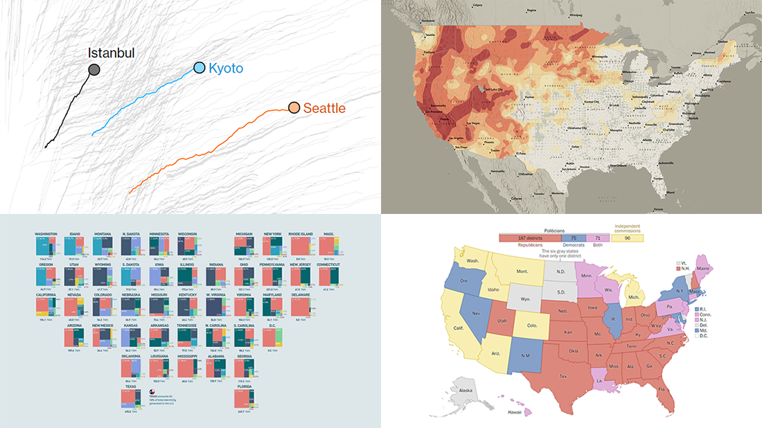
 The seven-day wait is over for all data visualization fans wherever you are! DataViz Weekly is back with a selection of new awesome charts and maps curated from around the web. Look at our latest picks.
- Current and historic drought conditions across the United States — Esri
- Relationship between temperature, income, and mortality — Bloomberg Green
- U.S. electricity mix by state — Visual Capitalist
- Congressional redistricting rules and practices — The Washington Post
Data Visualization Weekly: August 27, 2021 — September 3, 2021
Current and Historic Drought Conditions in U.S.
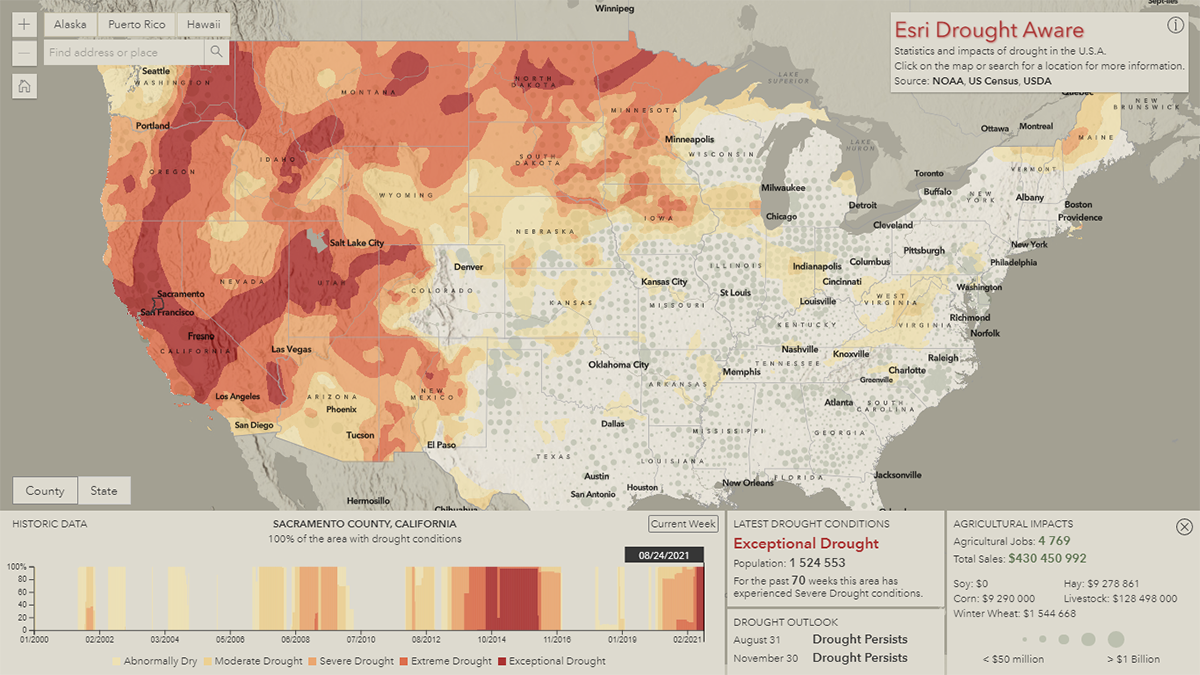
It looks like about half of the United States is experiencing drought conditions right now. That’s what a new web app by Esri shows at a glance once you open it.
Called Drought Aware, the app provides a convenient way to explore the current and historic drought conditions and their potential impacts across the United States, at the county level. The first thing you see is an interactive map that displays the latest information. There, you can instantly see which parts of the country are experiencing drought and of what intensity right now. Click on a location and a statistics panel will show up to deliver more details for the corresponding area, including the current status, historic data, outlooks, and agricultural impacts.
The time-series chart is interactive and synchronized with the map. Click on a date in the former and the latter will display drought conditions across the country for that time.
Drought Aware was developed by Esri’s Dan Pisut, Emily Meriam, Caitlin Scopel, and Chris Mahlke. It uses data from the U.S. National Oceanic and Atmospheric Administration (NOAA), Department of Agriculture (USDA), and Census Bureau.
Relationship Between Temperature, Income, and Mortality
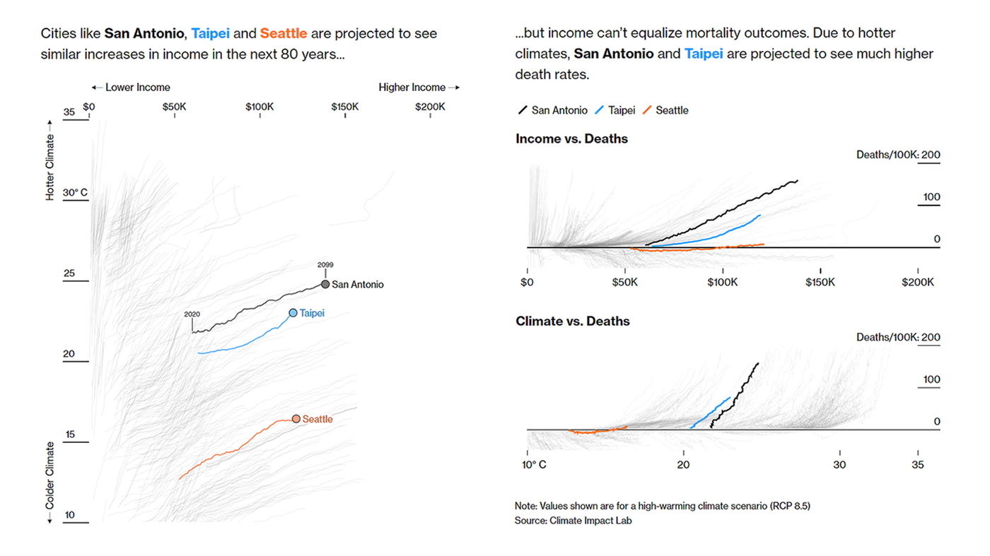
Cities need to be prepared for significantly warmer conditions. Otherwise, as the recent extreme heat demonstrated, they will suffer and all the more people will die. However, not all cities are equally able to adapt to increasing temperatures. Income is a major determinant as richer localities simply have more resources to invest in infrastructure and protect their residents.
Bloomberg — namely Eric Roston, Paul Murray, Linda Poon, Amy Yee, and Hadriana Lowenkron — took data from Climate Impact Lab’s recent study and looked at the relationship between projected climate, wealth, and heat-related mortality from 2020 through 2099. The story is built around three types of charts plotting these three variables for 369 cities against each other: income vs temperature, income vs deaths, and temperature vs deaths.
The article begins with comparisons for San Antonio, Taipei, and Seattle as examples of cities with similar incomes but different climates. Then for Istanbul, Kyoto, and Seattle with similar climates but different incomes. There is also a tool that allows you to check how climate and income are expected to impact a particular city over the next eighty years: choose one and see its lines highlighted among the others.
U.S. Electricity Mix by State
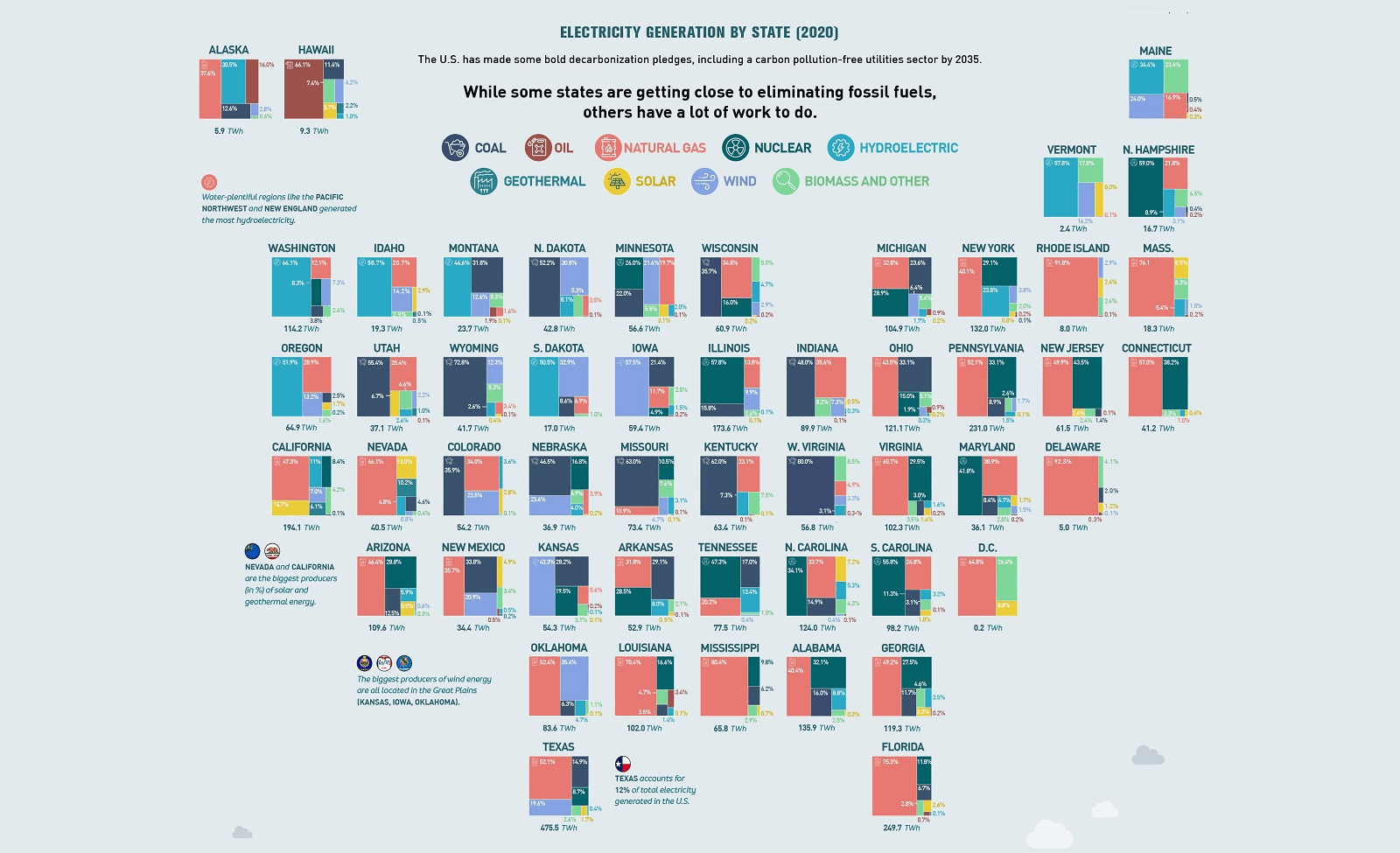
According to President Biden’s plan, the United States is on a path to achieving a 100% carbon pollution-free energy sector by 2035. Some parts of the country are already close to the goal. Others need to make really big changes.
To find out which states are where check out this cool new infographic. Visual Capitalist in collaboration with the National Public Utilities Council (NPUC), an initiative of Motive Power and Zpryme set up to promote decarbonization efforts, visualized a breakdown of electricity generation in 2020 by energy source across the country based on data from the U.S. Energy Information Administration (EIA).
See what states have more (and less) work to do than others on their way to the 2035 clean energy target.
Congressional Redistricting Rules and Practices Across U.S.
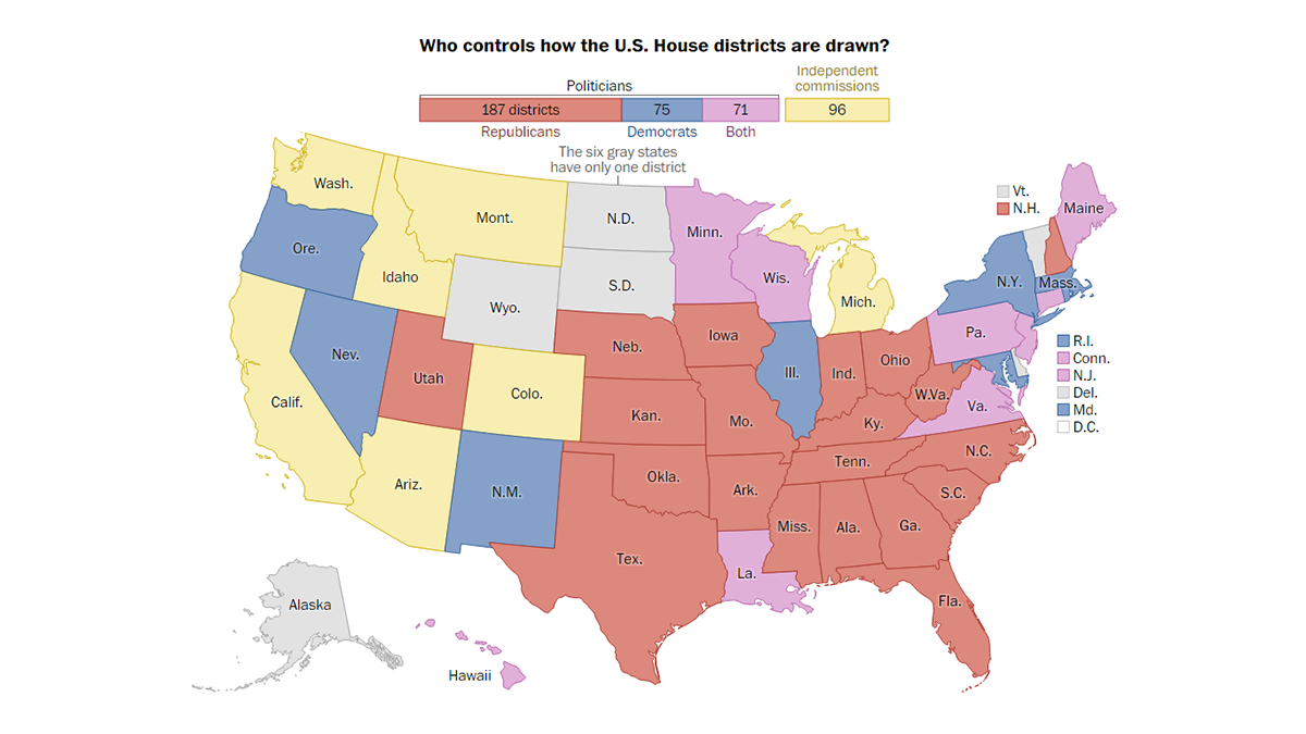
Now that the 2020 Census data is finally out, the redrawing of congressional and state legislative boundaries is underway across the United States. If you are confused about what redistricting is, how it works, and how political parties and interest groups (can) try to play with it to gain an advantage for the entire new decade, The Washington Post published a handy visual guide created by a large group of its staff journalists.
It starts with an interactive map that shows who has got control of how the U.S. House districts are drawn in each state: Republicans, Democrats, both, or independent commissions. Hover over a state to learn more. Then, slope charts visualize a summary of how control of congressional maps has changed compared with the outcome of the previous redistricting in 2010. Scroll down to learn about the constraints that must be considered here and there. Finally, see the details of the redistricting landscape in each state.
If you are interested in this topic, you may also like to see The Guardian’s recent visual explainer of gerrymandering in the United States.
***
We appreciate your attention and hope you enjoyed these awesome data visualization projects. Stay tuned for more.
- Categories: Data Visualization Weekly
- 1 Comment »