 This week, we have come across a number of wonderful new data visualization projects out there. Here are the four that we’ve found most interesting and decided to showcase today in DataViz Weekly. Join us for a quick overview of these works and check them out!
- Black mortality gap in America — The Marshall Project
- Excess deaths worldwide during the COVID-19 pandemic — The Economist
- Ida-caused power outage in New Orleans as seen from space — NASA Earth Observatory
- Average seasonal colors of the United States — Erin Davis
Data Visualization Weekly: September 3, 2021 — September 10, 2021
Black Mortality Gap in America
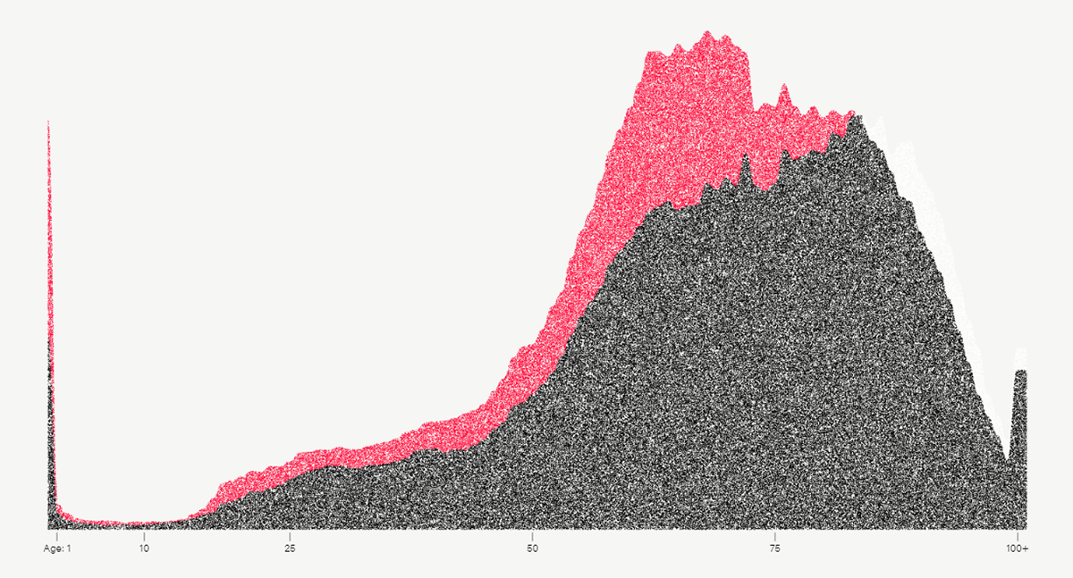
Racial disparities in mortality have existed in the United States for centuries. Even nowadays, according to The Marshall Project’s recent investigation, Black Americans die at a higher rate than White Americans at almost every age. And the gap is large: nearly one in five Black American deaths actually happens earlier than expected for White Americans.
Anna Flagg, a senior data reporter at The Marshall Project, used dots arranged in the form of a stacked area graph to display the difference. One dot represents one death in 2019, the most recent year for which the mortality data for the U.S. is available. At first they are shown as a random cloud. As you scroll the dots spread to show the distribution of all deaths by age. The next transition creates a stacked area chart illuminating the Black mortality gap in the U.S.
See this new story on the website of The Marshall Project. Keep looking below the scrollytelling part to learn more about the racial disparities in mortality, the role of the healthcare system, and how it was shaped.
Excess Deaths Worldwide During COVID-19 Pandemic
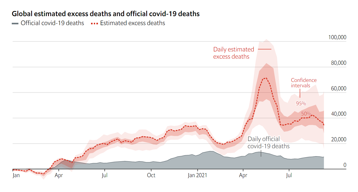
Many people are skeptical about the accuracy of the official COVID-19 mortality statistics. So there have been lots of talk about so-called excess deaths. Defined as the difference between the actual and expected mortality, it is seen as a better measure of the pandemic’s true impact than the coronavirus death counts coming from national governments around the world.
Currently, the official number of deaths from COVID-19 is about 4.6 million people overall. According to The Economist’s estimates of excess deaths, the real death toll could be two to four times higher, between 9.4 million and 18.4 million as of today.
Check out “The pandemic’s true death toll,” an impressive new project of The Economist. It presents daily estimates of excess deaths all over the world based on a special machine-learning model. The numbers are updated on a daily basis and can be explored in interactive charts, maps, and spreadsheets.
Ida-Caused Power Outage in New Orleans as Seen From Space
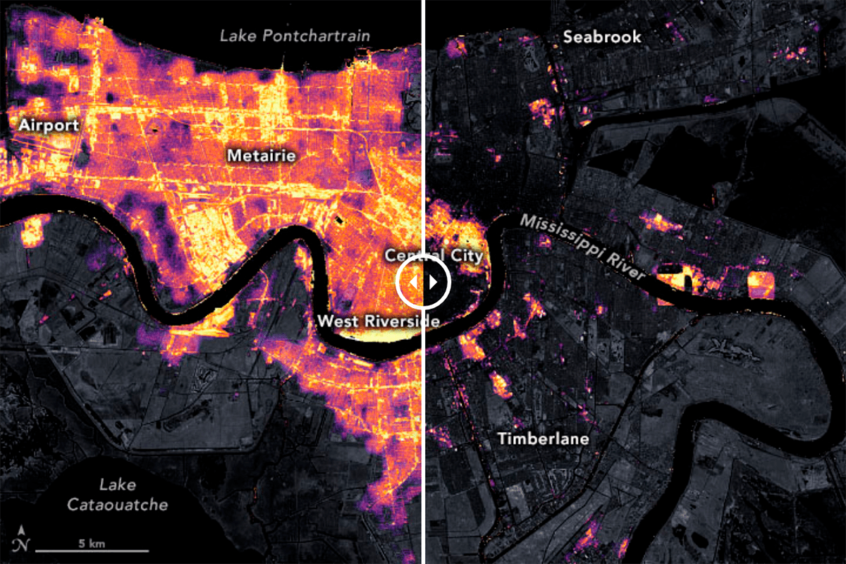
Almost all power is now restored in New Orleans after Hurricane Ida, the second worst hurricane on record to strike Louisiana, just after Katrina in 2005. Ida hit the city in late August. It brought severe damage and left nearly all of New Orleans without electricity.
The extent of power outage in New Orleans can be clearly seen on a visualization shared by NASA Earth Observatory. Representing nighttime lights data from satellite imagery taken on August 9 and 31, it allows you to compare the two views side by side using a handy slider.
Look how the city lights in New Orleans looked from space before and after Ida to see at a glance how incredibly massive the power outage was because of the hurricane.
Average Seasonal Colors of United States
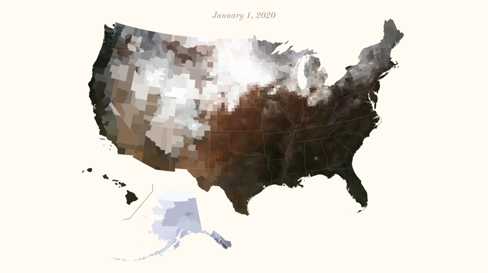
Here is another cool new satellite imagery data visualization. Several DataViz Weeklies ago, we told you about a set of stunning maps created by Erin Davis. They displayed the average colors of countries based on Sentinel-2 satellite imagery.
But it was only a summer look. Now, Erin is back with a new series of maps visualizing average colors for the United States throughout a year.
In the picture above, you can see a snapshot of the average colors of all U.S. counties as of January 1, 2020. Visit Erin’s blog to observe their change during the last year, in a slideshow or in an animated GIF. Enjoy a charming view of how snow retreats and greenery advances across the country, season by season.
***
Thank you for your attention! Stay tuned for great data visualization projects and more!
- Categories: Data Visualization Weekly
- No Comments »