 Are you ready for another set of amazing data graphics? It’s Friday, so DataViz Weekly is here to let you know about four great new visualization works worth checking out right now!
- 15-minute cities in Germany and worldwide — Chris and Nils from Gießen
- Daily temperatures in Tokyo since 1964 (and what to expect at the Olympics) — Reuters
- Average colors of countries, as well as U.S. states and counties — Erin Davis
- Euro 2020 and Copa América 2021 playoffs visualized in triangles — Krisztina Szűcs
Data Visualization Weekly: July 9, 2021 — July 16, 2021
15-Minute Cities
The pandemic has spurred demand for nearby amenities, attracting all the more attention to the idea of the 15-minute city. In this concept, residents are supposed to live within short walking or biking distance from all their essential daily needs such as groceries, healthcare facilities, leisure spots, and so on.
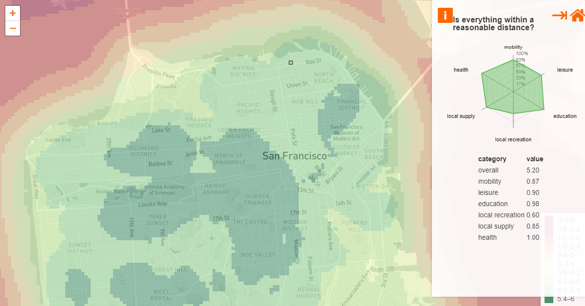
We have already seen a number of projects inspired by this idea. Here is a new interesting one that has caught our eye these days. Chris and Nils from Gießen, as they chose to identify themselves, created dedicated interactive maps showing at a glance how well various cities meet the requirements of the 15-minute city. Individual city maps are divided into small squares colored depending on how reachable the amenities are from the corresponding locations. Click on a place and you will see the breakdown of its score visualized in a radar chart.
Currently, the English version of this project includes 15-minute-city maps for San Francisco, New York City, and Tokyo. The German one has visualizations for literally all major towns across Germany.
Highest Temperatures Recorded in Tokyo Each Day Since 1964
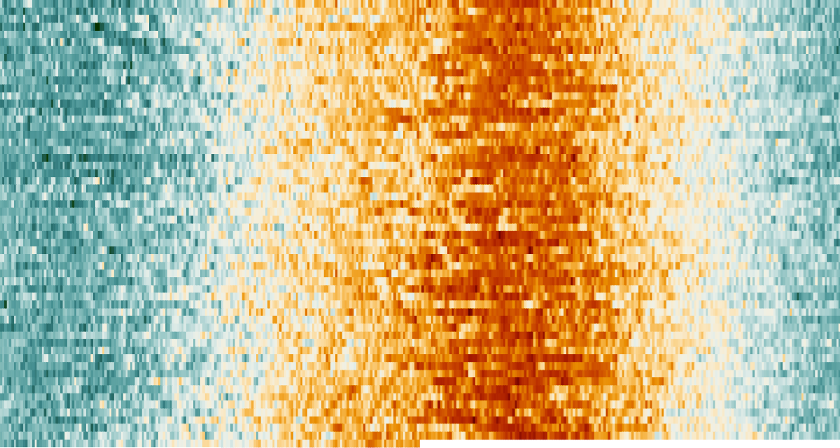
It is going to be really hot at the Tokyo Olympics. And not only in terms of competition between athletes. Chances are high that Tokyo 2020 will be the hottest Olympic Games ever on record.
What you see in the picture above is a Reuters visualization of the highest temperatures in Tokyo day by day, over the course of the year (left to right) and from 1964 to 2021 (top to bottom). The temperatures above 86°F (30°C) are displayed in red, and as you can see, this year’s Olympics are to be held at the very peak of summer heat. What’s more, the dates from July 23 to August 8 belong to an especially hot weather period where historical record highs fall.
Check out a fresh scrollytelling piece on Reuters for a closer look at this visualization. There are also a lot of other impressive graphics in the article, comparing the upcoming Tokyo Olympics with the previous Games and explaining why experts expect a significantly increased risk of heat illness during the event.
Average Colors of World
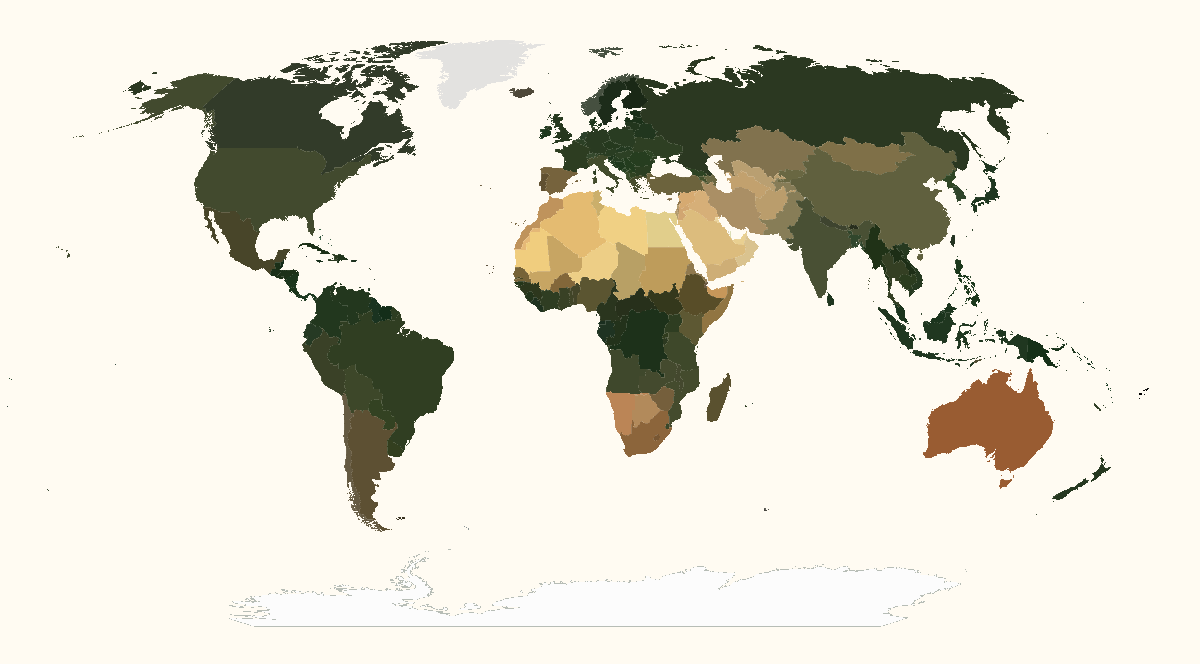
Have you ever wondered what is the average color of your country when viewed from above? Well, even if not, you may well find it fun to discover and compare with others!
Erin Davis used Sentinel-2 satellite imagery to determine the average colors of all countries around the globe. Then she visualized her findings in a set of interesting maps.
When you open the project, the first maps you see show the United States. They display the average color by county and then by state. The next pictures reveal the average color of each country, first representing the big picture in the world map and then zooming in on the individual continents.
In addition, Erin provided a detailed technical description of how this project had been developed. You will find it right below the maps.
Euro 2020 and Copa América 2021 Playoff Matches in Triangles
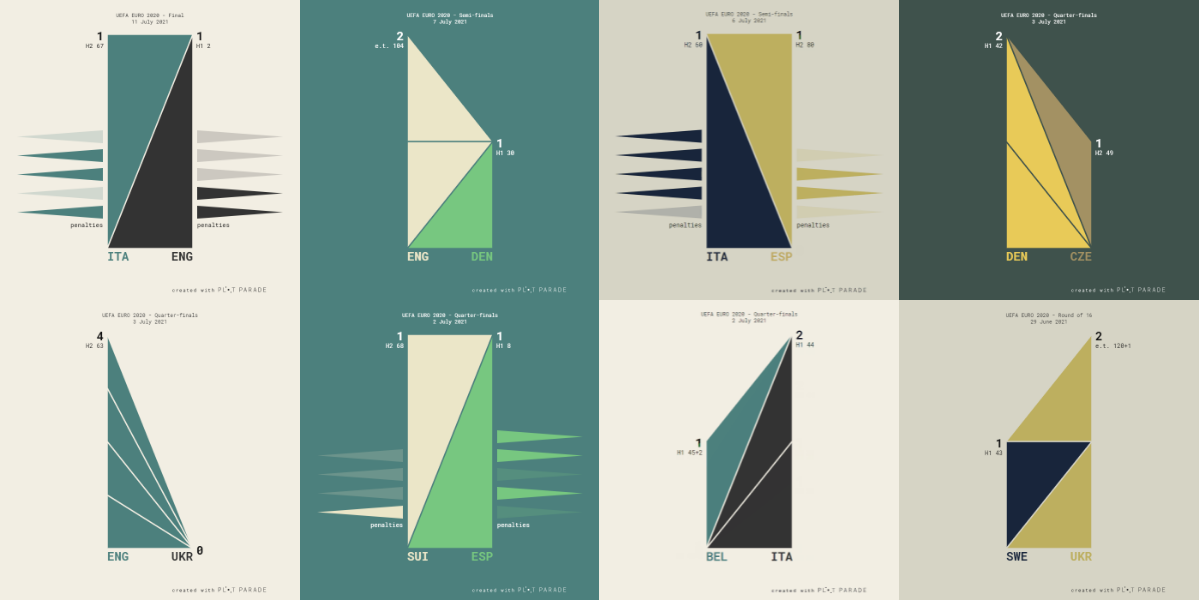
Before you leave, we would like to show you one more interesting visualization project. Krisztina Szűcs made use of triangles to represent how the knockout stage matches of the UEFA Euro 2020 and the CONMEBOL Copa América 2021 played out.
The visualizations are animated. The large triangles in the center appear on top of each other as the teams score goals. The long triangles on both sides visualize the penalty shoot-out sessions, displaying the outcome of each penalty kick.
For the Tokyo Olympics, Krisztina is going to make editable charts. Let’s see!
***
Thank you for your interest. Stay tuned for our DataViz Weekly series where we curate the most interesting new data visualization projects from around the web.
So, see you in a week! Please all stay safe and healthy, in the meantime and always!
- Categories: Data Visualization Weekly
- 1 Comment »