 Lately, we’ve seen a bunch of cool geovisualizations on the topics of climate, pollution, and human impact. Here are some of the most interesting fresh ones. Check out the new DataViz Weekly post which is entirely dedicated to great examples of environmental maps:
- American climate shifts — ProPublica
- Earth’s most biologically important lands — RESOLVE
- Rainforest loss — Bloomberg Green
- Toxicity in North Brooklyn — North Brooklyn Neighbors
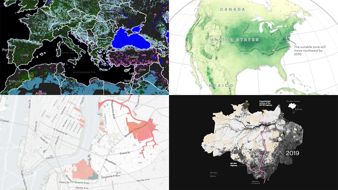
Environmental Maps in Data Visualization Weekly: September 11, 2020 — September 18, 2020
American Climate Shifts
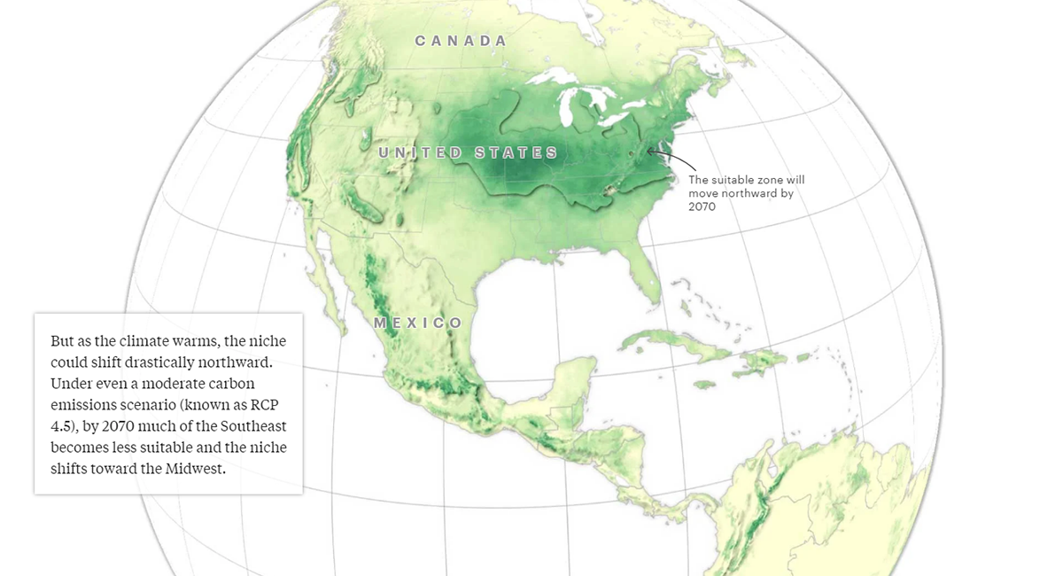
A group of researchers from Nanjing University, Washington State University, University of Exeter, Aarhus University, and Wageningen University made a model of the “human climate niche” which determines the areas where both air temperature and precipitation have been most suitable for humanity to live in over the past six thousand years. For the U.S., the largest part of that territory lies between the East coast and the Midwest, and includes California’s coast. But new data from Rhodium Group, analyzed by ProPublica and The New York Times Magazine, shows that the ongoing change of the climate will lead it northward quite drastically.
Take a look at cool map visualizations on ProPublica, which will guide you through the recent findings in a storytelling format. In particular, you’ll see at a glance where that most habitable zone is expected to shift by 2070 under two CO2 emissions scenarios, moderate (pictured above) and extreme.
Keep scrolling down the piece on ProPublica to explore more maps — those visualize Rhodium Group’s new estimates for heat, humidity, wildwifires, sea level rise, farm crop yields, and economic damages from climate, for all counties.
Most Biologically Important Lands on Earth
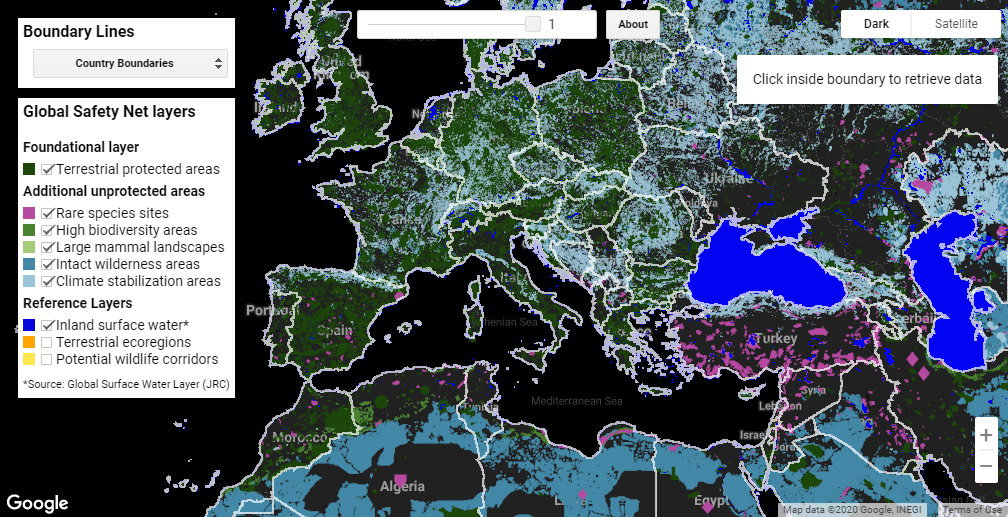
Lead by RESOLVE in cooperation with Globaïa, Arizona State University, and University of Minnesota, a group of researchers created the Global Safety Net. This project is reported to be the first-ever comprehensive analysis of the lands that humanity needs to protect in order to save biodiversity from further loss and stabilize climate issues. In total, such areas account for more than 50% of the planet’s land.
The data compiled by the researchers can be explored in an interactive map created by One Earth in partnership with Graphicacy and Google Earth Engine. Depending on what you want to view, you can turn on different layers, see country or ecoregion boundary lines, search for specific places, and more. Click on an area to look at its configuration of biologically important land.
Explore the findings of the Global Safety Net analysis by country, ecoregion, and — in the U.S. — by state.
Rainforest Loss
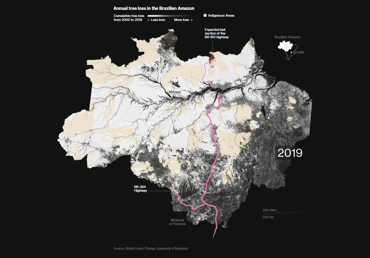
Rainforest Action Network, a California-based organization for environmental protection, says approximately one acre of equatorial forest is lost every two seconds. That’s just about the size of a football field. Bloomberg took a closer look at the issue with the help of satellite images and data on land use, and mapped tree loss across the tropical forests of Asia, Africa, and South America over time.
The maps are available as part of the impressive visual story published this week on Bloomberg Green, which reports the analysts’ findings on exactly where and how the rainforests have been vanishing. Two regions are put to the spotlight: Peninsular Malaysia and Brazil’s Amazonia.
Look how the planet’s equatorial forest gets destroyed due to natural (and deliberate) fires, human expansion, and climate change.
Toxicity in North Brooklyn
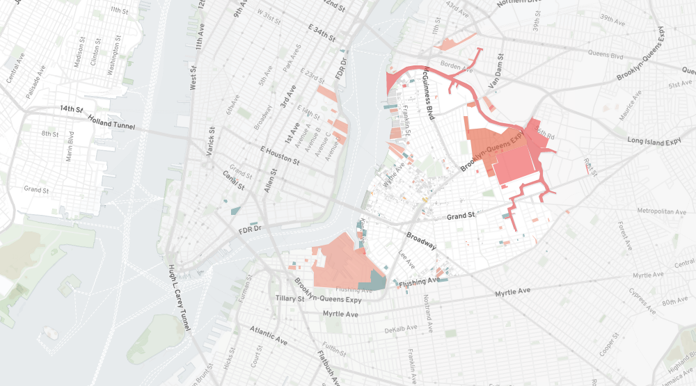
North Brooklyn Neighbors (NBN), a nonprofit advocating for climate and environmental justice in the Williamsburg and Greenpoint sections of Brooklyn, launched the Environmental Legacy and Improvements (ELI) project.
Created in collaboration with Pratt Institute’s Spatial Analysis and Visualization Initiative (SAVI), ELI is an invaluable resource that, with the great help of unique maps, describes the area’s industrial past and provides a detailed picture of the toxic legacy of multiple factories that used to drive the economy of New York in earlier times.
The storytelling component and interactive features make it easy and convenient to take a deep dive into the data on the current environmental contamination, which was taken from various agencies and combined by SAVI, and reveal its connections with historical land use in North Brooklyn. Local residents can use ELI to find the answers to some important specific questions, for example, whether their children’s school is located close to a brownfield or superfund site, and use this kind of information for potential collective action.
***
Data visualization is our passion and we are happy to share it with you. Stay tuned for great charts and maps from around the web.
- Categories: Data Visualization Weekly
- No Comments »