 The long wait is over! DataViz Weekly is here bringing some of the best new maps and charts from all over the web to the spotlight! Look at these amazing examples that show the power of smart data visualization:
- College football fan movement and COVID-19 risk — ESPN
- California wildfires over the past 17 years — FlowingData
- London solar opportunities — UCL Energy
- Voter scenarios for the U.S. presidential election — The Washington Post
Data Visualization Weekly: September 4, 2020 — September 11, 2020
College Football Fan Movement and COVID-19 Risk
Crowded sporting events can play a big role in the spread of COVID-19. Take the UEFA Champions League match between Italian Atalanta and Spanish Valencia held on February 19, for example, which turned out to be a really significant factor at the very beginning of the pandemic. Played in Milan, at the famous San Siro stadium, the game was attended by thousands of fans. Among them were about 40,000 people from Bergamo where Atalanta is based, which is one-third of that small town’s population, and 2,500 fans from Valencia. Dubbed as “Game Zero,” it became one of the major contributors to the outbreaks in those locations.
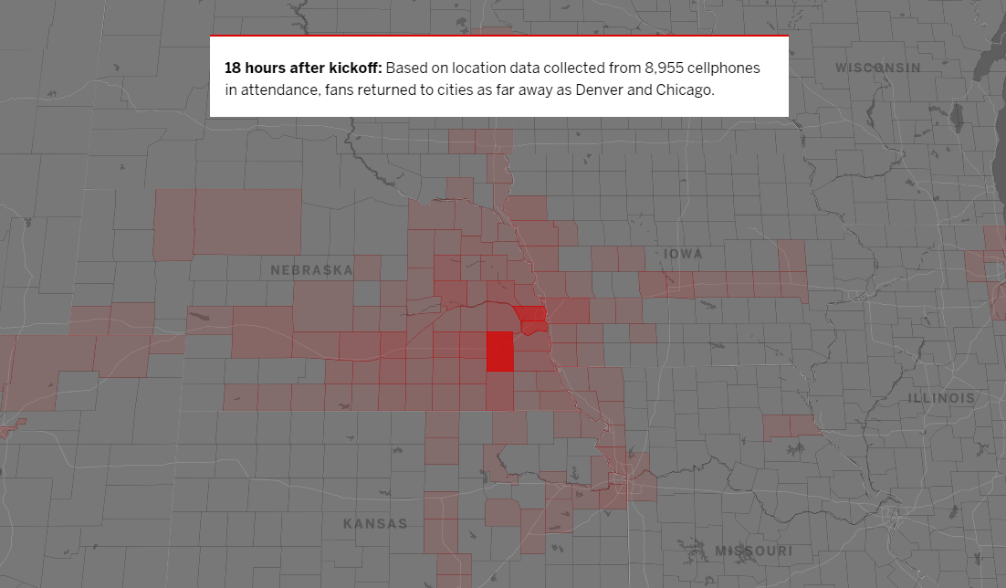
In America, college football is one of the most obvious risk factors. ESPN provided a great illustration of that by mapping anonymized smartphone tracking data provided by X-Mode Social. In the dedicated visual story, you can explore the graphical representations of fan movement after three Saturday games from the previous year: Ohio State vs Nebraska, Ole Miss vs Alabama, and Stanford vs USC. Let’s look at the first one, for instance, that took place in Lincoln, NE. Just about six hours after the kickoff, fans were already in thirty counties in the surrounding area, then went as far away as Chicago and Denver, and finally, in twenty-four hours, some travels were traced to California, Florida, and Connecticut. The visualizations are worth a thousand words, actually.
California Wildfires over Years
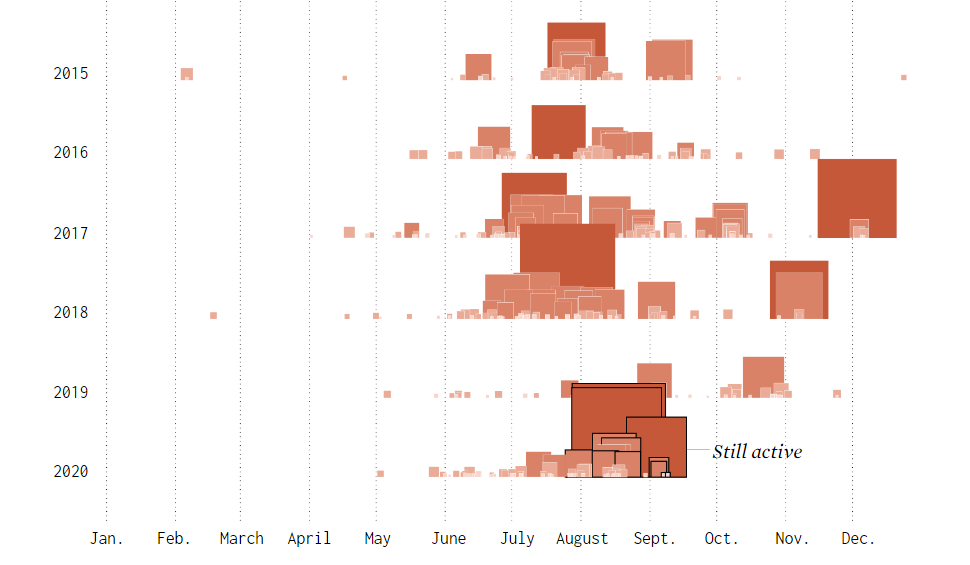
Wildfires in the American West are especially bad this year. In California alone, over three million acres have already been burned. Experts say dry forests, hot weather, and strong winds are the main things to blame.
Nathan Yau wondered how the current fire season looks compared to some past years. So he charted all fire incidents in California that are known to have blackened 300 acres or more, from 2004 to 2020. The source of the data taken for this visualization is the California Department of Forestry and Fire Protection (CAL FIRE).
The chart makes it quite clear that 2020 is at least one of the worst fire seasons over the past 17 years. Many fires in California are still active, though…
London Solar Opportunity
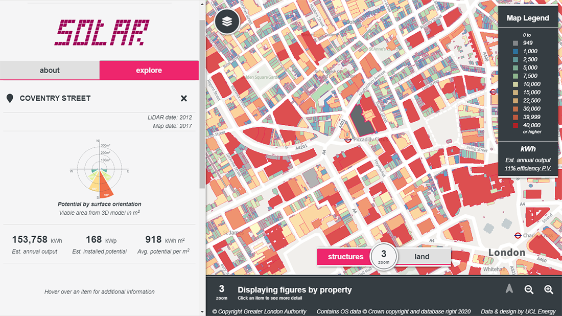
The UCL Energy Institute developed an interactive tool that makes it easy to explore the estimated solar energy potential of all buildings and open land in London. The main visualization here is a map which colors all buildings according to the estimated annual output. Both solar thermal installations and photovoltaic solar panels are taken into account.
Click on a building to see more detailed information on the solar opportunity it has. For instance, in addition to the estimated annual output, you can also see the estimated installed potential, average potential per square meter, viable area, carbon savings, and more. A polar chart visualizes the potential by surface orientation. All this information is expected to help Londoners “by saving them time and money ahead of site-specific suitability studies taking place.”
Voter Scenarios for U.S. Presidential Election
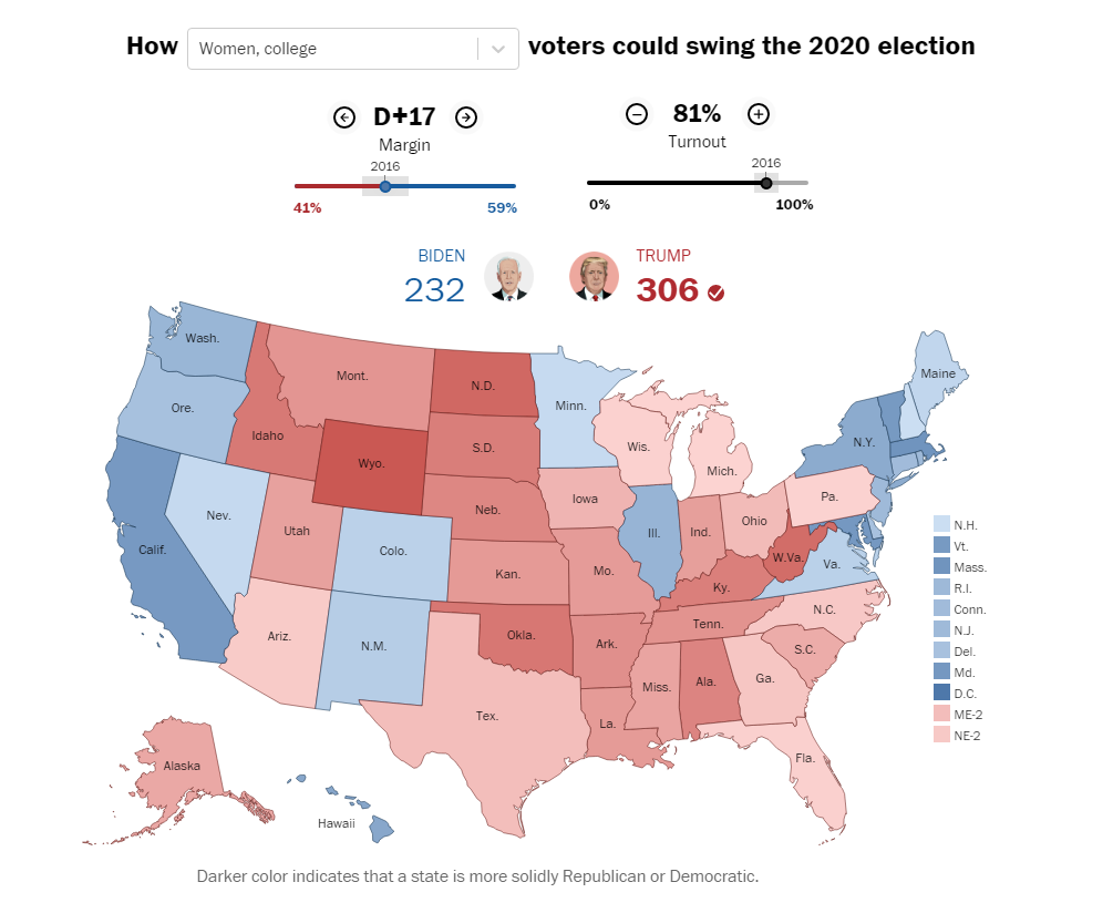
Last week, we paid attention to a New York Times tool designed to allow you to play with potential outcomes of the 2020 U.S. presidential election by dragging states into the baskets of Donald Trump and Joe Biden. Now, check out another cool thing. Looking at how turnout and swing voters can get Biden or Trump to the 270 electoral votes required to win the election and become the president of the United States of America for the next four years, The Washington Post analyzed several possible scenarios and provided a tool to design your own.
Сhoose a group — by race, gender, age, education level, or a mixed parameter (the picture above shows the “Women, college” scenario, for example). Then see what influence it could have on the election. Use the sliders to watch what happens as you change the margin and turnout.
***
Today is the 37th Friday of the year, and we are happy you’ve spent a part of it reading our blog. Don’t miss Data Visualization Weekly. It’s out every Friday, bringing new maps and charts worth checking out to the spotlight.
- Categories: Data Visualization Weekly
- No Comments »