 Data stories are all around us, and we are glad to present the most interesting pieces to you on a regular basis, within the framework of the Data Visualization Weekly series of articles on AnyChart JS Charts‘ blog.
Without more ado, let’s take a look at another four eye and mind catching data visualizations of the recent times and the stories they reveal.
New Data Stories in DataViz Weekly: June 30, 2017 – July 7, 2017
Same-Sex Partnership Laws Worldwide: Map and Charts
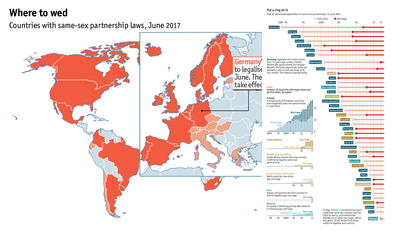
As Germany becomes the 24th country to legalize same-sex marriage, The Economist presents interesting data visualizations that illustrate the worldwide situation in this field. The map in the article shows what countries have already adopted same-sex partnership laws that authorize marriage or at least civil union between gays. The charts amplify the data story by displaying when such a legalization came where and bringing some other peculiar insights.
World’s Biggest Data Breaches Visualized
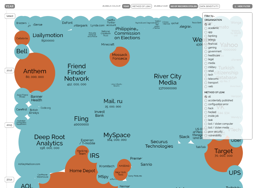
Visual Capitalist reminded us earlier this month about this impressive interactive visualization of the world’s biggest data breaches. Thanks to that fact, we noticed that the timeline first shared on Information is Beautiful several years ago had been updated again in late April 2017 bringing the latest data to life. Each bubble on this chart corresponds to how many records were lost per each data breach. Check out this cool visualization and the data story on Visual Capitalist and double-check that all DLP and cyber security solutions you’ve picked work great and that your own sensitive data is actually in safety.
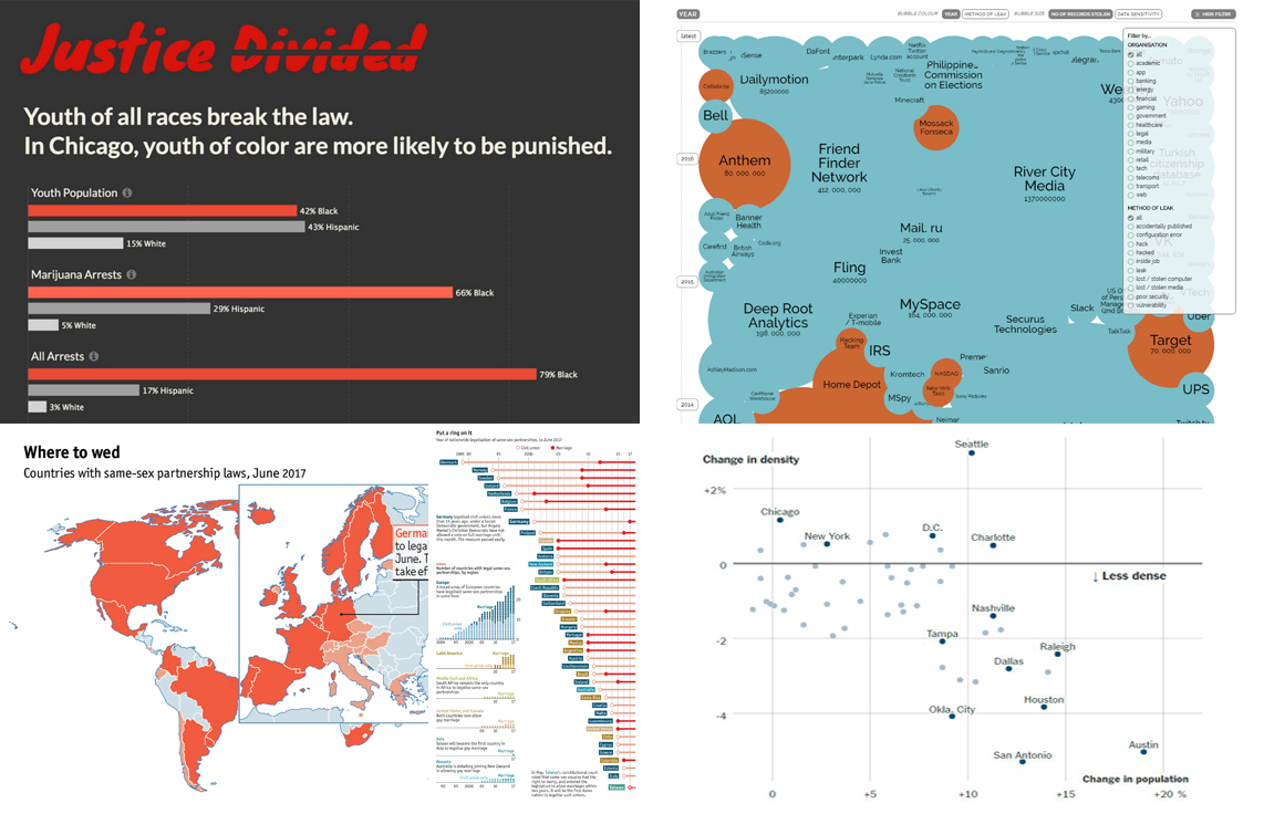
Justice Divided: Chicago Youth Crime Data Visualized

“Youth of all races break the law. Youth of color are more likely to be punished.”
These words are placed at the top of the Justice Divided project telling another important data story. Its authors revealed explicit race inequality in how the justice system in Chicago acts. Take a look at these charts and infographics to learn more.
Myth of Return to Cities: Visualizing Change in US Population Density Data
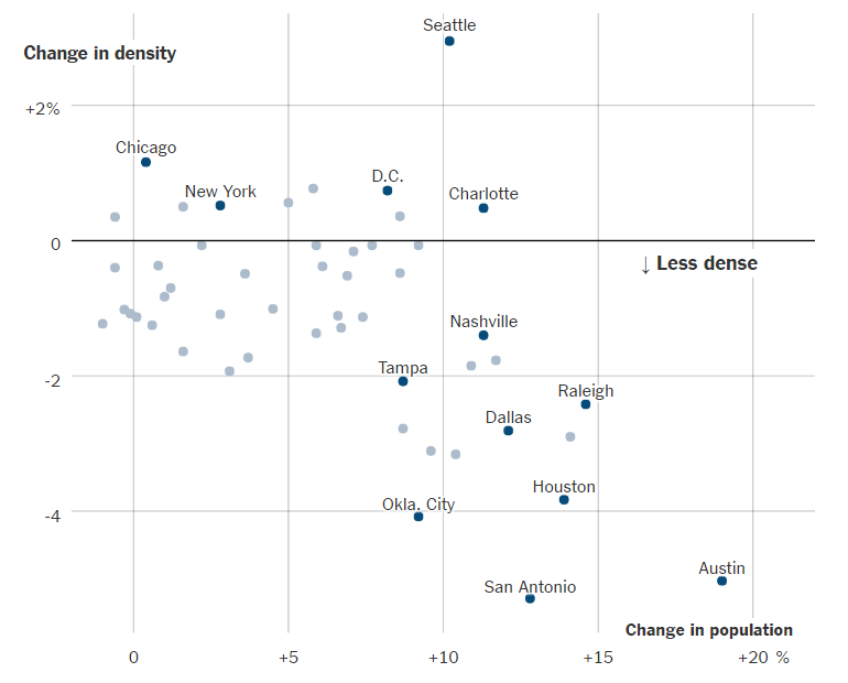
Only 10 out of the 51 metropolitan areas in the United States with a population of 1M+ became denser between 2010 and 2016. These are Seattle, Chicago, Minneapolis, Washington, Boston, New York, Philadelphia, Charlotte, Portland, and Hartford. The general US national trend is nonetheless clear: Large metro areas are becoming less urban (and more suburban). See this quadrant chart to learn how the change in density correlates with the change in population. You’ll find more details of the story in the Seattle Climbs but Austin Sprawls: The Myth of the Return to Cities article on The New York Times where we found this data visualization.
Thank you for your interest in data stories and examples of cool data visualization work. We will continue sharing worth seeing ones in the next issues of our DataViz Weekly series. Stay tuned, and in the meantime, have a nice time!
- Categories: Data Visualization Weekly
- No Comments »