 Now it’s time for another cool set of good data visualization examples that became known and even well-known lately. Today’s DataViz Weekly collection consists of the following charts and maps:
- flows of foreign students and researchers to MIT;
- top 100 companies by profit and revenue;
- change in “normality” of Trump’s presidency;
- income mobility in Canada by region.
Data Visualization Weekly: July 7, 2017 – July 14, 2017
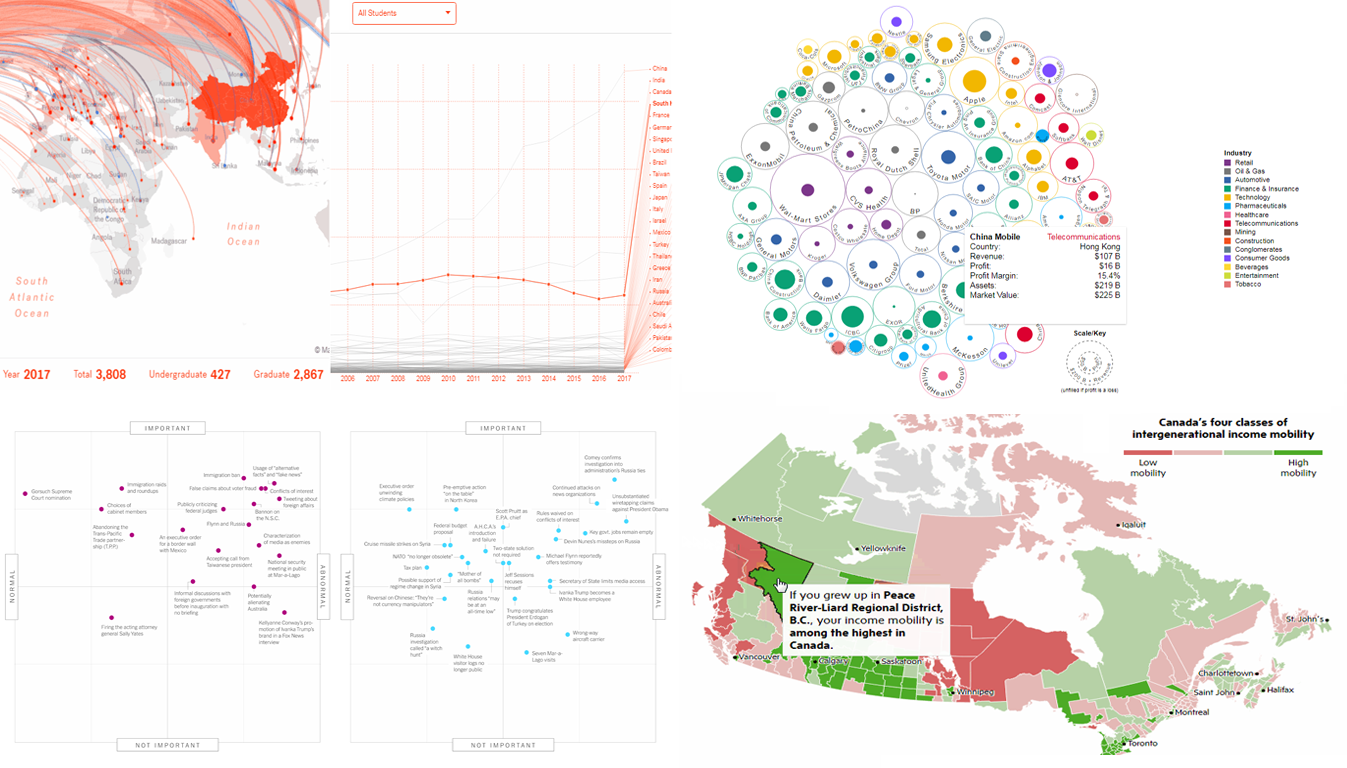
International Students’ Flow to MIT Nicely Visualized
MIT Senseable City Lab presented great interactive data visualizations that graphically represent the flow of scholars and student to the Massachusetts Institute of Technology in Cambridge, MA. See the MIT World project to see what countries contributed most to the international makeup of MIT’s campus and, for example, how that changed over the last 20 years.
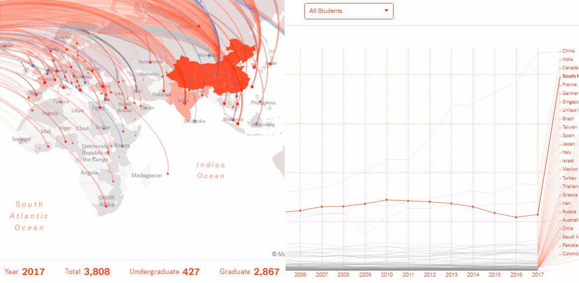
Cool Data Visualization Example of Top 100 Companies by Revenue and Profit
Ishtyaq Habib created an interactive bubble chart that visualizes corporate revenue and profit data in a peculiar manner. The picture he got in result can provide you with insights into the top 100 companies from the 2017 Forbes Global 2000 list by profit and revenue. Although this is definitely one of good data visualization examples out there, the author admits at the end of his explanation that the bubble chart type might be not the best form here because it is hard for humans to clearly judge areas. Well, that is another proof that the challenge of choosing the right chart type is topical.
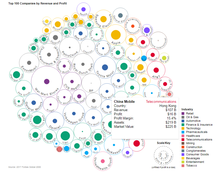
Good Data Visualization Examples Show Trump’s Presidency Gets More Normal
The Upshot asked over a dozen of experts to assess 28 notable news events that took place during US President Trump’s first 100 days in terms of how normal and important those occasions are. Then the results were applied to a quadrant chart and laid over the same kind of visualization regarding the first month of the new administration. To sum up what we see on the chart, Trump is likely to have started to adjust to the realities of the US presidency and govern in a more normal, or we’d better say typical way now. Check out the article with this interesting data visualization to learn more.
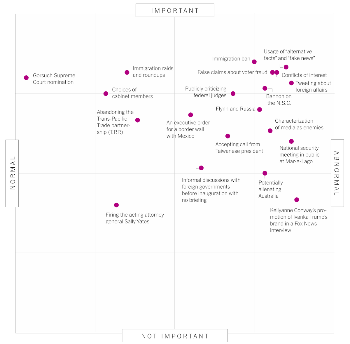
Visualizing Good Data About Canadian’s Income Mobility on Interactive Map
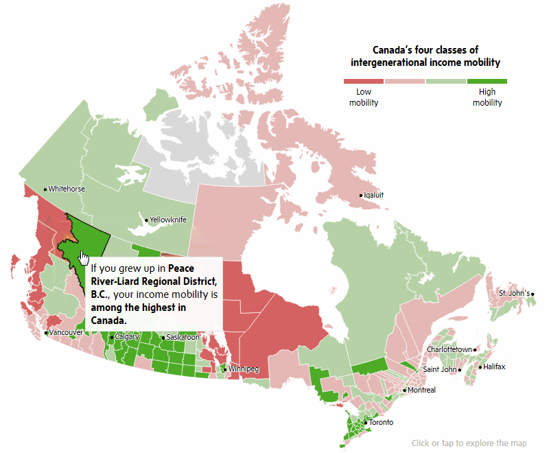
The financial future of Canadians is greatly affected by where exactly in Canada they grow up. To find out what regions are likely to be home to higher or lower income mobility of people, explore this nice interactive map published by The Globe and Mail. In the article, you’ll also find more good data visualization examples on this topic.
Expect the next issue of Data Visualization Weekly to go live next Friday. Whenever you come across a good example of data visualization or an information graphics being really cool in itself or delivering insights in any field that you think are worth understanding, please do let us know in the comments or ping us on Twitter or Facebook.
- Categories: Data Visualization Weekly
- No Comments »