 Data visualization quickly evolves as an industry. The wider variety of information emerges on the Internet, the higher quality and more extraordinary visualizations of data it demands. New chart types and features appear, technologies get improved, and all in all, data visualization companies to meet the growing needs of their customers.
As a result, there are more and more interesting data research and visualizations we can find out there, and we are glad to keep sharing some of them in our weekly digest of worth seeing data visualization examples.
This article will show you several interesting and outstanding visualizations of data on the following topics:
- fertility worldwide over time;
- Oregon’s increasing diversity;
- Australian population as 100 people;
- animated visualization of the London Tube.
Data Visualization Weekly: July 21-28, 2017
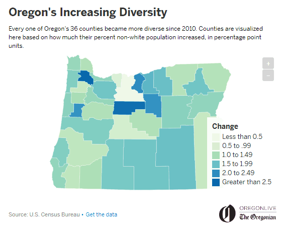
Australia as 100 People, Visualization of Census Data

ABC News published an interesting data visualization project graphically representing new Australian census data. The creators drew the entire population of Australia as 100 dots, each dot making one percent (i.e. 240,000 people), and displayed some basic and peculiar statistics using that visual pattern: from how the whole population’s breakdown by gender to the percentage of indigenous prisoners in the Northern Territory state.
The project sheds light on education, religion, urbanization, and other aspects, all considered for different time periods and (or) different segments of society. Just scroll up and down thes cool animated visualizations to learn more about the population of Australia.
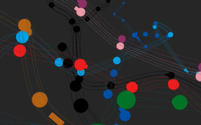
Oregon’s Increasing Diversity Visualized
The Oregon Live published a peculiar visual review of how Oregon’s population has changed since 2010 in terms of diversity. The article features a line chart visualization showing the growth rate across groups of population: black, white, Asian, and Hispanic, as well as overall. It also has an interactive choropleth map demonstrating data about the non-white populations’ increase in 2016 across all Oregon’s 36 counties.
According to the publication, many people, mostly Asians, are coming to Oregon for jobs, most of them take their families, which drives the population growth. Family reunification is another driver, and many people see this state as a good place for living and raising future generations.
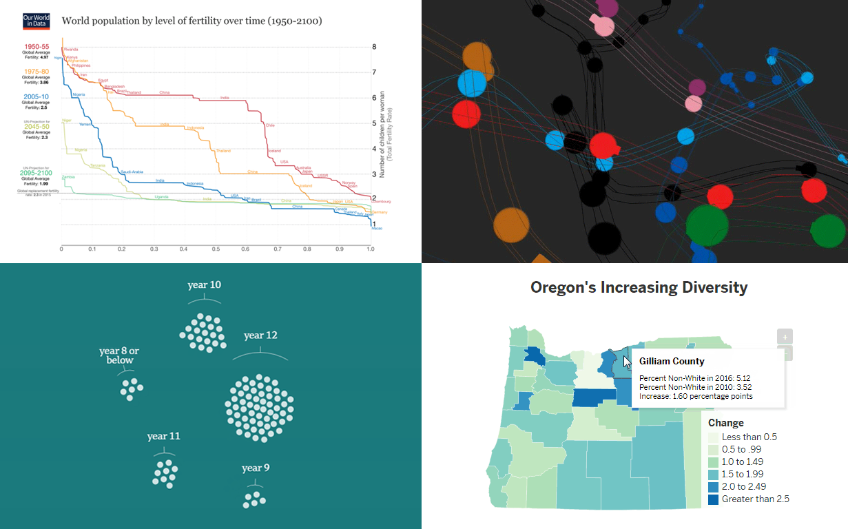
Visualizations of Data about Fertility Worldwide
Our World In Data’s creator Max Roser made a huge research of how fertility level was changing across the world from 1950 till nowadays as well as some projections of how it will be changing during the 21st century. For example, five polylines on the chart above show fertility in various countries for five time periods. There is an average fertility value for each time period shown, as well as you can check the value for each country using the scale on the right.
The research also includes several interactive maps visualizing fertility rates for different time periods, charts with yearly birth and children death rates. You can also find there a bar chart displaying the differences in the speed of the fertility decrease by country. A large part of a research spotlights various factors that affect fertility: child mortality, economics, education, religion, and others.
London Underground’s Life Visualized
Visual developer Bruno Imbrizi created an outstanding animated 3D visualization of the London Tube. No text, no serious research information, only the scheme of lines with trains coming from one station to another. He has also included the opportunity to switch the sound on and off and enable or disable the highlighting and animation of any of Tube’s lines. The observer can increase or diminish the speed of the animation.
Our Data Visualization Weekly series is designed to show you new and interesting visualizations of data. The next article will see the light in a week. Meanwhile, if you’d like to create your own charts, maps, and dashboards, you’re welcome to check out our advanced JavaScript (HTML5) charting solutions.
- Categories: Data Visualization Weekly
- No Comments »