 Hey everyone! Continuing to curate the best charts, maps, and infographics from around the Internet, we invite you to meet four fresh great data visualization projects worth checking out.
Today on DataViz Weekly:
- Visualizing the ways the Thanksgiving turkey leftovers were used — Nathan Yau
- Understanding the scale of 250,000 deaths from the coronavirus — The Washington Post
- Finding a correlation between scented candle reviews on Amazon and COVID-19 — Kate Petrova
- Evaluating tree equity in American city neighborhoods — American Forests
Data Visualization Weekly: November 27, 2020 — December 4, 2020
How to Use Thanksgiving Turkey Leftovers
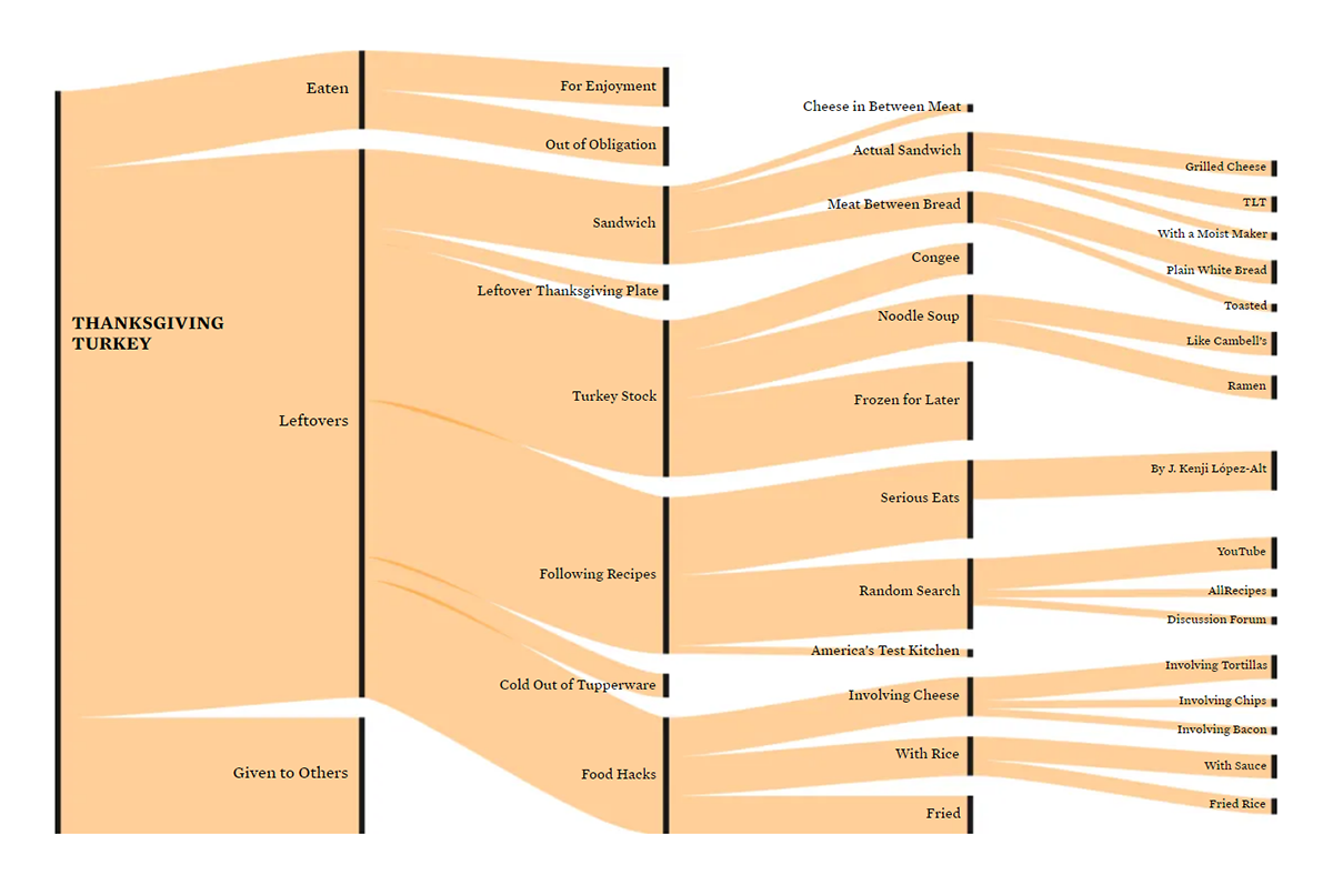
A roasted turkey is the centerpiece of a traditional Thanksgiving meal. These birds are usually quite large, so abundant leftovers are a common issue after dinner. Unless you feel fine about wasting food, of course. Luckily, there are a whole lot of recipes for turkey leftovers out there.
Nathan Yau, an expert in statistics and data visualization, had this problem again last week. If you would like to learn how it was solved, here is a cool Sankey diagram. The chart recently published on Nathan’s blog FlowingData shows all the ways his Thanksgiving turkey leftovers were used without having to consume the same thing for a number of days in a row. You can see that many pieces were eaten in different sandwiches. Recipes from YouTube, Allrecipes, and discussion forums were made use of as well.
Check out the visualization for more details. Keep it as a cheatsheet for next year, just in case.
Understanding the Scale of 250,000 Deaths
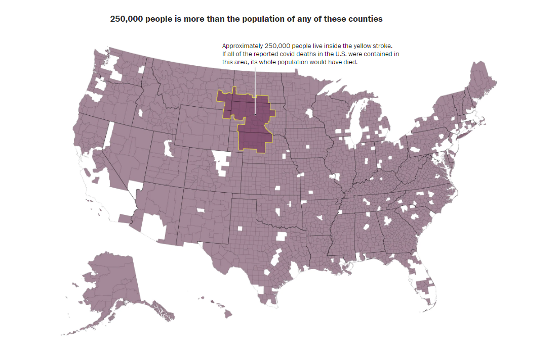
Meanwhile, the COVID-19 death toll in the United States surpassed 250,000. It is quite well known that large numbers can be hard to understand. So how much is a quarter million people?
The Washington Post’s new maps created by Tim Meko and Lauren Tierney provide context so that we could better realize the scale of this loss. Look at the first map — it is pictured right here above. 250,000 people is the entire population of the area within the yellow contour. So if all the reported deaths happened there, this territory would become completely empty.
See the article on The Post for more maps that allow us to visually compare this amount to the population of counties and regions, showing the scale of a quarter million deaths. That’s really a lot.
Finding a Correlation Between Scented Candle Reviews and COVID-19
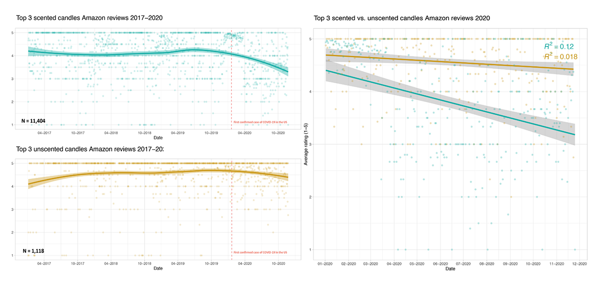
A temporary loss of smell, or anosmia, is a frequent symptom of the coronavirus disease. About 80% of people with confirmed COVID-19 are reported to have this problem. So when Kate Petrova, a research assistant with the Harvard Study of Adult Development at Bryn Mawr College, stumbled upon a suggestion of a potential relationship between the unfolding of the pandemic and an increase of negative reviews of scented candles on Amazon, she thought it could be true and decided to check if data could actually reveal any connection there.
Kate charted Amazon reviews over time, for both scented and unscented candles, and identified an interesting pattern. As you can see on the charts, there really is a surge in negative reviews of scented ones since the first COVID cases. But no such downward trend can be noticed for unscented candles. So there may be a correlation! (Or not, because other factors could also have some impact.)
Look at the data in these visualizations by yourself. Don’t miss out on the original thread on Twitter where Kate provides more details about her research.
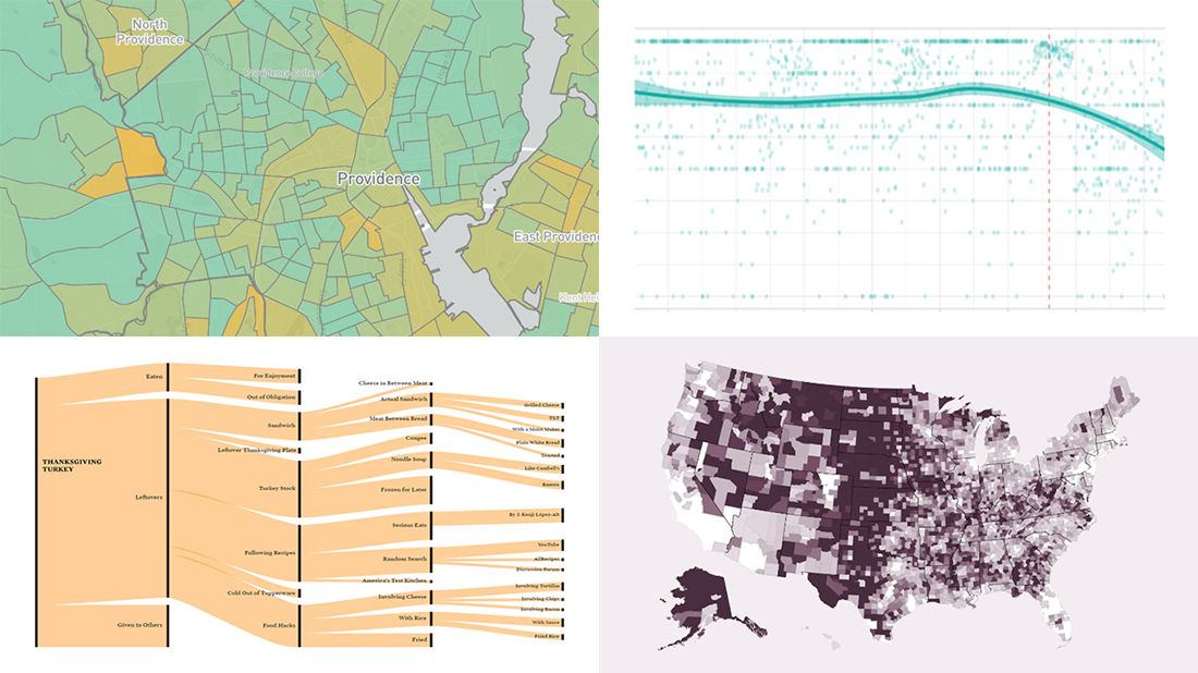
Evaluating Tree Equity in American City Neighborhoods
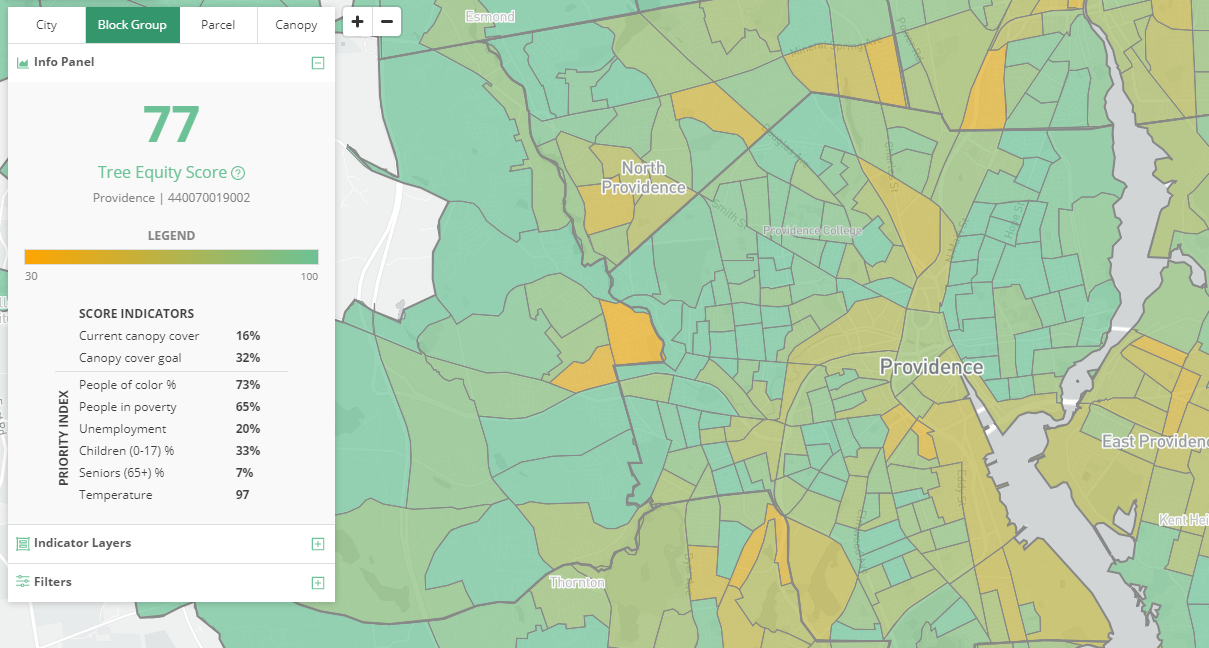
Sooner or later, the pandemic will go away and other significant issues will come to the fore (again). One of such problems is that cities lack trees which are known to help keep the air cleaner and reduce heat-related health risks. At the same time, tree cover is sparse in low-income neighborhoods, which means their inhabitants are left in worse conditions for living.
American Forests, an environmental protection nonprofit, worked out solutions designed to help solve this problem and achieve equity here with the help of data. The organization created a methodology that allows so-called Tree Equity Scores to be calculated for any city neighborhood, revealing what places require immediate action. The algorithm is based on evaluating data about the existing tree canopy, surface temperature, population density, income, race, age, and employment in the corresponding area. For now, the scores are available for San Francisco Bay Area, Rhode Island, and Maricopa County, AZ (with Phoenix). You can explore Tree Equity Scores and the underlying data across those three pilot locations using an interactive map.
In addition to that, American Forests also launched the Tree Equity Score Analyzer (TESA) — “for cities and states that want to dive deep into decision-making around Tree Equity Scores, catalyzing investment and estimating benefits of projects down to the parcel scale.” This interactive tool is currently available for Rhode Island only.
Feel free to explore the situation with the tree canopy in these locations and find out where investment in trees are especially needed.
***
Thanks for your attention. We’ll keep curating great data visualizations and let you know about them. Stay tuned.
- Categories: Data Visualization Weekly
- No Comments »