 Would you like to know how to easily create an interactive Marimekko chart for HTML5 based apps and Web pages using JavaScript? If yes, you are on the best path to learning this.
Also known as Mekko charts and market maps, Marimekko charts display numerical values that vary from 0% to 100% in its Y-axis. The most exciting part lies in their X-axis, which indicates the sum of values within categories. Each category’s width along the X-axis portraits the whole category’s contribution to a total of all data. In simple words, this is a type of a stacked chart that visualizes categorical data. Still, both the Y and X axes vary in a percentage scale by determining each segment’s width and height.
Are you a smartphone enthusiast and interested to look at the global smartphone shipments in 2019 by quarter and by vendor? Then especially follow the present tutorial as we are to visualize this market data in an elegant Marimekko diagram using simple JS chart coding techniques.
How to Create Basic JS Marimekko Chart
The general order of visualizing data in JavaScript charts consists of the following simple four steps, and building a JS Marimekko chart is not an exception:
- Create an HTML page with a container to display the chart.
- Connect all the scripts you need.
- Load the data you need to visualize in the chart.
- Finally, write the JS charting code.
Now, let’s dig into each of these steps to draw our nifty Marimekko chart.
Step 1: Create an HTML page
The first step is to set up a basic HTML page to place the Marimekko chart.
<!DOCTYPE html>
<html>
  <head>
    <title>My Marimekko Chart Example</title>
    <style>
      html, body, #container {
        width: 100%;
        height: 100%;
        margin: 0;
        padding: 0;
      }
    </style>
  </head>
  <body>
    <div id="container"></div>
      // Marimekko chart code goes here
  </body>
</html>
The HTML page developed above consists of two main sections, the header (between <head></head> tags) and the body of the page (between <body></body> tags). In the header section, we have set the HTML page title (between <title></title> tags) and CSS rules (between <style></style> tags) to manage the container element’s appearance.
The div element in the body section whose id is container, is the block that will be used to place our Marimekko chart. Since I want the graphic to appear on the entire HTML page, I have set the container element’s width and height fields to 100%. So the chart will be displayed across the whole page.
Step 2: Connect all required scripts
Next, we should connect all the JavaScript scripts that are required to build a Marimekko chart.
Generally, these simple steps to build a Marimekko or basically any other chart are quite the same for all JavaScript charting libraries. In this tutorial, I will take AnyChart as an example. It is a popular flexible JS library for interactive data visualization, which has great documentation and API reference, and a lot of demos, so it looks easy to get started with even for beginners.
AnyChart has a modular system, which means you do not need the entire library and can connect only those chart types and features that you need in reality. In this way, the size of the JavaScript code running on your web page is significantly reduced. It is always good for performance. So, the ‘base’ and ‘mekko’ modules should be used in our case to represent data in a Marimekko chart. They will be referenced in the <head></head> section, in the <script></script> tags.
<script src="https://cdn.anychart.com/releases/8.9.0/js/anychart-base.min.js"></script>
<script src="https://cdn.anychart.com/releases/8.9.0/js/anychart-mekko.min.js"></script>
The JavaScript code required to build the Marimekko chart should be written between the <body></body> tags of the HTML page.
Following is the look of the code with new changes. Isn’t it cool? Keep on reading, guys. We are getting close to the most exciting part.
<!DOCTYPE html>
<html>
  <head>
    <title>My Marimekko Chart Example</title>
    <script src="https://cdn.anychart.com/releases/8.9.0/js/anychart-base.min.js"></script>
    <script src="https://cdn.anychart.com/releases/8.9.0/js/anychart-mekko.min.js"></script>
    <style>
      html, body, #container {
        width: 100%;
        height: 100%;
        margin: 0;
        padding: 0;
      }
    </style>
  </head>
  <body>
    <div id="container"></div>
    <script>
      // Marimekko chart code goes here
    </script>
  </body>
</html>
Step 3: Load the data you want to visualize
As stated at the beginning of this tutorial, Marimekko belongs to the 2D stacked chart family, but it illustrates an additional dimension of data through varying column widths. This chart type is widely being used to interpret sales data and perform marketing analysis, but make sure you’ve picked data appropriately based on your requirement.
Are you curious about the number of global shipments of your favorite smartphone brand in 2019? Wait, let’s go more in-depth and visualize the shipments quarterly so that the data will be suitable to fit into a Marimekko chart.
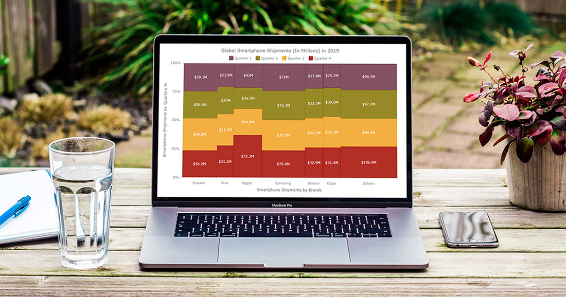
In the present case, a Marimekko chart will be used to illustrate the top six brands of smartphone shipments (in millions) in 2019, quarterly. Following is the dataset that we’ll be using. (Source: IDC.)
| Huawei | Vivo | Apple | Samsung | Xiaomi | Oppo | Other | |
|---|---|---|---|---|---|---|---|
| Q1 | 59.1 | 23.9 | 42 | 72 | 27.8 | 25.7 | 90.5 |
| Q2 | 56.6 | 27 | 36.5 | 76.3 | 32.3 | 30.6 | 97.7 |
| Q3 | 66.8 | 31.3 | 44.8 | 78.2 | 31.7 | 32.3 | 94.9 |
| Q4 | 56.2 | 31.5 | 72.3 | 70.4 | 32.9 | 31.4 | 106.4 |
The wonder of Mekko graphics is that both axes represent data on a percentage scale, but you need to put actual data only and the chart calculates everything automatically.
We transformed the mobile shipment data into a particular JavaScript object as shown below. It holds the data header settings, the title, and the data itself as an array of arrays.
The X-axis contains each smartphone brand’s total shipments, while the Y-axis is used to read each smartphone brand’s percentage of shipments by quarter.
Following is the dataset that we’ll be using. The header setting of the JavaScript object below is used to set the quarter details of each smartphone producer brand. Hence, we will see quarter-wise relationships.
var data = {
  title: 'Global Smartphone Shipments (In Millions) in 2019, quarterly',
  header: ['Name', 'Quarter 1', 'Quarter 2', 'Quarter 3', 'Quarter 4'],
  rows: [
    ['Huawei', 59.1,56.6,66.8,56.2],
    ['Vivo', 23.9,27,31.3,31.5],
    ['Apple', 42,36.5,44.8,72.3],
    ['Samsung', 72,76.3,78.2,70.4],
    ['Xiaomi', 27.8,32.3,31.7,32.9],
    ['Oppo', 25.7,30.6,32.3,31.4],
    ['Others', 90.5,97.7,94.9,106.4],
  ]
};
Step 4: Writing the JS Marimekko chart code
Once all the preparations are done, we can step into the final section to display the most awaited Marimekko chart. The entire JavaScript chart code responsible for displaying the Marimekko chart must be inserted inside the anychart.onDocumentReady() function which is written within the <script> tag. As the function’s name suggests, it waits until the page is ready to display the data.
<script>
  anychart.onDocumentReady(function() {
    // The entire JavaScript code of the Marimekko chart will be here
  });
</script>
Then, use the code from step 3 to generate the data that needs to be fed to the Mekko chart.
var data = {
  title: 'Global Smartphone Shipments (In Millions) in 2019, quarterly',
  header: ['Name', 'Quarter 1', 'Quarter 2', 'Quarter 3', 'Quarter 4'],
  rows: [
    ['Huawei', 59.1,56.6,66.8,56.2],
    ['Vivo', 23.9,27,31.3,31.5],
    ['Apple', 42,36.5,44.8,72.3],
    ['Samsung', 72,76.3,78.2,70.4],
    ['Xiaomi', 27.8,32.3,31.7,32.9],
    ['Oppo', 25.7,30.6,32.3,31.4],
    ['Others', 90.5,97.7,94.9,106.4],
  ]
};
The next step is to specify the JS chart type. In this case, we should use the mekko chart and feed it with the data to be visualized in a Marimekko chart.
// create a mekko (marimekko) chart
var chart = anychart.mekko();
// set the chart data
chart.data(data);
Let’s enable the legend of the chart like below.
// enable the chart legend
chart.legend(true);
Finally, command to draw the Marimekko chart in the container:
// set the chart container id
chart.container('container');
// draw the resulting marimekko chart
chart.draw();
Here comes what we’ve waited for. (See this basic Marimekko chart on AnyChart Playground.)
The complete code of the basic interactive HTML5 Marimekko chart above is below.
<!DOCTYPE html>
<html>
  <head>
    <title>My Marimekko Chart Example</title>
  <script src="https://cdn.anychart.com/releases/8.9.0/js/anychart-base.min.js"></script>
  <script src="https://cdn.anychart.com/releases/8.9.0/js/anychart-mekko.min.js"></script>
    <style>
      html, body, #container {
        width: 100%;
        height: 100%;
        margin: 0;
        padding: 0;
      }
    </style>
  </head>
  <body>
    <div id="container">
    <script>

      anychart.onDocumentReady(function () {

        // create data
        var data = {
          title: 'Global Smartphone Shipments (In Millions) in 2019',
          header: ['Name', 'Quarter 1', 'Quarter 2', 'Quarter 3', 'Quarter 4'],
          rows: [
            ['Huawei', 59.1,56.6,66.8,56.2],
            ['Vivo', 23.9,27,31.3,31.5],
            ['Apple', 42,36.5,44.8,72.3],
            ['Samsung', 72,76.3,78.2,70.4],
            ['Xiaomi', 27.8,32.3,31.7,32.9],
            ['Oppo', 25.7,30.6,32.3,31.4],
            ['Others', 90.5,97.7,94.9,106.4],
          ]
        };

        // create a mekko (marimekko) chart
        var chart = anychart.mekko();

        // set the chart data
        chart.data(data);

        // enable the chart legend
        chart.legend(true);

        // set the chart container id
        chart.container('container');

        // draw the resulting marimekko chart
        chart.draw();

      });

    </script>
  </body>
</html>
Customizing JS Marimekko Chart
Well, this section is to add some icing on the cake. You have substantial documentation resources in AnyChart, where can you obtain in-depth knowledge to improve, alter, and customize the generated charts. For inspiration, check the demo gallery.
Let’s try to modify our JavaScript Marimekko chart to give it a more elegant look.
Use palettes to change the chart color
The color of the Marimekko charts can be customized using the Palettes option. Refer to this manual to find more details on AnyChart Palettes. In the below instance we apply the Wines palette. There are many more pre-built color palettes, awaiting you.
// apply a palette for coloring
chart.palette(anychart.palettes.wines);
Doesn’t the chart look handy with its new colors? (See it on AnyChart Playground.)
Format the chart axes
Following code extras are used to format the axes by adding titles and changing the orientation of the axes.
Here’s the code to include the axis titles:
// set the x-axis title
chart.xAxis().title('Smartphone Shipments by Brands');
// set the y-axis title
chart.yAxis().title('Smartphone Shipments by Quarters %');
The orientation of the Y-axis can be either left or right. The default value is left. The orientation of the X-axis can be set either as top or bottom and by default it gets set to bottom. Configure them based on your interest. Following changes are made in the orientation of both axes. For the demonstration purpose, the orientation of the X-axis and Y-axis will be set as top and right.
// set the x-axis orientation
chart.xAxis().orientation("top");
// set the y-axis orientation
chart.yAxis().orientation("right");
The chart seems more readable with axes titles. (See it on AnyChart Playground.)
From the next example onwards, the Marimekko chart axes’ orientation is returned to the default look.
Format the chart tooltips
Tooltips are usually hidden but they become visible when hovering over the chart’s points. This can be used to display additional useful information.
As the first step, let’s generate information that needs to be displayed when hovering. According to the following code snippet, we display the seriesName (the quarter), and value (the shipment amount for the corresponding quarter, in USD million).
// customize the tooltip format
chart.tooltip().format('{%seriesName}: ${%Value}M');
The ‘union’ display mode helps to show the data for all quarters at once.
// set the tooltip display mode
chart.tooltip().displayMode("union");
Following is just another simple modification performed to the Marimekko chart tooltip title’s visual appearance. We can change font size, background appearance, and font weight as shown below.
// customize the tooltip title
var title = chart.tooltip().title();
title.fontFamily("Calibri");
title.fontDecoration("underline");
title.fontWeight(700);
title.fontSize(18);
Our JS-based Marimekko chart seems to be getting even better and more readable. (See it on AnyChart Playground.)
Format the chart label settings
A label is a text box that can be displayed along with a point on a chart. Labels typically indicate information that each point contains. Let’s configure the labels in this Marimekko chart to add that the shipment value for each quarter is displayed in millions of US dollars.
// set the chart labels settings
chart.labels().format('${%Value}M');
Finally, this is how our interactive Marimekko chart looks like after making the relevant customizations as suggested above. (See it on AnyChart Playground.)
The newly customized, advanced Marimekko chart looks more informative and attractive than the initial visualization. You can give your creative touch to present the chart with more details.
According to the finalized Marimekko chart, Samsung was the leading smartphone vendor worldwide in 2019. But be aware, Samsung! Huawei seems to challenge you soon. Did you notice that Apple had performed exceptionally well in the fourth quarter, beating all its competitors? The success story behind this outstanding achievement was the unveiling of the iPhone 11 series, which caught the eye of so many people all over the globe.
Play with your data, guys, because they are waiting to reveal exciting information for you.
Below is the full HTML code for the final Marimekko chart in this tutorial:
<!DOCTYPE html>
<html>
  <head>
    <title>My Marimekko Chart Example</title>
  <script src="https://cdn.anychart.com/releases/8.9.0/js/anychart-base.min.js"></script>
  <script src="https://cdn.anychart.com/releases/8.9.0/js/anychart-mekko.min.js"></script>
    <style>
      html, body, #container {
        width: 100%;
        height: 100%;
        margin: 0;
        padding: 0;
      }
    </style>
  </head>
  <body>
    <div id="container">
    <script>

      anychart.onDocumentReady(function () {

        // create data
        var data = {
          title: 'Global Smartphone Shipments (In Millions) in 2019',
          header: ['Name', 'Quarter 1', 'Quarter 2', 'Quarter 3', 'Quarter 4'],
          rows: [
            ['Huawei', 59.1,56.6,66.8,56.2],
            ['Vivo', 23.9,27,31.3,31.5],
            ['Apple', 42,36.5,44.8,72.3],
            ['Samsung', 72,76.3,78.2,70.4],
            ['Xiaomi', 27.8,32.3,31.7,32.9],
            ['Oppo', 25.7,30.6,32.3,31.4],
            ['Others', 90.5,97.7,94.9,106.4],
          ]
        };

        // create a mekko (marimekko) chart
        var chart = anychart.mekko();

        // set the chart data
        chart.data(data);

        // enable the chart legend
        chart.legend(true);

        // apply a palette for coloring
        chart.palette(anychart.palettes.wines);

        // customize the tooltip format
        chart.tooltip().format('{%seriesName}: ${%Value}M');
        // set the tooltip display mode
        chart.tooltip().displayMode("union");

        // customize the tooltip title
        var title = chart.tooltip().title();
        title.fontFamily("Calibri");
        title.fontDecoration("underline");
        title.fontWeight(700);
        title.fontSize(18);

        // set the chart labels settings
        chart.labels().format('${%Value}M');

        // set the x-axis title
        chart.xAxis().title('Smartphone Shipments by Brands');
        // set the y-axis title
        chart.yAxis().title('Smartphone Shipments by Quarters %');

        // set the chart container id
        chart.container('container');

        // draw the resulting marimekko chart
        chart.draw();

      });

    </script>
  </body>
</html>
Conclusion
Wasn’t building a Marimekko chart using JavaScript an easier task than you imagined at the beginning of the guide? Some charting libraries’ APIs like this one are easily accessible, informative, and can make your data visualization development work extremely easy. The available powerful documentation will help you quickly sort out any issues you may encounter while coding. Good luck!
- Categories: AnyChart Charting Component, Business Intelligence, HTML5, JavaScript, JavaScript Chart Tutorials, Tips and Tricks
- No Comments »