 Another seven-day wait is over, and a new DataViz Weekly issue is here! This time, we offer you to look at the following interesting charting projects:
- U.S. population projections through 2060;
- House of Representatives elections from 1840;
- Calgary traffic incident prediction;
- every building in America.
Interesting Charting Projects: October 12, 2018 — October 19, 2018
U.S. Population Projections Through 2060
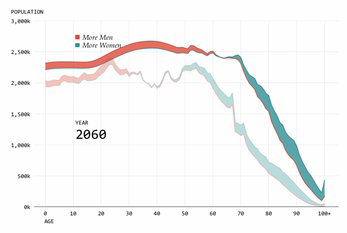
Nathan Yau took the same dataset — with population projections from the U.S. Census Bureau — and visualized it in 14 charts answering different specific questions. With such an abundance of views, this project not only is great for getting insight into what is going to happen with the American population through 2060, but also serves as a wonderful “practical example for how asking and answering questions helps guide you towards more focused data graphics.”
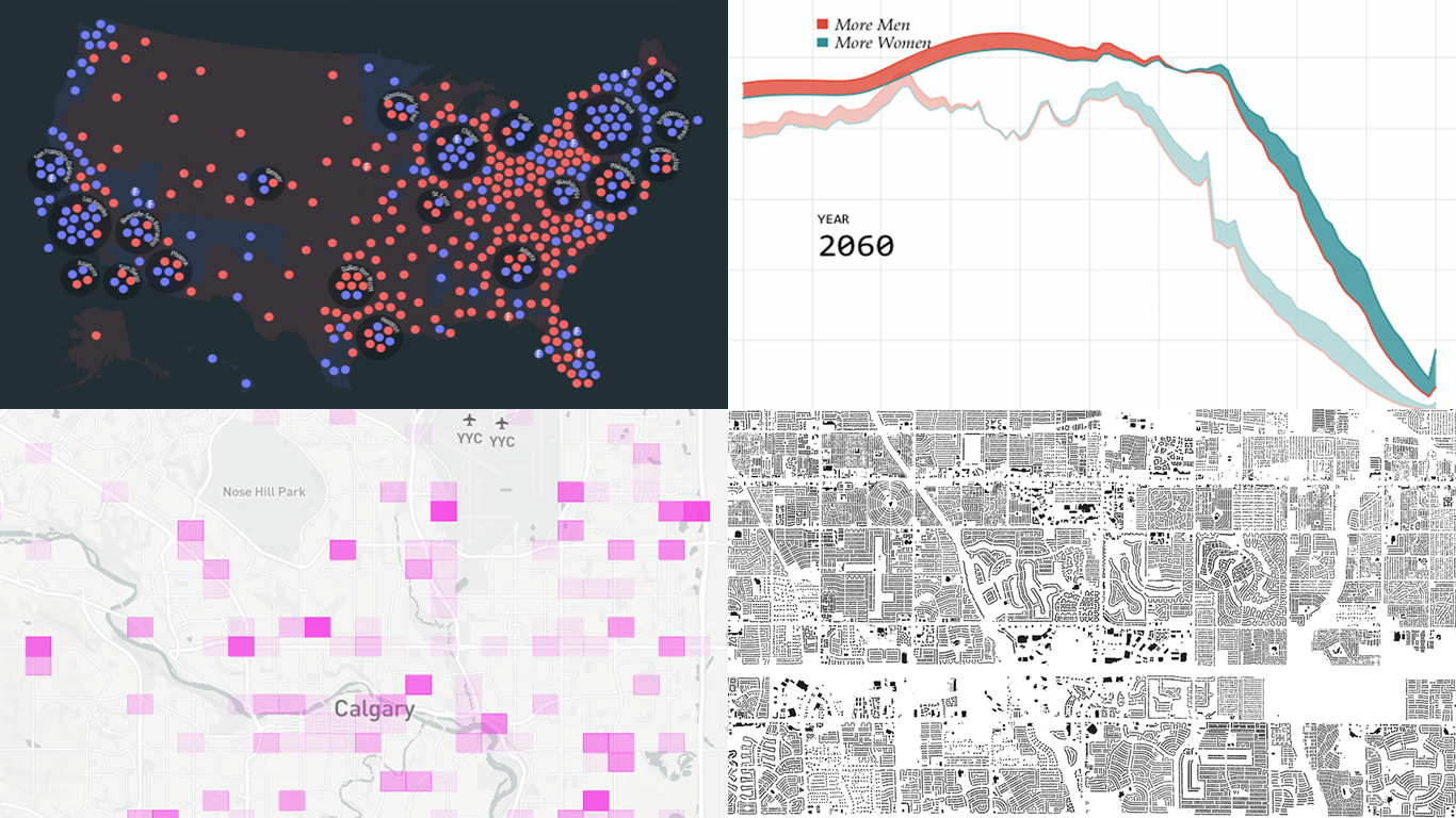
House of Representatives Elections, 1840-2016
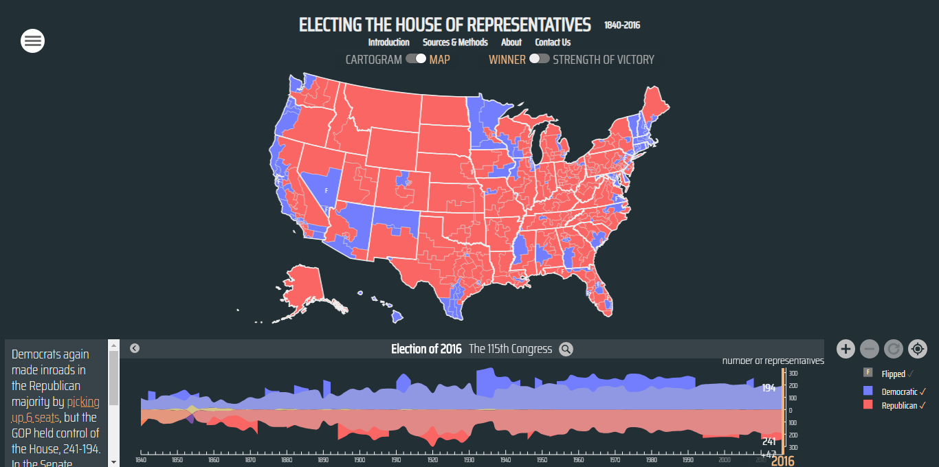
University of Richmond’s Digital Scholarship Lab in collaboration with Virginia Tech’s Department of History created an awesome tool for everyone interested in the history of elections in the U.S. It’s a visualization of polling data for every House of Representatives election, from 1840 through 2016. Here you can track the history of how your (and any other) district voted and explore patterns, national and regional.
Calgary Traffic Incident Prediction
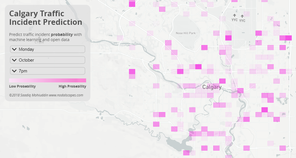
Data visualization enthusiast Saadiq Mohiuddin created a great map-based tool that predicts the probability of traffic incidents throughout Canada’s Calgary. Select a month, day of the week, and time in order to see where in the city cars are more likely to crash at that moment.
Every Building in America
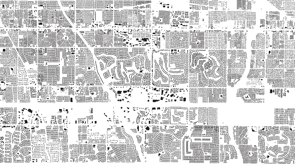
The New York Times made a stunning map that shows (almost) every single building in the United States of America. “We did it as an opportunity for you to connect with the country’s cities and explore them in detail. To find the familiar, and to discover the unfamiliar. So … look. Every black speck on the map below is a building, reflecting the built legacy of the United States,” the authors explained. The map is based on Microsoft’s database of building footprints, which was compiled using AI-based satellite image processing techniques. Find a place you want to check with the help of the search bar or simply zoom in and out to explore the visualization.
***
Thank you for your attention. Stay tuned.
- Categories: Data Visualization Weekly
- No Comments »