 DataViz Weekly is here to meet you with some of the interesting visualizations we’ve come across these days. The new selection includes data-based projects worth seeing, with charts and infographics on the following topics:
- Russian borders from 1462 through 2018;
- career paths to the U.S. Congress;
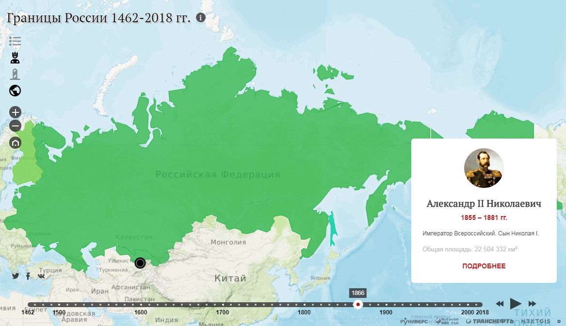
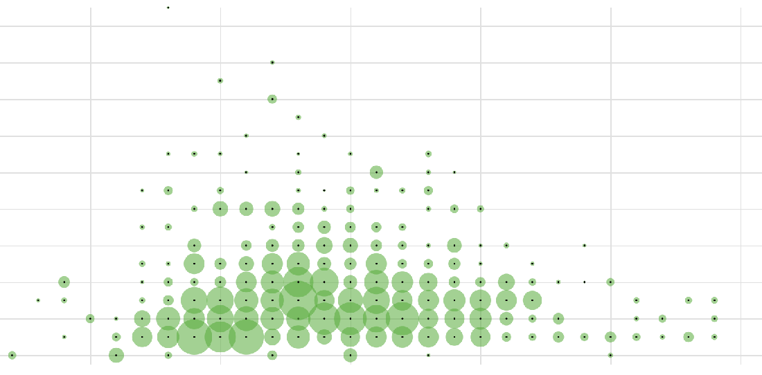
- time to have the first child;
- lifespan of news stories.
Interesting Visualizations in Data Visualization Weekly: January 25, 2019 — February 1, 2019
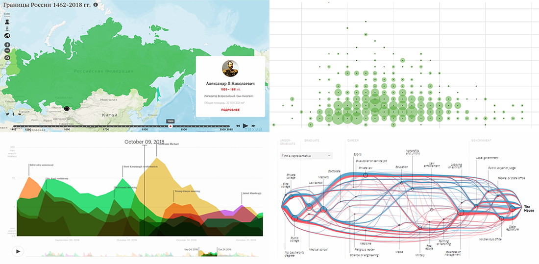
Russian Borders in 1462-2018
Runivers, a digital project dedicated to the Russian culture and history (supported by Transneft), in collaboration with the Laboratory of Historical Geoinformatics at the Institute of World History (Russian Academy of Sciences) and open-source geospatial software developer NextGIS, created an interesting visual project that shows how Russia’s borders were changing in 1462-2018. It is essentially an interactive map. Here you can add layers (e.g. if you want to see who ruled Russia at the displayed time), switch to one year or another, play the animation, and so on. The project looks helpful in studying Russian history in terms of territory.
Career Path to U.S. Congress
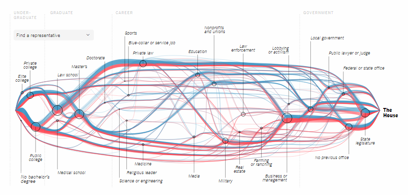
The New York Times published a cool piece of interactive storytelling, displaying the pre-congressional career of every member of the House of Representatives in the 116th Congress. Pick a representative and learn about the major educational, professional, and political milestones in their earlier life, on the way to the U.S. House.
First Child Time in America
Nathan Yau looked into data from the National Survey of Family Growth (NSFG), conducted by the Centers for Disease Control and Prevention (CDC), to find out how soon after marriage people have their first child. See what data has to say about that, for men and women. In the article, you’ll also find one more chart that visualizes how the pregnancy outcome depends on the mother’s age. In addition, don’t miss out on another interesting research from Nathan Yau, based on data from the same source and shared on FlowingData a few days ago: look how many Americans have at least one kid at one age or another.
Lifespan of News Stories
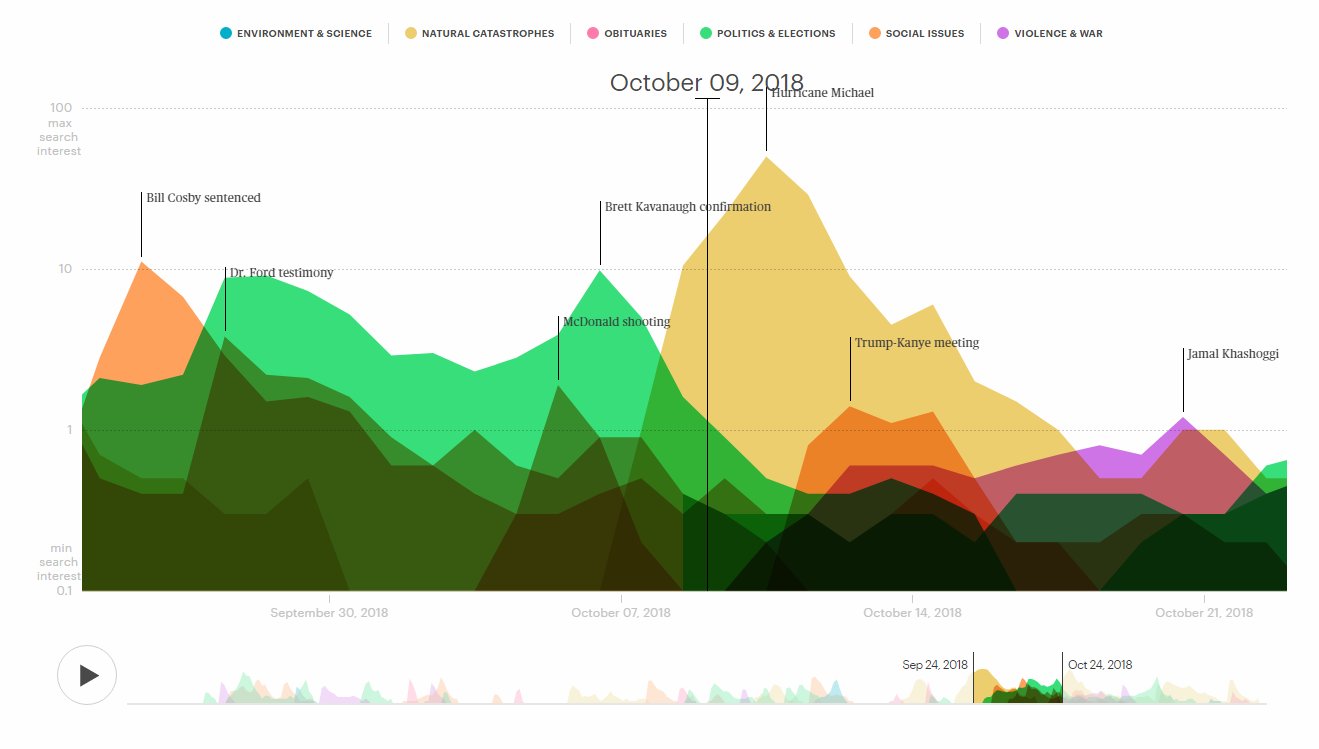
Design firm Schema Design — in collaboration with Google Trends, Alberto Cairo, and Axios — launched an impressive data visualization-based project displaying the lifespan of news stories. Check out the interactive and animated charts to observe how news enter, gain, and leave the public attention, revealing interesting patterns that can be useful in PR, press, and basically, any other communication-related fields.
***
Data is beautiful, indeed. Stay tuned for Data Visualization Weekly to get new proof every Friday.
Meanwhile, have a wonderful time!
- Categories: Data Visualization Weekly
- No Comments »