 Check out new interesting data analytics and visualization examples from around the web. Here are the topics in the focus of today’s DataViz Weekly:
- high-street crisis in town centers across England and Wales;
- interactive maps of changes in Greater Boston’s neighborhoods;
- connectivity between train stations in the Netherlands;
- economic costs of climate change vs election results in the United States.
Visual Data Analytics Examples in Data Visualization Weekly: February 1, 2019 — February 8, 2019
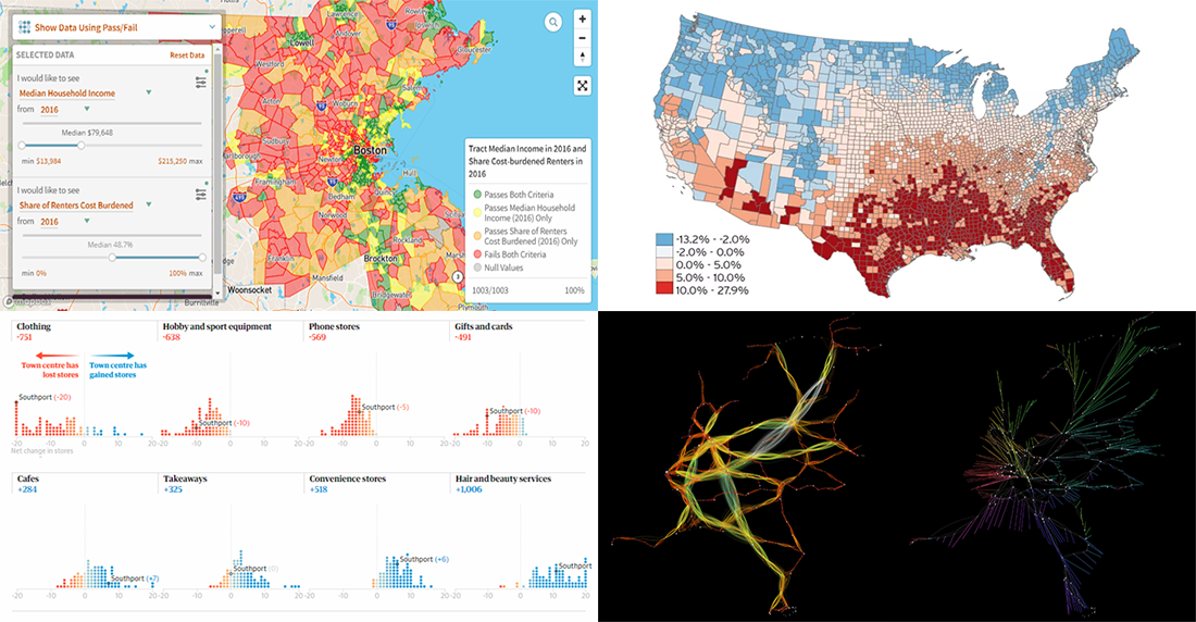
High-Street Crisis in Town Centers Across England and Wales
A data analysis recently conducted by The Guardian shows that 8% of shops have been closed in town centers all over England and Wales for the last few years, since 2013. Moreover, that’s only an average percentage. In some of the town centers, a decline appears to be even more dramatic. For example, Stock-on-Trent has lost just under a quarter of its 400+ shops.
The analysis is based on the Points of Interest database from Ordnance Survey, the United Kingdom’s national mapping agency, and covers 88 major English and Welsh town centers. In addition, ONS data is taken to look into the reasons.
Take a look, play with interactive charts, learn what categories of business have closed their offline points of sale (and what is expected to replace them), and read more — on The Guardian.
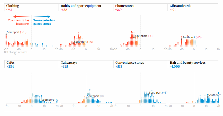
Interactive Maps of Greater Boston Neighborhood Change
The Joint Center for Housing Studies of Harvard University released a tool for visualization and analysis of various types of changes in the Greater Boston area. The project is built on statistics from the U.S. Census Bureau, including the official census data along with information from the (more recent) American Community Surveys.
Here, you can start with exploring ready-to-use interactive visualizations in Recommended Maps, unveiling changes in ethnic and racial diversity, inequality, poverty, gentrification, and more. Then create your own map to graphically display some particular data you want to research.
Connectivity Between Train Stations in Netherlands

Data visualization expert Jan Willem Tulp created a stunning visualization of the Netherlands’ train travel schedule for one of the busiest days, adjusting the picture based on a concept that any two stations temporarily get closer to each other when a train is running between them.
Take a look at his project to watch a cool animation that distorts the map according to train traffic at a particular time, showing how well-connected the cities in the Netherlands are. Don’t miss out on several stunning images also shared right there, generated while the author was working on the visualization.
Economic Costs of Climate Change vs Election Results in United States
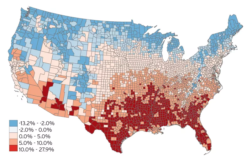
The Brookings Institution’s Metropolitan Policy Program mapped Climate Impact Lab’s estimates of the future economic damage caused by climate change and offered a view of this data from the perspective of the latest election results in the United States.
According to the report, published as recently as last week, economic impacts of the global warming are going to be widespread but uneven in terms of their distribution, which becomes especially interesting if we turn to the political geography. The authors’ final findings reveal quite a paradoxical fact: Many of the U.S. states exposed to the most economically harmful impact of climate change actually voted for people that are opposed to climate policy (like Donald Trump).
Check out the analytics on the Brookings Institution’s website to study the situation.
***
Visualization is helpful in data analytics, and you’ve seen some more interesting examples of that. We’ll share more next week, on DataViz Weekly. Stay tuned!
- Categories: Data Visualization Weekly
- No Comments »